Basically, flip books are a primitive form of animation. Like motion pictures and animation, flip books rely on the persistence of vision to create the illusion that continuous motion is being seen rather than a series of discontinuous images being exchanged in succession.
Friday, September 30, 2011
Flip Books
Today's animation is mainly computers and software. While looking at stuff to blog about this week, I stumbled on a really cool video that got me thinking about flip books and the history of animation. Patented by John Barnes Linnett, the flip book was first seen in September of 1868, and was called a kineograph (very similar to the name of our blog, eh?). Flip books were the first form of animation to employ a linear sequence of images rather than circular. I found this really fun flip book-like animation, but instead of on paper the animation is on balloons.
Thursday, September 29, 2011
Stargate Studios: Virtual Backlot
A friend of mine recently told me about Stargate Studios, an international production company that specializes in advanced production services and state-of-the-art postproduction. They have developed Virtual Backlot Live, which is one of the best, low-cost alternatives to shooting on location. Virtual Backlot Live has a library that includes hundreds of virtual environments from around the world. If a show is shooting on a backlot in Los Angeles but takes place in New York, productions can use a green screen and video from the virtual library to make it appear that the scene is in New York.
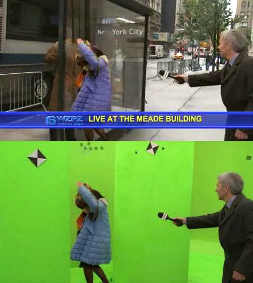
On their website you can browse their stock library which has tons of different locations. I definitely recommend exploring the website and checking out their gallery. They've posted a few reels that show some of the work they've done and there is a section on their website called "Before and After" that has a lot of cool behind the scenes interactive pictures. They have done a lot of work for shows such as Grey's Anatomy, Ugly Betty, The Walking Dead, 24, and Mad Men.
Here's their backlot reel from 2009:
Wednesday, September 28, 2011
More on Opening Titles
While looking around at different articles about opening sequences, I came across this article entitled '20 Brillant TV Show Title Sequences'. A lot of the links are disabled, so you have to look them up on youtube, but these really are some fantastic opening credits. Gone are the days when show openers consisted of a song that (sometimes) fits the theme of the show alongside the name and pictures of each of the cast members. The listed credits in the article range in dynamic, from Desperate Housewives to Six Feet Under and in difficulty, from Lost to The Unted States of Tara. If anyone still hasn't decided on a show opener they want to recreate, you should check out some of these!
As noted in class, I decided on recreating the opening for How I Met Your Mother:
As I was watching the sequence on youtube however, I stumbled a few mashups that people created of two different shows, for example the following is credits for Buffy the Vampire Slayer, HIMYM style:
The common denominator between the two shows is obviously Alyson Hannigan, but I thought it was interesting how this person tried to pick characters from Buffy that fit into the roles of characters from HIMYM.
I also noticed that this sequence had a little camera work with the pictures wiggling, but no 3D effects with the camera like the actual HIMYM opening.
Finally, I really enjoyed this HIMYM, Friends style opening. There were quite a few of this combination, but this was by far the best one:
Link to Mocha Download
The current download version here is 2.6.1. The one I have is 2.2 and the one Arturo has (I think) is 2.3, so it looks like the most recent download that Imagineering has is newer than both. I haven't tried downloading it yet, so I don't know if it will actually work, but we'll see.
Tuesday, September 27, 2011
An idea for project #1
So I made a list of all my favorite television shows and tried to think about which ones had good introductions to replicate. I thought of Lost, but there isn't much to it, I looked at House, Modern Family, Friday Night Lights, and a lot more. I came up with two choices that I might try to do for this project. Option one is the opening to Parenthood. I could only find the intro with a different version of the song but you get the idea from it.
It wouldn't let me put the actual video here so this is the link. I like this one because I can use old videos and pictures of my family or friends and fade them together. The hardest part would be figuring out the effects that happen at the beginning and end of the song.
Option two is Gossip Girl. Here is the introduction.
Gossip girl is a lot shorter but I think it looks pretty cool. I have no idea how to make that but I think it would be fun to learn.
These are just two ideas I had and I am hoping one of them may work for me.
Recreation Project Ideas
So I'm kind of having a hard time coming up with something doable for this project. The titles and ads I come across are either too complicated or too simplistic. Right now I have in mind a few things. I have the opening credits of North by Northwest, but I feel like it might be too simple. They also rotoscoped the lines to make them fit the window, but since I don't have that footage, I'm not sure what I'd do. Then I thought of the Psycho opening credits, which are also designed by Saul Bass (like those of North by Northwest), but because it doesn't involve images or anything other than titles and line animations, it might still be too simplistic.
But then I thought of this, and I think it might work. It's a narrated Flash of a horrible, misspelled review of a Flash online game, and even thought it was made in Flash, I think it's entirely possible to do in After Effects. I think that's what I'm going to do. Now I just have to figure out the elements in it (I think most of it is text, but I'll have to watch it again).
Project #1 ideas
So i've been sitting here thinking of any idea for this project and this is what i've come up with. The first one is The Big Bang Theory.
When you look at each of the elements closely it doesn't seem like their's that much to it. Basically it starts with you flying through space, where i would create glowing stars and planets and try to make them appear to fly by as if the viewer was zooming through. It then zooms into the earth to show dozens, maybe even over a hundred still images. It seems as though you are flying through each image to the next faster and faster as if you were flying through history. Here i think i would take each image and scale animate them so they scale up and cut to each image somehow. The sequence ends with a quick video clip of the cast in present day and then the show's title graphic.
If i am able to figure this out, i was going to replace the historic images with images of me throughout my college years. I haven't thought of a name for it yet.
I have a few backups as well in case this turns out to be to difficult. My next idea was to replicate Heroes. This one is shorter. It's all graphic and animation and no video which could be difficult but it seems pretty simple.
Ideas for the first project
So I'm stuck between a bunch of ideas for my first project! My top three ideas (which seem wayyy too complicated) are:
Option One:
The opening title scene of Chuck but I found something really cool on youtube that someone did using supernatural within Chuck's title sequence!
Original:
Supernatural Version:
Option Two:
Community:
Option Three:
Skins:
Skins (British version of course)(can't be embedded)
This is Harry Potter version someone did of the opening!
Then simpler ideas (but really short openings) I was thinking about were Lost or Gossip Girl!
Project #1
After thinking about our first project, I spent a lot of time on YouTube trying to find the best opening sequence. I found a lot of good ones and I started to break down the elements in my favorites.
My favorite and most realistic was Modern Family. I'm not sure if the length is too short tho.
My second favorite and a little bit more complex would be the Dancing with the Stars intro. I think I could do it, but I'm afraid it would not look as glamorous.
My other favorites were the intros to Saved by the Bell and The Brady Bunch. Both use motion graphics but not as "clean cut and edgy" as they TV is produced now.
Help me decide!
Monday, September 26, 2011
Face replacement
Motion Graphics Project
When we got the details for our first project, I immediately started to think about all of the possibilities and options. I thought about my favorite shows that have amazing opening credits and thought of Misfits:
Obviously, Misfits is very very complicated and I wouldn't even know where to begin! I love the show and I love the animation with the combination of real footage and the text in the beginning but it would just be too difficult for a beginner like me. After a lot of thought I settled on the opening sequence for House.
I think it's a lot simpler and doable, but I could be wrong? I plan to change the opening sequence and call it "Watson" and replace the footage they have with footage from BBC's Sherlock. Let me know what you think!
Web Portfolio Tips
The Ottawa Animation Festival hosted several discussion panels on both the creative process of animation and professional development. One of the professional development panels I attended was all about web portfolios. Along with the mediator, the panel had 2 professors and 2 recruiters. The professors would tell us about how they guided their students in making portfolios and the recruiters would tell us what they liked and didn't like in a portfolio. Here are some of the main points they made:
1. Web portfolios are so much easier for recruiters than physical portfolios. One of the recruiters (she recruits for Cartoon Network) said that CN doesn't even accept physical portfolios anymore.
2. Don't put in anything you don't want to do professionally. If you made a commercial but you would hate making commercials for a living, don't put it in there.
3. Put your best stuff first, no chronological order or anything. That way, if a recruiter only watches/looks at part of your portfolio, you know they saw your best work.
4. If you have a Tumblr or blog or website, make it organized and easy to navigate. A recruiter shouldn't have to dig for the work they want to see. Make it easy for them to get to your contact info and the portfolio you want them to see. If they like what they see off the bat, they'll dig deeper.
5. Blogspot could disappear in a few years, but a domain name won't. Domain names are better for long-term investments in getting your work visible online.
6. You'll want to rework your portfolio depending on what kind of job you want. If you're interested in both special effects and character modeling, you'll want different portfolios for each.
7. Make it clear what you want to do. Recruiters get annoyed when you say "Oh, I'm open for anything." Have something you're really interested in and aiming for.
8. If you put a PDF of your resume or portfolio on your site, the recruiter can download it and print it out if need be.
9. Research a company before applying to it so you know what they're looking for.
10. Be nice. If you have a lot of talent but you're a jerk and there's a nice guy with less talent going for the position, they'll go with the nice guy. It's common sense, but recruiters will Google you and look at your Facebook and stuff to see if you're a good person or not. So Google yourself and make sure you don't look like a jerk online.
All of this stuff can be applied to reels as well. A lot of it is common sense (be nice, make your contact info easy to see, etc), but I thought it was still good to hear all of it. Hope it helps you guys, too.
Sunday, September 25, 2011
Use and Overuse of Graphics and Animation in Outdoor Television
Since I was as young as I can remember, I have had a passion for the outdoors. This stemmed from many generations of my family because they also shared this same passion. Today the outdoor television industry has grown dramatically and I found myself wondering if I could take something I have loved my whole life and turn it into a career.
Today there are three outdoor channels both on cable and satellite television. The shows on these channels are geared towards outdoorsmen, hunters, fisherman, and people who just plain enjoy being out in wild.
I wanted to write my post this week and show those who don't know about this growing industry in order to show that the same steps go along with producing and finishing one of these shows.
Top companies like Drury Outdoors and Mossy Oak have created their own shows where they go around the world and hunt and fish the many species of out great world. From Kansas all the way to Africa, these teams set out to produce and finish shows that take the audience inside this world. As with any TV series, there is a large chunk of time that is devoted to post production and the need for editors and motion graphics artists is rising. I have found that the shows that have a large financial backing are the ones that use the right amount of graphics, but there are also the shows that don't have employees with production backgrounds
Here are two examples of the good and the bad
Good
Bad
As you can see there are many areas of these short clips that could be changed into quality products that even producers for the Discovery Channel would be proud.
Because this industry is only growing I have found myself very intrigued at the opportunites I could have with knowledge in editing and motion graphics. The need is there and in ten years hopefully this part of the industry will improve and the amount of quality shows and productions will be much higher.
MLB's Strike Zone Technology
After reading Jen's post last week on the tennis animation technology called Hawk-Eye, I started thinking about Major League Baseball, and it's use of animation. Like the way tennis uses Hawk-Eye to determine whether a ball is in or out of bounds, baseball uses animation technology to see if a ball is inside or outside the strike zone.

From 2001 to 2008, the MLB used a system called QuesTec. QuesTec patented products use a series of cameras, computers, and sophisticated Military-grade technology to track moving objects (such as a ball or person) and instantly reconstruct digital 3D images. These images can be viewed in real time and from any angle. Out of 30 major league ballparks, only 11 were ever set up to use QuesTec throughout a seven year period.
During the 2008 MLB season, a Pitchf/x camera system was installed in every ballpark in order to collect data required for a new camera system to go live in 2009. The data collected by the Pitchf/x system in 2008 included tracking nearly all pitches thrown for the entire season for supposedly all 30 teams. That data was used as the base measure for MLB umpire accuracy in 2009.
Pitchf/x, or the Zone Evaluation system, works by taking 25 pictures of the ball between the pitching mound and home plate. SportsVision software then uses the best fit algorithm in order to calculate compensation for the ball's flight path, including the position of the ball when it crosses home plate.
What's different between the use of this technology and the Hawk-Eye technology used in tennis is that the Zone Evaluation is not actually used to make calls. Zone Evaluation is used to show fans and viewers where exactly the ball was pitched, but more importantly it's used to evaluate the umpires' calls. This technology allows umpires to review their calls and adjust their future calls as needed. The big question now is whether or not Zone Evaluation will actually play a bigger part in the game of baseball, instead of just for evaluation.
Digital Artistry
In my search on the internet for all things graphic, I found a website CGSociety, where digital artists come together and show off their own work. Some of the photographs on the site include real human models along with graphics created by the artist, whereas other artists on the site create their human characters from scratch. My favorite example of work that I came across on the site is a 3D CG of SongKyeHo, a Korean actress.

I had been looking at examples that used human models with graphically designed items around them, but when I saw the thumbnail for this, I figured she had to be designed, as there was nothing else going on in the photo. In my opinion, she looks extremely realistic and seeing her quickly, I would never guess I weren't looking at an unaltered photograph. Upon closer inspection I would critique her hair for looking a bit unnatural in some parts (the whispiness on the right side) and the corners of her mouth. Although not human is perfect, her mouth could be suitable.
With the realistic nature of this CG woman, it makes me wonder if there will ever be a day where human actors are no longer needed. I think that creating movement and action shots for groups of CG humans would take a lot longer than shooting working, tangible people.
I feel this website would be a good place to look for real talent who may wish to freelance their work. As a digital artist, it would be a good place to spread the word about your work and be noticed.
Soul Surfer
This summer I Redboxed the story of Bethany Hamilton in the movie Soul Surfer. It was a good movie and afterwards I watched the extra specials in the menu because I was curious how they made the actress look like an amputee. After watching the bonus features I learned they used a green sleeve on the actress and keyed out the green. This is like what we were working with in Photoshop except not keying out the background.
After some research online I found that a small company called Engine Room worked on and created all the visual effects for Soul Surfer.


After some research online I found that a small company called Engine Room worked on and created all the visual effects for Soul Surfer.
"The visual effects is what made the film," said the movie's director Sean McNamara.
With just 10 employees and nearly 30 outside artists, the company did the lion's share of the 750 visual effects shots in the film for less than $1 million."
"Part of the key to survival, he says, is keeping overhead costs down. The company, which at one point had 40 employees, relies mainly on freelance digital artists who work as independent contractors and are paid a flat rate, rather than by the hour. "It's a very labor intensive business and it's easy to underestimate the costs of labor,'' he says. "It's what sinks companies."
Engine Room also recruits globally through an online registry it launched in 2009 that allows digital artists to post samples of their work. For "Soul Surfer" the company enlisted artists from China to New Zealand and Macedonia, although the bulk of the work was done by freelancers working out of their homes in California, Schmit said."
"During filming, Robb also wore a green sleeve or had her arm painted green, a technique that makes it easier for digital artists to later "remove" her arm when scenes are composited on a computer screen. Once the green arm is removed, however, it leaves behind an empty space. So McNamara had to shoot additional shots of Robb's torso and of background scenes without her in it to fill in the empty spaces.
There was a further complication. Most of the surfing scenes -- captured with cameras mounted on jet skis and surf boards -- were actually performed by Hamilton herself, who acted as her own stunt double. "She said there is 'no one better able to play a one-armed surfer than me,' '' McNamara said.
That introduced another technical challenge for Schmit and his visual effects producer Michael Caplan. Their task was to carefully meld Robb's head onto Hamilton's body, all the more tricky given that Robb was about 9 inches shorter than the 5-foot-11 Hamilton. That was achieved through a combination of digital effects and camera tricks."
- LA Times
Subscribe to:
Posts
(
Atom
)