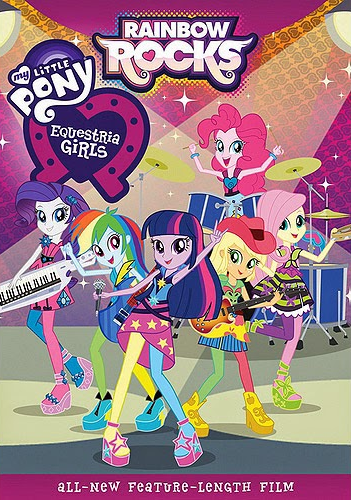
After the modest success of Hasbro's first attempt to bring their My Little Pony franchise to the tween/teen girl market, the highschool girl pony-girl-people are back! With guitars!
Presenting My Little Pony Equestria Girls: Rainbow Rocks.
The glam-rock elements abound in this one.
"Rainbow Rocks" is brought to us once again by the fine people at DHX Media Group of Vancouver, Canada. The movie itself is what you would expect. They're high school girls, in a battle of the bands in order to take down the forces of evil. The whole thing has a strong sense of Hasbro wanting X, Y, and Z in it to sell toys, and the people working on the movie trying to make the best thing possible with what was given to them.
Should you run out and see this movie? No, not really. It isn't horrible by any means, but I don;t see anyone in this class going to see it. However, there is one part that I feel is worth a mention, and that is the opening title sequence.
This movie has a rockin' title sequence! But I don't want to just tell you, I want to show you. So strap in, grab something to take notes, and let's get to it!
This is the whole thing, in full. Sorry in advance for the potato quality of footage I was able to get, but it should work just fine to dissect this.
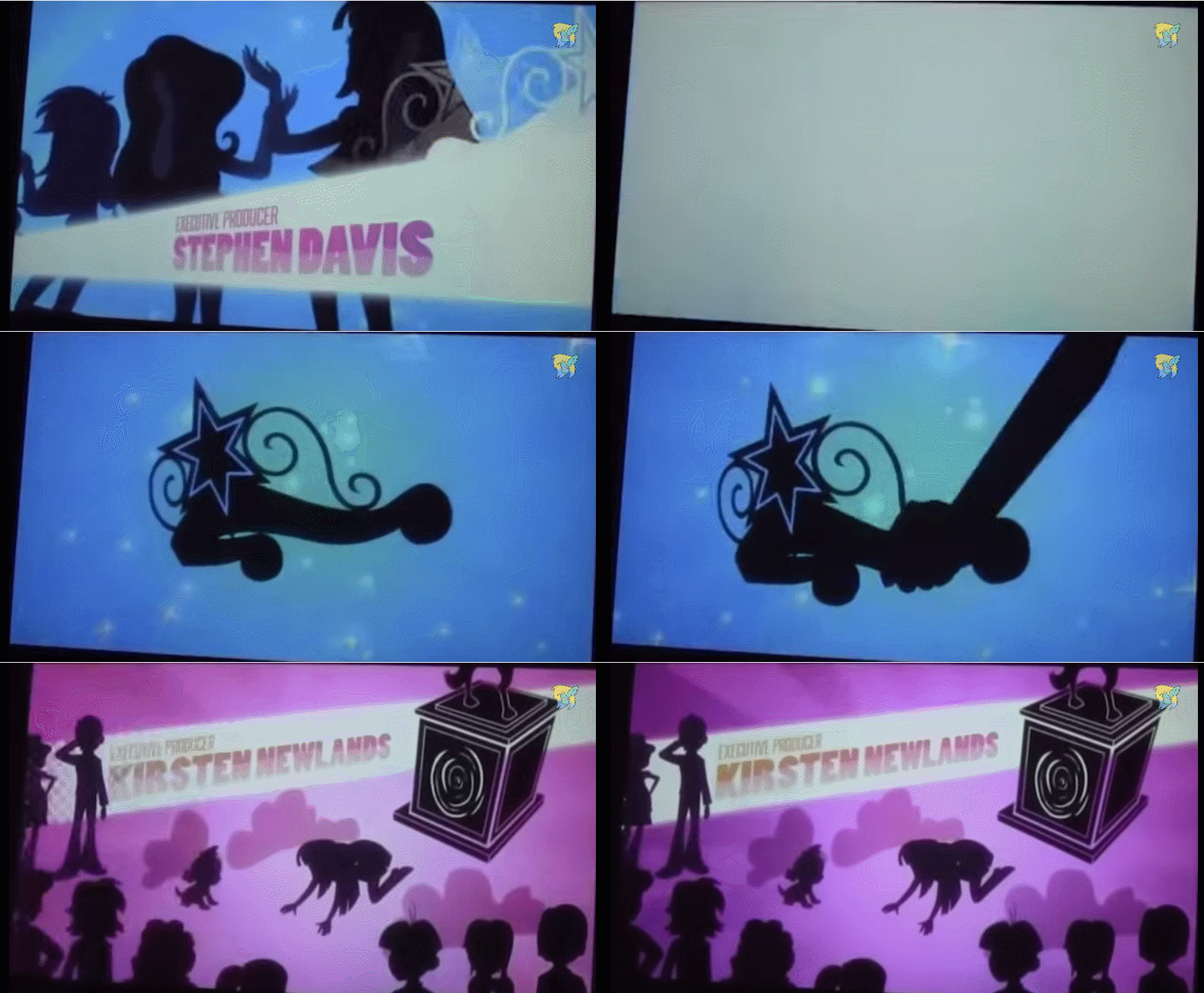
First thing I want to look at is this transition. It focuses on an object that then is used in a wipe. It's organic, not too static, and though you can't tell in gif form, it syncs with the music. On top of this, the font choice is good. It's not totally static, but it's moving slowly enough and on a fixed track making it easy to read.
This next part highlights what I feel is one of the strongest parts of the sequence, which is the fact that it has these transitions that take their time and don't have text to them.
This part has a fun animated bit. Her going out of frame, then popping back in impossibly fast has a cartoony squash and stretch feel. The lightning strike and changing color is well timed and uses a gradient, which shifts with the character.
The actor titles have full animated wipes as well. The flash of white on the guitar is a good palette cleanse into the next color and scene.
The next two title wipes have a continuity to them. Something is happening, and we're seeing it happen in between titles. Also note the sparkles on the nobs. This is an over the top 80's style battle of the bands movie, and oh does it relish in that fact!
This transition is nice, but the main thing I want to point out is the animation and its timing. The dog bites down on the bone in real time so to speak, but afterwords things slow down. It creates a neat effect that the other characters have been doing as well.
When we transition to the other set of characters we get another transition that takes its time to look good and build atmosphere. The transition from guitar neck to rainbow looks good, and is a creative use of the elements we've seen used so far.
Lastly, we get the movie's villains. The way they're introduced here sets them up well. We see that the two don't get along so well, and that their leader pushes them around. The way she pushes through them, and her title does the same to theirs is a creative way to show off her character in the title sequence alone.
I for one, was impressed with this. Much more impressed than I thought I would be. I decided I wanted to know who was responsible for it, so I did some digging and I found a guy called Tony Cliff . I ended up shooting him and email, and he responded!
This whole thing has inspired me to go at things with increased vigor. Finding something great and unexpected, reaching out and making contact, the whole shebang. I have a lot of work ahead of me, but I'm nowhere near quitting!
Let's get right into it! The title sequence we'll be breaking down is none other than the one from Hasbro's "My Little Pony: Equestria Girls"!
"Equestria Girls" is a spinoff of the popular "My Little Pony" series that's been around since the 80s. In the movie, the lead character goes to magic multicolored high school filled with bright multicolored girls that all look exactly the same. Apparently, putting known cartoon characters in a high school setting is a great way to make money! That's Hasbro's reasoning anyway. So let's take a look at the title sequence.
From a flash/dissolve wipe, we get a kaleidoscope effect with the name of the parent company. "Hasbro Studios" is a "virtual" production company, so it isn't the place that actually does the animation or the voice recording, or any of the "creative" stuff so to speak. The animation for this feature is actually from DHX Media/Vancouver.
From there, we get a rainbow wipe that goes flying by abruptly changing the scene. Producers' names are well presented and legible. We then get a camera pan down to a stylized green hills and trees, where we get the writer credits. The letters tumbling out of the trees are a nice effect, bring movement but still allowing the text to be readable.
We get another camera pan, this time to a castle type setting that I'm sure there's an overpriced playset for somewhere. We get some simple but effective particle effects on the director's credits here. The glowing letters stand out well against the night sky.
Then, all of a sudden, everything gets sucked into a black hole, the kaleidoscope effect returns, and we find ourselves in front of magical horse highschool, being greeted by the main title. The sparkle particle effects abound off of the logo, and we get a quick zoom wipe to actor credits.
The letters on the books are readable, even if they look a little out of place. The tween of the hand taking the book is decent, and the name is well presented.
The words on the ball are at an odd angle, but they're readable. However when the ball is kicked and it turns into an apple, it just looks like a cheap effect and makes the text look cramped and harder to read. Plus, an oddly proportioned apple flying by with an rainbow trail is a bit much, even for this movie.
The letters on the balloon inflating with the balloon might seem like a neat idea, but it doesn't work here. The effect looks poorly done and the text is hard to read. We don't get enough time to focus on it without it moving too much.
This one is much more animation based. It's simple, it works, and isn't too static.
This one is also more animation based. Though the character is moving, he stays at a constant place on screen, and the movement of the surfaces the text is on moves in a cycle making it easy to read.
This last name is pretty bland compared to the others, but we get a nice transition to black with the eye.
From this, we get more particle effects and the main logo again. All in all it's fairly un-remarkable, but the fact that it's in a low budget kids' movie is a nice surprise. The obnoxious dubstep remix going on in the background is campy and lame, but somewhat fitting.
I don't encourage anyone to give this movie a look. It's fun in a "let's riff on a movie" sort of way, but there's little to gain beyond that. The opening titles are quite honestly the best part of the whole thing, so congrats! You just got to see the highlights from "My Little Pony: Equestria Girls"!