I had a lot of anticipation before going in to see
Wes Anderson's newest film, The Grand Budapest Hotel. I've always been fairly neutral about Anderson, and part of me was hoping that this one, with it's almost universal acclaim and pretty massive amounts of hype, might sway me to be more in favor of him. I love some of his earlier movies and Fantastic Mr. Fox - part of me wants Anderson to exclusively make animated films - but I was pretty ambivalent on 2012's Moonrise Kingdom: it just didn't really do anything for me.

Well, unfortunately, Budapest didn't change anything. It's Wes Anderson at his most Wes Anderson-y. The colors are bright, the special effects are delightfully terrible, and there's a lot of A-list actors giving extremely odd - but great - performances. Things are
symmetrical and perfectly framed. The dialogue is bizarre and irreverent and borders on being depressing. It's a dark comedy wrapped up in a big, colorful, pink and purple box.
 |
|
You have to give it Anderson, however, for picking a style and sticking with it. It's unique, it's fresh, and it's his own. Apart from the already brilliant set design and colors in Budapest, there are a few colorizing techniques and effects added in post that I was really impressed by. The movie actually tells three stories from three different time periods: the main one being told in the 30's, the second being in the late 60s, and the last one in the 80s. Each time period was given their own respective color scheme and aspect ratio, and this helped to tell each story and really make them pop. The 30's has an aspect ratio of 1.37, which is an older, almost boxy view, and here is where the colors were much more brighter and saturated. In the 80s, he used a typical 1.85 ratio, and a 2.35:1 anamorphic (giving it a more rounded look) ratio for the 60s, where he also focused more on the gold and green colors.
Jill Bogdanowicz, who, I must say, has one hell of a resume, acted as the digital intermediate colorist for the film, which means she was involved with the grading, which she did on Da Vinci Resolve (a color correction program that Arturo recommends). She did an interview with Studio Daily about working so close with Wes Anderson, and the whole thing is a pretty interesting read. You can find it
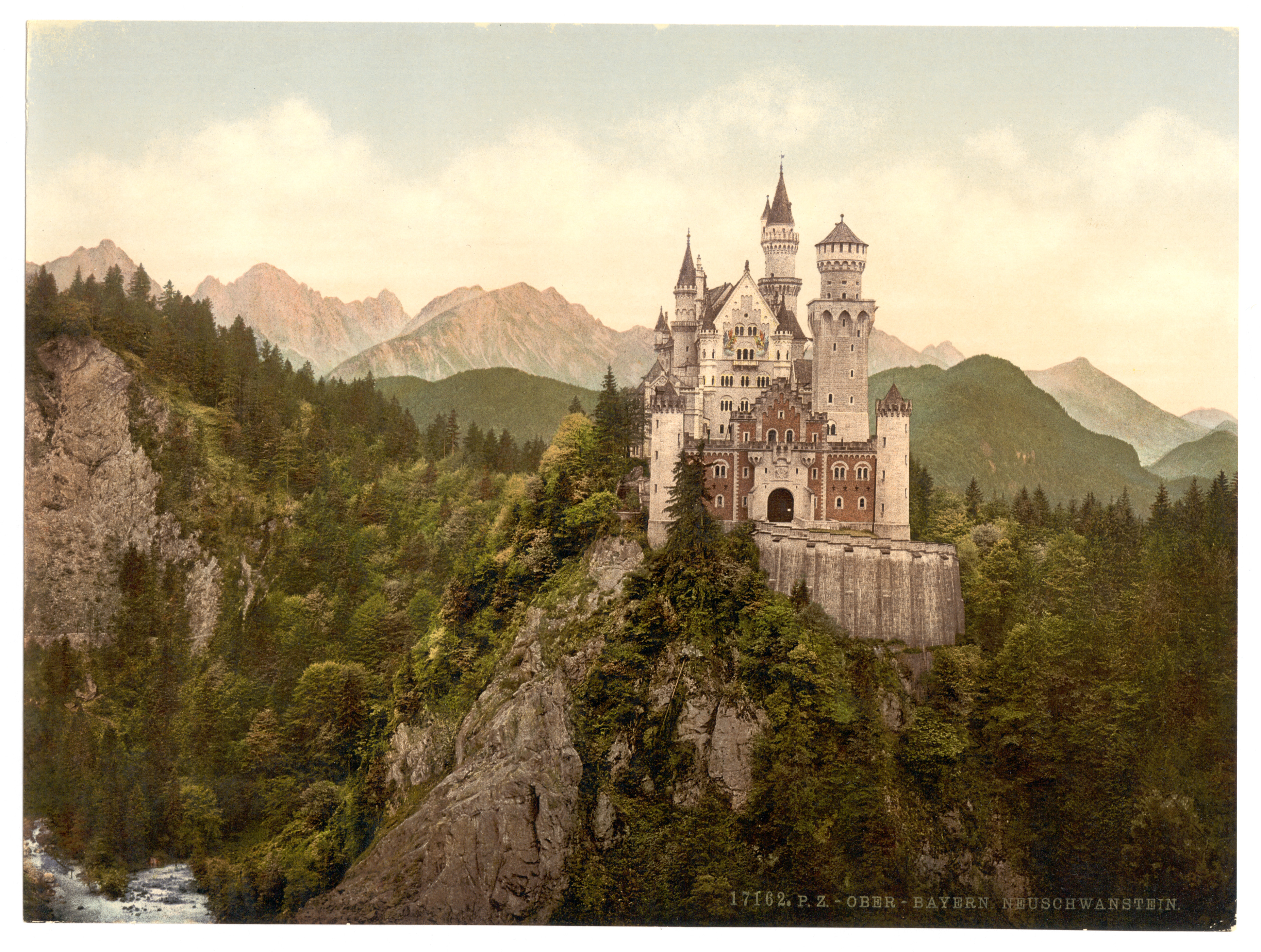
here. One thing from that article that I found particularly interesting is how Anderson used
Photochrom (think an early version of Instagram) as an influence for how he wanted certain segments of Budapest to look. I think it's pretty easy to see the similarities, particularly in the film's poster.
One last thing I found was a way to replicate the anamorphic aspect ratio that Anderson uses in many of his films. It's almost like a subtle fish-eye distortion, with the edges of the frame seemingly bending to give things a rounded look. You can watch the video to see what I'm talking about - and how it's applicable to your own work - and go to the website to download plugins for After Effects
here.