Showing posts with label color. Show all posts
Showing posts with label color. Show all posts
Thursday, April 21, 2016
Catch Me If You Can and Saul Bass

Thursday, March 31, 2016
Looks Like Animation, But Isn't Animation
I was trying to find something to blog about when I stumbled upon this video of paint mixing. Yeah. That sounds weird, I know. But watching paint mix is so much more fun than watching paint dry!!!!!! (Lol). The experimental piece is by a French artist named Thomas Blanchard.
Memories of Paintings from Thomas Blanchard on Vimeo.
You can animate anything you want, but there are some things that look just as good (if not, better) when they're not computer graphics. I think it just depends on what the animation is for and the feel of that particular project. For my Program Development project, I like the feel of a stop motion animation for the title sequence because it shows right from the get-go that the show will be fun and entertaining.
This video is very relaxing to watch. It also reminded me of the Joshua Light Show's piece from 1969, and I wonder if Blanchard was influenced by their work at all.
Memories of Paintings from Thomas Blanchard on Vimeo.
You can animate anything you want, but there are some things that look just as good (if not, better) when they're not computer graphics. I think it just depends on what the animation is for and the feel of that particular project. For my Program Development project, I like the feel of a stop motion animation for the title sequence because it shows right from the get-go that the show will be fun and entertaining.
This video is very relaxing to watch. It also reminded me of the Joshua Light Show's piece from 1969, and I wonder if Blanchard was influenced by their work at all.
Friday, December 4, 2015
Excessive Expression
I've been looking at a lot of foreign made animated content lately, and I've noticed that many of the pieces have no dialogue whats so ever. I like that a lot of animations cut the dialogue to make their content more universally understandable. Take this thesis film for example, made by incredible artist and animator Vivienne Medrano.
The animation, while being silly and lighthearted includes themes of prejudice, queer themes and love. Just from the characters color pallets and expressions we have a clear idea of their personality.
Also the music is really something else. There is hardly any diegetic sound, but the music does such a wonderful job of disguising it that you rarely even notice. The art style itself is fun and poppy, and the designs of the characters speak volumes about their personalities ie the police owls.
I really feel as though you can't make these kinds of films with live action. Human movement is too clunky and awkward to choreograph in this way, and acting would be a nightmare since so many of the characters expressions are so silly and over the top.
I hope you guys enjoy the animation. I've watched it about 3 times now, and I'm always finding something new about it to enjoy!
Friday, October 30, 2015
Boxed in by Curves
So a little while back one of my favourite online animators posted this image to his twitter.
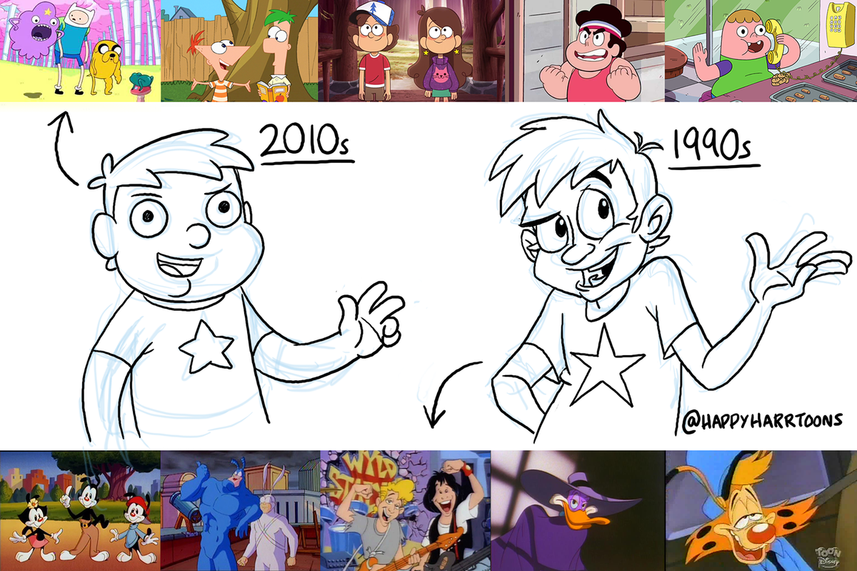 He's a huge fan of 90's "He-Man" style traditional hand drawn cell animation, and he feels as though a lot of cartoons nowadays are getting less stylistically diverse.
When the cartoon "Adventure Time" first aired on cartoon network I remeber thinking it was like nothing I'd ever seen before. The style was a lot cuter and curvier than a lot of cartoons at the time and it seemed as it's creators had put a great amount of detail into the characters and world of the show. The aesthetic matched the show's pleasantly strange world and for the most part I thought that AT would be one of those cartoons that usher in a new wave of creative aueterism.
However as the years have gone by it seems as though a lot of the new cartoons on cartoon network haven't really branched away from the curvey cute adventure time style. Content wise I think that many of these shows are really well crafted, but I can't help feeling as though a lot of character artists are stuck in a sort of creative rut.
Take a look at the difference between pilot episode for one of Cartoon networks newer series "Steven Universe" and it's release version.
The pilot had a darker more muted color pallet that I thought looked really cool and would have worked well for the show. The final version isn't by any means bad but it seems a lot more kid friendly than the pilot version.
I really miss the stylistic diversity of a lot of early 2000's shows.
When the cartoon "Adventure Time" first aired on cartoon network I remeber thinking it was like nothing I'd ever seen before. The style was a lot cuter and curvier than a lot of cartoons at the time and it seemed as it's creators had put a great amount of detail into the characters and world of the show. The aesthetic matched the show's pleasantly strange world and for the most part I thought that AT would be one of those cartoons that usher in a new wave of creative aueterism.
However as the years have gone by it seems as though a lot of the new cartoons on cartoon network haven't really branched away from the curvey cute adventure time style. Content wise I think that many of these shows are really well crafted, but I can't help feeling as though a lot of character artists are stuck in a sort of creative rut.
Take a look at the difference between pilot episode for one of Cartoon networks newer series "Steven Universe" and it's release version.
I really miss the stylistic diversity of a lot of early 2000's shows.
Wednesday, September 2, 2015
Blending Modes: Broken Down
Blending modes are the way that layers can be combined. Usually used when they are overlapping each other, blending modes change the way layers interact with each other. Each blending mode is a different mathematical equation for how colors are combined.
There are 27 blending modes organized into 7 groups:


There are 27 blending modes organized into 7 groups:
- Normal
- Normal
- Dissolve
- Darken
- Darken
- Multiply
- Color Burn
- Linear Burn
- Darken Color
- Lighten
- Lighten
- Screen
- Color Dodge
- Linear Dodge (add)
- Lighten Color
- Contrast
- Overlay
- Soft Light
- Hard Light
- Vivid Light
- Linear Light
- Pin Light
- Hard Mix
- Inversion
- Difference
- Exclusion
- Cancelation
- Subtract
- Divide
- Component
- Hue
- Saturation
- Color
- Luminosity
Basically, blend modes in the same group do similar things to the way pixels are blended together.
Interesting to note, the Lighten and Darken blend mode groups do the exact opposite option of the other:

I've found a couple of images that help demonstrate different blend modes:


Unfortunately, it's always a challenge to really know how two colors will interact, so my suggestion is to always just keep guessing till it looks right ¯\_(ツ)_/¯
For more information see:photoblogstop.com
Monday, February 23, 2015
Letter Inspiration
I stumbled upon this video on Vimeo designed by Jessica Hische. Since we are all making progress with our name projects and soon going to be moving into title sequences, I thought this would inspire some of you with font design and font choices. The color and design used in the video makes something so simple as just a letter seem more intriguing and personable.
Penguin Drop Caps Animation from Down the Street on Vimeo.
Tuesday, February 3, 2015
Off the Air
Off the Air is a adult swim show that airs late at night. It is a compilation of experimental films that they find on the internet. They cut the videos together and animate the transitions with unique and "trippy" changes. I personally love the show. I think it is a very creative work of art that while at some points can get extremely weird, is truly enjoyable to watch.


The show has a plot based on a specific word like "falling" or "color", then the makers of the show choose selections that fit into that category. The run time of each episode is only around 11-15 minutes, but there is so much going on in each that it feels just as long as a episode with a normal half hour runtime.
The show focuses primarily on animation but there are some times when some strangely edited live footage comes into play. As seen above there is a colorful spider that made its appearance on the "Dance" episode where it was performing a strange mating dance that had some strange editing and animation.
Off the Air incorporates a lot of unique contemporary animations. I find the style of some of the animations they choose to include to be very inspiring. The experimental videos are all entertaining but the animated ones specifically catch my attention due to their creativity and style.
Here are some links to full episodes:
Monday, January 26, 2015
Benham's Disk
Every once in a while, I will discover something that absolutely blows my mind and I will obsess over that thing until I can seem to wrap my mind around it. This thing that I have recently found out about is not only still stumping me, it stumps everybody. Scientists are still unable to figure out exactly why this phenomenon exists. It is called "Benham's disk". It was discovered by a man in 1895 who made a toy disk that looks like this:


A plain black and white disk. But when spun, extremely fast it looks like this:
You can see some color inside the disk when it spins very fast. That's interesting in itself, but there's something far more interesting about this illusion. The color that you are seeing within the wheel is not the same color that everybody else sees when they look at it. I personally see a light brown color in the spinning wheel like this:
Some people see olive green, cyan or yellow, but everybody sees their own color in the wheel, and some people don't see any color (just black and white). Scientists have still not yet determined why this is, but they have guessed that it has to do with the fact that the human eye responds to red, green, and blue at different rates.
This illusion was first discovered by spinning an actual disk very fast, but it can now be viewed with a simple repeating sequence of 6 frames:
Sunday, March 30, 2014
Wes Anderson is Living in his Own World
I had a lot of anticipation before going in to see Wes Anderson's newest film, The Grand Budapest Hotel. I've always been fairly neutral about Anderson, and part of me was hoping that this one, with it's almost universal acclaim and pretty massive amounts of hype, might sway me to be more in favor of him. I love some of his earlier movies and Fantastic Mr. Fox - part of me wants Anderson to exclusively make animated films - but I was pretty ambivalent on 2012's Moonrise Kingdom: it just didn't really do anything for me.

Well, unfortunately, Budapest didn't change anything. It's Wes Anderson at his most Wes Anderson-y. The colors are bright, the special effects are delightfully terrible, and there's a lot of A-list actors giving extremely odd - but great - performances. Things are symmetrical and perfectly framed. The dialogue is bizarre and irreverent and borders on being depressing. It's a dark comedy wrapped up in a big, colorful, pink and purple box.
You have to give it Anderson, however, for picking a style and sticking with it. It's unique, it's fresh, and it's his own. Apart from the already brilliant set design and colors in Budapest, there are a few colorizing techniques and effects added in post that I was really impressed by. The movie actually tells three stories from three different time periods: the main one being told in the 30's, the second being in the late 60s, and the last one in the 80s. Each time period was given their own respective color scheme and aspect ratio, and this helped to tell each story and really make them pop. The 30's has an aspect ratio of 1.37, which is an older, almost boxy view, and here is where the colors were much more brighter and saturated. In the 80s, he used a typical 1.85 ratio, and a 2.35:1 anamorphic (giving it a more rounded look) ratio for the 60s, where he also focused more on the gold and green colors.
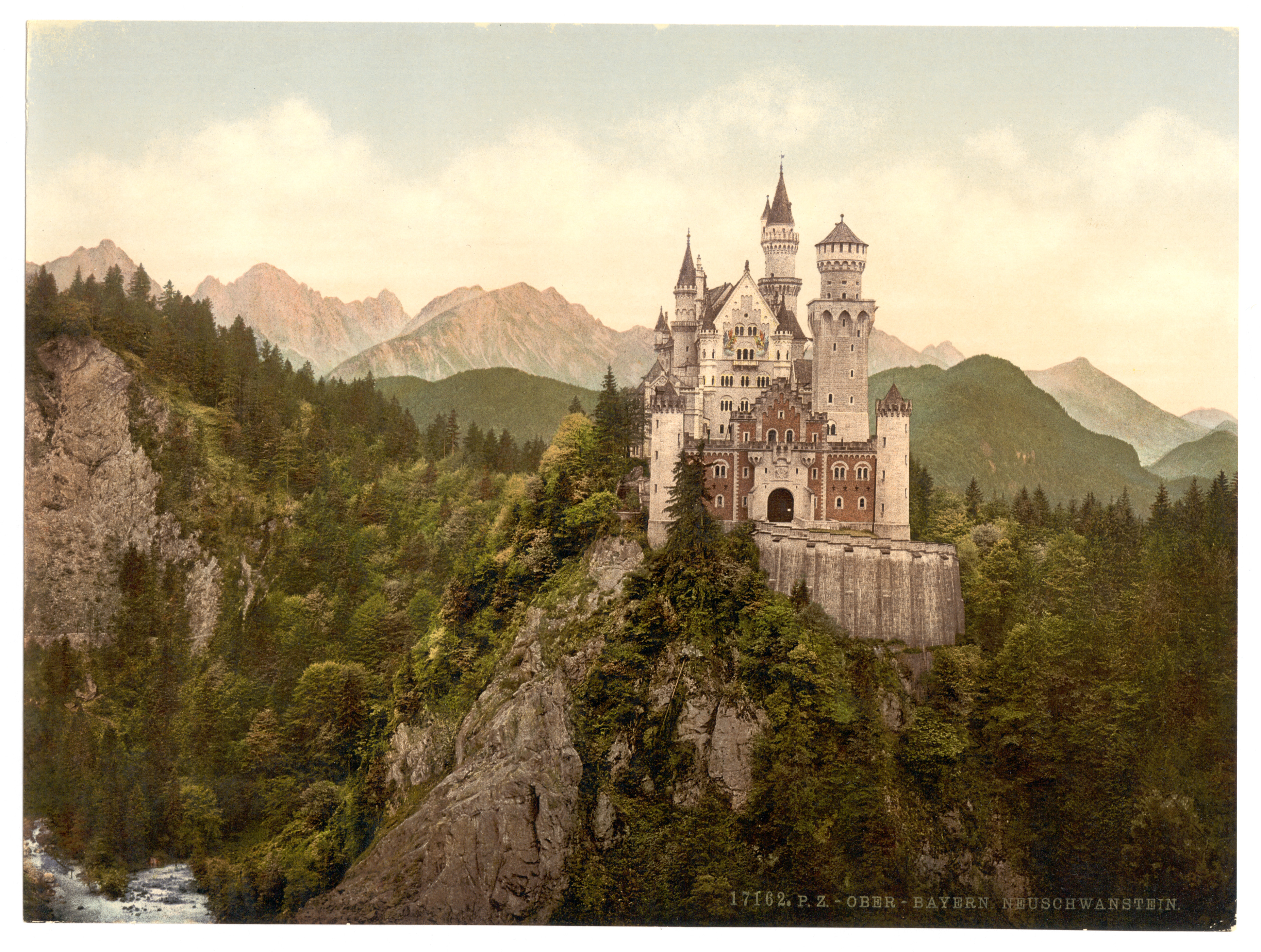
Jill Bogdanowicz, who, I must say, has one hell of a resume, acted as the digital intermediate colorist for the film, which means she was involved with the grading, which she did on Da Vinci Resolve (a color correction program that Arturo recommends). She did an interview with Studio Daily about working so close with Wes Anderson, and the whole thing is a pretty interesting read. You can find it here. One thing from that article that I found particularly interesting is how Anderson used Photochrom (think an early version of Instagram) as an influence for how he wanted certain segments of Budapest to look. I think it's pretty easy to see the similarities, particularly in the film's poster.
One last thing I found was a way to replicate the anamorphic aspect ratio that Anderson uses in many of his films. It's almost like a subtle fish-eye distortion, with the edges of the frame seemingly bending to give things a rounded look. You can watch the video to see what I'm talking about - and how it's applicable to your own work - and go to the website to download plugins for After Effects here.

Well, unfortunately, Budapest didn't change anything. It's Wes Anderson at his most Wes Anderson-y. The colors are bright, the special effects are delightfully terrible, and there's a lot of A-list actors giving extremely odd - but great - performances. Things are symmetrical and perfectly framed. The dialogue is bizarre and irreverent and borders on being depressing. It's a dark comedy wrapped up in a big, colorful, pink and purple box.
 |
 |
Jill Bogdanowicz, who, I must say, has one hell of a resume, acted as the digital intermediate colorist for the film, which means she was involved with the grading, which she did on Da Vinci Resolve (a color correction program that Arturo recommends). She did an interview with Studio Daily about working so close with Wes Anderson, and the whole thing is a pretty interesting read. You can find it here. One thing from that article that I found particularly interesting is how Anderson used Photochrom (think an early version of Instagram) as an influence for how he wanted certain segments of Budapest to look. I think it's pretty easy to see the similarities, particularly in the film's poster.
One last thing I found was a way to replicate the anamorphic aspect ratio that Anderson uses in many of his films. It's almost like a subtle fish-eye distortion, with the edges of the frame seemingly bending to give things a rounded look. You can watch the video to see what I'm talking about - and how it's applicable to your own work - and go to the website to download plugins for After Effects here.
Tuesday, February 25, 2014
Having some fun
So over the weekend I decided to experiment a little bit by creating my own moving shapes that "bounce" with the music. I'm not exactly sure how much I can write about this, but I'll definitely give it a try.
Making this did take me a little while because I had to try and remember all of the different elements that we used in it. In order to try and make it come out good, I wanted to make two different sets of Treble and Bass. However, I made each respective pair have the same settings for Treble and Bass. I didn't try and make one higher than the other so the bouncing ratio was different. If I wanted to redo it, that's one thing I would change. But anyway. I wanted to try and make each shape be seen by rotating the rectangles as they get larger. So in order to do that I created the 4 rectangles - actually two and then just duplicate that specific layer - and rotated two of them in order to give it that look of more than there actually are. This was done for both Bass and Treble. Once that was done I added a circle to cover up the middle parts so it looked as though the rectangles were coming out of the circle. Once the whole piece was done I had to make some minor changes to the background and the color of the shapes so it was colorful and bright, but that was nothing too major.
Anyway, all in all, I really like doing this specific project. It is always so much fun and I always smile ear to ear when it is all said and done.
Making this did take me a little while because I had to try and remember all of the different elements that we used in it. In order to try and make it come out good, I wanted to make two different sets of Treble and Bass. However, I made each respective pair have the same settings for Treble and Bass. I didn't try and make one higher than the other so the bouncing ratio was different. If I wanted to redo it, that's one thing I would change. But anyway. I wanted to try and make each shape be seen by rotating the rectangles as they get larger. So in order to do that I created the 4 rectangles - actually two and then just duplicate that specific layer - and rotated two of them in order to give it that look of more than there actually are. This was done for both Bass and Treble. Once that was done I added a circle to cover up the middle parts so it looked as though the rectangles were coming out of the circle. Once the whole piece was done I had to make some minor changes to the background and the color of the shapes so it was colorful and bright, but that was nothing too major.
Anyway, all in all, I really like doing this specific project. It is always so much fun and I always smile ear to ear when it is all said and done.
Friday, October 25, 2013
Pixar - Behind the Scenes
After this week's classes, looking at 3D animation has a whole new appreciation and understanding. Even though this week, we jumped right into Maya and 3D sculpture, it is important to take a step back and look at the creative aspect of things.
In this video below, we can see that it is very important to have a sculpture idea before jumping into editing software. Coming up with a detailed plan will help immensely before jumping into programs like Maya. It also seems like a lot of fun, watch the link below to understand what I'm talking about.
http://www.pixar.com/behind_the_scenes/Sculpting#/node/3834
Another important part of animation is color schemes. Color schemes can be generated from anything, such as a sweater pattern or a pattern on a blanket. Experimenting with color expands options and also seems really fun.
http://www.pixar.com/behind_the_scenes/Sulley-#/node/3832
In this video below, we can see that it is very important to have a sculpture idea before jumping into editing software. Coming up with a detailed plan will help immensely before jumping into programs like Maya. It also seems like a lot of fun, watch the link below to understand what I'm talking about.
http://www.pixar.com/behind_the_scenes/Sculpting#/node/3834
Another important part of animation is color schemes. Color schemes can be generated from anything, such as a sweater pattern or a pattern on a blanket. Experimenting with color expands options and also seems really fun.
http://www.pixar.com/behind_the_scenes/Sulley-#/node/3832
Thursday, August 29, 2013
The Leap
This incredible little device is a Leap. It’s a very
exciting new piece of technology that allows you to interface with your
computer in real 3D space. One of the reasons I’m so eager to start getting
into this class is because I want to come up with ways to use this new
technology. When we watched some of the examples of interactive media in class
I immediately thought of how I could use the Leap. I would really like to
create some sort of interactive art, animation, or maybe even a very simple
game using it. I think this could be the future of human-computer interactions
and I’d love to explore different ways of utilizing it for motion graphics.
Monday, August 26, 2013
The Basics of Motion Design
Motion design is the most intricate and dynamic field of design. This video from the Hochschute für Künste (University of the Arts) Bremen introduces viewers to the many different aspects of motion design.
Ranging from color to sound, timing to physics, the video gives a vocabulary for discussing the art of motion. Taken by itself, the video covers so much in 23 minutes that it is worth taking notes on.
Thursday, February 21, 2013
Music Visualizer
Hey all. For my name animation, I'm working with audio quite a bit. One of the elements of my piece is EQ bars that are set to the bass, mid and treble frequencies in the track I'm working with. So, I thought I'd explore some other examples of music visualizers that used expressions similarly to the methods we learned in class. This one is really intricate and visually breathtaking, while at the same time you can still understand HOW it was made. The artist is Matthias Müller. He used 3ds max, After Effects, Krakatoa and fumefx.
Thursday, February 7, 2013
"Watercolour"
I've been really thinking about how much music can impact the animations you decide to create, sometimes even shaping the overarching themes in their entirety. So - here's a music video from the Australian EDM group 'Pendulum'. It uses some pretty interesting 3D animations and color effects, so I thought I'd share. You can see a planet (or... something like it) throughout the video that slowly moves around a giant lighted orb of some sort (star?), until eventually these giant rays of light that it's shooting bust the planet open. Pretty sweet stuff. And the track is awesome too.
Sunday, September 16, 2012
Stop Motion is AWESOME
So I know a lot of you guys have probably seen this video before but it still gets me every time. Stop Motion truly leaves me in awe.
My absolute favorite part of the video is when he is cutting one thing and it magically turns into dice as soon as the knife hits the cutting board. If you were not paying attention to the fact that he is using things like grenades and baseballs to make guacamole, you would think it was a cooking tutorial.
It has great comedic timing and sounds effects. The colors are absolutely brilliant and the picture is unbelievable. This video has inspired me to make a short film with stop motion. Now I just need to know where to start.
In class we are learning all about title sequences. However, I hope that we can learn how to create a stop motion short film using the wonders of After Effects. I love the convergence of art technologies.
Friday, April 20, 2012
Colour
I was searching on vimeo for a cool animation and I thought this one in particular was pretty awesome. It is an animation that bring a black and white drawing of cartoons into color. The weird thing that I thought though was most videos that do that do it in a settle way but not this one. A paint brush literally comes into the video and paints the colors in which is an interesting effect that the artist has used and that's why I decided to post this video.
Saturday, March 24, 2012
Color Correction
I thought this video was interesting and wanted to share it with all of you. It is incredible how much has changed in just 10 years when it comes postproduction. The video talks about the color and the look of O Brother Where Art Thou and how they created the image that they were looking for. They took all of the shots and desaturated them to get a dust bowl type of look. All of the original shots were saturated with very rich greens and that was the exact opposite of what they ended up with in the final product. Just 10 years ago, it seems like a big process where you need a specialist in color to get these types of images, where as today you can do this type of editing alone on your laptop.
Saturday, February 18, 2012
Color Theory Resources
Arturo brought up the importance of understanding colors and how to use them so I thought I'd share my favorite color study materials.
Here's a link to a great tutorial for how to use color and light, it's great because it uses an image with different colors and lighting in each example, making concepts easier to understand.

The following is a great quick reference for colors and concepts like analogous, contrast, and complementing colors.


Here's a link to a great tutorial for how to use color and light, it's great because it uses an image with different colors and lighting in each example, making concepts easier to understand.
The following is a great quick reference for colors and concepts like analogous, contrast, and complementing colors.

This is a link to my most favorite color resource, it gives fun and in-depth explanations on a lot of topics in color theory. Plus, it's explained with Pokémon and Pokémon are awesome.
I also thought the following would also be nice to share, it's an infographic about the psychology of colors and how they're used in advertising.

Subscribe to:
Posts
(
Atom
)