Showing posts with label Saul Bass. Show all posts
Showing posts with label Saul Bass. Show all posts
Thursday, April 21, 2016
Catch Me If You Can and Saul Bass

Friday, September 25, 2015
Hitman or Inside Out; The Two Most Different Foods
For my title sequence project I had a bunch of ideas, but ultimately narrowed it down to 2 styles I think I can pull off. The first film I might make a title sequence to is Hitman, that awful movie in 2007 (or the upcoming one next year, pick your poison) which was based off the video game of the same title. The route I would take is to make it a Saul Bass homage since he is the father of title sequences as we know them today. Hitman, or at least the game, emphasizes a lot about how your character, Agent 47, is just a number to The Organization. Every assassin has a barcode tattooed on the back of their head and I thought it would be fun/interesting to style an intro around that idea in the style of Saul Bass.


My second idea involved a Pixar movie, of course. Inside Out came to mind first since it is the newest film from the California-based animation studio. I would want to also, in a way, replicate Saul Bass' style, while also making it my own. SPOILER ALERT: There's a scene in the movie where 3 of the main characters enter Abstract Thought, a land where thoughts and ideas are broken down into four stages, I won't go into detail. Anyway, the style that the characters are created in this area of Riley's brain holds so much potential in motion graphics.


Let me know in the comments which one I should give a go. I can't decide for the life of me. Thanks!
Thursday, November 14, 2013
Evolution of the Title Sequence in Cinema
Many of us reading this blog may only of ever known the spectacular opening title sequences in the motion pictures we grew up watching as kids. This week I thought since we are starting our title sequence projects it would be only fit to provide a short evolution of the title sequence in cinema.


Throughout the history of motion picture film titles have evolved with the time, fashion and the film industry. Although these sequences may be much more intricate then that of the silent film era the function of the titles serve the same purpose as 100 years ago. As any great designer knows intriguing the audience in the first seconds of the film can be the deciding factor between success or failure for remainder of the motion picture.
Beginning of Title Sequence in Film
Film titles made their earliest appearance on screen during the silent film era. These were called film titles or letter cards and had to provide only the essential information to the audience. Often times these film titles or letter cards were created by a lettering artist who collaborated with the script writer and director. The biggest film studios had the funds to afford typesetters and therefore employed their work in production of title cards as well. Soon after the incorporation of typesetters in film the typography of the letter forms not only in motion picture but also advertising seemed to match the art movement of that time (ex. art deco, expressionism, etc...). Additionally sans-serif along with the art-nouveau style is an example of classic horror film text used in the film portrayed below.

Also the main title from D.W.Griffith's "Intolerance" (1916) considered one of if not the greatest film of the silent era.

Title Sequence Progression
As film became more popular their titles progressed in a vernacular sort of manner., especially do to influence of the Nazi's and the World Wars. Animation slowly worked its way into movies and became a common additive to the opening credits. Here is a look at the oldest feature-length animated film "The Adventures of Prince Achmed" by German animator Lotte Reiniger.

Additionally here is the first mickey mouse cartoon in 1929 with its main title "Plane Crazy."

The incorporation of audio didn't immediately revolutionize how film titles were created until a man by the name of Oskar Fischinger came around providing insight on the relationship between motion graphics and title design. The first real score visualization product is seen in Fischinger's film "Studies" as he anticipates the motion graphic effects by Saul Bass in the title sequence "The Man With the Golden Arm" (1955).
Another example of score visualization by Susan Bradley in "Monsters, Inc." (2001)
Refining the Title Sequence
With figures such as Saul Bass, Pablo Ferro, Maurice Binder and Richard Williams arriving in the 1950's innovation of the traditional title sequence went through a complete transformation as studios began creating for television. Here is a look at some of these artists works.
Maurice Binder and his famous 007 opening title sequence (1967)
Saul Bass and a still from "North by NorthWest," his first film with legend Alfred Hitchcock

It might be argued that the title sequence has lost its typography during this phase of evolution nonetheless many believe it has put more emphasize on the imagery behind the credits.
Future Development
With the development of technology came the advancement of computers and therefore the integration of film and future. Consequently while this technology isn't always bad many in the industry fear that future artists will rely on progressive technologies unaware of the actual creative process. With Pixar and Disney currently at the forefront of this development the studios have almost branded there style with the hundreds of their storytelling title sequences. Here is a revolutionary title sequence for the film "Se7en"created by Kyle Cooper that was named "one of the most important design innovations of the 1990s."
A look at Susan Bradley's closing credits for Pixar's "Ratatouille" (2007)
Throughout the history of motion picture film titles have evolved with the time, fashion and the film industry. Although these sequences may be much more intricate then that of the silent film era the function of the titles serve the same purpose as 100 years ago. As any great designer knows intriguing the audience in the first seconds of the film can be the deciding factor between success or failure for remainder of the motion picture.
Friday, September 6, 2013
Remembering A Graphic Design Legend
Hi Guys,
For this weeks posts I thought I would switch things up a bit, while many of you are probably familiar with Saul Bass I thought I would do a little blurb on him to inform you of some stuff you might not know. Recently I stumbled onto an article featuring a Google Doodle honoring iconic title sequences associated with Saul Bass and I figured this would be ideal material for a blog post. Although I was aware of Saul Bass I was naive to know that not only was he a recognized graphic artist but also worked with some of Hollywood's most prestigious filmmakers during a 40 year span making countless
title sequences. In addition to assisting filmmakers Bass also created some of the most prominent corporations logos and designed legendary film posters still recognized today. Here is the Doodle that Google created for Saul Bass for his 93rd birthday which includes many of his most famous works such as West Side Story and Vertigo.
Some of his famous corporation logos.....

For this weeks posts I thought I would switch things up a bit, while many of you are probably familiar with Saul Bass I thought I would do a little blurb on him to inform you of some stuff you might not know. Recently I stumbled onto an article featuring a Google Doodle honoring iconic title sequences associated with Saul Bass and I figured this would be ideal material for a blog post. Although I was aware of Saul Bass I was naive to know that not only was he a recognized graphic artist but also worked with some of Hollywood's most prestigious filmmakers during a 40 year span making countless
title sequences. In addition to assisting filmmakers Bass also created some of the most prominent corporations logos and designed legendary film posters still recognized today. Here is the Doodle that Google created for Saul Bass for his 93rd birthday which includes many of his most famous works such as West Side Story and Vertigo.
Some of his famous corporation logos.....

Friday, April 26, 2013
History of Motion Graphics
I found a website with some pretty interesting stuff on Motion Graphics and what it is. It has a lot of cool videos from older movies and TV shows (including Adam West). This guy also gets into how he made a demo reel in order to find a job. So I guess Arturo was right for once (just kidding, don't fail me Arturo) that a good demo reel really does get you places. Check it out.
Thursday, September 6, 2012
"Cigarettes, Scotch, and Sex" A Look at the Title Sequence of Mad Men
So I thought long and hard into this and I came up with something I feel like the majority of people have asked themselves from time to time: how deep is the title sequence of Mad Men? Currently, I'm on the third season with only one or two more episodes until I progress to the fourth and every episode I watch furthers my interest in the story, setting, and style of the show. Every episode begins the same way, with a mostly silhouetted business man walking into his office before his world literally falls apart, all to the musical stylings of RJD2. The titles, created by production house Imaginary Forces, pay homage to graphic designer Saul Bass's skyscraper-filled opening titles for Alfred Hitchcock's North by Northwest (1959) and falling man poster from Vertigo (1958). Every time I start a new episode because it reminds me that although every visual aspect of the show speaks "classy" on a certain level, nothing is perfect and your world could come out from beneath you as easy as dropping your briefcase, as seen in the show. The intro continues by displaying the man falling from what looks like a skyscraper of advertisements with provocatively looking women, the all American family, and alcohol from the 60s, placing the viewer into the world right next to the characters of the show. I remember the first time watching the intro and thinking to myself, "Yes, I'm going to enjoy this show" solely because the intro's animation got me hook-line-and-sinker.
If you haven't seen it yet, Mad Men is a show on AMC that isn't currently airing new episode but can be watched between the hours of 6 am to about 8 or 9 am on Sundays and is also available online through Netflix and a number of streaming sites.
If you haven't seen it yet, Mad Men is a show on AMC that isn't currently airing new episode but can be watched between the hours of 6 am to about 8 or 9 am on Sundays and is also available online through Netflix and a number of streaming sites.
Friday, February 24, 2012
Influences
Saul Bass, who never went to college, described himself as "a subway scholar", as told by his daughter Jennifer, he read voraciously during his long subway trips from Brooklyn to Midtown Manhattan, "soaking up a wide array of imagery, from comic books and films to magazine covers."(1)
In one of his bookstore browsing trips, he discovered György Kepes's Language of Vision (1944), a book of student exercises by Hungarian artist and designer who had worked in Germany with Bauhaus teacher László Moholy-Nagy. Reading the blurb on the book cover he discovered to his amazement that Kepes was teaching at the Brooklyn College. Needless to say he enrolled immediately.


These are a couple of examples of György Kepes work as a photographer, clearly showing the influence of László Moholy-Nagy.


László Moholy-Nagy
Saul greatly admired the work of the surrealists, particularly Magritte, and also the work of Man Ray, Paul Rand, whom we have discussed in class, and Cassandre, all of whom were mentioned in Kepes's book.

Magritte's "The Son of Man"
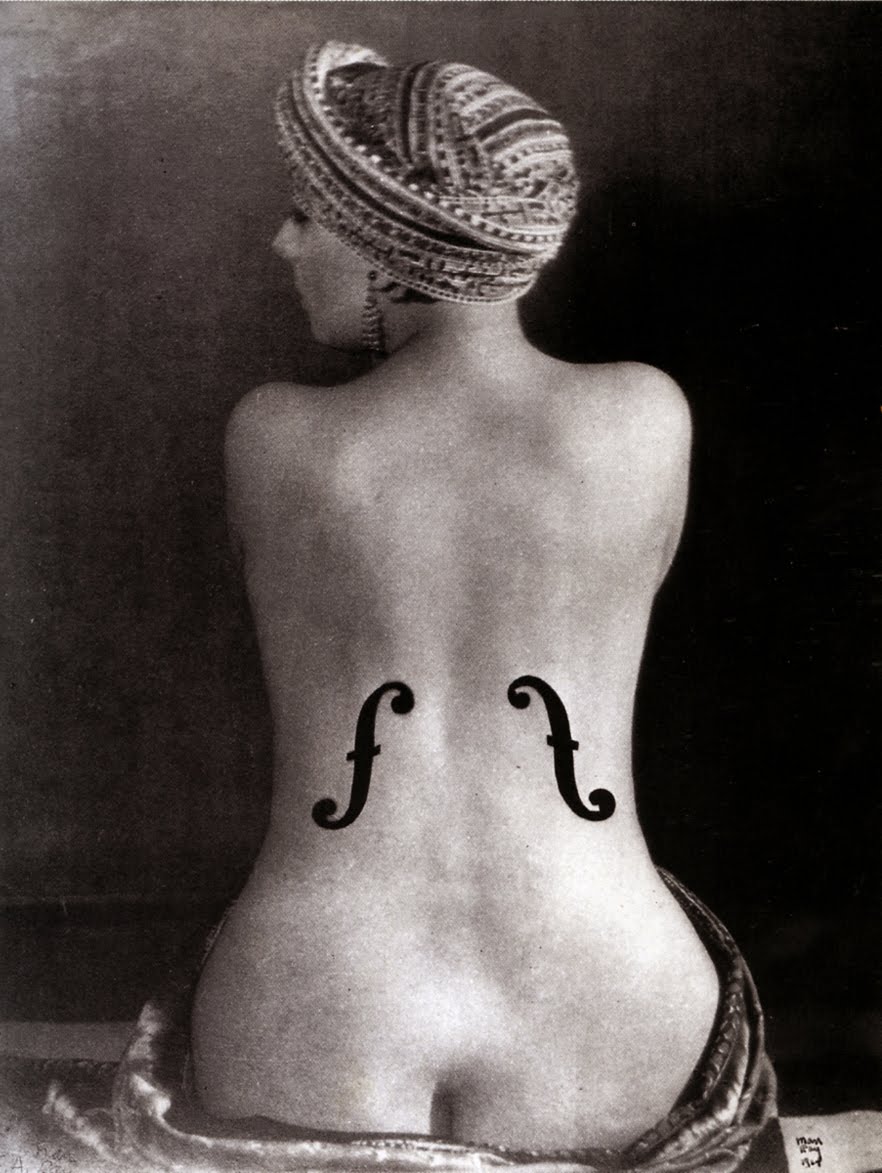
Man Ray's "Ingre's Violin"
A short motion graphics piece using the works of Cassandre, created in After Effects as you can probably see.
(1) From Saul Bass, A Life in Film & Design, by Jennifer Bass & Pat Kirkham, Laurence King Publishing, 2011
Saturday, February 18, 2012
Catch Me If You Can
In the past week's class we have been talking about and looking at the website "Forget the Film, Watch the Title," after browsing this website for a while and checking out the various title sequences that were present on the site, I decided to look for similar sequences in various types of media I watch. Two days ago I watched "Catch Me If You Can" with my roommates and was really intrigued by the opening credits. It seems to be simple but very interesting and unique. Many individuals have referenced this title as being inspired by Saul Bass, who was a graphic designer and filmmaker, best known for his design of film poster and motion picture title sequences. One fascinating aspect was that the characters went for a "stamp-style" animation, in which stamps were actually used to generate the characters. I also would like to know how exactly the did certain aspects of the animation, such as the light bulbs turning on and the character appearing there. Also when the plane flies across and the "me" looks almost like a cloud. This opening credit sequence was created by Nexus Productions. Here's the opening title, so check it out, and enjoy!
Sunday, February 5, 2012
Saul Bass
This is another Saul Bass compilation where you can probably find more movies that you have heard about or probably seen. The idea in any case is to detect the influence of this designer in many other title sequences that you can see today.
Friday, February 3, 2012
Saul Bass TV
Just in case any of you were searching for an easy way to take a look at some of Saul Bass's work I thought I'd suggest the website Saul Bass TV. The website has videos of some of his most famous poster artwork and also his most famous motion title sequences. There is also a brief biography of Bass as well as links to other related website and a list of all of his filmography credits. Chances are many of you would have found the site anyway since it comes up 4th on a Google search but I thought the website itself was pretty cool so it would be worth posting here. I'm assuming the layout of the page was done mostly in Flash but the artist probably also used Photoshop to create the graphics. It uses some of Bass's most iconic images (like the heroin addict arm from "The Man with the Golden Arm" poster) as well as sound to create a pretty entertaining interface. Out of the four title sequences featured on this website I think the one form "The Man with the Golden Arm" is my favorite. You'll probably notice it too when you watch it but I loved how the alignment of the words from the title mimicked the shape of the arm (minus the hand) from the poster.
Monday, November 14, 2011
Saul Bass/Amazon Studio
This is a compilation of Saul Bass' title work that was put out to celebrate a new book called Saul Bass: A Life in Film and Design. The video is pretty cool, and it showed a lot of titles I didn't know he had made, such as the West Side Story, Spartacus and Ocean's 11 titles. It also helps you notice patterns in what he does, like the patterns with moving lines and close-ups of eyes. I'm hoping this video is in the right format, since it came from Vimeo.
The Saul Bass book was written by a design historian named Pat Kirkham, who apparently knew Saul Bass personally and collaborated with his family while writing the book.
Random link: this is the link to the Saul Bass book, but scroll down past it and look at "Special Offers." I've never heard of Amazon Studios before, but apparently they have scripts that they're inviting people to storyboard and make test movies of for periodic contests. Sounds interesting, so I thought I'd throw it out there.
Thursday, September 15, 2011
Kiss Kiss Bang Bang Titles
So after seeing a few posts about opening credits, I tried to think of any other opening title sequences that really stuck out to me in the past. The opening titles from Kiss Kiss Bang Bang (Robert Downey Jr's in it) was the first one I came up with.
Overall, the movie itself was just okay (I had a really high fever when I was watching it, so maybe my judgment was skewed), but I thought the opening titles were really cool. I liked the orange cut-out theme, with the camera moving through the cut-outs to make it 3D, and you can definitely make a title very similar to this using the camera tool in AfterEffects and images that you can zoom past/pan around, etc. In one of the Basic Training videos, Andrew actually teaches you how to make a title sequence where you see one layer of text and zoom past it in 3D space to get to another layer of text. The KKBB credits seem like a more complex version of that, with some line/texture animations thrown in. I really like the camera tool on AfterEffects, and I'd like to use it in my title project, but we'll see how that goes. I've been trying a few ideas and I haven't really been satisfied with any of them so far.
Back to the video- I just looked into the background of it a little more, and apparently the creative director behind the movie is Danny Yount, who has also done title design for Iron Man and storyboarding for Across the Universe. The style of the credits is along the lines of Saul Bass' style.
Tuesday, September 13, 2011
Vertigo - Saul Bass
I was thinking about some of my other favorite opening sequences to movies, of course specifically ones involving motion graphics, and one of my favorite movies of all time, Vertigo, came to mind. The opening sequence is a combination of live action as well as graphics, and it along with its eerie music creates an uneasy feeling right from the beginning of the classic Alfred Hitchcock thriller.

The opening sequence, I learned, was designed by famed graphic designer and subject of class discussions, Saul Bass. Bass used a number of shapes and colors to create the anxious atmosphere that Jimmy Stewart's character experiences throughout the movie due to his vertigo, as well as the thrilling storyline. Bass uses vibrant color on top of a black and white live image to captivate the audience right from the opening sequence. He links the uneasiness of the scene perfectly to the score playing in the background as well.

The sequence is a classic example of a great designer using simple graphics to tell a story before it's even been told!
Subscribe to:
Posts
(
Atom
)