Showing posts with label Art of the Title. Show all posts

Thursday, March 5, 2015

ParaNorman Main-On-End Title Sequence


The spooky, yet heartwarming film, ParaNorman follows an outcast boy who can talk to the dead. It has a really cool main-on-end title sequence that consists of motion paintings as White Stripes' "Little Ghost" plays. The fun freeze-frames on each significant character with their credit.

As Art of the Title says, "With ghoulish typefaces and delightfully old-fashioned screen transitions, the sequence pays homage to the Saturday night horror flicks that inspired Norman’s spine-chilling adventure."

LAIKA/house artist and illustrator Aaron Sorenson directed the title sequence. The film's co-directors, Chris Butler and Sam Fell, had a vision inspired by old Hollywood horror posters. They wanted art for crew titles and credit roll for eight minutes, so there was a lot of planning and layout to figure out. It took six months in all, and the whole process went through many different stages.

Sorenson said the initial design stages were the hardest. "Getting the compositions to work in a wide-screen format was a challenge, but more importantly we had to integrate the stylized poster images with the characters’ personalities and key scenes."


Also, if you want to see an amazing Making Norman video - check this out:


Thursday, February 5, 2015

Game of Thrones Opening Sequence


Last weekend, I saw the last two episodes of season four of Game of Thrones in IMAX, with an exclusive preview of the next season. Clearly, I'm a big fan. The second the title sequence came on, I became filled with excitement (even though I've seen the episodes already). The opening sequence is so captivating and beautiful that, in that IMAX, I honestly would've been content watching it on loop for two hours.

The opening grabs the audience and educates viewers. It's a huge map of the entire world of Game of Thrones, and moves from place to place.

The creative director, Angus Wall at Elastic, wanted to keep the opening sequence feel very true to the world of the books and show. Since it's an unsophisticated place, everything is made out of natural materials. Dealing with the problem of maps being flat and a camera moving around this flat space, they decided to make the world a sphere. In an interview, Wall says, "I quickly realized we were still going to shoot off the map. So the next thought was, what happens when you put two bowls together? You have a sphere. Next question was “how is it lit?” And obviously, If you have a whole world inside a sphere, what would be in the middle of that sphere? The sun! Or whatever the light source of this world is."

Once the shape of the world was figured out, they started with concept art. The details are astounding.


"If you’re going to create a world, in order for it to feel legit, you have to have this fractal sense of detail. There are dust motes in the air when you’re passing through, and all the cogs have a logic to them."


They then planned out the sequence and blocked the big moves. Once they had their final concept art and everything planned, they gave it to the model makers working in Maya.


I'll leave you with some inspirational words from Wall: "But you can’t be afraid. You can’t be afraid to start over if you have to start over. At the beginning of every job you’re starting over. You’re facing failure every time you go out. But you can’t live in the place where you’re saying, I better not try this because I might fail. Because then you’re not going to succeed either."

Friday, January 23, 2015

Okay. 3 2 1. Let's Jam!


The anime series, Cowboy Bebop, started in 1998, has one of the coolest openings of any show. Created by Sunrise Animation Studios, the entire show is drawn beautifully. Each character has their own little segment in the opening that is different colors. The quick flashes and strong colorful backdrops with black silhouettes complement the jazzy music and fun percussion. They created a band called The Seatbelts to play all the music created for the show. This jazzy music carries through in the visuals - the bright colors, swift camera movement, and strong editing - which support the exciting and free nature of the music.

On the website, Art of the Title, they discuss the art direction: The art direction for the title sequence of Cowboy Bebop is reminiscent of Seijun Suzuki’s Tokyo Drifter (a 1966 film made during the Japanese New Wave or Noberu Bagu) and also from the pop art movement. The primordial element, however, is the bebop jazz influence (hence the term’s inclusion in the show’s title and the labeling of the show’s episodes as “sessions”).

While I may have watched the opening too many times by itself, I have also seen the whole series. It has it all - amazing art and colors, well-developed characters, good writing, and fun original music. I know anime is not everybody's cup of tea, however, I believe those people would still enjoy Cowboy Bebop.


And if you're anything like me, it provides a great escape from reality and makes you fall in love with animated, fictional characters.

Thursday, April 24, 2014

Masters of Sex

While I was once again browsing Art of the Title for some inspiration for my title sequence (no Arturo, I'm not done yet) I stumbled upon the intro for Masters of Sex. Despite what you might think, the show is not a straight up porno, but rather a dramatization of the research done by William Masters and Virginia Johnson in the early sixties. So, yes, the show is about sex, but it's much more subtle and witty than the title would lead you to believe.

I haven't actually watched the show, but since it's on my - very long - list of things to watch, I thought I'd check out the title sequence. I was not disappointed. While the sequence doesn't give you a complete idea of what the show is actually about, what it does present you with is pretty hilarious. Without knowing the title of the show, a normal audience member might be tricked into thinking that they're just seeing a montage of stock footage: some animals, food, a bit of medical equipment. With the right mindset, however, it becomes...well...see for yourself. 

The sexual innuendos just keep coming. In an interview with Art of the Title, art director Leanne Dare of Elastic (the same company that does the title sequences for HBO's True Detective and Game of Thrones) said that the concept started with the question "how can we show sex without actually showing it?" and gradually grew from there. The answer to that question? Nailing the audience with a barrage of implied sex, from beavers to time-lapsed mushrooms to trains hurtling into tunnels. It's brilliant, really, and keeps with the general tone of the show. After realizing what they wanted to do with the title sequence, the creative team did what they do best and got - surprise - really creative. To see some really hilarious, really dirty gifs of rejected ideas (and to read the rest of the interview with Dare) head over to Art of the Title right here

The last bit of the sequence is pretty interesting as well: the two teenagers sitting on a bench. Dare explains that Masters and Johnson - the two scientists who studied sex in the 60s - broke up the Human Sexual Response Cycle into four stages: excitement, plateau, orgasmic, and resolution. If you look closely, that's exactly what the teens are doing at different points during the credits. First they meet. Then they hold hands. Then - woah, PG13 alert - they start to kiss. And finally, in a slightly sardonic turn of events, we see the girl smoking a cigarette while the boy sits, exhausted. What a nice way for the creators to slip in a little bit of science when you're least expecting it. 


What's that? You want one last, very appropriately timed gif? Well, ok. 

Thursday, February 27, 2014

The Titles of True Detective

We're not even two full months into 2014, and people are already name-dropping True Detective as one of the best shows of the year. I have to say, I'm one of them; the show has great writing, amazing production (that six-minute tracking shot, anyone?) and don't even get me started on the acting. It's basically an 8 hour movie broken up into bite sized pieces, and it's pretty damn close to being perfect.


And all of this - the acting, the production, etc. - starts with the title sequence. Art of the Title pulled through once more, this time with a really fascinating interview with Creative Director Patrick Clair (check out his design studio, Antibody, here). Clair was given the first three scripts of True Detective ahead of time, to get a feel for the tone of the show before he started exploring with visual ideas. The main focus of the title sequence is to juxtapose the show's characters with the landscape of Louisiana and the Gulf Coast, as the setting is almost a character in itself.
"It made sense for the titles to feature portraits of the lead characters built out of the place they lived. "
Many of the images are based off of the style of double exposure, and Director Cary Fukunaga  immediately agreed with the direction that Clair was taking things. They decided they wanted to make the still images seem more like living photographs, so the production team actually took some shots and slowed them down to about 10%-20% of their original speed. They also digitally recreated certain still photos, so that they could move the camera around objects that were previously in 2D. It's subtle, but a very effective technique, much like what we messed around with in class a few weeks ago.

When all was said and done, they added lots of effects and optical flares and matched the cuts to the music (the brooding "Far from any Road" by the Handsome Family) to get the final credit sequence. I thought it was really cool to get an inside look at a sequence from a show that I'm so currently in love with, and it was a little bit of an inspiration for me to get going on my own credit sequence.

Read the full article here

Friday, January 31, 2014

"Movies that scar"


David Fincher: A Film Title Retrospective from Art of the Title on Vimeo.

"I don’t know how much movies should entertain. I’m interested in movies that scar."
               —David Fincher

David Fincher is arguably one the main reasons growth in the importance and design of title sequences  has happened. In all his films he has moved the use of the title sequences into a new direction. His films are very "distinct from one another", but are an undeniable Fincher film. From reading through an interview between Ian Albinson and Fincher it was really interesting to see how much influence this director has over his title sequences. The titles can prepare the audience for whats to come in the film. Fincher finds the titles to be well made not for pleasing the eye, but moreso for an engangement to set the scene and pull your interest. Movies that will be good always have superior title sequences as well.

For example, the title sequence for Seven, designed by Kyle Cooper. This carefully designed title sequence was able to give a glimpse into the world of the story you're about to enter and "did very important non-narrative things."

Another incredible sequence most people have seen is The Girl With The Dragon Tattoo. This sequence, not directly having anything to do with the plot of the film to come get your psyche in the mindset of the film.

My personal favorite sequence and movie though is the wonderful Fight Club. The microscopic view from inside Edward Norton's brain and zoom out to a shotgun rack focus to his face is simply incredible. He think the title sequences themselves are "part of the entertainment form."


Source
 

Saturday, November 23, 2013

Game of thrones Title sequence


Since i'm doing my title sequence on "Game of Thrones" on HBO, I thought I would talk a little bit about the real one for my blog this week, which is probably one of my favorite title sequences in television or film. The best thing I think this sequence does use perspective to carry the viewer around the world of the show. Because the show is so spread out over wintery wilderness, to deserts, to cities, this title sequence also has a lot of utility in the story, allowing the viewer to take in the sheer scope of the world. This effect starts immediately, with the pan down from the sun over to the map of the world, establishing immediately that the sequence will be traveling. The sequence then travels between every major location in the episode of the show (with this changing each time). The effect that really grabs you though is that the world "builds itself" from out of the map. Here is what the creative director on the project, Angus Wall had to say from an interview with Art of the Title here

http://www.artofthetitle.com/title/game-of-thrones/


"Our goal was to try to replicate something that looks and acts like a physical object. Art Director Rob Feng referenced  Leonardo's Machines which have a timeless sense of design. We wanted the title sequence to be rooted in world of the show, which is a technically unsophisticated place, but to also have a complexity that gives it life"

(Final Render of the Sun/Astrolabe)


There was clearly a lot of thought and work that went into this title sequence and I think it really shines in terms of design and production value as an amazing piece. 


Friday, October 4, 2013

Enter the Void and All Of the Lights

http://www.artofthetitle.com/title/enter-the-void/


I read a very interesting article this week on art of the title about a specific title sequence, from "Enter the Void", and a fairly prominent example of either homage or plagiarism, depending on your point of view. First, lets talk about the title sequence. It is incredibly aggressive, with heavy, bassy beats and almost unreadably text, mostly because of the speed. In fact I would argue the text is almost unimportant, because it streams by so fast one couldn't ever be expected to actually read the credits. However going frame by frame shows some really really cool designs for names, that are only on screen for literally a few frames. However the thing that the sequence really does best is play with the idea of a title sequence. It doesn't really accomplish crediting the actors and crew, what it does is be flashy, aggressive, and introduce the themes of the movie to the viewer right from the start


Another thing I want to touch on is a possible plagiarism of this sequence in a music video. The song, Kanye West's "All of the Lights", has a pretty great music video. However if you watch it, the opening sequence looks, almost shockingly so, exactly like the titles from enter the void. The graphic designers behind the music video said that it was just homage to the "enter the void" sequence. Tom Kan, graphics designer on Enter the Void, didn't seem to mind to the level of suing Kanye West, but did say "Plagiarism always devalues the imitator". He did go on to say that the expansion of the internet has allowed for collaboration and imitation between graphic designers like never before, which I think is a very interesting thought, and a very good point.

Saturday, September 21, 2013

"The Last of Us" Title sequence

http://www.artofthetitle.com/title/the-last-of-us/


Start the video at 14:00 for the full effect of the Title Sequence in context.


This is a really interesting title sequence of a game that I have played, called "The Last of Us". The importance of this title sequence was something I didn't realize until after I read the interview on Art Of the Title. The very first scene in the game is the main character and his daughter as she dies. This moment has surprising narrative weight even though it's incredibly early in the story. At first, the story then immediately jumped ahead several years and continued along. In early testing it was clear this jump was a problem, because the narrative weight of the story didn't have enough time to sink in, so the next scene was confusing and hard to pay attention to. Naughty Dog, the game studio behind "The Last of Us", decided that a film style title sequence would be ideal to give some time to the player to absorb the story. So, this title sequence is both an interesting artful piece, but is also utilitarian in that it is necessary for the story to work. The textures were all inkblots suspended in water, recorded and composited in After Effects, to represent the spread of a zombie virus. It works really well, the textures are intruiguing and you want to figure out what they are, but not so much so that they detract from the titles. The thing I really find cool about this however is that the title sequence wasn't originally intended to be in the game, it was later decided on because it made the story work better. In particular, the vast majority of video games don't have title sequences and those that do usually just flash the title of the game and move on, like for example in Mass Effect 2.


Start Video at 6:20

While this flash to title is interesting and effective in this context, you don't really get to see the more traditional film title sequence in games, and I think that "The Last of Us" is an example of how as video games become more cinematic, how film style opening titles can be incredibly effective.

Friday, September 20, 2013

The Last of Us

The Last of Us is a popular video game released just this passed June. I've yet to play the game myself, but I really hope to soon. I've heard incredible reviews about how successfully the game puts you right into the action. My roommate said he stopped playing the game because it got too terrifying. The game takes place in a post-apocalyptic 2033. You must defend yourself against the zombie-like monsters along with savage humans and cannibals. The story line is apparently very intense with complex characters and twists in the evolving plot. Along with that, the game looks beautiful. Here's a in-game screen shot to give you an idea:


With so much thought going into a game, the title sequence could not be given any less. On theartofthetitle.com, I found a video of the title sequence and an in depth interview of how they made it.

First off, the intro:


The director of this title sequence was a dude named Henry Hobson
During the interview posted on the website, he was quoted in talking about the making of this video.

Kevin and I spent a day in San Diego, just covered in black ink, pouring it on every surface imaginable, and every shot just ended up looking like paper! We had black ink, some natural sponges, mosses — everything borne of nature — and then we had compressed air, literally computer cleaning compressed air. If you shook the can heavily you could actually freeze the surface of whatever you sprayed it onto, so the back end of the sequence is actually the reversed footage of this freezing and unfreezing of black ink. It creates the look of the black mould, but it wasn’t anywhere near far enough. It worked perfectly for the back end, but the front needed that extra help from real mould.

If you want to read the rest of the interview here's the link:

http://www.artofthetitle.com/title/the-last-of-us/

It's a very interesting read and really got my mind thinking about ways to get creative shots. What's slight ironic (and I didn't realize until later) is that this intro was made with absolutely no CG effects. But we could easily apply this in After Effects and transform this footage into something that looked even more surreal. If you were looking for that effects anyways. 

As it is, I love the footage they got and I think it fits perfectly with the game. 
Let me know what you think!

Friday, May 3, 2013

TItle Sequence: Catch Me If You Can


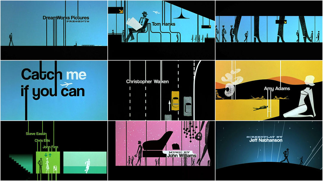
A few weeks ago, I watched the Steven Spielberg film Catch Me If You Can.  I really enjoyed the film, but the thing that grabbed me right at the start was the title sequence.  It is a very minimalistic animation that draws the viewer in and tells a story of its own.  Just through silhouettes, it is able to capture the essence of the characters and tell their story.  Even more impressive is the fact that the characters were not animated digitally.  Rather, the creators made stamps of the characters and animated with those.  There's  a lot more detail on the process and other aspects of creating the titles in an interview on the Art of the Title page.  Unfortunately I can't get the video to embed, but it is also available on the same page.

Sunday, September 9, 2012

Motion Graphics, easier said then done.

As we dove right into AfterEffects this week, I came to grasp how complex motion graphics actually is.    Before this class, I watched title sequences and would just be able to comment how cool it looked.  Now I am starting to grasp the long hours of hard, tedious work these artist put in.

 Our assignment for next class is to animate our names.  I am excited that we are getting right into AfterEffects, but I hope I can remember how to do it all.  It is one thing to be able to animate your name, it is another thing to animate your name well.  It will be fun to play around in AfterEffects, I just hope I don't get lost in the key frames.

One of the most incredible opening title sequences I have ever seen is the opening of Girl With the Dragon Tattoo.  The opening creates this epic, yet disturbing, tone.  I love the dark color schemes and pictures created out of the splashing metal liquid.  This would be a fun (yet extremely difficult) concept for my name animation!


Saturday, February 18, 2012

Catch Me If You Can

In the past week's class we have been talking about and looking at the website "Forget the Film, Watch the Title," after browsing this website for a while and checking out the various title sequences that were present on the site, I decided to look for similar sequences in various types of media I watch. Two days ago I watched "Catch Me If You Can" with my roommates and was really intrigued by the opening credits. It seems to be simple but very interesting and unique. Many individuals have referenced this title as being inspired by Saul Bass, who was a graphic designer and filmmaker, best known for his design of film poster and motion picture title sequences. One fascinating aspect was that the characters went for a "stamp-style" animation, in which stamps were actually used to generate the characters. I also would like to know how exactly the did certain aspects of the animation, such as the light bulbs turning on and the character appearing there. Also when the plane flies across and the "me" looks almost like a cloud. This opening credit sequence was created by Nexus Productions. Here's the opening title, so check it out, and enjoy!


Sunday, February 5, 2012

Saul Bass

This is another Saul Bass compilation where you can probably find more movies that you have heard about or probably seen. The idea in any case is to detect the influence of this designer in many other title sequences that you can see today.


Monday, November 14, 2011

Saul Bass/Amazon Studio

This is a compilation of Saul Bass' title work that was put out to celebrate a new book called Saul Bass: A Life in Film and Design. The video is pretty cool, and it showed a lot of titles I didn't know he had made, such as the West Side Story, Spartacus and Ocean's 11 titles. It also helps you notice patterns in what he does, like the patterns with moving lines and close-ups of eyes. I'm hoping this video is in the right format, since it came from Vimeo.


The Saul Bass book was written by a design historian named Pat Kirkham, who apparently knew Saul Bass personally and collaborated with his family while writing the book.

Random link: this is the link to the Saul Bass book, but scroll down past it and look at "Special Offers." I've never heard of Amazon Studios before, but apparently they have scripts that they're inviting people to storyboard and make test movies of for periodic contests. Sounds interesting, so I thought I'd throw it out there.