Below are a few animations that do a wonderful job at using color to set the mood:
Showing posts with label aesthetic. Show all posts
Showing posts with label aesthetic. Show all posts
Sunday, November 8, 2015
An amateurs guide to working with color
So something that really helped me improve my graphic design game was dipping my toes into the wide and wonderful world of color pallets. When I first started animating, almost all of the colors I used for my projects were chosen from the default color map. Let me tell you that the color map on most programs is not there to help you, it's there to destroy your life. They're incredibly one note and even someone with a novice eye would be able to spot them out. Instead try going to sites that already have user uploaded color palletes (like this one: http://www.colourlovers.com/palettes), bring them into Photoshop, and using the color picker see how the different colors interact with each other. You may find that a color you thought looked yellow actually turned out to be closer to turquoise, or that you enjoy the look of muted color pallets more than overly saturated ones. Tastes in color vary from person to person, and often times the style you like may have not have been someone else's first choice.
Below are a few animations that do a wonderful job at using color to set the mood:
Below are a few animations that do a wonderful job at using color to set the mood:
Friday, October 30, 2015
Boxed in by Curves
So a little while back one of my favourite online animators posted this image to his twitter.
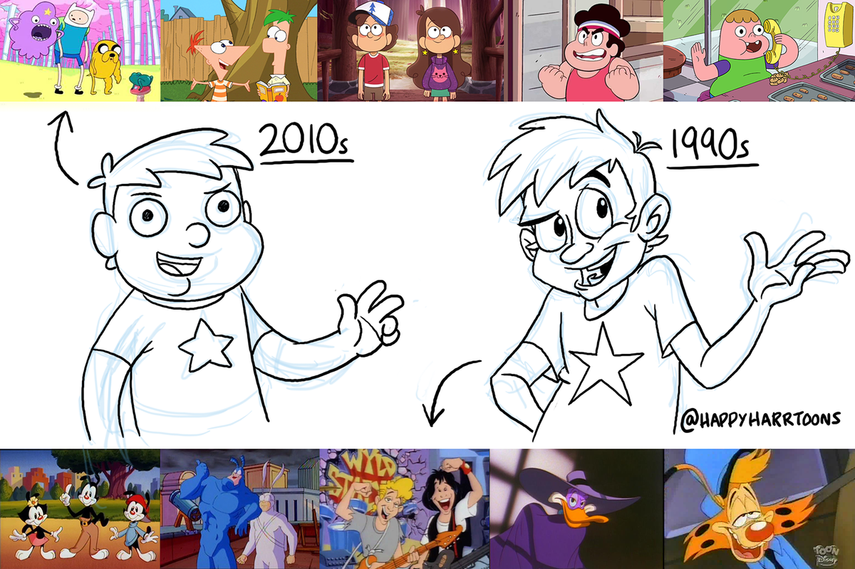 He's a huge fan of 90's "He-Man" style traditional hand drawn cell animation, and he feels as though a lot of cartoons nowadays are getting less stylistically diverse.
When the cartoon "Adventure Time" first aired on cartoon network I remeber thinking it was like nothing I'd ever seen before. The style was a lot cuter and curvier than a lot of cartoons at the time and it seemed as it's creators had put a great amount of detail into the characters and world of the show. The aesthetic matched the show's pleasantly strange world and for the most part I thought that AT would be one of those cartoons that usher in a new wave of creative aueterism.
However as the years have gone by it seems as though a lot of the new cartoons on cartoon network haven't really branched away from the curvey cute adventure time style. Content wise I think that many of these shows are really well crafted, but I can't help feeling as though a lot of character artists are stuck in a sort of creative rut.
Take a look at the difference between pilot episode for one of Cartoon networks newer series "Steven Universe" and it's release version.
The pilot had a darker more muted color pallet that I thought looked really cool and would have worked well for the show. The final version isn't by any means bad but it seems a lot more kid friendly than the pilot version.
I really miss the stylistic diversity of a lot of early 2000's shows.
When the cartoon "Adventure Time" first aired on cartoon network I remeber thinking it was like nothing I'd ever seen before. The style was a lot cuter and curvier than a lot of cartoons at the time and it seemed as it's creators had put a great amount of detail into the characters and world of the show. The aesthetic matched the show's pleasantly strange world and for the most part I thought that AT would be one of those cartoons that usher in a new wave of creative aueterism.
However as the years have gone by it seems as though a lot of the new cartoons on cartoon network haven't really branched away from the curvey cute adventure time style. Content wise I think that many of these shows are really well crafted, but I can't help feeling as though a lot of character artists are stuck in a sort of creative rut.
Take a look at the difference between pilot episode for one of Cartoon networks newer series "Steven Universe" and it's release version.
I really miss the stylistic diversity of a lot of early 2000's shows.
Wednesday, October 30, 2013
The Tale of the Three Brothers
http://vimeo.com/42287792
This week I decided to post the Tale of the Three Brothers, the animation from Harry Potter and the Deathly Hallows part 2. I had forgotten how much I enjoyed this animation when I first saw it in theaters and now that I have some experience with animation I really just appreciate it more. It's a beautiful piece that is extremely well planned out and incredibly executed. The character design is really what gets me every time though, and that's what I want to talk about the most. The fabric on these characters is just stunning I think. The transparent quality of all of the three brother's limbs along with the smoky quality of death's cloak all adds up to some really nicely created characters. The look of this animation is also very purposeful which I think is important. The over all look of this animation helps to reinforce the idea that this is a children's story being read aloud. The colors, the design of the locations, characters, and even the movement. You can see this being illustrations in a children's book, a creepy one but still. that kind of blending of genres can be very easily messed up and because every part of this animation is done very purposefully it isn't.
This week I decided to post the Tale of the Three Brothers, the animation from Harry Potter and the Deathly Hallows part 2. I had forgotten how much I enjoyed this animation when I first saw it in theaters and now that I have some experience with animation I really just appreciate it more. It's a beautiful piece that is extremely well planned out and incredibly executed. The character design is really what gets me every time though, and that's what I want to talk about the most. The fabric on these characters is just stunning I think. The transparent quality of all of the three brother's limbs along with the smoky quality of death's cloak all adds up to some really nicely created characters. The look of this animation is also very purposeful which I think is important. The over all look of this animation helps to reinforce the idea that this is a children's story being read aloud. The colors, the design of the locations, characters, and even the movement. You can see this being illustrations in a children's book, a creepy one but still. that kind of blending of genres can be very easily messed up and because every part of this animation is done very purposefully it isn't.
Thursday, September 12, 2013
As I was looking around for something to post this week I came across this music video. I finally decided on posting it for a few reasons. The first is the use of both 2D and 3D elements, which is something you don't see very often. I think that's a very powerful tool that was implemented well in this piece. Also, 2D elements like the ones used in this video are totally achievable using the techniques we've been learning in After Effects, they'd be a lot of work, but a lot of the same principals are there. The second reason I picked this is because of its aesthetics. This is something we haven't really hit on in class yet, but it's a very important part of creating anything, an animation in particular. this strange whimsical world the animator has created is pretty unique, which is not only tough to do, but it also generates a very specific response from the viewer. That response is hard for me to put into words but it does convey a sort of feeling or mood. That is also an important part of creating anything. You want to make your audience feel something, whether it's the theme of the movie following your opening sequence or the message of a song as a designer it's your job to do that.
Thursday, February 21, 2013
Music Visualizer
Hey all. For my name animation, I'm working with audio quite a bit. One of the elements of my piece is EQ bars that are set to the bass, mid and treble frequencies in the track I'm working with. So, I thought I'd explore some other examples of music visualizers that used expressions similarly to the methods we learned in class. This one is really intricate and visually breathtaking, while at the same time you can still understand HOW it was made. The artist is Matthias Müller. He used 3ds max, After Effects, Krakatoa and fumefx.
Subscribe to:
Posts
(
Atom
)