Showing posts with label color palettes. Show all posts

Thursday, April 14, 2016

Color Scripts in Animation


After taking the color grading minicourse a few weekends ago, I started to wonder how color correction and color grading played into traditional animation and how if might be different to the process that its used for live action films.  Color correction and grading are actually used quite frequently for animation in the same sense as live, to give the director more creative control on the final image and adjust each scene accordingly for the perfect emotional tone and to relate to the story.   In a sort of non-computerized form, animation films have their own version of Lookup Tables (LUTs) in the form of color scripts.  An LUT is essentially a way to modify the original image shot to the intended image to be displayed, and color scripts are sort of a way for animators to determine what kind color needs to be changed when the time comes for the process.  Color scripts are a way to map out the colors and saturation for each scene in order for the director to have a clearer vision of what the final product will look like, and possibly make more changes along the way.  Big-studio films like the works of Disney and Cloudy with a Chance of Meatballs use color scripts that are developed early on, and go hand-in-hand with the story development, as when some scenes change the emotion and color can change as well.Picture
Color Script for The Incredibles shown above, mapping out each scene chronologically

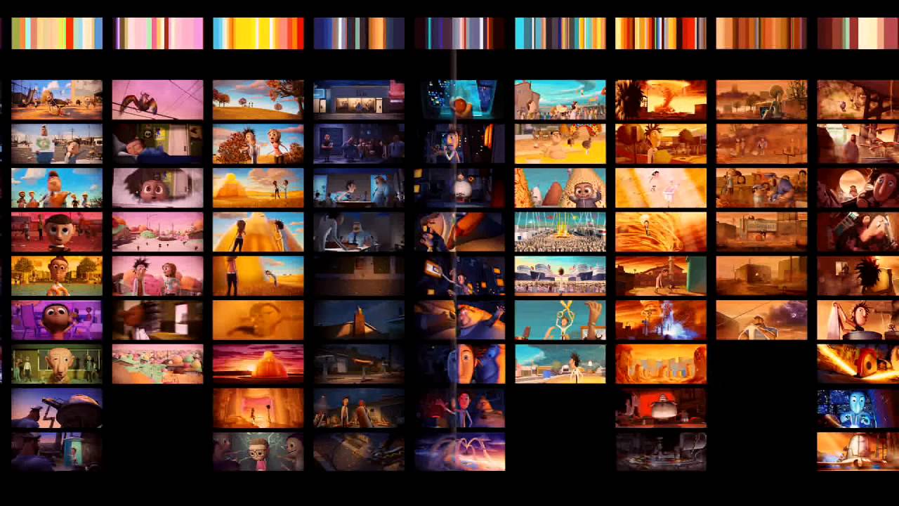
Script for Cloudy with a Chance of Meatballs, providing a palette of colors above 
to correspond with the specific scenes, not necessarily in chronological order

As much as I still need to practice color correction and grading with live action first, I find the techniques for color in animation quite fascinating, it's essentially another kind of storyboard to develop in the preproduction process in order to have a more solid vision of your final product.  Definitely something I'd like to try on some of my projects in the future.

Thursday, March 10, 2016

Adobe Capture is quite cool

While I could easily use this blog to geek out about the new saber plugin that VideoCopilot released, (that'll be for a later date) I would like to bring to light the really cool app that Arturo showed us right at the beginning of the semester.  It was this neat little application called Abode Capture, and one of its main functionalities is that it can take a picture and identify the color palette within the photo.  But what's intuitive about it is that the palette isn't completely locked once you take the picture; you can drag your finger on the colors it captures and move it to other areas to change up your palette.  

What really caught me by surprise though was how after I was playing around with it and picking up a lot of color palettes, the data showed up in one of my After Effects windows in the library panel.  When you sign into the app on your phone it will automatically sync the palettes to your Creative Cloud library, and that way you can use whatever you find on the go in your creative projects on your computer.  That made me realize that this app can be a very useful tool, because you could come across a range of colors that you might want to save for later, and with the help of this app you can accomplish that and integrate it into your projects.

What's even cooler about it that I just discovered recently is that you can take a picture of a pattern and save it as a special brush preset for Photoshop or Illustrator.  This pattern can really be anything; a pattern on a wall, a clothing texture, or even your own hand-drawn pattern on pencil and paper.  The Youtuber Draw with Jazza was the way I heard of this, and he was able to take a hand-drawn pattern and integrate it into his animation for the new Adobe Animate CC.  I think this is a great invention to come from Adobe, as it can totally help bridge the gap between hand-drawn and computer animation techniques.  For more information on the app, check out this video:


Sunday, November 8, 2015

An amateurs guide to working with color

So something that really helped me improve my graphic design game was dipping my toes into the wide and wonderful world of color pallets. When I first started animating, almost all of the colors I used for my projects were chosen from the default color map. Let me tell you that the color map on most programs is not there to help you, it's there to destroy your life. They're incredibly one note and even someone with a novice eye would be able to spot them out. Instead try going to sites that already have user uploaded color palletes (like this one: http://www.colourlovers.com/palettes), bring them into Photoshop, and using the color picker see how the different colors interact with each other. You may find that a color you thought looked yellow actually turned out to be closer to turquoise, or that you enjoy the look of muted color pallets more than overly saturated ones. Tastes in color vary from person to person, and often times the style you like may have not have been someone else's first choice.

Below are a few animations that do a wonderful job at using color to set the mood:


Wednesday, September 9, 2015

We are the Crystal Gems~

      While trying to keep a hold on my fleeting youth over the summer, I managed to fall in love with a cartoon called Steven Universe. Amazing, the representation in this show is goddamn incredible with gender and sexuality but I also want to cry at the aesthetic that it upholds. While the crewniverse (all of the people who work on the show) keeps the fans updated on tumblr with most of the process that it takes, all of the backgrounds and character sheets that are used are posted in high quality. I've personally found that they help as reference sheets for my own work and actually help a lot as colour palettes. Some are just plain cute, honestly.

      Their early designs were a lot more complex character-wise and it took a little tweaking on their part so they could animate the characters in a quicker fashion but they been noted to say that a lot of their actual focus goes much more into the story, music, and backgrounds specifically. The show tends to have a very overall relaxing quality and after looking at still frames of the show, I've found that it's really the backgrounds of the show that enthrall the viewer and suck them into this almost tangible world.
   
    The detail that is put into some of the backgrounds genuinely gives you more of a sense of the fuller environment and even though the backgrounds tend to be static, the motion of the surroundings can still be noticed, especially in the clouds, the ocean, and the beach scenes. I believe they actually put motion blur on those things, which is honestly very smart and an easy way to get away with minimal animation in the background, keeping the focus up front.

      Another thing that I very much love about SU is that there isn't much hidden in the process that they use to create the show. Aside from the simple behind the scenes that is usually given in a pathetic ratio to the actual show, SU gives more than they honestly should. But who's complaining. They post all of the creator, Rebecca Sugar's, demos for the songs (which, by the way, are adorable) and most of the storyboards including this little bit of the full version of the theme.

      Anyway, what I'm getting at is that you should definitely just watch the show for the weird storyline and the sweet gift that the damn thing is.  The style and the colours are definitely a constant inspiration for me art-wise and the efficiency that they've strived to gain is very admirable. I hope to be able to pump out as much as they have and in that amount of time as well; god knows that my time is spent procrastinating and watching Steven Universe so my extra time would need to be well spent.