Showing posts with label color correction. Show all posts

Thursday, April 14, 2016

Color Scripts in Animation


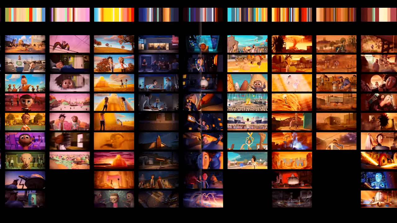
After taking the color grading minicourse a few weekends ago, I started to wonder how color correction and color grading played into traditional animation and how if might be different to the process that its used for live action films.  Color correction and grading are actually used quite frequently for animation in the same sense as live, to give the director more creative control on the final image and adjust each scene accordingly for the perfect emotional tone and to relate to the story.   In a sort of non-computerized form, animation films have their own version of Lookup Tables (LUTs) in the form of color scripts.  An LUT is essentially a way to modify the original image shot to the intended image to be displayed, and color scripts are sort of a way for animators to determine what kind color needs to be changed when the time comes for the process.  Color scripts are a way to map out the colors and saturation for each scene in order for the director to have a clearer vision of what the final product will look like, and possibly make more changes along the way.  Big-studio films like the works of Disney and Cloudy with a Chance of Meatballs use color scripts that are developed early on, and go hand-in-hand with the story development, as when some scenes change the emotion and color can change as well.Picture
Color Script for The Incredibles shown above, mapping out each scene chronologically

Script for Cloudy with a Chance of Meatballs, providing a palette of colors above 
to correspond with the specific scenes, not necessarily in chronological order

As much as I still need to practice color correction and grading with live action first, I find the techniques for color in animation quite fascinating, it's essentially another kind of storyboard to develop in the preproduction process in order to have a more solid vision of your final product.  Definitely something I'd like to try on some of my projects in the future.

Tuesday, April 22, 2014

Using After Effects in all the right places

This is not going to be a post that blows your mind, nor will it be a well-articulated post (continuing the pattern of all my others). My goal today is simply to highlight an excellent job one of my editors has done using After Effects. I guess I should give you all the proper context. I'm currently in charge of post-production on the upcoming ICTV show Working Title. With this position comes the responsibility of overseeing the work of three individual editors working on six episodes throughout the semester.

The show is a simple one. Its style strongly represents those of The Office and Parks and Recreation. In a minimally complex show such as this, one would expect there to be very little to do in post-production other than cutting together the footage and tweaking the audio a bit. At least that's what I thought, and to be totally honest, that's mostly what our post-production has consisted of. That, and color correction.

For those of you who understand the basics of color correction (that's the extent to my knowledge), you know it's not usually a particularly complex process; some color adjustments here and there, mess around with the exposure and saturation a bit, nothing too complicated. That's just the foundation of the process, I know. It's enough to understand what I'm discussing, though.

Everyone say hello to Erin! Erin is a wonderful cast member of Working Title and also happens to be one of the editors of the show! While she's doing a great job on her two episodes, she is, unfortunately, not the editor I'm going to showcase this evening.

What do you think of this shot? Pretty good, right? Well lit, in focus, nicely framed. It's a great looking shot for not having any color correction done to it if I do say so myself. The image takes place at the Golden Bell Film Festival (the festival which Erin's film was submitted to). Oh, did I happen to mention this shot actually takes place during the showing of her film? Everything about this shot is wonderful, minus the fact that it certainly doesn't look like a film is showing. Now look at this:

Much better, right? I'm going to be totally honest, this was none of my doing (surprise!). I never thought to ask Eric, the editor behind this spectacular transformation, to make a change like this. He though of it all on his own, and did a phenomenal job. It's a bit difficult to see exactly what he did in this small image to the right, so I recommend clicking the image to see a larger version. I'm now going to try to remember everything Eric did to make the changes you can so clearly see.

To begin, Eric placed two masks over the shot. One around the outside of Erin and the seats in the first row, and another one directly over Erin and the seats (everything else). He darkened both these masks drastically and then added a slight blue tint to both of them to give them that dark, movie theater feel. He then feathered the edges of both the masks to have more of a fade in the exposure change rather than leaving a clear cut between the two masks. After that, Eric added a solid black layer over the entire shot and then simply dropped the opacity to approximately twenty percent to make the shot just the slightest bit darker.

Here's the best part of the whole thing. What you probably didn't notice (which is, in a way, an indicator that he did a great job with it) is that Eric also added two lights to the shot as well: one over to the left and one to the right. The one to the left acts as a light source that one would expect to see from a movie screen. The one to the right behaves as the light that would come from the projector in the back of the auditorium if it were turned on. The lights don't make any major changes to the overall shot, but they serve to give a much more natural feel to the scene. It just goes to show that After Effects doesn't have to be used for animation, but can be used merely to change to look of a project.

I would have never thought to do what Eric did to this shot (or at least I wouldn't have put forth the effort to do it). It's well-rounded editor's like him that we need more of in this field. Interesting fact: Eric is only a freshman. Booyah! Kid's got a bright future ahead of him.

Side note: If at all possible, come to the Working Title premiere this Friday in the Roy H. Park School of Communications auditorium at Ithaca College! Doors open at 4:30pm. Here's the Facebook event. I'm sorry, my producer made me do that...
Friday, October 18, 2013

Motionographer Jobs

This past summer I worked as an office production assistant for a company called Red Car NY. They are are a national creative editorial company that offers their clients a diverse roster of creative editors, designers, animators, and visual-effects artists. Throughout my 3 month internship I was fortunate enough to spend time watching a Flame Artist work his magic. Now you may be asking your self, how what is a Flame Artist and how do they get their name. More often than not many jobs get their names from the tools they use and a Flame Artist is no exception. Flame is a computer program used to create 3D visual effects, advanced graphics and 3D compositing. Visual effect artist can use this program for real-time color grading and editorial finishing post-production solutions.

Typical solutions that Flame artist can fix consist of color correction, removing microphones/lights from background of the scene, adding special effects such as fires, mythical creatures, soaring bands of color, or flying splatters of blood.


Example of a Flame Artist using flame to relight a shot in a film.

Depending on their skill level a flame artist salary can range from $26,000 to $112,000 a year. Clients will typically pay them by the hour. Usually a Flame Artists office is a a lager room so that their clients can sit in an watch what you are doing and give them suggestions on your revisions. 

If you feel that you are ready for a challenge, and work well under pressure and are a team player becoming a Flame Artist might be the job for you! 

Thursday, September 20, 2012

Drive

Just recently I watched Drive for the second time. I was showing my roommates because it has quickly become one of my favorite movies. I tell people that its more of an experience than a movie because the story is so loose and the dialogue so sparse that you really need to pay attention to all of the other details in order for the point to come across to you. The soundtrack is so powerful that you could probably get most of the story and tension through it without ever opening your eyes. When I watched it the second time, I couldn't ignore all of the effects that were done in After Effects. Obviously things like title scenes and credits, but there were a lot of moments where the scene was color corrected or the lights were edited. One scene in particular, Ryan Gosling stares down a former client of his until he leaves the scene. The camera stays on Goslings face for the entire action, but you can see the reflection in his eyes of the man getting up and leaving. I believe that this effect was made possible through after effects, and it blew me away both times I saw it. It's an extremely powerful moment. I think that the way the story was told with such little dialogue is so impressive and the scenes with silence are so powerful that the movie will someday be called a cult hit.

If you have not seen this movie, I more than recommend it.

Saturday, April 7, 2012

Color Correction in AE

One of the most important parts of green screen compositing is color correction. Now that we're working on the actual compositing and all of our footage is shot, I'd like to know more about the integration of it all, because keying is only where the battle begins!

Here is a video tutorial that is fairly short and gives a few cool ideas about correcting an image to give it a very punchy, saturated quality. Of course he is using a still image so he does not need to track any of his layers, however it is not a big jump to adjust it for moving images.


TUTORIAL - COLOR CORRECTION in AFTER EFFECTS from PRETTY PEOPLE PICTURES on Vimeo.

 This next link is to a Creative Cow  tutorial. Unfortuantely it is not a video tutorial so I could not embed it here, but I think it is at least as useful as the one above if not more so. It has a number of small tips for matching color that, though they aren't flashy, will really kick up the production value. He also keeps it simple, applying only 3 adjustment layers and a mask.

Color correction is something I know a lot of people shy away from, but I think these two tutorial sum up the basics well and take away the illusion of how frighteningly complex it looks at first glance!

Thursday, February 2, 2012

Fun with Particles

So last class I was really intrigued by the particle playground effect we used for the smoke. I started looking around and there are a number of different particle generators in after effects. I guess we'll just have to play with them all to see what is best. Anyway, there are a ton of different functions a particle generator could have. Immediately I thought about snow or precipitation or things like that. I began to look for some tutorials and I found a very cool and pretty easy to do one on video copilot. It is using a particle generating effect called trapcode particular to make cold breath. He alters a lot of the effect setting in order to make the breath realistic and it looks really cool. He also did a quick color correction to make the scene look like it was really cold, turning up the blues and what not. I thought it was pretty cool and definitely practical if you needed to shoot a cold weather scene and we happened to be having unseasonably warm weather.

Monday, October 3, 2011

Pleasantville: Basing a Film Around a Simple Effect


One of my favorite films is Pleasantville, which was made in 1997. Pleasantville centers around two teenagers from the present day who are transported back to a black and white world and slowly turn it back to color. The film experiments with black and white vs. color and bases the entire plot around this. In the film, certain things and people turn to color while others remain black and white.
I looked into how this effect was done and found this tutorial on how to do the "Pleasantville Effect." In this tutorial, the author uses Photoshop to create this effect and it is actually pretty easy to do. In another tutorial (below) Final Cut Pro is used to create the effect.
It's interesting how such a simple effect was used as the basis for an entire movie. The result is an aesthetically beautiful film that is very entertaining. I've included the trailer below in case you haven't seen it.


Saturday, September 24, 2011

Sin City

In 2005, the movie Sin City, staring Mickey Rourke, Bruce Willis, and Clive Owen, premiered on hundreds of silver screens around the country. I remember learning that it was based on Frank Miller's graphic novel (well, more like a series of graphic novels) and I couldn't help but be completely spellbound with its animation. I had never seen another movie that had taken live action and completely transformed it to look like a comic. Most of the action is highly concentrated black and white with a few chosen colorful objects, and I couldn't wrap my head around how they could possibly do that with a film. Well its 6 years later, I have learned a few tricks and gained a little more experience in the industry, yet I am more impressed with the process they used to create the movie, as well as the techniques they used in order to achieve the detail of the original graphic novel.

If we look at the original panels from the book and compare it to the final product, we see the detail that went into the entire production design.

The costume designers were so precise that the placement of the bandages on Marv are actually in the exact same place on the book character as they were for the film character. Then if we look at the process that the artists and filmmakers used to enliven the graphic novel, we see exactly how much work had to go into the animation. Computer generated sets, color correction, and 3-D elements were just the beginning for this project.


Everything from the white rain...

...to the black and white high contrast look of the graphic novel was CG.

After learning how to key green screens and garbage mat everything outside, I realize how simple this process can be. However, it is still an incredible amount of work for an entire movie, and to create the entire world on a computer is just incredible.


Here's another example of how much CG was used in the very first scene. Notice the color correction, color selection, texture, and set.
Before:


After:


This is just a small portion of the effects used in this movie, but if anyone feels like exploring more, Animation World Network has a full 6 pages spread dedicated to the work that went into making this graphic novel a silver screen spectacle. I would highly recommend reading it as it goes into details about the project, what they used, and how they used it to created this graphic world.