Showing posts with label apple. Show all posts
Showing posts with label apple. Show all posts
Wednesday, September 16, 2015
Updates on Technology
So I know this doesn't really have to do with this class but I came across this video the other day on Facebook and I found it interesting and I wanted to share it with you all. As we all probably know, Apple came out with their new iPhone the other day and everyone is freaking out about it. I honestly can't tell you why, it looks like every other iPhone they have come out with. I'm apparently not the only one that thinks that because Jimmy Kimmel decided to prank people and go out into the streets of Hollywood and tell them that the first ever iPhone is the newest one and people believed him. Take a look:
In the video the reporter asks them what they like about it and a lot of them said that it works faster and that the display is more clear. Now I don't know if they were just scrambling for answers or if they truly thought that. Either way, does technology really improve so much that we need to spend hundreds of dollars on the new fad? If everyday people are ignorant enough to think that this is the new iPhone, does it really make a difference? Like with Adobe for example, they come out with a new update every few months and what's the point? It's not like anything is different. I know the answer to this and it's all about money and marketers know that people will eat it all up. It's silly but true. I know I'm one of them!

Thursday, February 20, 2014
Fibonacci's Sequence and The Golden Ratio
95% of the time, I hate anything involved with math. Like most TVR majors, it's never really been my thing; and that's perfectly ok. I realize that almost everything I use in my day-to-day life involves math in one form or another, but I kind of just don't care. However, every once in a great while, I have to admit that math does something that really, truly impresses me. This is one of those moments.
A few weeks ago, Arturo talked about something called the Golden Ratio. I'd heard of it before, maybe in a middle school math class or something, but I decided to a little more research on it to see what I could find. I wasn't disappointed. In a nutshell, the ratio is based off of the Fibonacci Sequence (each number being the sum of the two numbers that come before it) where any two adjacent numbers in the sequence, if divided, form a ratio of 1.618. This ratio had been proven to be the most pleasing ration to the human eye. TVs used to come in a ratio of 16:10 (now they're most common in 16:9, which is still pretty close), as do credit cards, and even older iPhones and Ipod Touches. This isn't a coincidence.
 What I find to be really strange, however, is how often this seemingly random pattern appears in nature. A great article on io9 points out how the Fibonacci sequence shows up on everything from flower petals to seashells to hurricane formations: even spiral galaxies, an unfathomable amount of distance away from Earth, have this shape, this ratio. It's unexplainable. If you search for this on YouTube, there'll be plenty of scientists and mathematicians trying to explain what's going here, but there will also be lots of crazy people trying to make some connections that just aren't there. It's crazy, and I just think it's so so cool.
So there you go. It doesn't have a whole lot to do with animation or motion graphics, and I understand it about as much as I understand how to use After Effects, but it's something to always keep in mind. If you want to make something look good; like, really good; use the magic, golden ratio. Everything else in the world does, so why shouldn't you.
Here's the link to one last article from the Guardian.
 What I find to be really strange, however, is how often this seemingly random pattern appears in nature. A great article on io9 points out how the Fibonacci sequence shows up on everything from flower petals to seashells to hurricane formations: even spiral galaxies, an unfathomable amount of distance away from Earth, have this shape, this ratio. It's unexplainable. If you search for this on YouTube, there'll be plenty of scientists and mathematicians trying to explain what's going here, but there will also be lots of crazy people trying to make some connections that just aren't there. It's crazy, and I just think it's so so cool.
So there you go. It doesn't have a whole lot to do with animation or motion graphics, and I understand it about as much as I understand how to use After Effects, but it's something to always keep in mind. If you want to make something look good; like, really good; use the magic, golden ratio. Everything else in the world does, so why shouldn't you.
Here's the link to one last article from the Guardian.
Friday, October 4, 2013
Green Screener App
Anyone who is familiar with green screen knows how difficult of a challenge lighting
it evenly can be. This recently designed cinematography app does just that, Green Screener uses image banding as a way to determine the luminescence in an image. This image is a visual reference to further explain the technology, taken from the Green Screener website.

The app essentially takes your device camera and the green channel ultimately dividing them into 4, 8 and 16 bands. These can be related to the f-stops that we have learned about and thus would roughly correlate to the 2-stop, 1-stop or 1/2 stop resolution between the bands. Although Green Screener is not equivalent in the scientific sense of the f-stop it is much more accurate then a light-meter or a waveform-monitor. In simpler terms the application breaks down whatever image is being displayed and uses the bands to show different levels of light. Here is an example of the banding...

Overall if your trying to keep an evenly light background for your green screen and have a decently well trained eye accompanied with a light meter, for only $10.00 this is a significantly inexpensive tool that will do the job.
it evenly can be. This recently designed cinematography app does just that, Green Screener uses image banding as a way to determine the luminescence in an image. This image is a visual reference to further explain the technology, taken from the Green Screener website.

The app essentially takes your device camera and the green channel ultimately dividing them into 4, 8 and 16 bands. These can be related to the f-stops that we have learned about and thus would roughly correlate to the 2-stop, 1-stop or 1/2 stop resolution between the bands. Although Green Screener is not equivalent in the scientific sense of the f-stop it is much more accurate then a light-meter or a waveform-monitor. In simpler terms the application breaks down whatever image is being displayed and uses the bands to show different levels of light. Here is an example of the banding...

Overall if your trying to keep an evenly light background for your green screen and have a decently well trained eye accompanied with a light meter, for only $10.00 this is a significantly inexpensive tool that will do the job.
Thursday, September 26, 2013
Flat Design and the End of Skeuomorphism
With the launch of Apple's iOS 7, they have signalled a departure from the stale designs of the past. Specifically, they largely abandoned the design trend known as skeuomorphism. Many users have responded positively to the radical change in their phone's operating system. This marks a major blow to the champions of skeumorpist design principles.
Skeuomorphism is the incorporation of ornamentation and elements found in previous non-digital formats. For example, a calendar application that makes use of a leather frame is using a skeuomorphist approach. Or a wooden bookshelf in iBooks...

Critics of skeuomorphism argue that the design trend clutters designs with unnecessary and outdated physical metaphors that can confuse users. Proponents contend that it gives technology users a reference point in the world.
Apple has opted in favor of a flat design chosen by the company's lead designer Jony Ive, after previous lead designer Scott Forstall left in October of 2012.


.png)

Skeuomorphism is the incorporation of ornamentation and elements found in previous non-digital formats. For example, a calendar application that makes use of a leather frame is using a skeuomorphist approach. Or a wooden bookshelf in iBooks...

Critics of skeuomorphism argue that the design trend clutters designs with unnecessary and outdated physical metaphors that can confuse users. Proponents contend that it gives technology users a reference point in the world.
Apple has opted in favor of a flat design chosen by the company's lead designer Jony Ive, after previous lead designer Scott Forstall left in October of 2012.
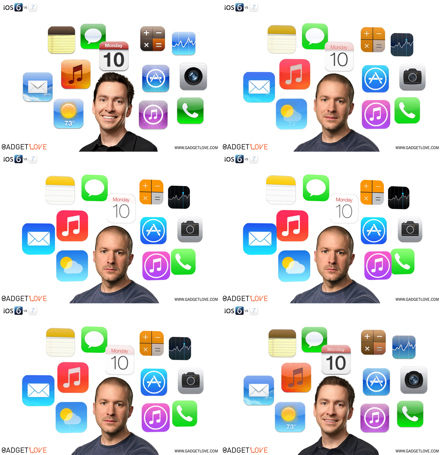
Flat design is a relatively new design concept, propelled to the forefront of talk with the introduction of the Windows Phone in October 2010. It consists of large elements, making use of the full potential of small screens. Essentially flat design proponents argue that usability and modernity are placed at the forefront of the design process.

Looking at the iOS 7's compass app compared to the previous version can give you a direct insight into the design change...
.png)

Thursday, March 7, 2013
This technology is very cool. Supposedly it is 100 time more accurate than “Kinect” for Microsoft's game system, Xbox. With this new technology, there is a system of cameras, sensors, and inferred light emitting diodes that all interact to make this possible. Also unlike other existing systems, such as “Kinect,” Leap Motion can track up to ten fingers all at once in a three-dimensional area of about eight cubic feet! The largest difference between this technology and others, is that this device is placed below that tracking area, whereas many others are placed in front of it, looking straight on. It is compatible with Apple and PC and just plugs into the computer. There are also countless applications for the technology including gaming, modeling and numerous others. The product will me available in the market on May 13th, which makes things all the better!
Thursday, September 13, 2012
The New iPhone and iPad Look Pretty Sweet
So have you heard about the new iPhone 5's features? Some say that it will boost the economy while others say it will revolutionize technology. All of these rumors sounded too good to be true so I decided to look up videos and they are all true! The site I found even had the new features for the next iPad as well. Here, watch these links:
I have three words for you: OH EMM GEE. I cannot wait to drive an hour to Syracuse to get in the long line to wait for hours to have both of these beautiful products so that I can live forever in peace and joy until the upgraded products come out and then I have to repeat the process all over again.
Alrighty, lets get serious though. These videos were made by Aatma, an animation and digital content studio specializing in the production of imagery for television, film, advertising and interactive media. Aatma has worked on a number of projects including a joint-campaign for Brisk and Star Wars Episode 1 when it came back to theaters, as well as a handful of viral videos mostly using computer graphics. I remember watching the iPad 3 Concept video a few months ago and thinking that Apple most likely has these planned in the next 7 years or so. I recently rediscovered this video and decided to watch more videos from this studio which are just as equally as cool as these two clips. Aatma has a unique ability to make videos that look so realistic that they're believable and its all very cleverly shot and perfectly edited. I'm looking forward to future videos from them.
I have three words for you: OH EMM GEE. I cannot wait to drive an hour to Syracuse to get in the long line to wait for hours to have both of these beautiful products so that I can live forever in peace and joy until the upgraded products come out and then I have to repeat the process all over again.
Alrighty, lets get serious though. These videos were made by Aatma, an animation and digital content studio specializing in the production of imagery for television, film, advertising and interactive media. Aatma has worked on a number of projects including a joint-campaign for Brisk and Star Wars Episode 1 when it came back to theaters, as well as a handful of viral videos mostly using computer graphics. I remember watching the iPad 3 Concept video a few months ago and thinking that Apple most likely has these planned in the next 7 years or so. I recently rediscovered this video and decided to watch more videos from this studio which are just as equally as cool as these two clips. Aatma has a unique ability to make videos that look so realistic that they're believable and its all very cleverly shot and perfectly edited. I'm looking forward to future videos from them.
Thursday, February 16, 2012
Project Idea
For my project, I plan on creating a funny animation on how the apple was decided on the logo of Apple Computers -- not an orange or banana or some other fruit // I have not decided yet.
In this below video, the "Video Graphics" comes falling from the sky and crushes out everything in the screen. Instead of the text, I plan to recreate the Apple logo -- crushing another fruit ... then bouncing onto a Mac or iPad or something (again that I plan to design and recreate) where it regularly rests on said products.
I think I could face a few different problems -- mainly the design and also the audio linkage. For the design, recreating an Apple product will probably the be toughest because there are so many details and finite specifics to a product -- even though it is a simple animation, I still would like to get the design mastered as effeciently as possible! In regards to the audio, bouncing items usually make squeaky noises and finding / syncing this said audio to the bounces could be challenging because I am going to need to find the best sounding audio and accurately link it and fade it -- so it actually sounds good, isn't simply present
In this below video, the "Video Graphics" comes falling from the sky and crushes out everything in the screen. Instead of the text, I plan to recreate the Apple logo -- crushing another fruit ... then bouncing onto a Mac or iPad or something (again that I plan to design and recreate) where it regularly rests on said products.
I think I could face a few different problems -- mainly the design and also the audio linkage. For the design, recreating an Apple product will probably the be toughest because there are so many details and finite specifics to a product -- even though it is a simple animation, I still would like to get the design mastered as effeciently as possible! In regards to the audio, bouncing items usually make squeaky noises and finding / syncing this said audio to the bounces could be challenging because I am going to need to find the best sounding audio and accurately link it and fade it -- so it actually sounds good, isn't simply present
Sunday, October 9, 2011
Motion 5
With all the recent talk about Apple and Steve Jobs, I looked into Apple's motion graphic software, Motion 5. After researching the Apple website and reviews it seems to be very similar to After Effects, but I'm not sure if there are as many features as After Effects offers. One nice thing about Motion is that it is only $49.00. I have heard multiple pros and cons of Final Cut X (which is the program Motion is synced with). But this might be a great program for those who just want to start learning motion graphics.
"The Motion interface has been redesigned specifically for Final Cut Pro editors, with a familiar look and feel that makes it easy to switch between the two applications. A new single-window layout puts all the tools you need at your fingertips, and redesigned icons make it easy to identify options at glance. The darker look of the new interface is designed to enhance color perception as you work with any combination of video, stills, and motion graphic elements. Many filters now include onscreen controls for direct, intuitive manipulation of effects. And keyframe editing is much more accessible thanks to a new view that displays the Keyframe editor below the timeline."
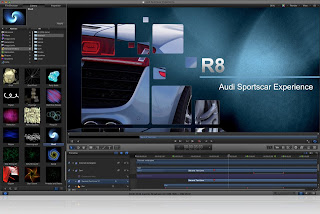
This is a Motion 5 tutorial.
"The Motion interface has been redesigned specifically for Final Cut Pro editors, with a familiar look and feel that makes it easy to switch between the two applications. A new single-window layout puts all the tools you need at your fingertips, and redesigned icons make it easy to identify options at glance. The darker look of the new interface is designed to enhance color perception as you work with any combination of video, stills, and motion graphic elements. Many filters now include onscreen controls for direct, intuitive manipulation of effects. And keyframe editing is much more accessible thanks to a new view that displays the Keyframe editor below the timeline."

This is a Motion 5 tutorial.
Thursday, March 10, 2011
Designers...
Paul Rand - Rand was probably successful because he believed that good design was part of life. Steve Jobs, who hired Rand to create a logo for NeXT called him "the greatest living graphic designer" shortly before his death. And while some in the graphics industry didn't like him, it is indisputable that Rand's work transformed the industry into what it is today.
Scott Kim - Kim is a designer in many aspects of web games and toys. He specializes in ambigrams and inversions, which are really quite cool. Like what Dan Brown did in "The Davinci Code." You can even buy Scott Kim greeting cards with ambigrams on the front.
John Maeda - Maeda is a designer who also works at MIT. One of his missions is to teach people how to use simplicity in such a complex global environment. He collaborated with Reebok to make shoes, and his designs can be found in many other places.
Scott Kim - Kim is a designer in many aspects of web games and toys. He specializes in ambigrams and inversions, which are really quite cool. Like what Dan Brown did in "The Davinci Code." You can even buy Scott Kim greeting cards with ambigrams on the front.
John Maeda - Maeda is a designer who also works at MIT. One of his missions is to teach people how to use simplicity in such a complex global environment. He collaborated with Reebok to make shoes, and his designs can be found in many other places.
Subscribe to:
Posts
(
Atom
)