Wednesday, November 13, 2013

Video Game High School - RPG & Opening

(NOTE: For the purposes of this post, only watch the first 2 minutes and 30 seconds of this video.)

Video Game High School, a fantastic Kickstarter-funded series by Freddie Wong, depicts a world where there is a high school... where you play video games. That is legitimately all you do. A whole world was created for this purpose, with the high school's classes ranging from "Sniping 101" to "Advanced Kart Racing". All-in-all, the world is pretty believable, all the way down to the pizza-in-a-can-from-a-vending-machine.

In this first episode from the second season, the show opens to the main characters having a bit of an adventure in an RPG, "questing". A couple of the characters fire off their own versions of attacks, all of which have a bit of After Effecting done to them. One character pulls out a lute, playing a melody which travels all the way to the girl, who is an archer. She then looses her arrow, the camera following it in slow motion all the way to the attacking brute, freezing him and allowing him to be shattered into hundreds of block-like pieces.

As for the opening, it's all quick titles and transitions set to music, but it's all very smooth and pleasant, both to look at and listen to. Freddie Wong and his colleagues did a fantastic job on this series, and it shows.

Saturday, November 9, 2013

Richard Morrison

Richard Morrison is an English title-sequence designer from England and has designed the titles for films like Tim Burton's Batman, Sweeney Todd, Frankenweenie and others like Brazil, Run Lola Run, The Constant Gardener and about 150 others. What I like the most about his work is that you can see a clear connection between the titles and the narrative/themes of the movie. His designs don't seem to be too complicated animation-wise, but are very conceptual and efficient.

My favorite one is the opening sequence for the 1998 German film Run Lola Run. It's probably a more experimental approach but it directly relates to the themes of the movie and builds up in a way that it really sets the mood for the rest of the movie. There are 4 different "acts" in the sequence, each one with a very different style. Of course the technique is important and crucial in this piece, but what really sets it apart is the idea and the message it's trying to convey.

Friday, November 8, 2013

Animation and Interactivity: The Future of Media Viewing


T_Visionarium is a 360-degree screen which animates several channels in front of its viewer at the same time, allowing you to select one or multiple screens by the gesture of your hard. T_Visionarium is not meant to be used as a way to watch one or multiple videos, but to use these videos as building blocks to create a larger visual landscape.

In this experiment, each video also carries data of the gender of actors, their positions, actions, emotions, and other aesthetic content. By using a special interface the viewer can select, rearrange, and link different clips based on relations of gesture and movement.


Basically, this is not a tool made to control the mediascape but a way of surrounding ourselves in a sphere of common media. In this way, T_Visionarium is a steppingstone in the history of new media. Some see it as a little more revolutionary then I do, but I still believe that this technology can be expanded upon, refined, and turned into something truly useful.

With it's organizational quality and ability to piece clips together, it could even by used as an interactive video editing tool... but I'm just spitballing ideas here.

National grid animated informational video.

This video's purpose was not to highlight motion graphics but to simply spread a message about national grid. The reason I'm posting this is to show how graphics can be applied to any topic to make it interesting and entertaining to watch. The graphics used to make this video are relatively simple, but used correctly can make a good video. Using 2D elements layers over each other is a nice way to create some appealing visual elements, they're simple but appealing to the eye. I came across this video completely by chance but I thought it was full of some nice effects that were worthy of posting on this page. All of these effects seem similar to things we've seen in class, and all the effects seem like things we could possibly manage to do in After Effects.


It's all in the Details


So my usual posts have been about how "we can do this or that", or at least that the animations that we see professionally done are a ton of work, but we can do. I want to take a step back from that for a second to talk about this video I found, because it approaches it's style of animation very well and does a lot of cool stuff. So I'm not going to say that I could make something like this, because it is really, really incredible work, but I want to pull out some cool things it does and talk about them. This is a video for League of Legends, about it's "Championship Series", and follows several top players at the game as they "transform" into the champions they play in the game. So you end up with the animations of a bunch of people who are half video game characters, acting as those characters. The creators made a conscious decision to still have a majority of the character model as the person, so we can still identify who they are. On top of this, in the first part they have the people in front of banners representing their team name, thus further having the audience play the game of "who is that?". The one thing I really liked about this video is all the extra little details they add in to make the animations seem more real. The "golem hand" has a little smoke come out of it for example, and when the hand hits a rock that rock breaks apart just a little bit. The green ooze that comes off one of them just has a little bit of particles going on to make it look better, and sparks and smoke effects are common on all of the animations used. I love these little touches because it is really these things that add production value to this type of piece. The art style is obviously really striking, but to make an animation believable you need to really be detailed oriented, not just thinking about the super big picture. Because obviously the animation and story as a whole are strong here but in my opinions the details count dramaticly more then we give them credit for

Winter is Coming

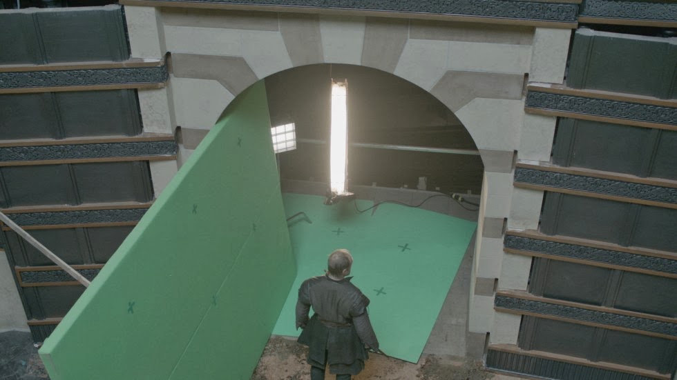
Game of Thrones, the medieval HBO series, has captures television fans attention with it intense story line, bloody narrative, and brutal fight scenes. SpinVFX brings Westeros to life by building the castles, birthing the creatures, and multiplying the soldiers to make the series grander than any other production in television.

 The Creation of a Giant


The Making of an Army


The Building of a Kingdom


Forming of an Adventure


The usage of green screen is highly valuable for the magical kingdom because the amount of visual HBO would like would not be possible without this illusion. In September 2013, the company won an Emmy for their work they did for Game of Thrones. SpinVFX has done work for many visually thrilling productions, such as Abraham Lincoln:Vampire Hunter, the ABC television series Titanic, Battle: Los Angeles, and After Earth

The Return of the Pink Panther

Growing up one of my favorite movies was The Return of the Pink Panther. I can recall countless movie nights where my sister and I sat in the middle of the couch with a big bowl of popcorn and sang along to the opening credits.


In this 1975 comedy/crime/mystery film  the bumbling idiot, Inspector Clouseau is assigned to work the case when the Pink Panther diamond is stolen. Through out the film hilarious event take place that cause your stomach to hurt from laughing so hard. However the most impressive part of the film takes place in just 4 minutes.


The animation short was created by DePatie-Freleng Enterprises, they were an American animation production company from 1963 to 1985. They produced theatrical cartoons, animated series, commercials, film title design sequences and television specials. The Pink Panther title sequences are what the company are most well known for. A brilliant team of three are responsible for creating this masterpiece, Blake Edwards a comic constructionist, Henry Mancini was the composer, and Friz Freleng was in charge of the actual cartoon work. Friz Freleng was an american animator, cartoonist, director and producer. Some of his most famous work consists of the Loony Toons and the Merrie Melodies series.


Wednesday, November 6, 2013

Transistor

This week I'm posting about "Transistor". "Transistor" is a new video game that's being released in 2014 by SuperGiant Games. This is the trailer for "Transistor".
In "Transistor" you play as Red, a singer who finds an intelligent sword and because of that is constantly being pursued by the antagonists of the game. This trailer, shown at the announcement of the game is ripe by 2D animation both from the actual game, and cinematics created for and played throughout the trailer. This is a 2D game meaning all of the animation within it is in 2D. This is also a nice piece of work to look at because it really demonstrates how much animation goes into a video game. There's all of the cutscenes, the character animation, the environments, and more, these are all things that have to be created in order to make a complete game. In this trailer you can see all of that. You can also plainly see how all of the elements in the game are in 2D. In order to make a good video game, you need to think about everything you would think about while making a movie. Framing the scenes, lighting, costuming, all of that. I feel like sometimes people forget that games are art and I think this trailer really illustrates that well.

Ryan vs. Dorkman - Your Everyday Lightsaber Battle

Ryan vs. Dorkman, created by Ryan Wieber and Michael Scott, two effects artists who had a friendly rivalry on a Star Wars forum, leads the two friends into an intense lightsaber battle complete with, of course, lightsabers, but in addition, invisible wires, "the force", and lots of good camera work.

It's a fairly old example, but is an interesting look into what exactly was possible 7 or 8 years ago. We've come so far in such a short time, and it's amazing what was considered 'amazing' back then is now commonplace today. There's also a sequel!

The sequel not only incorporates better lightsaber effects, but introduces film-quality camera work and better pacing! The addition of better music and sound effects placement only makes this sequel better, and the production values certainly do show.

Tuesday, November 5, 2013

Sundance Institute Changes Identity

            The Sundance Institute is a non-profit organization that was founded by Robert Redford in the mountains of Sundance, Utah in 1981.  Since its establishment the now global organization has offices in Park City, Utah, NYC and Los Angeles, CA. It has been a phenomenal resource for providing creation and financial support to the thousands of aspiring filmmakers, directors, producers and other forms of story tellers looking for a place to showcase their talent. The organization is best known for the Sundance Film Festival and is responsible for screening some of the most beautiful cinematic indie films in the world. Paula Scher is a graphic design artist of over four decades who has been featured at venues all over the world including the ever popular TED talks and is responsible for this identity change. She is additionally been a partner in the New York offices of Pentagram since 1991. Scher is a seasoned veteran in the motion graphics community who has not only created the new identity of the Sundance Institute below but was also hand picked to design to the "graphic" identity for the 2014 Sundance Film Festival. Paula Scher is not just any graphic design artist, her work is internationally recognized and therefore is no surprise why she was elected to construct the new identity for this legendary organization. Here is a quick look at Scher's new identity for the Sundance Institute...


The new Sundance Institute graphic identity...


The old Sundance Institute graphic identity...

Friday, November 1, 2013

Freddie Wong Tack Bell commercial

I found this video on youtube the other day, freddie wong is one of my favorite modern vfx artists. He makes plenty of funny videos using techniques and programs that anyone could learn. Often aside from his original video posting page, he maintains an alternate page where he posts inside looks on his videos. I chose this video because I found it entertaining and it contained some simple yet amusing video effects to create the taco. While the mini taco bell prop may have been real, its obvious that the taco that was made on the inside was not. He must have and to track the camera movements in order for the 3d taco to look like it was indeed placed within the mini taco bell prop. And it probably took some time to create the actual digital taco that was made from the lasers. Anyway heres the video, hope you enjoy it.


Picture Animations

I recently saw an animation compilation entitled The Elegant Gentleman's Guide to Knife Fighting. The Elegant Gentleman's Guide to Knife Fighting is an australian sketch show and features various animation bits and transitions. The animation uses pictures and animates parts of them to create movement and comical and crude dialogue. I've seen many animations like this and I would like to learn, in class, how to animate pictures well and especially how to animate an actual mouth on a picture or inanimate object. I know Cannon uploaded the talking orange tutorial and it's fairly simple but I could use some practice and direction. Animations that use preexisting pictures are usually humorous and when done well, they make it look like a genuine, moving clip. I would like to make a series that involves pictures similar to The Elegant Gentleman's Guide to Knife Fighting. It would involve modern art or movie posters and I think at this point, with some practice and time, I could pull it off. The animation reminded me of Monty Python and the Holy Grail.


The 2013 Summer Video

Most of the posts here are about work that we've found by other people, but today I wanted to change things up a little and show off a little something of my own. This summer I did more traveling then I ever have in my life and some great shots were taken along the way. I've been working on this video in my [little] spare time this semester and I finally finished it yesterday!

I incorporated some basic animation in the video to follow the rhythm of the song, although most of it is just done through cuts to different shots. The end credits I made in After Effects, along with the final clip at the end which some of you may recognize from our first project :) Now it has audio though!!

This is definitely not an animation-heavy video, but hopefully it shows how versatile the clips we made in our first project can be. With a few extra edits, I may make it my little tagline to put at the end of all my videos. I'm thinking of changing the lens flare to just a simple text glimmer that goes across my name. Let me know if you guys have any other suggestions!

Anyways... without further adieu here's the 2013 Summer Video:

:D


Green Screen Movie FX Studio App

            Since we shot our green screen footage this week I thought I'd post about an app which may not be as advanced as our class material nonetheless can be something to play around with on the side. This app was introduced in 2012 but was recently updated, it has some sort of complexity as well as one hell of a studio editing program for an iPhone and or iTunes application compatible device. The application is suprisingly easy to use while also having a pretty impressive tool set when adding special effects in postproduction. More specifically this app allows you to use the chroma key special effect to replace video or pictures with additional media.  The app comes with a boat load of built in videos to begin your green screen experience. As well as the built in videos you can also import pictures and videos to splice yourself in (whether or not you can rip the files off the app to utilize in After Effects or another program is behind my research). Some of the application features consist of real time compositing, capture resolution, chroma match quality, camera focus mode and many more. Overall the Green Screen Movie FX Studio is a powerful special effects editor that allows you to create projects for only $1.99 at the iTunes application store, this is a must buy. Here is a quick start tutorial that gives you a sneak peak of the application... (the app was created by epocfield)


Here is some examples of clips made using the application...

"Devour" Commercial

The M&M's commercials are always some of my favorites.  They take inanimate candies and give them life, and the commercials are always funny and enjoyable to watch.  There is an art to their commercials too.  They really use precise and detailed animations to create the M&M characters.  They have very specific personalities through the details they are given.  

But the animators do something great.  They insert these characters into real life footage.  I'm sure that the process is difficult.  My guess on how they do something like this is that they take a similar approach to what we have been learning in class with the "inserting ourselves into a movie" project.  There must be a way to simply take the animation and place it into the footage.  I doubt a green screen is used, but maybe it is for some parts.

Here is a commercial that I'm talking about...

Star Wars Lava Planet Sequence


So shooting in studio this week got me thinking about how major companies do it, and so my post this week is a featurette from Star Wars Episode 3.  It's primarily about building the effects for the Mustafar sequence, a fight scene on a lava planet. While it is mostly an ego stroking for Lucasfilm and Industrial light and Magic, there are a lot of cool tidbits in here. There is a lot of cool stuff about the compositors and matte artists. The matte artists build the background for mustafar, which is a space hilariously based around a gravel parking lot, but obviously with a ton of assets and art. The assets that are involved in the sequence itself, because they are a giant mix of different sources. Some of the lava is from a shot of an actual volcano, some if it is built with particle effects. The use of models along with CG is also really interesting to me. ILM puts a lot of emphasis on making real rocks and setpeices because it can be easily manipulated in a real scene. So what comes down is what parts of the scene need to be real models and what can be made in CG, and someone sitting down to composite the two. The same went for the lava, a lot of it is done with real shots in a miniature set. Lighting and real effects like smoke are key, and then they just film it as their overall wide shot.


Clearly there is a ridiculous amount of elements here, but I just find it really cool how they all come together.

Wednesday, October 30, 2013

The Tale of the Three Brothers

http://vimeo.com/42287792

This week I decided to post the Tale of the Three Brothers, the animation from Harry Potter and the Deathly Hallows part 2. I had forgotten how much I enjoyed this animation when I first saw it in theaters and now that I have some experience with animation I really just appreciate it more. It's a beautiful piece that is extremely well planned out and incredibly executed. The character design is really what gets me every time though, and that's what I want to talk about the most. The fabric on these characters is just stunning I think. The transparent quality of all of the three brother's limbs along with the smoky quality of death's cloak all adds up to some really nicely created characters. The look of this animation is also very purposeful which I think is important. The over all look of this animation helps to reinforce the idea that this is a children's story being read aloud. The colors, the design of the locations, characters, and even the movement. You can see this being illustrations in a children's book, a creepy one but still. that kind of blending of genres can be very easily messed up and because every part of this animation is done very purposefully  it isn't.

Food Fight - US War History Depicted via Food

In a somewhat hilarious yet simultaneously, oddly sobering After Effects experience, "Food Fight" manages to summarize and depict a variety of United States-centric wars, using food to represent people and machines. Hamburgers and french fries line the streets, representing American soldiers and tanks, going up against a variety of food from different countries (which also represents those respective countries).

It all has a stop motion feel to it, and seems to be viewed through what looks like an old film camera. Sound effects and music punctuate the views, with human screams and blood-curdling explosions commonplace. It's all very disconcerting, especially since what we're looking at is only food, after all.

The art direction is simple, with the food represented in warm colors with little shadowing. The backgrounds are all just a tone of brown. Nonetheless, it's an effective, entertaining video that offers a different perspective on how this country's wars happened.

Friday, October 25, 2013

Freddie Wong simple skit

While this video is simply a short comedy skit, it does feature some hints of motion graphics that I thought were good enough to post on this blog. Some examples of graphics added to this particular video are the lasers on the guns, the drone in the sky and the masks that each of the characters take off. The masks, while only being a short segment of the entire scene were interesting to me as they had to map the persons face to the mask mesh that was to be taken off. There is evidence of tracking in this video as well, the laser on the sniper rifle clearly was added during post production. They must have tracked the gun footage and then added that laser to the bottom of it. And obviously the end gunshots and city scape were both computer generated as the wizard city titles came into view. Overall a funny video, this shows that effects like gunshots and such don't need to be over the top to add to the existing footage and make a simple story.

http://www.youtube.com/watch?v=IHQr0HCIN2w

The Art of Drowning

The Art of Drowning

I wonder how it all got started, this business
about seeing your life flash before your eyes
while you drown, as if panic, or the act of submergence,
could startle time into such compression, crushing
decades in the vice of your desperate, final seconds.

After falling off a steamship or being swept away

in a rush of floodwaters, wouldn't you hope
for a more leisurely review, an invisible hand
turning the pages of an album of photographs-
you up on a pony or blowing out candles in a conic hat.

How about a short animated film, a slide presentation?

Your life expressed in an essay, or in one model photograph?
Wouldn't any form be better than this sudden flash?
Your whole existence going off in your face
in an eyebrow-singeing explosion of biography-
nothing like the three large volumes you envisioned.

Survivors would have us believe in a brilliance

here, some bolt of truth forking across the water,
an ultimate Light before all the lights go out,
dawning on you with all its megalithic tonnage.
But if something does flash before your eyes
as you go under, it will probably be a fish,

a quick blur of curved silver darting away,

having nothing to do with your life or your death.
The tide will take you, or the lake will accept it all
as you sink toward the weedy disarray of the bottom,
leaving behind what you have already forgotten,
the surface, now overrun with the high travel of clouds. 

This depressing yet beautiful poem written by Billy Collins has been read by many of us. "Many of us" tragically did not include me until today, but poetry and I rarely got along in elementary school you see. I'm slowly catching up. Anyways, I came across this poem after watching a short animated film by Diego Maclean:


This two minute film, like its source, is very strait forward. The poem and film both match a style of raw simplicity that I find really impressive. After looking more into it I found Diego Maclean's personal website which features an awesome opening reel.

http://www.diegomaclean.com/

Billy and Diego are both very talented artists and their collaboration worked seamlessly. Making animations that coincide with poetry seems like a great stimulus for a project idea. Sadly, animation is no quick process and I may have to wait until winter break to tackle something like this. Damn, this material has gotten me into a really sad yet realistic mindset.