Below are a few animations that do a wonderful job at using color to set the mood:
Showing posts with label color theory. Show all posts
Showing posts with label color theory. Show all posts
Sunday, November 8, 2015
An amateurs guide to working with color
So something that really helped me improve my graphic design game was dipping my toes into the wide and wonderful world of color pallets. When I first started animating, almost all of the colors I used for my projects were chosen from the default color map. Let me tell you that the color map on most programs is not there to help you, it's there to destroy your life. They're incredibly one note and even someone with a novice eye would be able to spot them out. Instead try going to sites that already have user uploaded color palletes (like this one: http://www.colourlovers.com/palettes), bring them into Photoshop, and using the color picker see how the different colors interact with each other. You may find that a color you thought looked yellow actually turned out to be closer to turquoise, or that you enjoy the look of muted color pallets more than overly saturated ones. Tastes in color vary from person to person, and often times the style you like may have not have been someone else's first choice.
Below are a few animations that do a wonderful job at using color to set the mood:
Below are a few animations that do a wonderful job at using color to set the mood:

Sunday, September 20, 2015
Pixar Supercut
Color theory is a big part of filmmaking. It allows the filmmaker to subtly convey a tone or feeling to the audience. Color theory is most commonly known for giving Hollywood blockbuster movies their dramatic undertones. Teal and orange is one of, if not the most, common color combinations that filmmakers utilize.


Red is danger, yellow is happiness, green is growth, blue is tranquility, and pink is friendship.

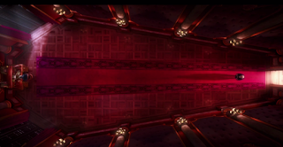


However, color theory is not reserved for live action films. Color plays a huge role in animated features. More often than not, it is an animator's job to give an inanimate object human-like expressions and emotions. It can be quite difficult to make, let's say, a robot look as though it is experiencing wonder. I recently stumbled upon this fantastic video that takes the most colorful scenes from Pixar movies and organizes them according to ROYGBIV, that is, the colors of the rainbow.
Here's the video I'm referencing: Pixar Supercut
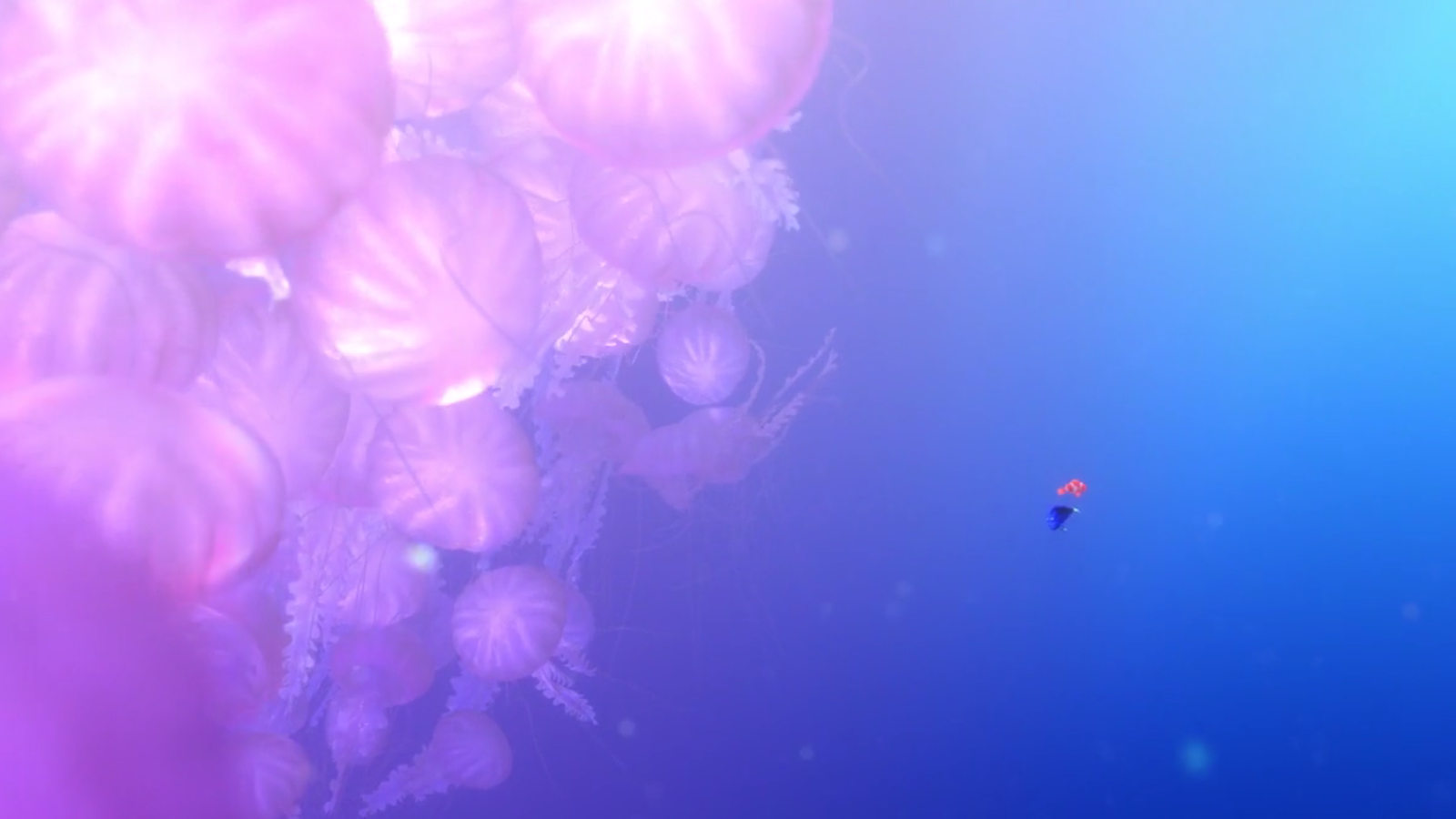
If you know anything about color theory you'll be able to tell how each color affects each scene in the movie. For the still frames below, the emotion or state that the color represents is listed:


Saturday, February 18, 2012
Color Theory Resources
Arturo brought up the importance of understanding colors and how to use them so I thought I'd share my favorite color study materials.
Here's a link to a great tutorial for how to use color and light, it's great because it uses an image with different colors and lighting in each example, making concepts easier to understand.

The following is a great quick reference for colors and concepts like analogous, contrast, and complementing colors.


Here's a link to a great tutorial for how to use color and light, it's great because it uses an image with different colors and lighting in each example, making concepts easier to understand.
The following is a great quick reference for colors and concepts like analogous, contrast, and complementing colors.

This is a link to my most favorite color resource, it gives fun and in-depth explanations on a lot of topics in color theory. Plus, it's explained with Pokémon and Pokémon are awesome.
I also thought the following would also be nice to share, it's an infographic about the psychology of colors and how they're used in advertising.
Subscribe to:
Posts
(
Atom
)