Hey guys,
So, since I'm a second semester senior the time for reel making and selling my soul to the industry is quickly approaching. Over the past couple of weeks I have been working on designing a motion graphic with my name and contact information to go at the end of my reel. While I have already spent a lot of time working on it and have put this current version up with my reel on Vimeo, I still feel like it can be much better. I'm specifically worried that the colors and the font may be a little too bubbly for a reel, even if it does accurately reflect my personality haha. So, since I'm strapped for inspiration on how to make it better at the moment I thought I'd ask you all for advice. I'd honestly appreciate any opinions or suggestions any of you might have to offer. I will post the graphic here, just keep in mind that the music may sound weird since it is cut off from the rest of the reel.
You may notice in the graphic that there is a reflection underneath my name. I actually created this using a free plug in that I downloaded from Video Copilot. It is a pretty cool and also extremely useful plug in so I figured I would paste the link here so that you all could download it too if you are interested.
Click here to watch the video or download the files!
Tuesday, February 28, 2012
Monday, February 27, 2012
More CG shorts
This is another one of those awesome "created entirely in CG" clips. I love the absence of any live footage and can't fathom how much work goes into stuff like this...not to mention render time for such complex stuff even on nice hardware!
This one is definitely sci-fi themed but the shot that blows my mind is the reel to reel recorder. It just looks infallibly real, as if it were simply a well-lit live shot.
One thing I'd like to play with is depth of field, like in the shot that seems to be of a keyhole-looking object. Are there any good plugins that create nice, realistic depth of field blur like that? Also, this seems to be yet another really high-end film out of Spain.
One thing I'd like to play with is depth of field, like in the shot that seems to be of a keyhole-looking object. Are there any good plugins that create nice, realistic depth of field blur like that? Also, this seems to be yet another really high-end film out of Spain.
I Messed Up
Today begins a new tradition, doing my blog post on Monday. Twice now I have forgotten to do my post on Saturday due to a blur of other things going on. Forgetting to do my blog post added insult to injury when I received some bad news that I wouldn't be able to get a rifle for my first project. Maybe I will return to that idea in the future but for now I will need to pursue something else. Musically I'm all set, I will be using an instrumental created by a friend from Boston. For my project I will now be creating a production company introduction, I am currently scouring YouTube for a little inspiration here and there. An intro graphic for Skydance Productions stuck in my mind after seeing Mission Impossible 4.
Sunday, February 26, 2012
Youtube My Facebook
I found this cool project on vimeo. This would be great to use as a commercial for facebook. I figured I would post this video because it reminded me of our classes about motion tracking.
I also found a tutorial to create light streaks with particles. This guys does some really great tutorials, and he explains everything so you will learn what everything is actually doing. CHECK IT OUT
Motion Graphics in "Being Elmo"
So this post is coming a little late for this week, I completely forgot to post yesterday evening. Mostly because I got caught up in watching the documentary Being Elmo: A Puppeteers Journey, which turned out to be perfect material for discussion on this blog. First, let me start off by saying if you haven't seen this doc than I would definitely suggest adding it to your Netflix instant queue. For anyone who watched Sesame Street as a child this film is an absolutely incredible and touching look into what it takes to be a puppeteer, specifically the man behind Elmo and his journey to success. The documentary tells the story of how Kevin Clash came to be the genius behind Elmo and several other Sesame Street characters. Lucky for the filmmakers, Kevin had a plethora of home videos of himself as a budding puppeteer in his teens. This made it possible for almost all of the documentary to be made up of video. What I thought was really smart and the reason I am posting about this film is what the filmmakers did when they did not have video provided by Kevin or filmed by themselves to use. Any time they decided to show a photograph to go along with the narration they made the photograph 3D, adding a slight movement of camera so that their audience did not feel as if they were looking at a static image. You can see them using this technique even in the trailer, posted below.
I thought that this was a really intelligent way of using such a simple effect to keep the film "alive." While I have always thought the concept of turning still images into 3D images in After Effects is pretty cool (I'm basing my first project off of the concept), Being Elmo proved to me that there was an extremely practical way to use the technique. In a way you could almost say that it's the Ken
Burns effect for the 21st century. To me, Being Elmo is evidence that motion graphics animation is a tool that we will see more and more documentary filmmakers embracing to help tell their stories over the next few years.
Day & Night
I've been really interested in masking lately because we do it a lot in class and I'm planning to do some for my project. I started to think about some good examples of masking that I could study and I remembered this one short from Pixar called Day and Night. It's actually one of my favorite Pixar shorts because I find the premise really touching and well done. The short makes fantastic use of 2D hand-drawn animation to mask 3D animated scenes. I actually feel this is something that could be relatively easy to do as well, at least in regards to using 2D animations to mask other things. Check out the short below plus a fun how-they-did-it video.
Academy Awards
Ironically, when I began searching for "oscars graphics" -- I found so many personal graphics reels from animators, named Oscar. This first one by Oscar Nofre created these animations all via After Effects. At :35. you can see the motion blur effect very present. At 1:47 you can VERY QUICKLY see the mask outline and opacity decrease. Overall, this fast-moving + up-beat + high intensity reel is so cool and it just shows that everyone and anyone can learn motion graphics and greatly develop skills to become this skilled.
Another non-Academy Awards "oscars graphics" reel is one by Oscar Garza. This producer seems to have worked at an NBC affiliate station, KXAN, and created their graphics. It seems like these kinds of images and animations are so simple, with basic vector movements and keyframes -- as if we could make have made something similar the third day of class!
Now onto the actual Academy Awards -- some real Oscar animation. I was slightly surprised when I could not find that many open or close animations. This featured one, from 2010 // the 82nd Awards, is great because it explores many lens flare effects and simple typing text that transitions into a bevy of film titles and numerous layers moving in and out
s
Saturday, February 25, 2012
Black Sheep Films
As I was searching this weekend for interesting videos on the Internet, I came across a video which required a large amount of work and effort in After Effects. The video is called, "Buenos Aires-Inception Park," and it was created by a film production company called Black Sheep Films. This particular video was directed by Fernando Livshitz was managed to pull off this amazing illusion of having an amusement park actually operating inside the center of Buenos Aires. The video itself if really quit an interesting concept and pretty cool to watch as well. However while watching this film I couldn't help but think, especially after all the time and effort we put into doing our small class projects, how time consuming a project like this takes. In addition, I look at many of the comments on the video to see what other viewers said and how they believed the video was made. Many individuals said there was most likely the use of masking, silhouette shadows, motion blurs, and numerous other effects used to make this possible. Well, overall thought this was a very interesting and unique piece. It is definitely worth watching!
Buenos Aires - Inception Park from Black Sheep Films on Vimeo.
In addition, even though I believe this is a Spanish film company and most of their website is in Spanish, I have attached the link to the site just in case you would like to check out some more of Black Sheep Films videos and director, Fernando Livshitz's various works done through After Effects:
http://www.bsfilms.com.ar/Bsfilms/Black_Sheep_Films_-_Fernando_Livschitz.html
Creating 3D Text within AE
After Effects is a great program for compositing and 'effecting' material. Unfortunately it is not designed to generate detailed subject matter such as 3D text, which is something I need for my latest project. However there are ways of doing it. As I do not own and am not fluent in any 3D programs I have been doing a little research to find out how it can be done solely in After Effects. I came up with two basic methods that seem to be the most practical. One, linked below (top) simply involves layering text into the Z axis and pre-composing it. This method is the simplest and fairly easy to manipulate to you will!
The second method (bottom) involves extruding the text using the effect Shatter. However when you do this (unless you want your text to shatter) you must go into your physics and force settings and bring everything down to zero. This method gives a nice clean look and makes it easy to add texture to the sides of your 3D text.
What is very nice about both methods is they can be done in After Effects without any external plug-ins necessary.
The first video, though I was not able to embed it for you, has a link to download the project files in case you want to play around with them right away.
Layered 3D Text
The second video is nice because it shows you both how to create the 3D text and how to apply the custom texture to it. It is more complex, but it allows you to manipulate much more about your text.
Shine
Ever since watching the interview with Michael Riley from Shine, I have been thinking a lot about design companies and what they do. I went onto the Shine webpage, and saw that they do so much stuff. They have made title sequences for so many TV shows and films, but they also do commercials and branding.
But what I found most interesting is that they don't have just one style. When we looked at Saul Bass, we saw that he had a very unique style, one that is often imitated. But Shine isn't like that. Watching their different projects on their website, one would never be able to guess that they were created by the same company.
We already saw the "Gattaca" and "The Back-Up Plan" titles in the interview, but here are a few more
The "Modern Family" title is much simpler than the ones for the films.
The "Criminal Minds" sequence combines images from the show with mugshots and article clippings from real life serial criminals
Next to each of the videos, it also tells a little something about coming up with the idea for the project or what the client had to say about the company.
Friday, February 24, 2012
Influences
Saul Bass, who never went to college, described himself as "a subway scholar", as told by his daughter Jennifer, he read voraciously during his long subway trips from Brooklyn to Midtown Manhattan, "soaking up a wide array of imagery, from comic books and films to magazine covers."(1)
In one of his bookstore browsing trips, he discovered György Kepes's Language of Vision (1944), a book of student exercises by Hungarian artist and designer who had worked in Germany with Bauhaus teacher László Moholy-Nagy. Reading the blurb on the book cover he discovered to his amazement that Kepes was teaching at the Brooklyn College. Needless to say he enrolled immediately.


These are a couple of examples of György Kepes work as a photographer, clearly showing the influence of László Moholy-Nagy.


László Moholy-Nagy
Saul greatly admired the work of the surrealists, particularly Magritte, and also the work of Man Ray, Paul Rand, whom we have discussed in class, and Cassandre, all of whom were mentioned in Kepes's book.

Magritte's "The Son of Man"
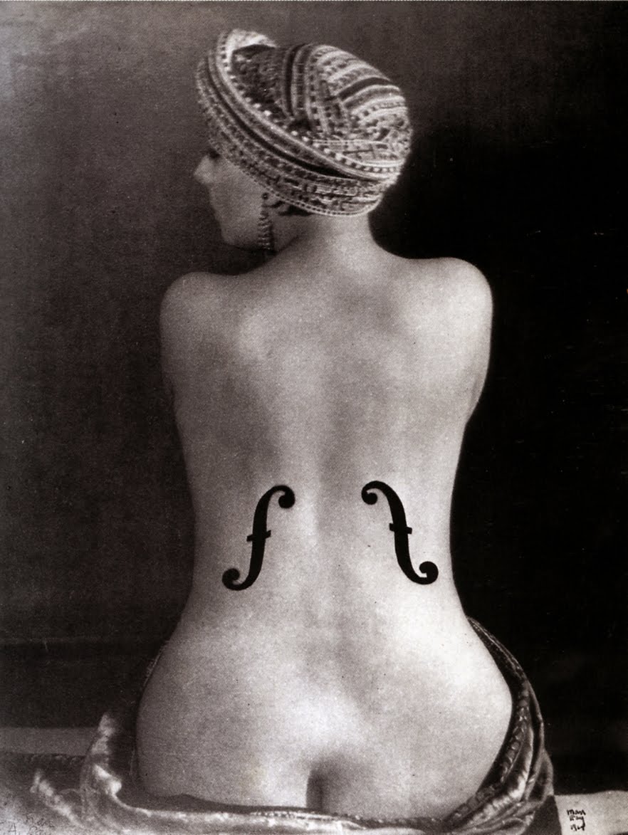
Man Ray's "Ingre's Violin"
A short motion graphics piece using the works of Cassandre, created in After Effects as you can probably see.
(1) From Saul Bass, A Life in Film & Design, by Jennifer Bass & Pat Kirkham, Laurence King Publishing, 2011
History of Title Design
I noticed a lot of people in our class are doing projects inspired by titles they've seen in movies. Good titles are really memorable so it's a really good thing to learn how to do well. I'm also interested in titles and I came across this video that shows the history of titles in the media.
One thing that's cool about this video is that you can see how certain titles influenced others. Saul Bass' influence is noticeable as well as the Se7en titles. Towards the end the variety in titles and the creativity is incredible.
It's worth watching if you're interested in title design.
A Brief History of Title Design from Ian Albinson on Vimeo.
Look Around
So my favorite band is the Red Hot Chili Peppers and I was checking out one of the music videos from their newest album. The song is called Look Around. All four members of the band are in different rooms jamming and doing different things and the camera kind of cycles in between them. There is also a lot of movement within the frame, and the band members even go in between the rooms. I thought it was a really interesting concept for the video but I wasn't exactly sure how they pulled it off.
Luckily I also found a behind the scenes clip of how the video was shot to help answer my questions. They used 4 different 5k red cameras so they could get a full 360 degree look. I thought the coolest part was that the cameras were all interconnected so the band members all in separate rooms could perform at the same time and have it be stitched together in post. Also since the Red cameras shoot in 5k, they could zoom into the shots digitally and not lose quality. Really cool stuff. Here's the behind the scenes video too!
Juno Title Sequence
In spite of learning about and watching different title sequences I thought I would look at different titles to see which ones I liked. That is when I remembered about the move Juno. The title sequence for Juno was done in a very clever way. Juno is one of my most favorite movies and when I saw the film in the movie theater I realized it was the title sequence that immediately drew me into this film. As the frame changes from a real life picture to a cartoon drawing and back again was a very cool way to show Juno and set the mood for the entire movie. I hope you enjoy this video as much as I did.
Thursday, February 23, 2012
Project One
I was looking through some tutorials that I might be using in my first project (explosions and turning photos from 2D into 3D). I found some that I think would be very useful. The first one doesn't tell you how to create an explosion but it includes a zip file that you can just import into your project and it tells you how to size it up and place it where it will fit best.
This video copilot tutorial (that someone may have posted before) shows how to layer photos to make them seem like they are in 3D. I was hoping to create the credits for the actors in the movie by taking images of them and creating a 3D image from the 2D stills. Here is another tutorial on how to do this, I didn't watch through the whole thing but it seems like an alternate way to create this using displacement maps.
Another thing I wanted to try (hopefully not adding too much work for myself) would be to create shapes in Photoshop and then animate them in after effects. Since it is a war movie, I wanted to use these shapes when I bring out the title (show the title of the film and then have them either drop down). I've made more then one storyboard so I just have to decide which one to use. Either having solid colored parachutes drop down or maybe creating a gun from a template and having the title come from that.
Monday, February 20, 2012
Typography project
Can we do one of these in class? They seem fairly simple (depending on how complex you get with it) and they look awesome. I have seen several of these on Youtube, mostly doing quotes from movies. There is a lot of potential to make this kind of project unique, as you can pretty much do anything you want with them in AE. Some of the more simple ones just involved zipping around form word to word as they are said, varying the size of the word to emphasize or unemphasize (is that a word?) its importance. The really good ones, like the Anchorman one above and the Inception one below, translate the emotions and feelings coming from the words and express them through the fonts and other images. The Inception one is cool because it uses a lot of actual animation of the images.
Saturday, February 18, 2012
Color Theory Resources
Arturo brought up the importance of understanding colors and how to use them so I thought I'd share my favorite color study materials.
Here's a link to a great tutorial for how to use color and light, it's great because it uses an image with different colors and lighting in each example, making concepts easier to understand.

The following is a great quick reference for colors and concepts like analogous, contrast, and complementing colors.


Here's a link to a great tutorial for how to use color and light, it's great because it uses an image with different colors and lighting in each example, making concepts easier to understand.
The following is a great quick reference for colors and concepts like analogous, contrast, and complementing colors.

This is a link to my most favorite color resource, it gives fun and in-depth explanations on a lot of topics in color theory. Plus, it's explained with Pokémon and Pokémon are awesome.
I also thought the following would also be nice to share, it's an infographic about the psychology of colors and how they're used in advertising.
Catch Me If You Can
In the past week's class we have been talking about and looking at the website "Forget the Film, Watch the Title," after browsing this website for a while and checking out the various title sequences that were present on the site, I decided to look for similar sequences in various types of media I watch. Two days ago I watched "Catch Me If You Can" with my roommates and was really intrigued by the opening credits. It seems to be simple but very interesting and unique. Many individuals have referenced this title as being inspired by Saul Bass, who was a graphic designer and filmmaker, best known for his design of film poster and motion picture title sequences. One fascinating aspect was that the characters went for a "stamp-style" animation, in which stamps were actually used to generate the characters. I also would like to know how exactly the did certain aspects of the animation, such as the light bulbs turning on and the character appearing there. Also when the plane flies across and the "me" looks almost like a cloud. This opening credit sequence was created by Nexus Productions. Here's the opening title, so check it out, and enjoy!
Monsters Inc.
I was trying to think of a project idea when I remembered the introduction to Monsters Inc. It is one of my favorite movies and I think it would be fun to try and replicate what they did in the title sequence. Watching it, I feel that I know how to accomplish a large portion of the animations excluding a couple of more advanced ones. It is perfect because it is mainly simple shapes moving through space and synchronized with the music. This project is also great because it will give me a chance to go through all the effects that After Effects has to offer and get a grasp of what they all do.
My Favorite Title Sequence
In class the other day, we were talking about how title sequences and the entire time, I was thinking about my favorite one. I have always loved the title sequence for "The Partridge Family". I have no idea why, I honestly am not sure I have ever even seen an episode of that show, but it really sticks out in my mind. It is such a simple animation, with the black background and the mostly white birds, but it works really well for the style of the show. But I think that the designer was successful in creating an iconic animation. Almost anyone who has seen the show can you that the credits have birds walking across the screen to "Come On Get Happy" and I think that creating something that memorable is what we are all trying to achieve.
Teen Titans Intro
So as a kid I watched a lot of cartoons. One thing I loved about them were the theme songs. It always got me excited for the show. One title sequence in particular I always though was really cool, the intro to Teen Titans.
So I went back and looked at this sequence again. It impresses me even more now. The use of color is extremely important in the sequence. Each one of the characters has a specific color that is associated with them. The colors get repeated throughout the opening and signal to the audience what characters are being talked about. The thing that I find really cool is how the words Teen Titans are constantly manipulated throughout the open. Every shot is working within the context of one of the letters. The transitions between the shots are matched with the music and are all involving the letters in some way. Making the open one fluid piece that just continually transitions is so cool and must have taken a ton of planning. Not only was Teen Titans a great cartoon, this opening is amazing.
Friday, February 17, 2012
Paul Rand
I found some cool things about Paul Rand that related to the videos we watched in class. This article explains his process when he was designing the UPS logo among other things. Here's the part that discusses UPS:

The quotes from Rand really give you a feel for what he was like and how he worked. He seems like an interesting guy and has a lot of good tips for logo design, and design in general. Another article describes his presentation method and how Steve Jobs reacted to it when being pitched the NeXT logo. Here's the section on that:
Here is an image from Rand's NeXT booklet and the final logo:


For UPS his challenge was to transform the out-of-date shield into a modern image. He streamlined the contours, used a lower case letter and placed a simple drawing of a package on the top of the shield. “I didn’t try anything else,” Rand admitted.
“If you show them more than two ideas” Rand would say, “you weaken your position. (...) You make one statement, and this is it”. This doesn’t mean Rand’s ideas always came floating, He often made fifty sketches before showing one. “If you think it comes easily, it’s not easy. I can solve any problem in the world, but it does not always come instantly.” But very often the first idea that came into his mind was the solution.
The quotes from Rand really give you a feel for what he was like and how he worked. He seems like an interesting guy and has a lot of good tips for logo design, and design in general. Another article describes his presentation method and how Steve Jobs reacted to it when being pitched the NeXT logo. Here's the section on that:
Amusing is Rand's brash presentation style. He usually gave corporate chiefs only one logo to "choose" from, accompanied by a booklet explaining why his design was not merely attractive, but inevitable. "I was convinced that each typographic example on the first few pages was the final logo design," Steve Jobs recalls of Rand's book for NeXT, which showed the four letters, then paired them with the computer's signature black box, and then arranged them in a square. Jobs thought he was getting lovely typography, but Rand's final logo was more than that. "I was not quite sure what Paul was doing until I reached the end. And at that moment I knew we had a solution... Rand gave us a jewel, which in retrospect seems so obvious."
Here is an image from Rand's NeXT booklet and the final logo:
Stop Motion WITH PAINT
I have come by a few pieces from BLU when i have been stumbling and was excited to see that he created a new one. This one was created in Argentina, Uruguay. I was searching all over to try and find out how long these projects, but was unsuccessful. I can only imagine that this must take months to paint and produce. This takes dedication. Enjoy!
Check out more of his art HERE
Thursday, February 16, 2012
a short love story
This is an interesting video about a little girl daydreaming about her own love story. The short film begins in black and white with the birds from the girls picture flying around the screen. Then when the video begins to focus on the girl and her story the claymation turns to color. I liked that as the story progresses the color becomes more vibrant as her love grows. It is shot in 3-D but the picture the girl is drawing is one dimensional and that in the end the picture that has been the focus of the video ends up showing the two "lovebirds" as stick figures.
The Story of Stuff

The Story of Stuff is an environmental movement that educates people on the issues through animated shorts. The short movies are about things such as drinking bottled water vs tap or what happens to electronics after we throw them away. They range from about 8 minutes to 20 minutes and are entirely animated (with the exception of the narrator). Since these videos are a little long and the topic doesn't necessarily grab the audience's attention, I think the animation keeps you more focused and interested in what they are trying to say. They are overly simplistic, from the information to the animations, which is helpful for people because it presents the problem in a comprehensive way.
The animations were made using photoshop and flash but I think something similar could be made using after effects, but it might have a less cartoonish feel to it.
Freerange was the company that produces the films and in their case study, they show how they created the simple design and applied to everything related to the project. So the concept of The Story of Stuff is now recognizable by the sketch design and animation.
MoGraph Festival
This is the promo for the Motion Graphics Festival 2008 and I loved the style and beat of it. I feel that the form meets the content very well in this piece and portrays a lovely irony. I also found it very fitting as it is obviously a nod to Kyle Cooper's work which was just covered in class. The Motion Graphics Festival is a festival based out of Chicago that showcases a large number and variety of motion graphics work that is definitely worth a look.
Motion Graphics Festival 2008 from Psymbolic on Vimeo.
This promo was done by Lift Motion Design (LiftMotion.com). They do a lot of commercials, (5 gum commercials, and Geico) as well as the type of fast moving, heavy impact animated graphics for sports shows like ESPN.
5 Gum - Lush from LIFT MOTION DESIGN on Vimeo.
Race to March Madness from LIFT MOTION DESIGN on Vimeo.
Project Idea
For my project, I plan on creating a funny animation on how the apple was decided on the logo of Apple Computers -- not an orange or banana or some other fruit // I have not decided yet.
In this below video, the "Video Graphics" comes falling from the sky and crushes out everything in the screen. Instead of the text, I plan to recreate the Apple logo -- crushing another fruit ... then bouncing onto a Mac or iPad or something (again that I plan to design and recreate) where it regularly rests on said products.
I think I could face a few different problems -- mainly the design and also the audio linkage. For the design, recreating an Apple product will probably the be toughest because there are so many details and finite specifics to a product -- even though it is a simple animation, I still would like to get the design mastered as effeciently as possible! In regards to the audio, bouncing items usually make squeaky noises and finding / syncing this said audio to the bounces could be challenging because I am going to need to find the best sounding audio and accurately link it and fade it -- so it actually sounds good, isn't simply present
Wednesday, February 15, 2012
Happy Belated Valentine's Day
Love Birds from Francine Price on Vimeo.
I thought I'd post my little valentine's day project here in case any of you wanted to check it out. The quality of the video isn't very high but I think that has to do with all of the information that's in the AE file. I'm sure there is a much simpler way of doing what I did that would help the resolution a lot but
I'm still pretty proud of what I made. It's a silly little animation but it was great to be able to mess around with cameras a little with this project. I took Topics in 3D last semester, where we learned Maya. Navigating cameras in that program is extremely difficult and much more tedious than it is to do in After Effects. It think this has a lot to do with the more user friendly interface After Effect has. In Maya it is difficult to move the camera around while looking through the camera view. In After Effects you can use the sliders under camera position and point of interest position to move your camera as you look through it's view in the composition. Another huge advantage AE has over Maya is that you can do a Ram preview that is much more accurate to the final product. You can preview in Maya as well but is often not as accurate. I think that the clouds in the piece are the worst resolution. This is probably because they are an image that I took off of Google and then changed the color in Photoshop. If I were to do this project over I would probably increase the resolution of the clouds in Photoshop first to improve the quality.
Sunday, February 12, 2012
100 years of SFX
This video shows an overview of special effects in films since 1900. It is nuts to see how far visual effects have come over the past 100 years. One of the very first clips involves nothing more than camera work and smart editing, and the last clip shows the aging process of Brad Pitt in Benjamin Button. Some of the other cooler parts are Who Framed Roger Rabbit, Star Wars, and Pirates of the Caribbean. A lot of the comments on this video were people asking why the Matrix and Avatar weren't included, and I agree. Both were very groundbreaking and have remarkable special effects.
ESPN "Numbers Never Lie"
In this past week's class we spoke about the "Write-On" effect and we had to incorporate a pen or hand into our animation. However I came across this video, which reminded me of this effect, even though it is slightly different, and I was really interested in seeing how the creators went about doing this. This video was created by ESPN but is similar to the work done by a company called Ydraw who generate scribing videos which are clean artistic, clean, and extremely detailed.
This ESPN Whiteboard Animation consists of a hand drawn video that takes the viewer through the process of the drawing and creating of an artist's work in fast time. However within the drawing there are two parts in which one of the drawings winks and the other one has the characters move there body and heads. I wondered how they pulled this effect off especially since it is made to seem as though the entire animation is just a sped up version of the artist drawing. I wondered how did this animation and maybe it smooth and flowing from one drawing to the next. It is really cool to see stuff we learn in class in all different types of videos and be able to point them out.
Here is the video:
Augmented Reality
So in researching a project for another class I came across this new technology being developed by Qualcomm called Vuforia. It is an augmented reality interface that allows you to use a camera on your phone or another device to look at an object and get real time instruction on how to use said object. One of the employees likened it to Google Maps turn by turn directions but for real life applications. The applications of this technology would be endless. It could be used to give after effects tutorials as one example. I am definitely interested in the interface though. In the video they point the phone at a desk phone and get taught how to make a conference call. The software recognizes the phone and highlights the buttons you need to press in order for it to work. This could be produced for larger scale things in the future and the possibilities are endless.
No Ad: New York
Many are familiar with Morgan Spurlock because of his hit documentary, Super Size Me. He's worked on a number of great projects since that film but one of my favorites happened to be very similar to something we covered in class the other day. When using After Effects to change billboards in New York City's Time Square, I immediately thought of No Ad: New York, Spurlock's project against visual pollution in NYC.


Spurlock, however, takes a different approach to removing ads than we did. Instead of using a program like After Effects, he crowd-sources his project with the help of Aviary, an online photo and graphic editing suite. For this project, a panoramic image of NYC has been divided into many frames that can be individually edited. Anyone who visits the site can select a frame and edit it using Aviary's Photoshop-like software. The goal is to have visitors cover up the ads in all the frames to remove Times Square of its visual pollution.
It's disappointing to see this project still incomplete, especially since it was started over two years ago, but hopefully it can be completed soon. After learning how to cover up ads in After Effects using tracking, it seems like a very easy goal to accomplish. I feel the decision to crowd-source internet users to complete the project frame by frame was a bit of an ambitious idea.
Saturday, February 11, 2012
More crazy CG films.
I'm not sure if this one has been posted yet, but this is another video that I look up to. It's one of the best pieces of CG work I've ever seen. It's called The Third & The Seventh, a 12 minute long film created entirely in CG.
I wish I could see some of the work involved in this and how it evolved over time during the production process to result in the final product above. I always feel like I'm figuring AE just fine out by doing the tutorials but it would be so cool to work with project files from films like this to see how it was all done. I have a film idea that I want to produce for the doorknobs that would involve heavy 3D/AE work but it's so intricate that it would take possibly two semesters... It's definitely a goal of mine to be able to make convincing work like this.
Encouraging Winter
This post runs along a very similar topic as
Unfortunately I was unable to embed the video for you, but here is the link to it; it is a fairly short tutorial: Particle Playground: Ice. This will give you an idea what the result looks like:

And now putting it together. The only aspect of the composite done outside of After Effects is the snow on the roof of the saloon, which was painted in Photoshop.
For further details on 3D compositing visit: Video Copilot, or Creative Cow, I know both of them has some superb tutorials on the subject.
TV logo animation
This week, I decided on bringing up live TV After Effects graphics and video. I was watching a hockey game and just watching the commentary (with double boxes, background animation, et al) and various intros / outros, the idea of discussing network animation logos came up!!
There are many different terms for on-screen graphics throughout the news and sports industry -- I am specifically going to talk about intros and logos to major networks. Many images on live TV are created either from video or Chyron, there are so many different aspects of animation and digital non-video pieces we watch while viewing network news or sports.
The below CBS animation was created on Maya and the other two (I assume were AE) ... The reason why I am posting is because although today's animation and 3D images are crazy intensive and glamorous. Yet when we look at these intros, the simplest of vectors and colors are being used on national network broadcasts. We must really think, with all the hype of intense and crazy 3D animation -- why do the major tv channels still rely on basic vectors and and colors for their logos and backgrounds
recent CBS logo animation
recent NBC logo animation
1957 NBC logo animation
ESPN logo animation
Relativity Media Intro
Of all the intro graphics I have seen recently my favorite is Relativity Media's. It begins on some molecules, protons, neutrons and what not spinning around each other. The camera then pulls back through a ton of other material until a spinning Universe like object is seen spinning. You can watch it here.
Since taking Topics in 3D I have always wanted to try and create something like this for myself. Being in Motion Graphics has renewed this urge. I searched on google for "Relativity Media Intro Tutorial" and it brought me to a site filled with a bunch of tutorials. Ballyweg Productions, on the site it has a long list of tutorials that the owner has completed and those that he will do in the near future. On that list of future tutorials is my Relativity Media one.
So last week in class we learned the basics of green screen and color keying and i thought that it would be helpful if i found a tutorial to create shadows. Without shadows, it simply looks like your person or object is floating. This will help you make the object 3D as well. It is another simple tutorial, hope you guys enjoy!
USE THIS LINK if the video does not load.
USE THIS LINK if the video does not load.
The Lorax
I loved Dr. Seuss growing up, so I was pretty excited when I found out that "The Lorax" was being turned into a film. When I first saw the trailer for the first time, I was even more excited, and thought that the animation looked so honest to the world that Dr. Seuss created.
As I was searching for what to write about this week, I found an article in Animation Magazine about making the movie. The producer of the film, Chris Meledanari, talks about the 2 year process that went into the animation process and how they created the world in The Lorax. He compares this animation process to others that the studio made in the past, and how this project was so different from those ones.
Friday, February 10, 2012
Write-on Effect
In class on Wednesday Arturo mentioned how we would start seeing the write-on effect everyone now that we've learned it. While I was watching Motion Graphics videos this week I really did notice the effect.
One of the things I've seen it in is the end credits for the Sherlock Holmes movie that just came out. The animation in these credits is really similar to the exercise we did with creating a piece of paper and animating writing on it.
It's cool to see the things we're learning applied to a professional animation. Here's the full end credits. The effect is most noticeable when it says the title of the film 46 seconds into the video.
Sherlock Holmes : A Game Of Shadows end credits sequence from Danny Yount on Vimeo.
Rotoscoping
After effects is such a great and efficient program it is easy to forget what people had to do before the emergence of computers and these types of software. A man named Max Fleisher was the first to introduce rotoscoping to the animation world in 1914. He would draw on top of a glass panel with film projected onto it in order to trace over every frame of the film. This would give the animation a fluid and realistic motion that no other project could capture. Fleisher used this technique on shows such as "Betty the Boop" and "Poopeye the Sailor." Year 1937 was the beginning of the Walt Disney's rotoscoping milestone when they released "Snow White." This film was groundbreaking because Disney decided to rotoscope some characters while classically animating the others. Since then, there has been many films and television shows that use rotoscoping and it has become a very popular practice. Now, instead of having to trace a movie frame by frame, the advancements in technology allow even us to rotoscope a film.
I have attached a small clip of "Snow White" for you to see the motion differences between Snow White and the dwarves. Snow White was rotoscoped while the dwarves were not.
Thursday, February 9, 2012
Supernatural Opening
Something that is unique about the show Supernatural, is that every season they change the graphics of their opening theme and they match it to the running plot of that season. The show is about two brothers who dedicated their lives to hunting down demons and monsters, and the atmosphere of the show is captured in just a few seconds of their opener. I'm sure very similar aspects of these can be achieved using after effects, but some of them are things we have talked about or gone over. Season 3 is set over fog and clouds, which we have done very basics forms of with the smoke. Another one that involved particles could be season 7 where the name of the show emerges from black material that dissipates into smaller pieces. Similar to season 5, where there is a red liquid that looks like many of the examples from Video Copilots riot gear expansion. It is also really similar to the end credits of Harry Potter and the Half Blood Prince.
We're definitely seeing a lot more opening credits that rely heavily on motion graphics rather then rolling text over live action. Especially the opening for Chuck, shown below.
This is a really interesting article on fanboy.com that chronicles animated opening sequences in television from the 50's through the 70's (it also mentions how Saul Bass played a large part in this television revolution that brought animation to the audiences at home). It says that in the late 1970's, credits began to switch back to live action or just straight animation.
An article in smashing magazine showcases many of the impressive animated credits that have been playing in the last couple of years. Everything from the minimalist title of Lost, to the pop-up book in United States of Tara. While live action seems to work better with comedy, dramas are better paired with animation because it can create a certain mood for the audience and prepare them better for the show without getting distracted.
PES
So I found this really awesome animation by PES:
Western Spaghetti
Western Spaghetti
The animation in this YouTube video is amazing because no one really thinks of the everyday items that were used could come to life. The fact that the animator made household objects that had nothing to do with cooking into cheese, spaghetti, sauce, etc. was genius. My favorite parts were the candy corn flames and when the person uses real knife skills to cut the Rubix cube into little pieces and individual pieces of the cube come apart to be added to the mix . This is definitely a very creative and well thought out way to do animation.
Monday, February 6, 2012
Super Bowl Halftime Show SFX
So, I figured I better write a post about this before someone else steals my idea. I'm sure that many of you watched the Super Bowl last night just as I did. However, I doubt that all of you were as excited for Madonna to perform as I was so there is a chance you may have missed the halftime show. Yes, the show itself was way over the top and Madonna is so clearly too old to be dancing in heels that high. Even if you were completely appalled by how gaudy the performance was (wtf was up with that cheer leading segment anyway?) you can't say you weren't at least a little bit impressed with the graphics that were playing on the stage. The halftime show is just another example of how far animation, especially 3D animation can take you and in how many different ways it can be used. Not only did the graphics looks incredibly crisp and clean, but they were also incredibly realistic. At one point, 2:40 in, I was convinced for a split second that the stage was actually moving up and down when in reality it was just really well done 3D animation. The moment 11:00 minutes in when she is singing her final song is also incredible. Yes, lighting was definitely also a factor in this part but it really did look like they were standing in space. Ok, maybe I'm getting a little too excited about this but just taking into consideration how difficult creating that was blows my mind. Over the past couple of months I have noticed a trend of live productions becoming increasingly more graphics oriented. During this past Thanksgiving break I went to see the Rocketts in NYC. They also incorporated some pretty impressive 3D animation into their scenery. It just goes to show that the demand for animators is only going to get bigger over the next few years.
Sunday, February 5, 2012
Saul Bass
This is another Saul Bass compilation where you can probably find more movies that you have heard about or probably seen. The idea in any case is to detect the influence of this designer in many other title sequences that you can see today.
Saturday, February 4, 2012
UbiArt
I love video games and I've been playing a lot of Rayman Origins recently. I've always been a fan of the Rayman game series but this particular game grabs me with a fantastic art style. This art style is not only unique for the Rayman series but for games in general. "Beautiful" does not even begin to describe the art, just see the trailer below:
I really wanted to learn how the art for the game was created and after some research I came across quite a surprise. Ubisoft, the company behind the Rayman series, actually developed a fantastic new art engine called UbiArt and used it for this game. The story behind UbiArt is even cooler, Ubisoft wanted to create an animation system that can be used with ANY visual source and they succeeded! UbiArt can work with anything from crayons and ink to clay and 3D renderings. The tool primarily works by letting animators import content with ease, add skeletons to their chosen medium, and easily animate by establishing poses the tool then processes into animations. A more technical description was found on the UbiArt blog:
I really wanted to learn how the art for the game was created and after some research I came across quite a surprise. Ubisoft, the company behind the Rayman series, actually developed a fantastic new art engine called UbiArt and used it for this game. The story behind UbiArt is even cooler, Ubisoft wanted to create an animation system that can be used with ANY visual source and they succeeded! UbiArt can work with anything from crayons and ink to clay and 3D renderings. The tool primarily works by letting animators import content with ease, add skeletons to their chosen medium, and easily animate by establishing poses the tool then processes into animations. A more technical description was found on the UbiArt blog:
These next two videos provide great explanations of the UbiArt tool. The first shows some Ubisoft staff collaborating and using UbiArt and the second video has a nice intro to what UbiArt is before cutting to the Rayman Origins game trailer show above."...we use 2D patches to contort sections of the image with a level of complexity that can adapt to the potential needs of the final rendering and the target machine. This technique adapts remarkably well to this type of animation and gives excellent performances in a real-time context."
Face Morphing in Moving Objects
This week I know Auturo spoke about looking at all the various video tutorials on video copilot. However I found my inspiration for this week's blog through a very unexpected source. I am willing to admit that during this weeks episode I was impressed by one of the special effects that occurred during one of the music performances, more specifically Black or White originally done by Michael Jackson. The editors of this episode were inspired by the originally Michael Jackson video to actually morph the faces of the actors into one another as they were singing. I thought this was absolutely crazy and wanted to immediately figure out how they did this or if there was anyway I could simply replicate this effect in After Effects. Here is the link to the video unfortunately I couldn't get a shorten version but if you want to skip right to the special effect it starts at 1:42:
After looking up all different information on how to actually how to do this animation I found out that the editors most likely used an additional effect in after effects known as RE: Flex Morph which always you to take two different moving objects and morph between the two. I found this really interesting and found a simple tutorial that gives step-by-step introductions on how to create this effect. In my upcoming projects I am extremely interested in incorporating this effect and seeing if I can complete it as effectively as the editors of Glee. Here is the tutorial for the effect and a link to morph still images into various objects such as other people, animals, etc:
This is the link as well:
http://library.creativecow.net/articles/zwar_chris/morph.php
Super Bowl Commercials
Since it is Super Bowl weekend and many people love watching the commercials, I thought I'd post a few new ones (that have "leaked" or been released already by the company) and old ones! Over the past two decades, graphics and animation have visually changed but the principle + usage of them have stayed the same = enhancing and improving the aesthetics of said commercials.
I have included three different commercials (1992 7-Up and 2012 Chevy are said to be Super Bowl commercials ... 1993 Chevy was only one I thought was useful). They are are not necessarily the best commercials, but I chose them because I thought there were some good(ish) examples in them!
Diet 7-Up 1992 = this Super Bowl commercial is completely created on vectors, shapes, and motion graphics. From the animated circle men, 7-Up liquid flowing, and human hand movement in the end, the whole commercial is created or enhanced by the industry-leading software (at that time). Watch it on YouTube
Chevy 1993 -- these graphics are very subtle and simple ... I had to watch this a few times to notice the actual graphic changes / After Effects (or a other program). I might be seeing it wrong, and all the supposed graphics are just simple non-linear edits. Watch it on YouTube
Chevy 2012 -- 20 years after the shown 7-Up commercial, graphics and animation editing technology have improved. Now we can ultimately create a whole new 3D, interactive, and unique world. This "2012 Mayan Apocalypse" world is most likely created via After Effects or other 3D video creation program. Unfortunately there was no "behind the scenes" or "making of" videos yet, but I would assume that they had the humans and Chevy vehicles in front of a green screen for x number of takes and then keyed in the fiery, hell, disheveled scene. Watch it on YouTube
Particular Text
Text, particles, parenting layers, expressions... Why not all at once?
I was browsing through various videos and tutorials on YouTube, Google and Video Copilot searching for something that was both interesting and applicable. Fortunately I stumbled across Speed Particles at Video Copilot. It essentially combines everything we have learned in class so far, and goes into more specific detail on the manipulations that can be done to particles. It provides a good example of the usefulness of parenting layers and also introduces a way of working with expressions that I know we will be working with in class later: an if-then-else formula.
What Andrew Kramer creates in this tutorial is a very cool effect that is not that difficult to understand or to make. As with anything in After Effects, it could have countless unique and explosive variations by simply tweaking properties of the existing layers and effects!
Subscribe to:
Posts
(
Atom
)