Ian Fleming's 007 - James Bond has been around for a long time, at this point. Numerous films with different actors took on the role of Bond, the suave, yet cold-hearted killer loyal to his mother country. In Martin Campbell's 2006 hit film "Casino Royale", Daniel Craig takes on the role of Bond for the first time. The title sequence starts out with the iconic "looking down the sights" shot, with Bond in the crosshair, shooting his would-be killer, blood pouring down the screen.
As the title sequence continues, royal and regal colors fill the screen, accompanied by references to casino games, such as poker and roulette. Everything on screen is replaced with these symbols, and even the characters are just silhouettes made up of clubs, spades, hearts, and diamonds. (When they are "killed", they disintegrate into their respective suit.) It's very cool looking, and it flows well with the theme of the movie. (That being high stakes casino games accompanied by the usual Jame Bonds-esq. fare, e.g. killing the bad guy.)
Once in a while, a woman's face appears in one of the cross hairs. This woman plays an important part in the movie, and it is foreshadowed here.
The music reflects the theme of the movie well, too. All around on screen, people appear to be dying, killed by suits from cards, while the music says "arm yourself because no one else here will save you, the odds will betray you and I will replace you". This is interesting, particularly because this is Daniel Craig's first movie as James Bond, and it reflects how operatives and agents are replaced if they get sloppy. It's all very 007'y, and it's no surprise that this title sequence (and movie) are a fan favorite.
http://www.youtube.com/watch?v=UXjS0pjPscw
(for some reason blogger won't let me embed this)
So my post from last week got me interested in looking at video game title sequences (the few that there are) and how they differ in structure from more traditional film title sequences. They deal with an obvious structural problem, games are expected to be interactive, and title sequences draw upon film in that they are clearly not. So, last week I talked about how the title sequence in The Last Of Us had other utility in that it was useful for the story. This week I want to talk about the title sequence from "God of War 3", published by sony. Again, this is one of the few video games that has a title sequence in the first place, but the title sequence here is useful for another reason, it artfully fills in the "previously on" sequence. Almost every tv show will include a "Previously on" segment including information that the viewer will need to understand the story. So is the case with video games, this type of information fill is fairly common, especially when the gaps between sequential games can be years, programmers find it useful to fill in the player with backstory if they didn't play the earlier games, or remind previous players what happened.
So first I want to talk about this title sequence specifically for its art style, because it is so incredibly striking. It looks like it is a painting from a greek pot or sculpture, which fits in with the mythology of the game. The background texture is incredibly detailed and cool, and the characters are appear as mostly psedo 2d and 3d cutouts on a 2d background, with some drop shadow to give dimension. Also, the use of lighting is incredible, especially at the beginning, to emulate a forge. Some interesting particle effects are used as well to transition between events.
One thing that I want to focus on however is the fact that this title sequence serves another purpose. The things that are animated are events that happened in previous games. It fills in the gaps that the player may or may not have, artfully, avoiding the simple "previously on" sequence that every media viewer in the world is tired of. I find it really cool in both the cases of The Last of Us and with God of War that the game makers decide to use a title sequence to make their game more "cinematic", as many games try to be, but also work to give this sequence extra utility. This title sequence passively fills in the viewer on the backstory of the world, without getting so much in the way, and still being entertaining and interesting to watch
With my last post I found some retro graphical intros for various production companies, and with my latest post, I'm continuing with that trend. This video is the 1998 NBA finals intro for NBC but what I really like is how such a short simple graphic can become so iconic. What might have taken ages to render in 1998 can easily be done on any Macbook Pro now with programs like after effects. The entire sequence was made of simple titles and shapes in order to make the logo, and graphics. There were even simple particle effects when the basketball enters the scene, I enjoy watching video's like this as they are much easier to break down when compared to modern graphics. Anyway I hope you watch this video and enjoy the simple sequence that draws so many memories for many people who were watching this iconic game.
After our latest class I got really excited about how to create compelling visual pieces that follow music. Music, as we know, is an experience made entirely for the ears. It's beautiful like that, because we can focus on just one of our senses. Music videos are nice, but much less of our attention is on the music. With motion graphics that follow the sounds of music, I believe it actually enhances our attention to it. Every beat, lick, and slide we can not only hear, but see. There was a TED Talk I saw recently (which I'm having trouble finding right now... I'll post it later if I can.) which explained how we experience thing better if it engages more of our senses. They used sex as an example, because it engages pretty much all of the senses. Now, I'm not going to compare these motion graphic videos to sex... but it's a very similar idea. These videos are engaging more of our senses!
What I really wanted to show you is this video I saw a while back. It was made to James Blake's song, "Limit to Your Love".
BEFORE YOU PALY IT, please be aware that the audio will not play properly if you listen to it right out of your laptop. The bass is at such a low frequency that most MacBooks can't handle it. I highly recommend plugging in a sound system or some nice headphones to get the full experience. And without further adieu:
I thought this was a perfect example of how visuals can increase a song's experience. When I first watched this video I said "Wow... that's really cool." Now, I watch this video and say "HOW DID THEY DO THAT? I MUST KNOW." It seems very doable yet incredibly complex at the same time. I think I have a long way to go before I can do anything like this... but I'm excited for when I do get to that point.
EDIT:
I just learned that the original song was by Leslie Feist, and I'm a fan of giving credit where it's due so make sure you check out the original!
(Although, sorry Feist, I kind of like James Blake's version better. Maybe that's just my unnatural teenage mind.)
I recently watched Blue Valentine for the second time and although the movie had one of the most heartbreaking and intense endings I've ever seen, I enjoyed and thought of motion graphics during the end credits sequence. The shots of the fireworks work great with the emotional stills from the movie and the music syncs up perfectly with the fireworks and shadows created on the still images. Jim Helton and Charles Christopher Rubino were given the ultimatum to use a Grizzly Bear song and received footage from fireworks in Scranton, PA from the director. The end title sequence captures emotion through shadows, light, intense colors, and a powerful song. The movie was extremely powerful and captivating and this end sequence embodies the entirety of the movie. The use of field footage and effects with still images works great and I plan to create something with footage that I've captured outside of the realm of after effects. I think that this title sequence is technically not as advanced as many animated title sequences but appropriate for the movie and very powerful.
This week I decided to look at some audio visualization videos, because of what we did in class on Thursday. I think audio visualization is a really interesting art form for a few reasons. The main reason I think that is because audio visualization is a really weird and complex blend of both random and calculated factors. You have the ability to control what you want the audio to control and how you want it to be controlled, but you don't really know what the final product will be. this can and does lead to a lot of unique art. The first video accompanying this post contains some clips from some different audio visualizations. I think some of these are really neat, the third one in particular. The first one is a really good example of how you can mesh controlled and non controlled factors.
This next video is another example of intricate and varied art of this kind can be. It's also a really cool blend of controlled and "randomized" factors. I really liked this video because it doesn't really rely on colors as much as other audio visualizers do. The shapes and shadows are also a really cool aspect of this video.
Working on animations that are controlled by mapping the amplitude of a sound clip made me think about how else mapping could be used. After seeing the video in class and hearing Arturo mention that different projections are commonly seen in Europe on the sides of buildings, I wanted to read up about this phenomenon.
Searching around the Internet, I stumbled across an artist named Doug Aitken who is currently heading up an art project where a train travels across the United States and stops in nine different stations, bringing music, video, projections, and all forms of art to each stop, starting in NYC and ending in San Francisco.
You can see a lot of the different art that's been produced so far at this website:
(I'm not sure how to get Blogger to show a Vimeo clip, it seems partial to YouTube....)
Anyhow, the installation is called Mirror and is described by Doug Aitken thus:
Collecting data about Seattle's weather patterns, traffic and pedestrian movements, and other environmental factors, the installation adapts and changes its projections and rhythms according to the data, as it is controlled by these other parameters that it is parented to, so to speak. This art exhibit makes me think mapping is one of the most powerful tools for creating dynamic design and art. I can't wait to learn more about it.
You can read more about this installation and the artist at these sites:
Recently I was scrolling along our blog page and stumbled upon the link to the site Motionographer. I found a short little animation called "Coin" created by a small animation and motion graphics company in James-port, NY that specializes in animation production and graphic design. "Coin" was directed and animated by Chris Burns with music, sound design and composition by Bob Fox. "Coin" is a 2D 8-bit animation that plays homage to games from the past. The animation takes the viewer on a nostalgic journey through many environments such as underwater and outer space that include references to many of the games in our early childhood which inevitably faded out due to better technology. While only a team of two EXIT 73 Studios stands tall among its peers with its precise animation, overwhelming creativity and lastly experience to keep the company moving in the right direction. Chris Burns has been an animator for over 10 years working for prestigious clients such as Disney, Fox, Adult Swim, Comedy Central, MTV and Nickelodeon. Additionally Bob Fox partner of Burns has worked for such clients as Disney, Nickelodeon, MTV and IFC. Enjoy as "Coin" takes you through some of the most memorable video games of all time.
This video is an interesting application of clean, consistent design to express in an "infographic" way the theme of how social media creates the illusion of communication without actually achieving it, and in fact, most likely, creating in us a feeling of loneliness that grows as we collect more "friends"
You can probably figure out by now most of the techniques used in this piece, but the most interesting aspect is the use of color, composition and simple shapes to convey a powerful idea.
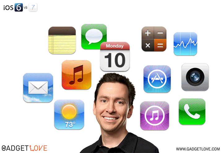
With the launch of Apple's iOS 7, they have signalled a departure from the stale designs of the past. Specifically, they largely abandoned the design trend known as skeuomorphism. Many users have responded positively to the radical change in their phone's operating system. This marks a major blow to the champions of skeumorpist design principles.
Skeuomorphism is the incorporation of ornamentation and elements found in previous non-digital formats. For example, a calendar application that makes use of a leather frame is using a skeuomorphist approach. Or a wooden bookshelf in iBooks...
Critics of skeuomorphism argue that the design trend clutters designs with unnecessary and outdated physical metaphors that can confuse users. Proponents contend that it gives technology users a reference point in the world.
Apple has opted in favor of a flat design chosen by the company's lead designer Jony Ive, after previous lead designer Scott Forstall left in October of 2012.
Flat design is a relatively new design concept, propelled to the forefront of talk with the introduction of the Windows Phone in October 2010. It consists of large elements, making use of the full potential of small screens. Essentially flat design proponents argue that usability and modernity are placed at the forefront of the design process.
Looking at the iOS 7's compass app compared to the previous version can give you a direct insight into the design change...
The Ottawa International Animation Festival is considered one of the biggest animation festivals in the world and the biggest in North America. I attended the festival this weekend and watched many animated films and title sequences selected for the festival. While watching the screenings I kept noticing how many different styles and techniques were being used to create the films; Hand-drawn, oil painted, cut-out, claymation, CG animation, rotoscoping you name it. It was impossible to not admire the amount of dedication and skill to create such great work, specially when I am starting to learn the techniques they are using.
At the festival they also offered various professional development workshops with people like the director of "The Blue Umbrella"- Pixar's latest short, Regular Show's creator JG Quintel, Disney animator Eric Goldberg (Alladin, Hercules, Fantasia 2000, etc...) and a few more. They talked about developing stories, coming up with ideas, animating and working in the industry.
It's difficult to find many of the films screened since most of them can't be available online after being selected for the festival, but here's one very interesting animation and the trailer for the festival, which used a lot of simple but interesting motion graphics.
Start the video at 14:00 for the full effect of the Title Sequence in context.
This is a really interesting title sequence of a game that I have played, called "The Last of Us". The importance of this title sequence was something I didn't realize until after I read the interview on Art Of the Title. The very first scene in the game is the main character and his daughter as she dies. This moment has surprising narrative weight even though it's incredibly early in the story. At first, the story then immediately jumped ahead several years and continued along. In early testing it was clear this jump was a problem, because the narrative weight of the story didn't have enough time to sink in, so the next scene was confusing and hard to pay attention to. Naughty Dog, the game studio behind "The Last of Us", decided that a film style title sequence would be ideal to give some time to the player to absorb the story. So, this title sequence is both an interesting artful piece, but is also utilitarian in that it is necessary for the story to work. The textures were all inkblots suspended in water, recorded and composited in After Effects, to represent the spread of a zombie virus. It works really well, the textures are intruiguing and you want to figure out what they are, but not so much so that they detract from the titles. The thing I really find cool about this however is that the title sequence wasn't originally intended to be in the game, it was later decided on because it made the story work better. In particular, the vast majority of video games don't have title sequences and those that do usually just flash the title of the game and move on, like for example in Mass Effect 2.
Start Video at 6:20
While this flash to title is interesting and effective in this context, you don't really get to see the more traditional film title sequence in games, and I think that "The Last of Us" is an example of how as video games become more cinematic, how film style opening titles can be incredibly effective.
Done by Shine, a creative design studio in Los Angeles, in close collaboration with James Baxter Animation, who were responsible for the opening sequence, and DreamWorks Animation, Kung Fu Panda's ending credits sequence is a great example of simple, yet effective motion graphics. While the sheer graphical awe may not be present in this sequence, the aesthetics are phenomenal, evoking imagery of Chinese manuscripts and scrolls through the horizontal scrolling, kanji stamped on the screen, and old-style fonts.
There was a lot of visual research done for Kung Fu Panda, said Raymond Zibach, the production designer, and Tang Kheng Heng, the art director. According to them, most of the visuals in this ending sequence are actually concept designs of the characters from the movie, so they were able to make use of them, instead of just having references for the actual 3D models in the movie.
It flows extremely well. The screen moves slowly throughout the colored concept art, with parallax. Kanji are painted on the background. The colors are all warm, and the art style is consistent with Chinese paintings. Without a doubt, these aesthetics were thought about to great extent, and the result is a pleasant feeling credits sequence accentuated by fantastic music in a Chinese style.
I found this video the other day and I thought it would be perfect to post on this blog. This video is a mashup of many different introductions of various companies from the 80's. What I appreciated most is how I can see these intros being fairly simple to make with programs such as after effects. Watching video's such as this one with simple effects allow you to see the individual parts that can come together to make a short piece. Each segment has a beginning, middle and end, and each has separate elements that converge quickly to not only make an engaging animation but one that viewer could recognize. I was amazed at all the different variations of titles, fonts and sequences to make a short but unique piece. I also believe its watching short videos such as this one that can give someone a spark for ideas, using random shapes and and colors in animation to create a recognizable image. Watch for yourself and you can see where this could give someone the idea or spark that they need for a simple title sequence.
Blue Valentine is a film directed by Derek Cianfrance, released in 2010. I watched it the other night and thought the end credits were superb.
Take a look:
This title sequence was designed by Jim Helton, an experimental filmmaker and editor who commonly collaborates with Derek Cianfrance. Mr. Helton has a very interesting past: born in Germany on a US army base, he then went off to attend the University of Colorado to study film under Stan Brakhage and Phil Solomon, whose work he credits as his main influence.
In an interview on theArtofTheTitle, he cites Phil Solomon as his main inspiration and recommends interested in this type of design to explore Phil's work. He talks about learning a process called "bi-packing," a process of placing two film strips on top of each other, and then rephotographing them to create a different effect than a superimposition. He goes on to describe his process for this sequence, made entirely on Final Cut Pro, taking a layer of footage of out-of-focus exploding fireworks, then taking the song by Grizzly Bear and using its rhythms to edit, and finally taking set photography by Davi Russo and reframing them to fit within the fireworks, and cutting them up into little details. Although he does not give away entirely his process, he says it was basically made with the composite feature and lots of tweaking. The fourth layer, the actual typeface for which he used "a short fade in, and a long fade out, like exploding and disheartening light." And finally, the fifth layer he discusses is the sound recordings of fireworks streaking and crackling, children playing and laughing, mixing it with the image to create an abstract echo.
I really like the elegance of this piece, but I really love how this clearly shows me that the tools and tricks to do these things are not necessarily difficult at all. Instead, coming up with good design in the first place is the actual labor.
Phil Solomon's influence on Jim Helton makes it clear how important an awareness and attention to other design truly is for making original design work. By paying attention to other's work, Jim was able to find ideas as references points for this piece. For me, this is a good example of how paying careful attention to design, and being knowledgeable and active supplies you with a well of creative influence from which to pull.
The Last of Us is a popular video game released just this passed June. I've yet to play the game myself, but I really hope to soon. I've heard incredible reviews about how successfully the game puts you right into the action. My roommate said he stopped playing the game because it got too terrifying. The game takes place in a post-apocalyptic 2033. You must defend yourself against the zombie-like monsters along with savage humans and cannibals. The story line is apparently very intense with complex characters and twists in the evolving plot. Along with that, the game looks beautiful. Here's a in-game screen shot to give you an idea:
With so much thought going into a game, the title sequence could not be given any less. On theartofthetitle.com, I found a video of the title sequence and an in depth interview of how they made it.
First off, the intro:
The director of this title sequence was a dude named Henry Hobson.
During the interview posted on the website, he was quoted in talking about the making of this video.
Kevin and I spent a day in San Diego, just covered in black ink, pouring it on every surface imaginable, and every shot just ended up looking like paper! We had black ink, some natural sponges, mosses — everything borne of nature — and then we had compressed air, literally computer cleaning compressed air. If you shook the can heavily you could actually freeze the surface of whatever you sprayed it onto, so the back end of the sequence is actually the reversed footage of this freezing and unfreezing of black ink. It creates the look of the black mould, but it wasn’t anywhere near far enough. It worked perfectly for the back end, but the front needed that extra help from real mould.
If you want to read the rest of the interview here's the link:
It's a very interesting read and really got my mind thinking about ways to get creative shots. What's slight ironic (and I didn't realize until later) is that this intro was made with absolutely no CG effects. But we could easily apply this in After Effects and transform this footage into something that looked even more surreal. If you were looking for that effects anyways.
As it is, I love the footage they got and I think it fits perfectly with the game.
I wasn't sure which artist to write about but the thumbnail for The Poker Club title sequence caught my attention. Dan Savage, the artist behind this sequence, went to school at Purchase College in NY and studied more traditional art but had a love for animation so he taught himself After Effects outside the classroom. I think that it's possible to master After Effects via following tutorials constantly and experimenting with the vast effects and possibilities on AE. However, this must've taken Savage years to master and an insane amount of patience and dedication. When asked about The Poker Club title sequence, Savage responded, ""There was practically no budget...I art directed, designed, and animated the entire thing with the exception of the 3D chips. I rented the exact gun model from the film and hired Eric Wagliardo to help photograph it. The titles were designed for HD 1080p, so to get the extreme close ups on the card elements I went through the tedious process of scanning in the cards, cutting out the parts I liked, printing, photocopying each part like 20 times to get the nice texture, then scanning each part in to piece it together for animation. It was a lot of late nights and weekends." The creative process behind this opening sequence is amazing and the sequence itself is quite mesmerizing. Savage created a title sequence that immediately engages viewers without giving too much away. Savage hints that the movie will involve poker and then draws your attention with the perfectly animated gun and then to top it off, he fades out the sequence with blood dropping on the cards. I think this sequence works well and I want to see the movie now.
CHECK OUT SOME MORE OF HIS WORK AND TUTORIALS HERE
Who is the coolest smooth operator of all film history well in my opinion it's james bond. But even though the emotional nostalgia that keeps me re watching Dr. No will have me eternally faithful to Sean Connery. Bond was reborn and he had to be cool again. One of the things i expect to see in every bond movie is an Awesome opening sequence. Designer Ben Radatz co founder of MK12 a motion graphics and design collective produce my favorite bond sequence to date. Its a modern twist on the classic bond imagery silhouettes of the secret agent poised ready to shoot. of course it has tons of sex appeal and is fluent with the background track by alicia keys and jack white titled another way to die.
I love how the camera transitions to different scenes so seamlessly nd the combination of live action images and cgi is fabulous.
Karin Fong, one of the founders of Imaginary Forces, is recognized for her work with film, television, ads, and even video games.
Fong began her career with a job on the production team for The Island of Dr. Moreau (1996) under the command of Kyle Cooper. Cooper then took Fong along and created Imaginary Forces where they both remain working.
One of Fong's first independent projects was Dead Man on Campus(1998).
This title sequence shows similar attributes to previous work with Cooper, for she used 2D animation and quick cutting motions. The movement is comparable to the Sure Targettool we learned in class on Thursday.
Fong since has done amazing work on title sequences such as television series Boardwalk Empire (2010)and films Rubicon.
Fong made title sequences for movies like Cat in the Hat, 102 Dalmatians, Charlotte Webb, The Pink Panther 2, and Ray. He as also done work on Ads for Herman Miller, Target, Honda, and God of War.
Richard Greenberg is a motion graphics designer based out of Chicago Illinois. After getting degrees in industrial design and graphic design he taught for a number of years. He then created a short film entitled "Stop". "Stop" won first prize at the New York Film Festival Student Competition which led to him working under Pablo Ferro. Greenberg then started his own business and has sense created title sequences for Superman, Alien, Dirty Dancing, Death Becomes Her, and The Untouchables. His work is very polished and clean. In The Dead Zone in particular, he does this wonderful, mysterious, slow addition of black shapes in front of some video of a small town. It isn't until most of the way through the sequence that you realize it's the negative space of the title itself. I like this title sequence a lot, because you don't notice anything out of the ordinary immediately. When you first see it you're really only thinking about the peaceful scenery and the quaint town It's a really powerful juxtaposition then, to see "THE DEAD ZONE" spelled out using that same scene. It's simple and it says it all, this town. This beautiful town that everyone has been looking at for 2 minutes now has, with the help of Greenberg and the music become, "The Dead Zone". I really appreciate this fairly subtle imagery in part because it is something I don't see very often in modern movies.
Wayne Barlowe is a benchmark science fiction artist and designer who has had his hand in Avatar, Pacific Rim, Harry Potter, Hellboy, The Hobbit and many, many other big budget films. He is known for his creature designs. In this short interview, Barlowe talks about the believability of science fiction creature design and how conceptual artists must keep forms both familiar but interesting at the same time for the audience. This has always been the balancing act that visual conceptual artists face every day. He states that he wishes to bring his work into a modern classicism. As far as I am concerned, he has achieved it and has entered the circle of master artists of today. What strikes me however is his capacity of imagination and for fun. He still has an air of child-like wonder that makes it clear to me that that honest curiosity is critical for ALL artists.
Steve Viola is a creative director, title designer and head of Method Design (formerly Rok!t Studio), located in Santa Monica, California. Viola has some elite title sequences working as both creative director and or title designer including The Avengers, Captain America: The First Avenger, Madea's Big Happy Family, and X-Men Origins: Wolverine. One of his latest title sequences Captain America: The First Avenger began when Rok!t's EP David Garber collaborated with the director of The Wolfman, Joe Johnston,to generate ideas and eventually pitch the idea to Marvel. The idea behind the title sequence is a spin on the black and white Nazi propaganda films. The really cool part about this sequence is how the production team of Rok!t Studio's took existing Nazi propaganda to create the stereoscopic effect. While this might be a little advanced for our class an animation with depth like this one should be something to strive for in the future. The team created the title sequence by using Adobe Photoshop, After effects, Illustrator, 3D was done in Autodesk Maya and all 2D /3D composting was done in Nuke. Viola stated, "As a team we took a lot from Joe himself. From a concept perspective we tried to take inspiration from the WWII period and abstract/environment-based titles like the Bond title sequences and Thank You for Smoking." Here is the Captain America: The First Avenger title sequence, Enjoy!
Here is The Wolfman intro title sequence created in Adobe After Effects by Joe Johnston and his team, Johnston again was the director of the title sequence for Captain America: The First Avenger.
Michael Riley is a designer from Palo Alto, California. His career began over 20 years ago and he has been known for designing some great sequences. A few of his most popular ones are the "Kung Fu Panda" opening sequence and the "Gattaca" opening sequence. Riley has received numerous design honors, including a Gold Medal From D&AD, five Primetime Emmy nominations, and an Art Directors Club Silver Medal for the design of the Marvel Pictures theatrical logo. http://www.artofthetitle.com/title/kung-fu-panda/
Above is the link to the Kung Fu Panda title sequence. This sequence by Riley has a very unique style. The animation almost looks like a 3D diagrams where the layers are made out of paper. The style is also very anime, and the panda looks more abstract than the actual movie's animation. This sequence is very "cartoon" esque and relies heavily on the animation aspect.
http://www.watchthetitles.com/articles/00114-Gattaca
This link of the "Gattaca" title sequence is very different than Kung-Fu Panda. It is very calm, playing with different shades of blue. It only tends to focus on one thing at a time, drawing the viewers attention to specific and simple motions.
Michael Riley's style is variable and flexible, very unique and artistic.
Gareth Smith & Jenny Lee are self described filmmakers, designers, and collaborators. They are known for major title sequences for the films Juno, Thank You For Smoking, and Up In The Air.
Juno's opening sequence was a unique breath of fresh air in the design world. Incorporating folk principles into each detail of the composition, gives it a feel that you rarely see in major Hollywood films anymore.
The two were masters at distilling the title character into her most basic, and even cutesy attributes. Not only did they enhance Ellen Paige's award winning performance, but they gave it new depth and imagery that helped build her character's core.
The couple posted a behind the scenes 'making of' blog post in which they chronicle their production experience. They painstakingly stitched 900 photographs to create a two and a half minute hybrid mixed cartoon.
"We wanted to create something that had texture and a little bit of edge, but also imparted the warmth and heart of the screenplay." - Gareth Smith
Jim Capobianco has been a story artist for quite a while, working on films like Bug's Life, Monsters Inc., and Finding Nemo and Ratatouille, for which he was nominated to the Oscars for best original screenplay. He's currently working on the sequel of his next short animated film Leonardo and has also notably directed the end titles for Wall-E.
Wall-E's end title sequence is basically an art history tour depicting the rebirth of earth and how the humans survived and developed after the events in the story.
Reading the interview available from this link you can see how much work and research it must have taken to design each of these shots and animate them.
Thinking about what we've learned in class so far, I could probably see myself being able to re-create some of the simpler parts of this sequence, such as the cave painting and greek pottery animation bits. Of course it starts getting more complicated after that, but hopefully I'll get there one day.
This is quite the interesting video. The Royal Observatory Greenwich put out this video last year, using motion graphics a bit of science to explain why we can measure the distance of things from us that are so far away, even if we can't physically measure them with, for example, and measuring tape.
The video reflects the narrator's commentary well, with simple, yet effective graphics used to accentuate the meaning behind each explanation.
Even with something as complex and mostly unknown as our universe, this editor found a way to make it all seem super simple and extremely understandable. And for that, he or she should be congratulated.
I recently found a fun and easy tutorial on ae.tutsplus.com on how to add your face onto an inanimate object. Also, with the Golden Doorknobs competition coming up, I'm really thinking about possible creative ideas to put together. With this, I could give doorknobs a personality of their own and make something really unique. Just a thought.... anyways, here's the example video the tutorial provides:
The full tutorial can be seen on the ae tutsplus website:
This video features a bunch of green screening and modeling effects, I really enjoy how the effects are used to make an entire world for the band to be in. during the segments of him falling, clearly there was heavy green screening, but I still thought it was interesting how a simple shot can be turned into something amazing just by knocking out the background and adding some nice effects. Many music videos are actually simple shoots in front green screens, its only after that effects team takes the shots of a singer or guitar player and makes something cool out of it. While some of the effects do look dated, I still thought it was worthy to post on this blog.
Since I watched Watchmen for the first time, its title sequence became one of my favorites. It basically gives you an idea of what recent history and pop culture would be like with the superheroes around and, for those who read the graphic novel, it shows some parts of the story that didn't make it into the actual film.
I really like the fact that it relies mostly on the cinematography and production design more than the actual titles/animation. However, the simplistic approach they gave to the actual type design is essential to make it - in my opinion - a memorable title sequence.
Last year, during my mass media research methods class, we had the opportunity to talk to a writer that worked on Portlandia, Arrested Development, and Comedy Central's Kroll Show. Our class watched the Kroll Show pilot before it was aired and the one part that stuck out was the animated intro sequence. Famous icons, fonts, and titles are recreated to say Kroll show and flashes quickly with the electronic music. This intro seems simplistic but graphic artists must've photoshopped each individual font and put it in the necessary background. The last Kroll Show title with the explosion in the city seems fairly easy to recreate. The only question I have about this sequence is how did Comedy Central get away with using all the fonts and titles from famous shows and games. I would think that there would be some type of copyright lawsuit of sorts. The show is quite funny but like many sketch comedies, it's either hit or miss and not all skits are funny.
-MCH
*The title sequence wasn't a choice on the blog youtube search but here is the link. KROLL SHOW INTRO
As an aspiring concept artist, I come across and review many process videos of the trade. Artists such as Feng Zhu (Transformers, Gears of War, Svedka cyborg ads, etc.) are a constant source of inspiration and give insight into the industry through their experience. Feng Zhu runs his own design school out of Singapore and produces many concept art tutorials revealing photoshop techniques while injecting his own experience in the entertainment industry.
In this video, Feng reboots the classic game Doom and brings it into the contemporary age of high-end graphics. He draws inspiration from a screenshot of the original as it would have been played 20 years ago and refines it into his own high-res version.
If you ever take a moment to think about what you are best at you would probably realize it is what you spend the most time doing. weather thats writing, drawing, building, playing a sport, or even a particular video game. Its a fairly simple equation in my opinion the more time you put into something the more adept you are at it. I was talking with a friend of mine comparing different software and talking about how we learn them. I was honestly surprised when he said that he didn't like using tutorials from youtube. to me almost every software i've become proficient in is because of direct use of tutorials. I found this one earlier this week and have been playing around in after effects. just to get my time in the program up. i feel that if you are not taking advantage of the thousands of tutorials online you are really missing out.
This is an interesting animation that I found, put out by Riot Games, creators of the video game "League of Legends". The content isn't all that important, but when I saw it, the animation style really caught my eye. It starts out with the "animation of words" style graphics that Arturo showed in class. Where it gets interesting is when it gets into the animation of gameplay sequences. The point of these animations is to represent gameplay without actually showing recorded gameplay. It is a pseudo-cutout style, and involves a lot of 2d graphics moving around in a somewhat 3d space. The cutout characters move around and do the actions they normally do within the game, but in the cutout style that the video uses. The whole time, the video follows the narrator using the "stream of consciousness" sort of style that this type of video tends to use. It seems to me that one of the harder things about making this video would be making the elements recognizable to players while still making each asset unique. Each action that these "faces with weapons"take is one that is based on the game, and since the video is made for players, needs to be recognizable to them. However, using this 2d cutout style would naturally make this difficult to pull off. Overall, its a very cool animation that accomplishes its intention well.
As I was looking around for something to post this week I came across this music video. I finally decided on posting it for a few reasons. The first is the use of both 2D and 3D elements, which is something you don't see very often. I think that's a very powerful tool that was implemented well in this piece. Also, 2D elements like the ones used in this video are totally achievable using the techniques we've been learning in After Effects, they'd be a lot of work, but a lot of the same principals are there. The second reason I picked this is because of its aesthetics. This is something we haven't really hit on in class yet, but it's a very important part of creating anything, an animation in particular. this strange whimsical world the animator has created is pretty unique, which is not only tough to do, but it also generates a very specific response from the viewer. That response is hard for me to put into words but it does convey a sort of feeling or mood. That is also an important part of creating anything. You want to make your audience feel something, whether it's the theme of the movie following your opening sequence or the message of a song as a designer it's your job to do that.
Searching for inspiration on YouTube I encountered a collection of videos called "The Creator Project." Among the collection of innovative videos was an animation genius, Matt Pyke. Pyke is an animator, curator, designer, the founder and director of Universal Everything in London, UK. Universal Everything is an art/design studio which focuses on human motion and is ultimately redefining the way in which people view the world of motion graphics and animation. The mission of Universal Everything and Pyke alike is to create unique visuals on screen that portray the nature of human motion while altering the way in which we are expressed through animation. These animations ultimately capture never before seen shapes while additionally incorporating the essence of human elements. Pyke has many notable works including "Made By Humans" for Hyundai Motor Group (2012); "Tai Chi" exhibition at Tokyo's Framed Gallery (2012); "Super-Computer-Romantics" exhibition at la Gaîté Lyrique (2011) and also tour visuals for Coldplay (2011). Additionally Pyke has received awards for the branding of the 2012 London Olympics with Wolff Olins a brand consultancy founded by Wally Olins. Here is one of Pykes creations, "Humanizing Motion Graphics."
MattPyke.com, UniversalEverything.com
information from thecreatorsproject.vice.com
Like many of my peers in the class who are still merely in awe of some of the larger and more ambitious projects we've seen as we scour the Internet for examples, references, and inspiration, I feel overwhelmed. Even a project as long as a minute still involves hours of work.
That's why I felt comforted when I found this blog post that showcases the results of a 5 second sandcastle building contest. Below are some of my favorites that highlight the fact that you don't need to create the next feature animation, especially when you're first starting out.
This title sequence is the holy grail of awesome. What do I mean? Well, from a motion graphics/animators stand point, there are many different effects and types of animation thrown in.
Here's the video. Watch and I'll elaborate.
In the very beginning, we see the hand dragging down the body, an effect probably stemming from some photoshop and after effects crafting. Simply edit the hand in photoshop to be larger than the body, and accurately place the layers in after effects, and I'm pretty sure that's how you get that effect.
Now, what I found cool was that there were some clear signs that some of the effects were made using the particle effect that we learned about in class last week. First, the sand moving inward as the body falls into the hole looked like the particle effect that we used. I'm no expert- but I have a feeling that the sand was made using some of the same techniques we learned in class when we made the smoke coming from the cigarette.
Then we see the picture of the man (again, just guessing, but that's probably the work of photoshop), with blood floating away from the picture. Now does the blood not look exactly like the cigarette smoke we made in class, just using red particles?
If I talked about every effect in this sequence, this post would go on forever. A few other things I liked were the "3D effects" by changing the opacity of the images that were supposed to be further away, to make them look further in the distance and therefore, more faint. Also, the rhythm of the movements went along perfectly with Adele's "Skyfall". This is one of my favorite title sequences, and it's comforting to know that recreating some of the effects in it is something I've learned how to do.
Michael Dante DiMartino and Bryan Konietzko probably didn't go out to create one of the most critically acclaimed animations ever to grace the Nickelodeon station, but they did, and here we are.
Avatar: The Last Airbender is a feat of cultural references, storytelling, fantastic animation, drama, and comedy, all blended together in an easy-to-swallow package that will most like stick with generations of children and adults alike. The show appeals to its demographic (12 to 18 year olds) with the action-oriented fight scenes and the humor, but the story is thick enough to appeal to older viewers as well.
No matter what way you look at it, Avatar: The Last Airbender is a good show to spend your time watching. The quality of the animation is also top notch, and the opening animation from the very first episode definitely reflects that. Please note the animation style, reminiscent of eastern paintings, which the show draws a lot of its atmosphere from.
I had heard about Matte Painting before, but never really took time to see how it really worked before watching this video. This is an awesome breakdown of an artist's process of creating one of his fictitious worlds, and the amount of work he seems to have put into it is quite amazing. I thought it would be a good idea to post this here because it was put together using - amongst a few others softwares - Photoshop, After Effects, and Maya, and it shows a bit of what those tools can do.
In my first post I talked about the benefits animation could serve for education. I'm going to follow the same train today, sense I recently found another video that beautifully demonstrates how it can make learning much more enjoyable of a task.
(just copy and paste the link – for some reason blogger could not find the video)
http://www.youtube.com/watch?v=US7wLCbZ84M
I thought the combination of information and animation made this an incredibly interesting video. My curiosity was sparked by this video and I found this TED Talk that covers the same theory.
I was very fascinated by the research behind how language can effect your lifestyle. Of course this is still a theory and is not fully proven, but in a globalizing world this can help us further understand the cultural differences we face between different groups and ethnicities.
We spoke about the Breaking Bad intro and how many people posted about it on the blog last year but as a dedicated fan, I feel it is necessary to post about. The main title sequence is accompanied by a distinct guitar and bongo song that Breaking Bad fans can identify but the animation itself is extremely simplistic. For most shows, the intro develops over time and changes based on the season and what is going on at the time. For Breaking Bad, however, the title sequence has been the same through five seasons. I truly believe that in a few weeks, I will have the ability to recreate the Breaking Bad title sequence with no problems. For example, I could make the smoke in the background already and the periodic table of elements is layered over itself to create the ghost look. I think this is the first major project I want to do. What does this simplistic intro say about the show? Unlike other opening sequences, the Breaking Bad intro only says created by Vince Gilligan. There are no shots from past episodes, there's no cast listed, and it's only 18 seconds long. I think that the title sequence can take away from the show at points and since diehard Breaking Bad fans know who is in the show and want more story, the short title allows a longer period of time for the actual show. At same time, however, the sequence is memorable due to the accompanying sound and simplistic yet clever use of the periodic table. Also, the actors' names appear with elements placed in their name during the opening scene.
The Monster's Inc. title sequence is one of my favorites of all time. Most people agree. It has been talked about by bloggers and reviewers everywhere.
The upbeat jazz music and rhythm inspire the movement of the graphics. It is also a title sequence that embodies what the film is going to be about. The monster's hiding behind the doors as the opening credits were rolling really made the sequence playful but also relevant to the plot of the film. It also went full force with taking parts of the sequence and playing around with them so they become the next part of the sequence. To better explain what I'm trying to say, the random shapes in the beginning become a door, the door opens and we find a children's closet and then a monster. Later in the sequence, a monster's hand takes a piece of chalk and writes out the word "Presents" and then the chalk turns into a door. See what I mean? The designer was playful and turned certain things into other relevant things. It was one of the first Pixar films with a true title sequence.
Susan Bradley is the designer of the title sequence. So here it is. I hope you enjoy it as much as I do.
Along with taking MG&A this semester I am also taking New Telecommunications. In this class we talk about the latest technologies that are being created in the world. Google Glasses came up in one of our discussions today, I was interested in what this product was so I looked it up and found a video explain what the product has to offer.
While watching this video i started to notices the graphics that were being placed on the screen. Although this wasn't the most challenging video in the world I still this that it is really interesting that by the use of graphics it helped explain what the product can do.
Obviously this video is quite old but I still thought it was worthy to post here due to some of the effects used in the video. My favorite part of the video was the keyboard segment because it was one of the better fake features. Aside from the concept, the video's effects are nice as they were well made enough to mimc reality. When I initially saw this video, I was impressed with how realistic the edge to edge display looked. This video is a perfect example of how some simple effects can create a nice sequence, and make for an entertaining video without going overboard.
RWBY is a new animated web series by Roosterteeth. This is the first trailer promoting the series and has received positive acclaim on the web. The aesthetic at first glance appears to be in the 2D anime style but in reality is rendered in three dimensions giving it a videogame-like quality. Roosterteeth is best known for their decade old machinima series Red vs. Blue and has since then become more and more action oriented in their productions. Also, GUN SCYTHES.


.png)


