Sunday, March 30, 2014

Ahoy there, matey!

Sick of posts regarding VFX breakdowns from MPC? Well, too bad. Get over yourself. You have no say in this matter. I'll write about these breakdowns until the day I die (or at least until the end of the semester). These videos are simply so fascinating. They show simple folk like you and I just how much work goes into the films we know and love.


This week's breakdown comes to you from MPC (Moving Picture Company)--the same as usual--highlighting some of the greatest visual effects accomplishments found in Pirates of the Caribbean: On Stranger Tides. I can confidently say the fourth Pirates installment is by far the worst film of the series, but it's impossible to overlook the spectacular visual effects.

Before
After
What's so fascinating about this particular breakdown is just how much of the highlights was news to me. I know that's not much of a surprise, but isn't that the true indicator of a job well-done? Not knowing something was actually added in postproduction means it was truly done with skill and precision. I was confident the majority of the effects displayed in the video were shot on-scene. Sure, I know Johnny Depp couldn't have possibly jumped from a couple hundred-foot high cliff into a rock-infested river and survived (probably), but the plants he walks past are fake?! You've got to be joking.

Apparently Barbossa's peg leg is fake, too. I guess everything I've ever known to be true is just a lie. It's an unfortunate discovery, but I'll just have to learn to live with the sad, sad truth. It's strange, really. One of Barbossa's biggest defining traits is his wooden leg, and it turns out it's been animated the entire time. It just goes to show how much of an impact animation has on individual characters as well as the entire layout of a film.

Gary Brozenich led the MPC team on Pirates of the Caribbean VFX supervisor. Having spearheaded other projects such as The Lone Ranger and Wrath of the Titans, he certainly was a good pick for the job. I'm sure he'll have other great work for us all very soon.

I've said it before and I'll keep saying it: MPC is doing some amazing work and they need to be recognized as a leading visual effects company. Now, I shall leave you all with this compilation of unbelievably cute puppies.

Wes Anderson is Living in his Own World

I had a lot of anticipation before going in to see Wes Anderson's newest film, The Grand Budapest Hotel. I've always been fairly neutral about Anderson, and part of me was hoping that this one, with it's almost universal acclaim and pretty massive amounts of hype, might sway me to be more in favor of him. I love some of his earlier movies and Fantastic Mr. Fox - part of me wants Anderson to exclusively make animated films - but I was pretty ambivalent on 2012's Moonrise Kingdom: it just didn't really do anything for me.


Well, unfortunately, Budapest didn't change anything. It's Wes Anderson at his most Wes Anderson-y. The colors are bright, the special effects are delightfully terrible, and there's a lot of A-list actors giving extremely odd - but great - performances. Things are symmetrical and perfectly framed. The dialogue is bizarre and irreverent and borders on being depressing. It's a dark comedy wrapped up in a big, colorful, pink and purple box.


You have to give it Anderson, however, for picking a style and sticking with it. It's unique, it's fresh, and it's his own. Apart from the already brilliant set design and colors in Budapest, there are a few colorizing techniques and effects added in post that I was really impressed by. The movie actually tells three stories from three different time periods: the main one being told in the 30's, the second being in the late 60s, and the last one in the 80s. Each time period was given their own respective color scheme and aspect ratio, and this helped to tell each story and really make them pop. The 30's has an aspect ratio of 1.37, which is an older, almost boxy view, and here is where the colors were much more brighter and saturated. In the 80s, he used a typical 1.85 ratio, and a 2.35:1 anamorphic (giving it a more rounded look) ratio for the 60s, where he also focused more on the gold and green colors.

Jill Bogdanowicz, who, I must say, has one hell of a resume, acted as the digital intermediate colorist for the film, which means she was involved with the grading, which she did on Da Vinci Resolve (a color correction program that Arturo recommends). She did an interview with Studio Daily about working so close with Wes Anderson, and the whole thing is a pretty interesting read. You can find it here. One thing from that article that I found particularly interesting is how Anderson used 
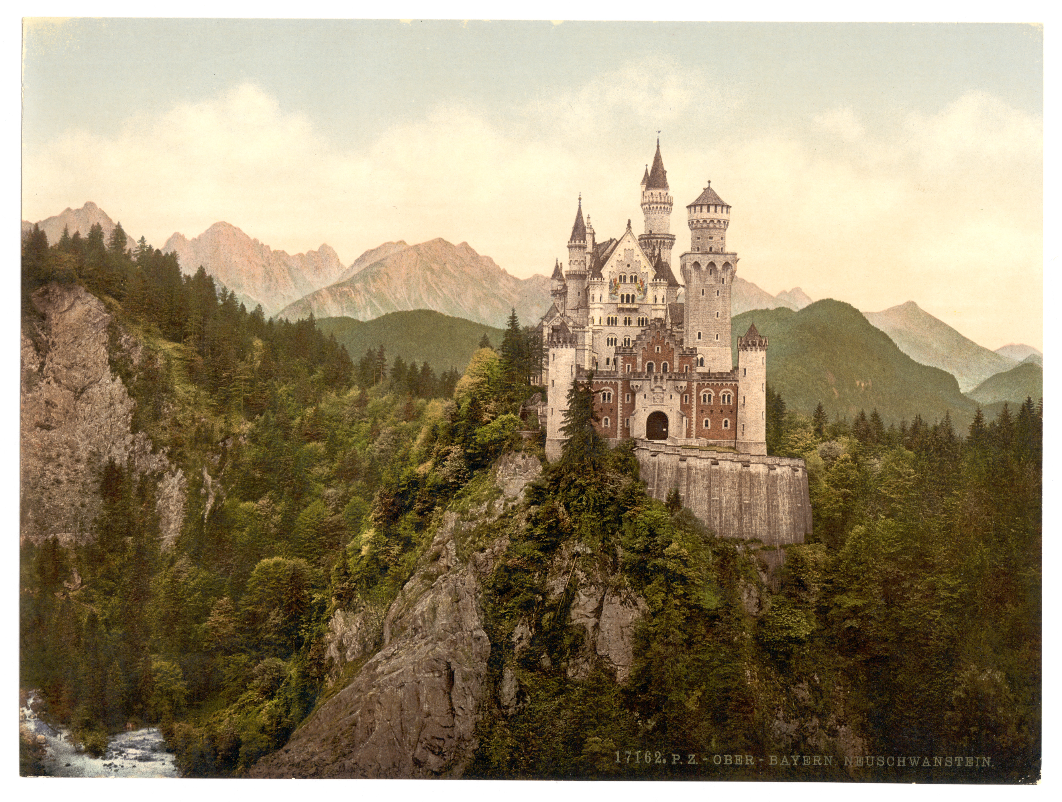
Photochrom (think an early version of Instagram) as an influence for how he wanted certain segments of Budapest to look. I think it's pretty easy to see the similarities, particularly in the film's poster.

One last thing I found was a way to replicate the anamorphic aspect ratio that Anderson uses in many of his films. It's almost like a subtle fish-eye distortion, with the edges of the frame seemingly bending to give things a rounded look. You can watch the video to see what I'm talking about - and how it's applicable to your own work - and go to the website to download plugins for After Effects here.


Saturday, March 29, 2014

Super Bowl Magic

So the Super Bowl was held in New York City this past season and besides a very one sided football game, the NFL had a decent attempt at making the city that never sleeps into the ultimate destination for Super Bowl week. Along with all of the sights to see, the NFL along with Moment Factory on the iconic Macy's storefront. Located in the heart of NYC, the projection mapping show was eight minutes long and included both 2-D and 3-D motion graphics along with game footage which mesmerized an estimated audience of over one million fans who visited Super Bowl Boulevard.

Super Bowl Virtual Theater - Demo from Moment Factory on Vimeo.

Friday, March 28, 2014

Animatrik Virtual Production


When most people think of virtual production, films such as Avatar and Transformers come to mind. Indeed, films such as these have helped to change the landscape of media and push forward ever evolving technologies. One company in particular that is at the forefront of such advancements is Animatrik Film Design, based out of Vancouver, British Columbia. The team at Animatrik has worked on films ranging from District 9 to The Lord of the Rings: The Return of the King. In addition to film, Animatrik has worked on video games such as Cyrsis 3 and Mortal Combat 9. 

One of the ways that Animatrik has been able to carve out a niche in the media industry is by revolutionizing motion capturing techniques. Although it may be funny to see actors running around in skin-tight suits with motion sensing balls attached to them, these suits help to translate an actors real-life movements to a digital world. Thanks to modern technology, all the movements taking place are applied to the CG in real-time. Until recently, all of Animatrik motion capture work has taken place inside their Vancouver studio. However, thanks to the release of improved sensors which allow light to be emitted directly from a marker instead of from the camera, the studio has become more mobile and hopes it signals a new chapter in their growth.


Miyazaki's "Final Film"


After 51 years of writing and animation, as well as thirteen award winning films famed director Hayao Miyazaki lays down his pen for The Wind Rises…for now.  The writer of Ponyo, From Up on Poppy Hill and The Secret World of Arrietty, has claimed these to be his last films before allowing new talent, like his son Goro Miyazaki take the reins of writing/directing the Studio Ghibli franchise. But almost every time he’s said this, the wizard always seems to have one more trick left up his sleeve, and creating his most recent features that continue to astound us. Unlike his previous “last films,” this one seems to be his grand finale, as he returns to the director’s chair after five years. The film is adapted from Miyazaki’s 2009 serialized manga of Jiro Horikoshi, the designer of the Mitsubishi A5M aircraft used in WWII. 
Much of the film’s story parallel’s with Miyazaki’s personal journey as a storyteller. Miyazaki and Horikoshi both share an enjoyment craft of what they do and sought to create beauty and art in story, animation and aviation respectively.


Like some some of his other projects it contains the following things one usually associates with a Miyazaki film.
1) Prominent Female Protagonist that resembles the pervious ones


Naoko Saotomi

          2) Fantastical Images 


        3) Highly Detailed Environments


These elements are the main reasons I continue to watch Miyazaki's films. When I found out this film is supposed to be Miyazai's last I was disappointed. Personally I don't think this is the end for Miyazaki as far as a storyteller. But if this is his final film in the director's chair, I think he couldn't have chosen a better story to end his directorial rein at Ghibli. Most likely Miyazaki will continue in the as the mentor for the upcoming directors at Ghibli.


Like his son's film created 2006 where he presented the concept, while his son handled the screenplay and directorial aspects of the project.

Eh, I've Seen Better

There's something mesmerizing about early CGI. Somewhere right at the beginning of the takeover of complete computer animation. We take it for granted now, but it was a big deal back then for any sort of character or object to appear on screen that wasn't really there. Nowadays we don't even blink an eye at visual marvels like Transformers or Avatar. It might pique our interest for the time being while watching it, but it's easily forgotten an hour after the film is over. We've become spoiled, in a sense, with the incredible advancement in technology over the past 20-30 years. We always want more, we're never satisfied. Things we make fun of now because they "look like shit", we marveled at in their heyday.

Maybe I feel this way because of nostalgia. It seems to be a big thing in society nowadays (or at least in my general age group) to reflect upon things of the past (Buzzfeed feeds this problem like none other). For my age group, it's 90's Cartoon Network/Nickelodeon shows, Playstation/N64 games, and Pokemon. Maybe it's because we long to go back to a time when things still made us feel something. We still had a sense of awe back then. We just don't get that same euphoria anymore. As I said earlier, we've been desensitized by how much we have now. I can play a PS4 game and marvel at the graphics and gameplay a bit, but it's soon forgotten. I remember when my first cell phone had 3 shades of green as far as graphics capabilities, Snake and Brick Break. It was the coolest thing ever! Now even with the endless possibilities of my iPhone, I feel nothing. As I'm writing this post, I'm playing N64. It brings me back to when this made me marvel, and I felt a sense of awe.

The same applies to animation. When the dancing baby animation to Hooked on a Feeling by Blue Suede came out, my mom screamed to me from the other room to come and see, and we watched it over and over. It made us so happy! Maybe we felt a sense of accomplishment as a human race to have seemingly perfected the art of digital animation. Of course, now, it's much better. We've progressed so much in the field of technology. I can go on for years about how many marvels there are that exist today. It's truly breathtaking and captivating.

But I just don't care.


I Don't Oppose Some Pose to Pose

When it comes to 2D animation, 
two techniques reign supreme: 
Straight Ahead animation, 
and Pose to Pose Animation.
I'd like to present the pro's and con's of each style 
so that you may leave this blog feeling more knowledgable, and more aware.


Straight Ahead animation is the easier of the two dueling techniques to understand. NOTE: Although the concept is simple, the results can be disastrous when done incorrectly. Straight ahead animation refers to animation that is drawn frame by frame in the order they appear in the final product. 


For example, when creating Post-it animations, most people draw the animation in order, Post-it note by Post-it note. However, what happens when you get to the last little square in the stack and your animation isn't complete? 
This is what I'm talking about; disastrous. 


Still, when done right, straight ahead animation results in animation that flows extremely well. This style is often utilized when spontaneity is a necessity. Many of the early Disney animations were produced using the straight-ahead method.


Pose to Pose animation is the solution to the short-comings of straight-ahead animation. In Pose-to-pose, certain key poses of a character doing an action are set in advance on an exposure, or "dope" sheet. Key poses describe WHAT happens, but not necessarily HOW it happens. 


Once the key poses of the action are in place, the animator just has to fill in the space between each key. This proves not so simple. Many inexperienced animators, (the experienced ones too on occasion), have a hard time delegating the correct amount of movement for each frame between key poses. This leads to stiff, unrealistic animation. 


Neither animation technique is easy to control, because animation isn't about to make your life easy. Both techniques are incredibly time-consuming. Still, it's good to know that maybe, just maybe, you'll make it to that last post-it note and have nothing left to animate.


A lesson on Keyboard Shortcuts

Today, I decided to write my blogpost on one of the most useful things in any software: the Keyboard Shortcuts. Abusing keyboard shortcuts can help you maximize efficiency, and help you work a whole lot faster.

The Easy Ones:

Alright, these are the ones that are pretty standard in most programs, so we'll run through them quickly...

Hotkey Command
CTRL-N New Composition
CTRL-S Saves the project
CTRL-D Duplicates a layer/composition/effect
CTRL-I Imports a file
CTRL-K Opens up the Composition Settings
CTRL-ALT-; Opens up After Effects' Settings
CTRL-R Enable Rulers
Shift-F10 Reset your workspace to default

Composition Hotkeys:

Here we have a bunch of hotkeys that add or do something to a composition...

Hotkey Command
CTRL-Y Creates a New Solid
CTRL-Shift-Y Opens the Layer Settings
CTRL-M Add the Composition to the Render Queue (to export)
U Opens all the parameters that contain active keyframes
P Opens the Position parameter
S Opens the Scale parameter
T Opens the Opacity(transparancy) parameter
R Opens the Rotation parameter
SHIFT (R/T/P/S/etc.) Keeps current parameters open, and also opens a new parameter
M Shows a list of available masks on your layer
Space Allows you to Click-And-Drag around your composition
Shift-? Sets the composition to "Fit To Window" view
/ Sets the composition to "100%" view
CTRL-Alt-Shift-Y Creates a Null Object

General Useful Ones:

These are all around really useful and should be used whenever you can...

Hotkey Command
` Hover over a window and click "`" to maximize that window, and hide the other views
V The basic selection tool
Y The Pan-Behind tool
Q The Rectangle/Elipse/Polygon tool
G The Pen tool
CTRL-T The Text tool
Alt-W The Roto-Brush tool
Numpad 0 The "RAM Preview" play button
F4 Shifts between Switches/Modes in the timeline

And there you have it! Now, I didn't want to go into EVERY hotkey that exists in After Effects, that would take forever. These are simply the hotkeys that I find myself using on a day-to-day basis, and think they are essential for people to know.

No pictures today, so enjoy this stock image!

Facebook Takes Away Hopes and Dreams

     The Oculus Rift is a wearable head mounted virtual reality screen created Oculus VR that as yet to be released to the public. Through their kickstarter campaign they have earned almost 100 million dollars.
   
     Palmer Luckey, through online forums, developed his idea for a head mounted virtual reality unit that would effective and inexpensive. Around this time a game programmer named John Carmack was doing his own research and came across Luckey's ideas. During the 2012 Electronic Entertainment Expo Carmack presented Luckey's prototype.


The Rift in Action


     Oculus Rift was making everyone in the video game world very excited. Popular game developers were making there games compatible with the device and had plans to make new games for the The Rift. However that is mostly over now. Many developers have pulled their support for the Virtual Reality headset once Facebook acquired the technology for two billion dollars.

     It is far too soon to tell what will become of the Oculus Rift now with Facebook's acquisition of the technology. However despite "insider sources" saying that Facebook plans to rebrand and redesign the headset, Facebook is denying those claims. Oculus thinks that Facebook's ownership of the technology is better for gamers, they believe Facebook will be able to produce a product that is better and cheaper than before.
 

Behind the Scales: Smaug, Benedict, and Motion Capture

Okay, so as a Lord of the Rings fan, I was discussing The Hobbit (both movies), with a few friends this week. During our discussion, we brought up how amazing Andy Serkis is as an actor bringing Gollum to life through motion capture. I have always been fascinated by motion capture and the capabilities that animators have when it comes to making a character come alive. However, I always suspected that the only way motion capture worked was with humanoid forms. So, imagine my surprise when I discovered that the character of Smaug in the Hobbit, played by Benedict Cumberbatch, was brought to life on the basis of Benedict's performance in a motion capture suit! The endless possibilities that motion capture has opened for an actor's performance is incredible. This link is to a video about Peter Jackson's and Benedict Cumberbatch's opinions on the character and performance side of things.

What really took my breath away was the description of the animation from WetaDigital. Not only did they have control over the smallest details in the dragon's face (the throat, eyelids, nostrils), they had to take the time to bring Benedict Cumberbatch's human performance and translate it into a believable, fierce dragon. Seeing as human anatomy and physiology is very different from what a dragon's would be, I can't even imagine the challenge this created. Yet, they pulled it off splendidly. One of the things I love about the Lord of the Rings and The Hobbit is the incredible detail that they put into creating these films. Everytime you watch them, you encounter something new that you never noticed before and it is because they take the time to create those details most people would just shrug off. For example, there are one million scales on the character of Smaug and each one was created unique. They aged Smaug with flaking skin and scars that added to the depth and believability of the character. We may not catch all this detail consciously when we watch it, but subconsciously we realize that this is not just an animal, but a clever being with a past because of the detailed and careful animation. Right down to the reptilian eyelids and the preemptive glow of spouting fire, Smaug is a completely defined character and creature. This link is a video of their description of how they created Smaug. Notice how they started with the bone structure and built all the way up to the skin layer by layer. Amazing!

Amber Capogrossi


Clever Coventry


Last month, Coventry University's Residential Life department released an interview video of multiple students like no other done before. Short Malone, who created all the animations, really wanted to capture the college with the animations. Each scene is a animated replication of parts of the campus. What is really neat is the characters embody the scene as well. These real life testimonies are paired with wacky animations to make the video entertaining and educational. 
The creators wanted to make the video in a color blind point of view. Color blind as in blind to racial profiling, the creators wanted to make everyone in the video equal so they did not give much emphasis to the color or gender of the characters. This mix of equality and animation made a great video that expressed the college's "everyone is equal" ideology. 
Overall this video is a perfect way to catch the eye of incoming students for the college thus a great example of how animation can be used in not only entertainment purposes but in educational purposes. 

Thursday, March 27, 2014

Walt Disney

This video was shown in another class of mine and I find it relevant to what we do in Motion Graphics.
The Story of the Animated Drawing is an episode of the Disneyland television program. Walt Disney is explaining throughout the vid the history of animation. In the 1950's, animation for a movie was much more difficult. Everything for a cartoon movie was done physically by hand. There is a person devoted to changing the scenes by using the kinetograph and other devices as well as a person devoted to music. The most interesting part is that the audience had no idea how much work was put into showing that movie.
   

I tried making a simple flip book with a stack of post-its, it wasn't impossible but it was definitely time consuming. Also you can't take the post-its apart because the adhesive wont stick the same and it wont be aligned perfectly. Fun task but imagine having to make a flip book for an entire episode of a show. Tough work! we're fortunate today to have all these programs with plugins that make our life so much easier.

Let's Track A Bit... Shall We?

So while I was scrolling through some videos on YouTube, I came across this video that I right away knew had After Effects editing put in on it. They had used the tracking effect in order to have each of the cartoon body parts (ears, eyes, hats, etc). It's actually really cool to see this done because, well for starters, I knew all of the cartoons that the band was playing, but Just to see it tracked so well and have some of the other ones animated while being tracked was cool too.

One of the really cool effects that was used was the music notes that came out of the instruments and hands as the players hit certain notes or hit certain keys on the piano or certain areas on the percussion sets. I loved this video and I thought that it was really cool. I would love to be able to do something like this when I get more advanced on After Effects. It would make for a great video in my reel and it would also just be plain fun to do something like this to one of my favorite songs.


Tuesday, March 25, 2014

The Regal Cinemas Openings

(NOTE: THIS WAS MY ORIGINAL POST FOR THIS WEEK THAT I FORGOT TO POST)

When we go the the movie theater we always get a little promo telling us to observe the various rules of the theater. But one of the main things exhibition houses push are their promos inviting movie goers to visit the concession stand.
 2D Animation

Special Guest Star Promotion
other 90s policy opening

Going to the movie theater as kid one of most memorable promo movie theater openings was Regal Cinema's 1990s movie train.
1990s Original 
At this point in time Imax was available only in major cities and 3D films were a few decades away from making a major comeback in major theaters. But as you can see from this earlier version of the opening this opening looked almost like sort of 3D roller coaster experiences you'd get in some of these indoor amusement parks. This opening played on Regal Cinema screens until the Fall of 2003. 


2011 Remake

In my investigation of Regal Entreatments' openings, I was unable to find exactly how they were able to create one of my favorite nostalgic movie openings. I did however discover that the main reason they brought back the train opening. Around 2009 this theater had made a deal with Sony upgrading its sound systems and screens to 4K projectors. In anticiaption of these updated projectors, Regal brought back its' iconic 3D coaster to match with the full power of the new technology.


Monday, March 24, 2014

Winter is Coming

Following in my friend Sam's footsteps, I too shall be writing about one of my favorite shows and how exactly visual effects have made the show possible. Game of Thrones, a particularly violent show with enormous sets and countless extras, it has always seemed to baffle me how exactly a show of this style would possibly be shot. Well, it turns out that quite a bit of this medieval drama isn't actually shot on camera, but is added in postproduction.


Game of Thrones - SSVFX Breakdowns from Ed Bruce on Vimeo.

Tez (Terance) Palmer, the senior special effects technician on the show, is one of the driving forces behind the show having become the great success it is. Having been a special effects technician on X-Men: First Class (it wasn't the greatest film, but the VFX were pretty dope), I have a high level of respect for this man. This is most definitely a larger project for him to take on, but he has done a spectacular job with it so far.

What fascinates me is just how much of this wonderful show is done using animation. From making a couple dozen soldiers into an army to turning a boy climbing a few feet off the ground into a 100-foot drop, the animation in the show is endless. In order to make it appear as a man is getting beheaded, the actor wore a chroma green mask to blend his actual head in with the background. It's so simple and yet I would never think to do it.

As far as I know, every time a spear, arrow, or sword impales an actor, animation is what makes the death come to life. Clearly, you can't kill an actor for a television show (as far as I know). Maybe there's a loophole in their contracts or something. Assuming there isn't, however, every weapon causing every death is not actually shot on camera. It's all added in postproduction. I was honestly never quite sure how something like that would be shot. The reason for that is, it probably can't be. I just never thought that so much time would be spent on something like that (there are quite a few deaths in Game of Thrones for those of you who have never watched).

There are so many reasons to watch Game of Thrones. Swords. Spears. Blood. Death. Animation.

Using Science in Art

"Professor Fletcher's invention of the CellScope, which is a Nokia device with a microscope attachment, was the inspiration for a teeny-tiny film created by Sumo Science at Aardman. It stars a 9mm girl called Dot as she struggles through a microscopic world. All the minuscule detail was shot using CellScope technology and a Nokia N8, with its 12 megapixel camera and Carl Zeiss optics."


This technology can be used for Medical Doctor's everywhere, but also gives a new opportunity for art. The Cellscope technology can take almost any smartphone and turn it into a portable high powered microscope. Super cool stuff!

Everything Is A Remix

Quentin Tarantino a American film maker is a screenwriter, producer, director and actor. Quentin Tarantino has made many hit movies over the years such as, Reservoir Dogs (1993), Pulp Fiction (1994), Death Proof  (2007), Inglourious Basterds (2009), Kill Bill (2003), Django Unchained (2013) and countless others. Quentin Tarantino has made such hit movies by taking the movies that inspire him and using some of the same shots and cinematography from other films. For example,Quentin Tarantino film Kill Bill uses shots from Game of Death (1978), Samurai Fiction (1998), Once Upon A Time In The West (1968), Death Rides A Horse (1967), Lady Snowbloody (1973), Deep Red (1975), City Of Living Dead (1980) and many more. Quentin Tarantino uses his inspirational scenes from these films to his advantages and to better his own work in the film industry.


Everything Is A Remix: KILL BILL from robgwilson.com on Vimeo.

If you aren't a film buff you probably wouldn't notice the similarities between these movies but in the video it shows how Quentin Tarantino used certain scenes from each movie. Some people might consider this stealing or even plagiarism but if you look at it that way then there would be no room for artistic interpretation. If something works why change it. I believe that Quentin Tarantino did a great job with using his inspiration and using that in Kill Bill.


Sita Sings the Blues


Sita Sings the Blues is a 2008 animated film by Nina Paley. It is unorthodox both in its animation and method of distribution. It tells the story of the Ramayana, an ancient Hindu text about a woman's love and loss.

The film uses several types of animation to tell its story, primarily using 2D computer graphics and Flash animation. The first type, used to tell the story of the Ramayana itself, is Flash based animation using heavy textures and vivid colors. The characters are often shown in profile to exaggerate their eyes and show where their attention is being focused.


The second type of animation is a digital mock-up of traditional shadow puppetry, which saw its first wide appearance in The Adventures of Prince Achmed, a German film made in 1926. In the case of Sita, these shadows are the narrators of the Ramayana who often discuss the story's characters which are represented by collage cutouts. The shadow figures used together with the mixed media characters creates a delightful image to watch, often placed in front of a background of rich tapestry.


The third style used in the film happens during the musical sequences! Songs by jazz singer Annette Hanshaw are sung by Sita to express her feelings or despair to the experiences she's having. These sequences are often done in bold vector graphics animation that seems much more digital than the other styles present. The style however allows for close vocal synchronization with the songs being synced.


The final style used in the film is present when the contemporary story is happening alongside the Ramayana. This is the story of filmmaker Nina Paley and how her own life ties in with the text. The style of animation used here is still digital, but hand drawn and with little solidity to the image. It is a more lighthearted counterpart to the other styles present.  


Upon the film's release, it ran into a number of copyright issues surrounding the use of the Annette Hanshaw music. Unable to pay the copyright fees demanded of her, Paley decided to release the work using a Creative Commons license, making the film free to distribute and use in ways desired by the viewer. Despite giving the film away for free, Paley considers it to be a financial success, due to donations given to her by various individuals and organizations, citing that it earned $132,000 from March 2009 to March 2010.


So that's the story of Sita Sings the Blues! I highly recommend taking the time to watch this entertaining and visually-exciting film. In fact, because of its distribution method, you can watch it in its entirety right here:


Sunday, March 23, 2014

The Art of South Park

Despite your opinion on the writing and overall content of Comedy Central's longstanding comedy South Park, you have to admit that it looks unlike anything else on television. Inspired by the paper cut-outs that Terry Gilliam made for Monty Python's Flying Circus, the creators of South Park - Trey Parker and Matt Stone - have made a show so distinct that almost anyone can identify it from the animation style alone.

Personally, I had no idea how the show was made. Part of me (not a smart part, I'll admit) still thought that the animation was stop motion, and actually used paper cutouts for each week's episode. Having come to appreciate how long it takes to film something using stop motion, however, I now realize that it's impossible to shoot a full, 22 minute episode in the span of six days. Again, I'm not proud that it took me so long to figure this out.

After the first episode was done entirely using stop motion, the creators switched over to a program called PowerAnimator. After the original cardboard cutouts were scanned and imported, they were animated using a mix of PowerAnimator and SGI workstations. Starting with season 5, the animators actually starting using Maya in lieu of the somewhat outdated PowerAnimator, and they continue to use it to this day. Even though the technology - and, consequently, the animation - has improved from the first few years, they utilize multiple techniques to keep the show looking the like the cheap cutout version that it used to be.

Yes, it's raunchy and super controversial, but you have to praise Stone and Parker for their ability to put together a cohesive, well-animated, and often hilarious show in six days or less. It's amazing to think that we're using the same programs that a professional studio is using to produce TV shows, and it really makes me want to create something cool.

Friday, March 21, 2014

The Magic of Monkeys

So, for those of you who aren't familiar with the Gorillaz, I feel really..bad for you. The Gorillaz are not only an amazing band, but they follow up with amazing animation and art direction concepts, done by Jamie Hewlett. Damon Albarn is the lead singer, and met fellow animator and comic book artist Jamie Hewlett in college. Together, they began conceptualizing the idea for Gorillaz!

During their early years, the band would stand behind a huge screen while live visuals of the animated characters were projected onto the screen for the audience. The virtual band The Gorillaz is consisted of 2D, Murdoc, Russle and Noodle. The music videos, along with a novel called Rise of the Ogre, follow these characters and their various adventures in the non fictitious world that they live in. It is a truly fascinating universe and I strongly recommend you guys check it out! I have been following the Gorillaz for a while, as I am in love with their music videos. They recently released a video for a song called "Stylo," which is their first live action video and was featured on the album "Plastic Beach." Notice the artistic differences between the animation in Stylo and the rest of the videos I'll post. It really is amazing!


Since this post is about the magic of monkeys, I will be posting another AMAZING animated short film about a monkey. It's called "Shave It," and is written and directed by Jorge Tereso. The production company who made the film goes by the name 3dar studios. I have to say, this short animation has one of the best examples of art direction and coloring that I have yet to see. The whole world in which this money lives in simply filled with rich colors, so colorful in fact that you feel as if you can taste it! Ok, this is getting weird but my point is the film is both creatively and visually innovative and it is definitely worth the watch. 


Here is the 3dar website!

http://www.3dar.com/the-work/


My First Animation Software!

When I was younger we didn't have all this fancy technology of After Effects or Maya. Okay well maybe we did but I had no idea that it even existed. My brother was in high school at the time and he brought home this program called Pivot. It is a simple software to create animations. Based on stickfigures, the software gives you the possibility to create an animation by moving the joints and nodes of the figures.There is no need to redraw your figures in each frames. The figure creator gives you the possibility to create any types of figures you want. I fell in love with software and began creating little animations. Here is a video on the software and some examples on what people have done.


If you are looking for something to mess around with I definitely recommend downloading Pivot. It is really easy to use and you can do some pretty amazing things with it.