
Well, unfortunately, Budapest didn't change anything. It's Wes Anderson at his most Wes Anderson-y. The colors are bright, the special effects are delightfully terrible, and there's a lot of A-list actors giving extremely odd - but great - performances. Things are symmetrical and perfectly framed. The dialogue is bizarre and irreverent and borders on being depressing. It's a dark comedy wrapped up in a big, colorful, pink and purple box.
 |
 |
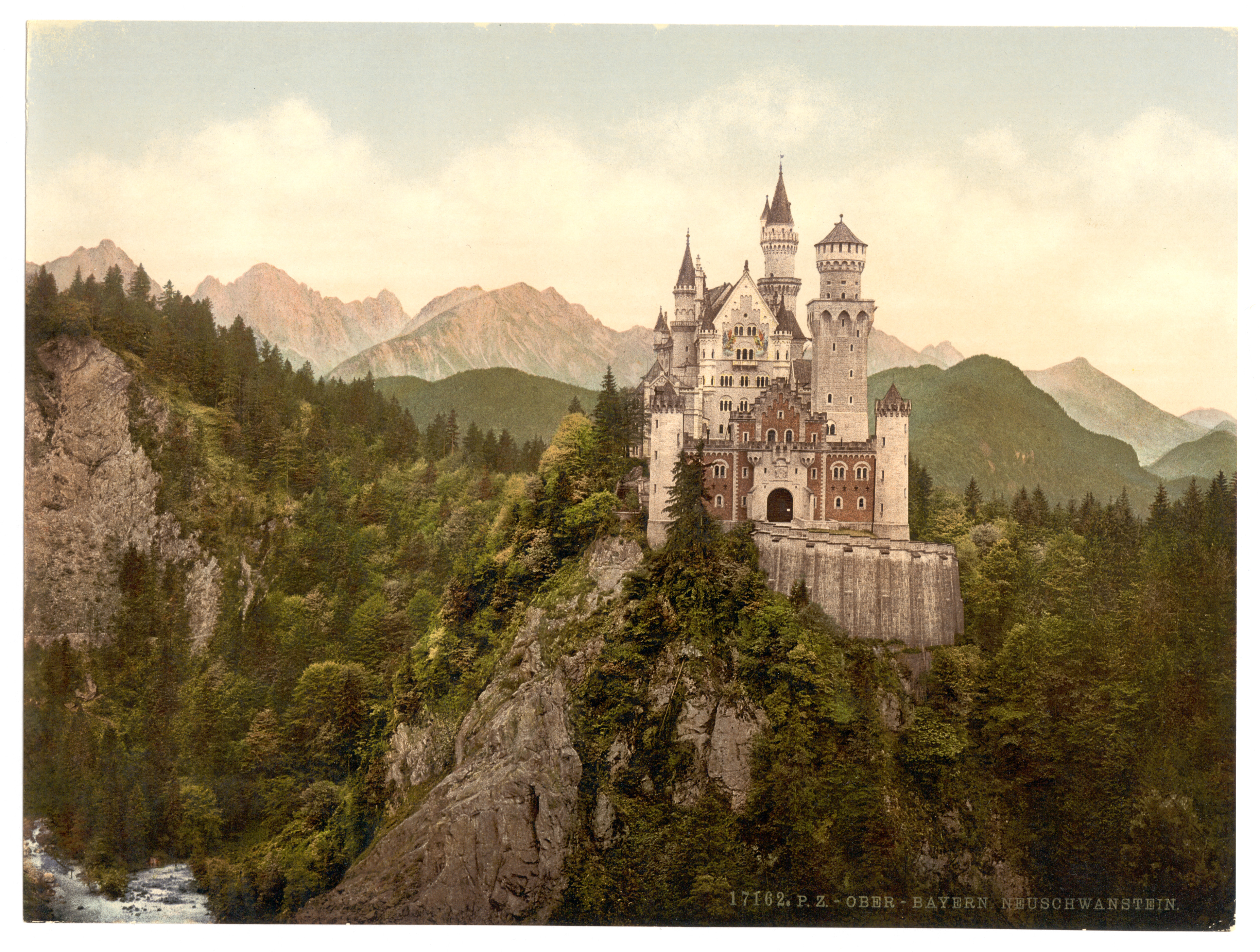
Jill Bogdanowicz, who, I must say, has one hell of a resume, acted as the digital intermediate colorist for the film, which means she was involved with the grading, which she did on Da Vinci Resolve (a color correction program that Arturo recommends). She did an interview with Studio Daily about working so close with Wes Anderson, and the whole thing is a pretty interesting read. You can find it here. One thing from that article that I found particularly interesting is how Anderson used Photochrom (think an early version of Instagram) as an influence for how he wanted certain segments of Budapest to look. I think it's pretty easy to see the similarities, particularly in the film's poster.
One last thing I found was a way to replicate the anamorphic aspect ratio that Anderson uses in many of his films. It's almost like a subtle fish-eye distortion, with the edges of the frame seemingly bending to give things a rounded look. You can watch the video to see what I'm talking about - and how it's applicable to your own work - and go to the website to download plugins for After Effects here.
No comments :
Post a Comment