Monday, September 29, 2014

Music & Animation

One of the things I'm most excited to play with more in After Effects is animation based on music. I (like most people) am a huge music lover and transitively a big fan of music videos when they're done well. I think for certain albums, more artists should consider creating visuals to go along with entire albums as opposed to just certain singles. I saw a lot of potential for this in a video released by producer Flying Lotus a few weeks ago, which was essentially a preview for his upcoming album "You're Dead!". The video basically shows snippets of every song on the album with a little trippy visual for each one. The animation is all based on the music and fits the album very well.  The video is not on YouTube but you can watch it at this link:

(WARNING: Lots of flashing lights do not watch if susceptible to seizures)

Flying Lotus Website

Flying Lotus is no stranger to setting his music to animation. Here are a couple other examples:


These are more quirky little videos. Each tell a story and each have an art style that is truly unique and fitting of the music it's made for. It's a ton of work, but this is the type of stuff I'd have a lot of fun making.

By the way, the new album "You're Dead!" releases October 7th, but it leaked over the weekend. It's absolutely amazing, and I definitely recommend checking it out (and buying it when it releases). My roommates and I have been each listening to it and promptly getting our minds blown.




Saturday, September 27, 2014

A Look at the New Super Smash Bros

Hey everybody!

It’s me again. This week, I won’t be talking about a show, but this time rather, a video game. I’m pretty sure everybody who grew up with a Nintendo 64 will know what I’m talking about when I mention the new Super Smash Bros game. This is a game that I grew up with and my childhood, and back when this game was new, the graphics weren’t very sophisticated. Now with this fourth sequel, the scenery looks like something out of a storybook, and the characters look even more real; You can see Charizard’s arm flexing as it prepares to attack, you can see the stitching on Mario’s overalls as he runs, and you can see the newcomer, which is the new Pokemon, Greninja (who is awesome and is the Teenage Mutant Ninja Turtle that I always wanted) move it’s body like an acrobat and so fluidly. The camera angles makes the action seem so much more intense and almost 15 years ago, graphics like these were a complete pipe dream (pun sort of intended because Mario used to be a plumber). The graphics for this entire commercial is absolutely incredible and this is definitely something I would love to do for a living. If you’re a video game kind of person, it would be a sin for you to not give this game a look.


Friday, September 26, 2014

Gritty Reboots: The Process


Gritty Reboots is a youtube channel dedicated to remaking nostalgic television shows/video games/comics into something more well, gritty. And while these videos may or may not be your cup of tea, it’s interesting to see the kind of effects they have to do to accomplish what they want. They divide their work into three parts: the final product video, the back-to-back comparison video, and the how it was done video. They’re definitely a channel I’d recommend checking out if you’d like to see the process of video production and after effects with a small-scale company.


    Looking through their work, Gritty Reboots definitely had built a signature look: dark and edgy. They're lighting is more often than not borderline cold, catering to the dynamics of light and dark in a picture. It only makes sense given that they're final products are marketed as being more serious than their whimsical origins. 


    The before and after is a good look at what their original shots looked like without all the color-grading and special effects. It's really interesting to see what a change in lighting here or a single mask there, makes in a film. 

   Similar to other small-scale video production companies on the internet (such as the Hillywood show), Gritty Reboots has a small team that knows how to get the shot. Their behind-the-scenes are as interesting (if not more) than the final product. To me at least, it shows just how able you are to accomplish something if you're willing to put in the work. Like other BTSs of theirs, they also offer a glimpse in to the entire production process as a whole. Yes, these aren't meant to be tutorials but they can do just fine as inspiration.
   Gritty Reboots is certainly a company that's worth looking at, even if it's just to see their feats they've managed to accomplish. 


South Park - From Construction Paper to The Emmys

Ever since I was young I remember watching South Park with my big brother.  We would laugh until our sides hurt over the quick, witty lines mixed in throughout the toilet humor.  But the thing that stands out to me looking back over the years is the evolution of the animation involved in South Park.  The creators of the animated series, Trey Parker and Matt Stone, started with pieces of construction paper cut out to look like the characters they had in their heads.  One of the first episodes, entitled "The Spirit Of Christmas (Jesus vs. Santa)", never actually hit the airwaves.  It was actually just a short film that Trey and Matt made together.  Here is 5 minutes of that video.


From there, South Park changed drastically - using state-of-the-art animation software and having a team of writers work on episodes nearly 24/7 until they are complete.  Today, South Park is one of the only shows in existence to write, animate, and air an episode within a week.  The team doesn't start writing until the last episode they created has aired, then they sit and brainstorm ideas for episodes until something comes to fruition.  From there, it is a scramble to animate the episode and finalize changes with the network until the air time - which is only 7 days from when they started the writing process.  Here is a short example of a modern episode.

So as you can see, the animation is far superior now to what it used to be.  The team of animators on the show keeps all of the character object files so they can be quickly added to episodes for editing.  I think this show, despite the style of humor, is one of the most sophisticated animated tv series today.

Cinemagraphs: Classy Gifs

The smoke animating we did in class made me want to take a deeper look into Cinemagraphs. Cinemagraphs are still photos animated in select areas, very much like our cigarettes and chimneys from class. Cinemagraphs is actually a trademarked name from Jamie Beck and Kevin Burg, though the idea of animating a still photo has been present for much longer than the trademark.

Beck’s and Burg’s website, cinemagraphs.com, features a lot of their work from around New York City. Cinemagraphs are GIFs, but somehow much more emotive than what one might normally associate with a .gif. It is very much like watching a regular video, but the stillness of most of the scene adds an element that can be very soothing or haunting—like the whole world is frozen except for that one point. It’s an interesting glimpse into a moment.


The process of creating a Cinemagraph (or a gif in general) is relatively simple, considering how beautiful and impressive it can be. All it takes is a recording or some photos and you’ve got yourself the basis of a cinemagraph!


Flash Animation Overview Part 1: The History


Adobe Flash is a powerful animation, vector graphic and games/software creating tool. The first version of Flash was created in 1996 by a company called FutureWave Software. It was released as FutureSplash Animator, before it was sold to Macromedia, who released the product as Macromedia Flash.

Flash was widely used on the internet, for many applications such as playing music, games, and video. Flash was used to make many of the 'classic' internet toons we love today, such as That badger thing, The Demented Cartoon movie, and the great Homestar Runner.com  
Homestar Runner's creative cast

Flash stayed on the internet until 2002, when Warner Bros. Animation debuted the first animated TV show done in Flash: Mucha Lucha 

In 2005 Adobe purchased Macromedia, bringing Flash into Adobe's army of creative evil: The Creative Suite. 

Next Week: How do Flash do? A look into how Flash works, symbols and actionscript. 


The LEGO Movie Credit Sequence

One of the most popular movies that came out last year was "The Lego Movie." This movie gained a lot of attention because of its insane cast consisting of Will Ferrell, Allison Brie, Morgan Freeman, and many more.

What makes this movie so interesting is the fact that the entire world shot in this movie is made from LEGO's. Most of the film is done in fluent stop motion as the main characters are portrayed as plastic.

One of the coolest things in this film in my opinion was the ending credit sequence, which tracked through many different tiny scenes consisting of LEGO's. While there isn't much motion graphics in here other than possibly the camera tracking and maybe some moving LEGO pieces, I felt this stop motion was so incredibly well done, and that the use of programs like After Effects for the mouth movements really made this film possible.

And what a film it was!


Homestar Runner - Trogdor

I think that it's safe to say that Trogdor the Burninator pretty much describes my childhood. My family and I still quote the video to this day. The website called Homestar Runner, which I'm sure most of you have heard of (I hope) is full of cartoons such as this one with a unique collection of characters.  The fact that the site was created in the year 2000 makes me feel very old!  You can still visit the website here, although it has not been updated since 2010.


Trogdor is an animation from the series "Strong Bad Email."  There are not only many more videos you can watch, but there are also games and ways to interact with the site.  It's very nostalgic, and I highly recommend taking a look at it.  It was one of the first websites I really appreciated as a kid.

Thursday, September 25, 2014

Everyday Animation

There is potential for animation everywhere we look--we just have to use some creativity to see it sometimes. That spark of imagination is how animator Marty Cooper started his animated shorts called "Aug(de)mented Reality". In these shorts, Cooper animates hand-drawn characters interacting with mundane and ordinary objects. He uses just a clear cell/sheet, an iPhone, and his surroundings to generate quirky and fun stop-animations. 


As you can see in the video, Cooper comes up with zany characters that move around dumpsters, destroy pillows and even dig in the dirt. His use of animation in the real world is both unconventional and creative. He is able to both capture the characters with all of their motions and capture the background and make changes to the physical objects as if his animations were moving the objects. This video makes me think of all of the different capabilities of animation. The possibilities are really endless, all it takes is a little bit of creativity and a lot of patience. 

Wednesday, September 24, 2014

Grand Theft Auto - A Retrospect!

Hi there,

The amount of development and progression in the world of graphics and animation is mind boggling.  Now videogames not only simulate real life, they are confused with real life. Crystal clear graphics on the current generation of game consoles feature serene backdrops, painstakingly beautiful textures and animation that emulates life.

One of the must visually stunning videogame series is Grand Theft Auto (GTA). Regardless of how you feel about the content, the guts and gore, Rockstar Games has consistently created a beautiful city to wreak mayhem on.

The first version of the game was released way back in 1997 and featured depth and scale never really seen before in videogame land.


In just only 15 years the series transcended all graphical expectations. GTA 5 was released in 2013 and brought with it the clearest, most defined graphics of any video game to date.


The people are real. The situations are still crazy, but as a player you get much more devoted to the characters and their lives. Even compared to GTA 4 leaps and bounds are made.


I'm excited to see where this series goes next. I can't even imagine what the next step is. Although, I am very eager to play it!

Until next time!

Alex

Sunday, September 21, 2014

Title Sequences

Looking at some of the title sequence tutorials on videocopilot.net had me thinking of the art of the title sequence in general, especially because I know we're going to have to make one soon for class. I YouTube'd "best title sequence" and came up with this video. This guy sums up pretty well some of the best TV title sequences we've seen:


I agreed with a lot of what he had to say. Mad Men, Dexter, Fresh Prince, The Simpsons, etc. all have title sequences I would call "iconic". They take the quality and creativity of title sequences in TV to another level. Fresh Prince does it mostly through catchy music, but how can anybody deny a title sequence where almost everybody knows the lyrics to it's song front-to-back.

Mad Men in particular is a fantastic example of how a title sequence can use motion graphics and animation to display themes of the show beautifully. This video I found does a great job explaining just how much of Mad Men's themes are telegraphed in the intro:


It's me again, tapping into my inner passion for the childhood television series that lit up a rather dark childhood.

Whether this show is animated or not is debatable, but nevertheless played a very big part of my childhood when I was very little. It's definitely not a non-fiction series because the last time I checked, trains don't have faces, but its a show that will always resonate with me and quite recently I learned about the kind of production that goes into making this show; Thomas the Tank Engine. They shoot the show as if it were an actual set, and they build everything from the engines, scenery and people from scratch and have different faces for different expressions. I think it's incredibly neat what these producers and directors have been able to do with this show. I'm sure a lot of you saw at least a few episodes while growing up, but below me is one that stands out as one of my favorites.


Friday, September 19, 2014

Music & Animation

One of my favorite things to do while aimlessly browsing the web is watching music videos because I am always interested in seeing the visual interpretation of songs that I enjoy. One video that I like in particular is the the music video for the Arctic Monkeys song, "Do I Wanna Know". This video was released in 2013 and it was produced by David Wilson with the animation agency Blinkink. This music video is minimal and it showcases the music without being too distracting. It is also an awesome visual representation of sound and sound waves. The animation and the music are in perfect sync with each other, creating a mesmerizing effect to the video. The videos use of lines and color add to the psychedelic effect-- this video just so cool. Enjoy!


Also, click here to watch more Blinkink animations (they are pretty cool too!)


If a fight happens in a boxing ring, but there are no boxers present, did a match really occur?


PAUL PFEIFFER,
Video Artist


Considering that I am three weeks late on publishing my inaugural blog post, I figured I needed to bring something to the discussion that would make up for my previous absence. That something is an introduction, for those of who you may not have heard of him, to the video artist Paul Pfeiffer. After watching the short video above, it will probably become clear as to why I thought this class is a perfect place to look at his work. I was introduced to The Long Count in my Experimental Media class earlier this semester and when Arturo showed us the camoflauging work he was doing for that period film in After Effects, I recognized that for a skill set that generally gets put to work making other people's projects polished and finalized, Pfeiffer was using those exact same techniques, over ten years ago,  on raw footage and was making them his own. 


Thursday, September 18, 2014

The Golden Ratio - What is it?

To answer the question flat out, it's roughly 1.61803398875. But what does it mean, where does it come from, and most importantly, what does it do?

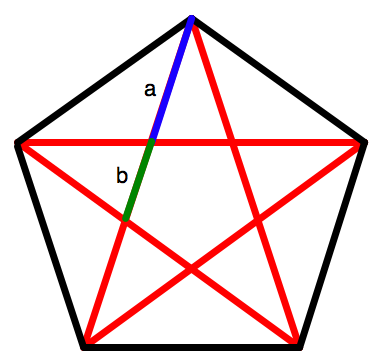
Well, the answer to these questions is something that everybody knows, just not consciously. The golden ratio can be found all throughout nature and art. Achieving the golden ratio can be as simple as a+b being to a as a is to b.
Does this rectangle look familiar? It's a perfect shape to draw or film things on.

The golden ratio can famously be found in plants, notably in their spirals which tend to result in Fibonacci numbers. (Golden ratio and Fiboncci are like, best buds) 
This relationship would be a blog post in itself, but we got other stuff to go over. I encourage you all to head over to mathisfun.com to learn more!

The golden ratio pops up in art all the time. The more beautiful we tend to find things, the closer they are to the golden ratio. Take a look!
Remember, it's as simple as a+b is to a as a is to b

The golden ratio is found in things as simple as a pentagram,


To things as complex as the human body.


Steamboat Willie

For this week's post I looked at one of the earliest examples of a Disney animation that I could find - Steamboat Willie.  In this classic animated short film we see the beginnings of Mickey Mouse and other cartoon characters play out a few scenes on a steamboat going down a river.  What I enjoy about the animation is the use of sound to accompany the action on screen.  Disney is a talented artist but the story would be far less effective if it was missing a soundtrack.

This animation was completed one frame at a time, with the artist drawing each frame with slight differences from the previous one.  These drawings were then photographed and when played back at speed, they show the story of Steamboat Willie and his friends.  I can't imagine having to draw each frame over and over again, so I have a deep respect for Disney and all of the animation team.

Tuesday, September 16, 2014

Forrest Gump: The Animated Movie


Forrest Gump is quite the movie. Not only is it lovely story-wise, it features some pretty amazing CGI, from leg removal to ping pong ball addition and beyond. The quality of work in this movie was impressive in 1994 and continues to be amazing.

This video goes into the making of the ever-famous, super deep Feather Scene. The scene itself is often considered the ultimate metaphor for the whole movie, channeling the idea of “wherever the wind blows.” Funnily enough, the wind of this scene was completely choreographed. The graphics people working on Forrest Gump were able to composite a blue-screen video of someone controlling the flutter of the feather onto the exiting scene and meshing it to an actual feather that Forrest interacts with in the scene. Everything had to be planned and thought out extremely thoroughly for the scene to work. And boy did it work.


Another really cool part of Forrest Gump is whenever Forrest shows up in historical footage—meeting JFK, sitting with John Lennon. The behind the scenes video shows how much matching, masking, augmenting, and altering went in to realistically putting Tom Hanks in the scene. These scenes really show the magic of the green (or in this case blue) screen. Forrest Gump is quite the testament to CGI and animation in a movie that might not be immediately associated with animation.

Saturday, September 13, 2014

Cosmos: A Spacetime Odyssey

Cosmos is definitely one of my favorite shows right now. It's not only educational, but also entertaining and just plain cool. The effects that are used in this show are captivating and extremely impressive.


Neil deGrasse Tyson floats through space as he explains many of our universe's phenomena. In the first episode, there's a really cool representation of how old our universe is in which major events in the past few billion years are squeezed into one calendar year. Neil walks around on the big calendar in the middle of space and shows how insignificant humankind really is in comparison to how long our universe has existed (this can be seen briefly at 2:41 in the trailer).

I also love the opening intro with the word COSMOS spread across a black hole/eyeball. The amount of time and work that went into creating this show certainly paid off.

Friday, September 12, 2014

The Art of the Green Screen


It had been another one of those days when I had nothing to do and I had visited every social media site that I bothered to subscribe to. Bored out of my mind, I decided that it might be somewhat interesting to browse the “recommended” section of youtube. And while I scrolled by videos of cute animals doing stupid things and shoddily put together videos meant to go viral, my eye caught something that looked different from the rest.


To be honest, I don’t remember what was the first video of theirs that started the addiction but I can say that they are one of the few youtubers that I still subscribe to. Their moniker is PistolShrimps and they’re a Norwegian duo whose most infamous works include them green screening themselves into popular movies. Mixed with their borderline offensive humor and somewhat dark spin on things, they've created videos that you really can't help but watch from beginning to end. They also have a cool range of special effect videos, but for the purpose of this blog I want to focus on their green screen work. This is because their feats at inserting themselves as if they were actually actors cast in the movie, is surprisingly well-done. In my book, they were (and still are) doing something right.


And for me, this was essentially all about the set-up of the lighting and (potential) color-grading of their shots. I think this is something that people who use a green screen often overlook and forget about when putting together a movie. But PistolShrimps seems to have gotten it down to an art. They’re able to center their light source almost identical to those actually set up in the film. And they keep in mind that not every shot is the same “color temperature.” Sometimes a shot will be blue and gritty, other times warm and sunny: but they take that all into consideration. Pair this with how expertly they’re able to subtly insert shadows and overlay their footage behind (on top, below, in front of) key objects in the shot, all works to really suspend a viewer’s disbelief that they are not in the film.

It’s a work of art itself, but it’s one that they’ve managed to get down to a dot. And with their witty editing techniques, they’re able to twist a story into something vastly different than it originally was. They not only insert themselves into a movie, they bring a whole new plot and point of view.


Pokemon: Now and Then

This week, I’m going to be talking about a television series that has been one of the trademarks of my childhood. I’m sure a lot of people, especially here at college know which show I am talking about here. I could remember when I was 7 years old, that I saw my first Pokemon episode. My eyes were completely glued to the television screen and I was so entranced with the music, Pokemon and adventures that our main protagonist, Ash Ketchum would take part in.

This show is still on the air after almost 20 years, but the format of it is completely different. I’m attaching below two different clips of the show. One was when it was newly aired to the public, and the other, a more recent clip. The differences are quite substantial; the animation, music, the kind of dialogue that was used, to name a few. One key difference that I was able to pick up on immediately was that the animation for certain battles. Back then, the animations were rather simple and now everything is so meticulous. Obviously, I would prefer the first season’s style of production over right now, but it’s a great example of how animation has evolved in a rather short period of time.


I must warn you; Nostalgia Shivers will occur. 

Video 1


Video 2


The Paperman


Many of you probably saw this animation already. It premiered in front of "Wreck-it-Ralph" in theaters. It also won an oscar for best animated short.

The Paperman does an amazing job of telling a story animating objects. That's actually all it uses to tell the story as this film has no dialogue. The way this film displays inanimate objects in an animate way is beyond impressive.

It makes sense that this short won an academy award because the attention to detail seems amazing. One thing that greatly stands out to me in this short is the lighting. As this animation is in black and white, lighting becomes more important to differentiate objects in the 2D field.

I felt that this was a prime example of how inanimate objects can be a huge deal in a film, and how animation alone can create a heartwarming story.


Flash Back Friday...Oprah Style!

Hi there,

As I learn more about animation, the process of animation and the incredible tools available to assist this process, my mind is continually blown. There is so much involved in creating a successful animation, title sequence or graphic. Luckily there are some amazing computer tools out there that simply the process.

These tools didn't always exist. As with most things technology wise I am always amazed with how quality things were produced in the past without the help of these advanced technological tools. Take a look at one of the earliest intros of The Oprah Winfrey show. These were well produced, full of life, music and graphics.

I can not fathom the amount of time and energy spent in producing these pieces. Bravo and special shout-outs to all the early editors, animators and graphic designers out there!

Until next time,

Alex Cammy


Scott Pilgrim vs. the World

One of the best opening sequence for a movie that I have seen is the opening for Scott Pilgrim vs. the World. This movie was based on the graphic novel by Bryan Lee O'Malley and the film adaptation was produced and directed by Edgar Wright. Since the film was based off of a graphic novel, the movie has a comic-like style to it. This is shown especially well with the inclusion of motion graphics and animation throughout the film. The movie is a hybrid of a movie, a graphic novel, and a video game. Scott Pilgrim is a zany story so the unrealistic animations do not distract from the feel of the film. Here is the opening title sequence:


This title sequence sets the mood for the entire movie. Each time an actor/actress's name comes up, the animations gives clues to the character and foreshadow the events to come. It is fast-paced, colorful, and it showcases the music (which is one of the major parts of the movie). It's fun and it is also great animation.

Thursday, September 11, 2014

Her Morning Elegance

For this week’s post I chose to look at a music video by Oren Lavie.  The song is called “Her Morning Elegance” and the entire video is a stop motion piece.  The video features a woman in bed who then (through stop motion) goes through an animated, dream-sequence adventure while still in bed. 

I love this video because I can watch it without audio and still follow the story being told.  No props are used besides pillows, sheets, and even laundry – all things that can be found in a person’s bedroom (where the video takes place).  I love the simplicity of the video because it can be recreated on a budget.  The video shows how easy some of these animations can be – all you need is a camera and some common household items.

Freddiew/RocketJump

Im sure he's been posted on this blog a million times, but one of the most impressive and most popular displays of animation excellence on YouTube has to be Freddie Wong. His newer YouTube channel is called Rocket Jump, but all of his older stuff is still on the "freddiew" channel. If you're a fan of video games or action movies, his videos are sure to entertain you, and the effects he uses in his videos always look great. His videos get millions of views each, so he's no secret, but here's some of my favorites:


These are all really well done and show some creative and funny uses of After Effects. The Epic VFX Time video in particular was great to watch again after a couple classes, knowing now how I might approach creating those effects. The rain of guns looked exactly like the particle effect we were playing with Tuesday. I could be wrong, but I'd guess you could turn those particles into almost anything. That idea alone gets me excited to keep playing around with AE.