Saturday, November 30, 2013

West Wing opening Credits and Thoughts


For my post this week I wanted to talk about the opening credits to The West Wing because they have always sort of fascinated me for their seeming simplicity on the surface but complex compositing underneath. On the surface it seems like, well, any other television opening sequence. "Make sure to get everyone in with scenes from the show" seems to me the M.O. for many TV shows, particularly during the 90's and early 2000's. However what makes this memorable for me is how many flash frames, extra assets, and compositing is going on between each shot. The sequence flows so well that you barely notice them the first few times you watch without a keen eye, but as you watch you can pick out more and more. I watched the entire run of the show years ago, and it still took a long time to be able to see. One in particular i'd like to bring your attention to is that as the sequence goes on the black and white pictures stop covering the screen and become more like pictures on a desktop being moved around.


 For me this gives the piece a much more alive feel, like someone was going through a stack of historical photographs. The thoughtfulness of the photographs themselves are also interesting to me, in the last 5 seconds there are several of these shown, but the one ended on is the shot of the president facing away from the camera.


 Even though the show is really about adding personality and character to political figures, the title sequence ends on this, showing Aaron Sorkin's awe of the "majesty" of government, a thought that definitely comes through in his writing of the show

Even Thor Plans Ahead


  Pre-visulization is crucial for movies that depend on visual effects, and as FX become more popular and advances each year, pre-visulization becomes more prevalent. Third Floor in London and LA did pre-visualization for the box office hit Thor:The Dark World.

Pre-visualized

Final

  Pre-visualization helps pace out time, set shots, and help make FX seem as realistic as possible. I feel in our course we should focus more on Pre-Visualization for each of our projects. Without this step, projects can be scattered and unfocused. 

Be like Thor and plan ahead. 


Friday, November 29, 2013

Star Trek opening titles

Below I posted a video of the opening titles of each series of Star Trek. What I thought was interesting to watch was how the graphics progressed over the years. The original was quite crude by today's standards, but back when the original series was created, it was actually acceptable and the graphics were very similar to other shows. Most effects used to deal with miniaturization as computers weren't powerful enough to create intense three dimensional graphics. As time goes on, you can see how computer graphics began to become a more integral part of the introductions. By the time of even Star Trek Voyager, computer animations and graphics almost entirely made up the entire introduction. I like videos such as these where you can witness the progression of computer animation, and how it became more advanced as years go on.


'Six Feet Under' Title Sequence

I was recently brainstorming for my final animation project and wanted to look into the creative process. I wanted to see what goes into making a title from nothing but still creating something that centers around a main idea. I watched the 'Six Feet Under' sequence for inspiration and it lead to storyboarding and looking into artist Danny Yount's work. He explains his creative process and how planning ahead is key to animation and creating titles. Each shot must capture the mood of the show and stand alone as a beautiful composition. We talked about composition and framing but storyboarding and coming up with alternatives and backup plans are necessary when creating a title sequence. The sequence refrains from using actors and the ambiguity of the characters and emotional shots create a sense of sorrow and darkness. The font and titles are simple but the composition of the shots is amazing and truly draws the audience in to the main theme of the show in a dark yet beautiful way.


WATCH YOUNT'S TALK BELOW


Thursday, November 28, 2013

Steam Autumn Sale! Artistic Indie Games to Check Out!

Happy holidays everybody! It's that time of the year again where you can buy games off of Steam during their holiday sale and I wanted to share a couple hidden indie gems available at reduced prices that have quite the unique art styles. The above trailer for the game Contrast depicts the mechanic of shadow manipulation. The player is able move both in 3d as the main character, and as her cast shadow in 2d space. Hence the title Contrast which deals with the dynamic relationship between light and shadow. It has a cartoon cabaret art style that is both instantly recognizable and beautiful.

Don't Starve is a crafting survival game that has a flat, cut-paper aesthetic with an original demented circus fair soundtrack. It's flatness is accentuated by being able to rotate the player view in 3d yet all the visual elements remain two dimensional. The trailer above demonstrates this odd, yet strangely satisfying, visual paradox

Antichamber, is a first person puzzle game that forces players to disregard conventional puzzle-solving methods and substitute more creative solutions. The art style can be categorized as minimalist. Most areas are pure white save for key elements within the game which serve as visual clues, tools, and indicators of progression. I have yet to see a more abstract and playable game.

There you guys have it. Hope you guys are having a good break!

Wednesday, November 27, 2013

Thor - Ending Titles

The ending sequence to Marvel's hit superhero movie, "Thor", is a sight that has to be seen to be believed. Based off of images from the Hubble Space Telescope, the ending titles to Thor take us on a journey through our universe and beyond, focusing in on galaxies, nebulae, stars, and other such space-worthy existences.

This all takes place immediately after Thor blasts off from Earth, leaving a comet-like trail in his wake as he returns to Asgard. Simple titles of those who helped to create the film are displayed, without interfering with the beautiful scenes, on the screen. It all cultimates on a journey through unknown stellar formations, all the way until the camera reaches Asgard itself, a kingdom built on the clouds of its own galaxiular disc.

It's a sight to behold, and also created in After Effects! With a little help from the likes of Maya, anyone could create a sequence of this caliber.

Tuesday, November 26, 2013

Top of the Lake

This week I'm going to talk about the BBC show Top of the Lake. This is a show about detectives looking for a girl who has gone missing after being sexually assaulted. The dynamic and interesting cast of the show is what really sets this show apart from other crime dramas, and makes for a really interesting watch. Here's a trailer so you can get an idea of what the show's about.

http://www.youtube.com/watch?v=NKlsiZhgnbc

(Sorry this is a link, it's not letting me embed the clip.)

The reason I'm posting this intro is because of how well I think it captures the feeling of the show. It's very short, only about 30 seconds long, but in that time you get a real feeling for the show is going to be about. The colors used in the clip, aquas and deep blues make you feel calm when you watch it. the music also helps to create a very placid feeling. It's because of those elements that the symbolism really makes you feel uneasy. The image of the deer head slowly sinking until it disappears into the darkness of the bottom of the lake and the fetus and photo appearing just makes you feel on edge. On top of that the stop motion feel that this intro has also adds to the feel of unease this intro is trying to convey. I just really think this clip does a fantastic job of setting a mood for the show to follow. Here's the intro.

http://www.youtube.com/watch?v=NwSVYPWXoBU

Saturday, November 23, 2013

Game of thrones Title sequence


Since i'm doing my title sequence on "Game of Thrones" on HBO, I thought I would talk a little bit about the real one for my blog this week, which is probably one of my favorite title sequences in television or film. The best thing I think this sequence does use perspective to carry the viewer around the world of the show. Because the show is so spread out over wintery wilderness, to deserts, to cities, this title sequence also has a lot of utility in the story, allowing the viewer to take in the sheer scope of the world. This effect starts immediately, with the pan down from the sun over to the map of the world, establishing immediately that the sequence will be traveling. The sequence then travels between every major location in the episode of the show (with this changing each time). The effect that really grabs you though is that the world "builds itself" from out of the map. Here is what the creative director on the project, Angus Wall had to say from an interview with Art of the Title here

http://www.artofthetitle.com/title/game-of-thrones/


"Our goal was to try to replicate something that looks and acts like a physical object. Art Director Rob Feng referenced  Leonardo's Machines which have a timeless sense of design. We wanted the title sequence to be rooted in world of the show, which is a technically unsophisticated place, but to also have a complexity that gives it life"

(Final Render of the Sun/Astrolabe)


There was clearly a lot of thought and work that went into this title sequence and I think it really shines in terms of design and production value as an amazing piece. 


Friday, November 22, 2013

Movie Production Logos

Recently, I saw All is Lost starring Robert Redford and it was basically Cast Away without Wilson. Regardless, I started thinking about production logos and what makes them special. I watched many intros and realized at this point in my school career, I could remake practically all of the logos. The memorable part of each logo, however, is the sound. You recognize the Focus synth and the MGM lion roar as much as you remember the logo itself. Arturo stresses the use of sound in animation and it truly is important. Whether it is a song or a synth swell, the audience can associate the sound with the logo. More advanced titles are recognizable such as Jerry Bruckheimer Films and it preps the audience to expect something amazing. If you see an unrecognizable production title you may not know what to expect but if you see the MGM logo, for example, you associate it with extremely high production value. The companies have a few seconds to express the brand and need to make it memorable. Each logo requires a sound and it's usually a swell that draws you into the picture. I plan to create a powerful logo for my reel that draws the audience in through sound and simplicity.


DSLR rig, and video effects

This is a video about a a DSLR rig that the user Matthew Pearce put together, making a camera into a full fledged video rig. This cannon 5DMKIII has been completely outfitted to be used as a cinema quality device. This rig features a matte box for the front lens and an external monitor for enhanced viewing during video. Aside from the actual rig itself, the video features some nice effects to showcase the additions to the original camera. There are some nice stylistic titles to show each of the new parts for the camera rig. The titles as seen in the second shot were mapped to the footage to scale appropriately to the shot as it zoomed in. These are the kind of effects that we have been seeing in class, and would be easily replicated with our current skill set. I'm sure there was some color correction on this footage as well, and once again this is another effect that is completely within our range of capabilities. So I leave you now to watch the video, as you watch not only to admire the rig, but the subtle effects that add to the video to make it more interesting to watch.

http://www.youtube.com/watch?v=YBd7k28Ckbk

The History of the Title Sequence

Seeing as our next and final project is to create or recreate a title sequence for a film I thought it would be appropriate to learn about the history of how the title sequence evolved. The main function of a title sequence is to display the movies's title and to credit the director, producer, actors and other people who were involved in the making of the film. However, the title sequence is also suppose to prepare the viewer for the viewing of the film.

The original title sequence started off as simple title cards, they were used to top and tail silent film presentations in order to identify both the film and the production company and to act as a signal to show that the film has finished and started.


J. Stuart Blackton directed "Humorous Phases of Funny Faces" (1906), they had one of the first animated opening title sequences.


Graphic designs were created by lettering artists' who created compositions of typeface and some minimum decorative patterns until about the 1960's. Throughout the 1930-50's the title sequences were considered to be conservative and unimaginative. During the 1960's a preference emerged among the avant garde filmmakers, this stye became a kind of prestige symbol for of all the movies


One title sequence that really stuck out to me when I was growing up was the one for North By North West which was created by Saul Bass in 1959.


As the years have gone on technology has improved allowing the artist to create even more amazing title sequences. One of my most favorite ones is Monster Inc. created by Susan Bradley in 200.


Animate Still Photos in After Effects

Arturo has briefly gone over this technique in class, but I recently saw a very impressive video made entirely of still images from the WWF archive that have been animated to look like video. It's a really captivating technique and it gives the pictures a breath of new life. Ken Burns, I'm sorry, but your methods are just too old school nowadays. It's time to get our pictures animated with After Effects!

First, check out the video they cerated:


Some of these shots took a lot more worth then others, but you can see how much more captivating the picture becomes when it starts moving. If one of you is looking to create a similar effect in your movie trailer project, here's a nifty tutorial by The Creators Project that walks you through the process:


Thursday, November 21, 2013

This is a very short animation I found on YouTube, I believe it's a student animation from some competition. Anyway, I picked it because it does a very good job of telling a story. I won't spoil it for you, but the ending is great, and very unexpected. In just over a minute this animation conveys a sense of tension, whimsy, anxiety, and a plethora of other emotions. I think story really is the most important part of any animation, game, video, website, or whatever you're making. Conveying a feeling or a theme is, in theory, why you're creating whatever it is you're working on. I think the creator/creators of this video did a really good job of conveying a mood, theme, and feeling in this piece. I also think they did a really nice job of leaving some questions in this story. You don't know what this monster is, you don't know why it's chasing this guy or why they're on this train, and I think that's deliberate. There's enough holes in this story for people to make assumptions and fill in the blanks, and that's pretty cool too.

Storytelling in Animation: South Park

This week I thought I would switch things up a bit with a look into the storytelling behind South Park since I've always wanted to write about this topic! While many of us are consumed with the aesthetic elements which make up our animations as we progress we should really  incorporate a strong plot in order to convey a cohesive product. Lastly while I am not trying to tell you to create ridiculous animations this is food for thought in what provokes your audience and how you can catch their attention.
  
  South Park has long been considered a major source of uncertainty for millions of Americans and citizens of other nations alike. Often known for exploiting social hierarchy, corporate America and depicting hundreds of other cultural references South Park uses unique provocative satire in their storytelling along with animation to construct social criticism and exploit wider issues in society.
Satire is found in many past and present-day plays, literature, television shows, media, commentary and has been a crucial part of South Park’s success in their 17 seasons as an American adult animated sitcom. South Park embodies a complex set of comedic values to project preferred meanings about social criticism, corruption of America and other political and social concepts involving worldwide phenomena. The storytelling behind the animated sitcom is considered so controversial it has been the source of much critical analysis by college students and scholars alike in the media and literary fields. The cultural norms displayed on the television series are often an exaggerated form of comedy used to shock the audience. While many people might explicitly reject these absurd recreations of human interaction, the questions raised by the production team in many of their episodes are something to consider. An interesting aspect to explore with the show is how the graphic material affects the way in which the individual views the world and therefore how their actions are based on their reactions to what they are viewing. For example, in many occurrences episodes contain disturbing even comedic mockery of major catastrophes and tragic events that have occurred. While some people are outraged at the show and even call the witty artistic expression a disgrace, people in America especially tend to alienate themselves from information about foreign/ national events making the show an interesting pill to swallow for the people of this nature. The show can also utilize subliminal tactics making it hard for the uninformed to pick up on the irony, satire or symbolism being used; this is sort of an “inside” joke if you will. This also raises another interesting question about whether the American public and international citizens alike can handle the ugly truth of worldwide corruption. The fact of the matter is while South Park may not be the actual event occurring in live time the animations created by this unique production team exposes the traumatizing real life truth of the world we live in.
South Park remains a controversial source of media due to the programs ruthless demeanor and unorthodox form of artistic expression. Consequently, South Park producers Matt Stone and Trey Parker utilize a compacted and convenient television show as its medium to deliver brilliant manifestations of irony and sarcasm focusing on critical worldwide issues to awaken an other wise naïve audience.

        Here are some examples of my argument... 


Wednesday, November 20, 2013

"Fireflower" by Pierre Michel

Punctuated by a dramatic soundtrack, and beautifully colored 'flames', Pierre Michel's short video "Fireflower" is sure to induce awe in those who watch it.

It's simply animated at first glance, but it's extremely effective at illiciting the emotion it desires to illicit. It's an abstract vision of sensuality, according to the motionographer, and the intense focus on texture and color add to the already mystic views of the film.

The one thing that I really enjoy about this clip is that it appears to have been made entirely in After Effects - And I can pretty much see exactly how, too! Particle generators, 3D lights, and simple expressions are all that anyone needs to create a piece of art like this, and that is certainly a phenomenal thing.

Without a doubt, this is one of the more pleasant After Effects videos that I have had the pleasure of viewing. It's all particle effects and simple colors, with the periodic partial silhouette of a woman, but at the same time, I feel like that's all it needs.

Saturday, November 16, 2013

Second Son

I know I posted about a video game last week but I'm going to again. This trailer came out about a day ago and it was just way too good to not talk about. This trailer is for a game coming out in February 2014 called Infamous Second Son. In this game you play as Delson Rowe a man with super powers fighting for equality for himself and others like him. The reason I posted this trailer is because its all about his new neon power which is a sort of teleportation  power. That means this movie is literally all about movement. Very interesting and beautiful movement of the main character and how it looks in game. As a Game Development minor and someone in this animation class I was blown away both by how complicated it would be to pull of the mechanical/implementation aspects of this power. I was also amazed by how hard it would be to create the elements needed to make these pieces of animation and how hard it would be to actually put them all together. Anyway, watch this video I am so excited to play this game and look at this piece art even more.

Signs opening titles: too easy for a major motion picture

Sorry for the short post guys but I just wrapped from 13 hours on set and I'm a little exhausted. I quickly just wanted to point out something I noticed when flipping through artofthetitle.com the other day. The "Signs" opening title sequence. Some of you may remember when this movie came out... I myself was just a little 10 year. Most people thought the movie was terrible but as a 10 year old I was scared out of my mind and therefore thought it was pretty good.

I got a better idea about what people where talking about when I watched the opening sequence on artofthetitle.com Yes, it's effective... but good god it's too simple. I realize now that I could have done this in just one of our class periods.


Take a look at it at this link.

I think you'll all agree that this title sequence is a bit too simple. The music however I still find very captivating. 

Friday, November 15, 2013

NBA Jingle Hoops


This is a commercial for the upcoming release of the new Xmas day NBA jersey's and NBA Xmas day schedule. The reason I am posting this is because if you watch the original video and the behind the scenes video, you'll see how the crew used a bunch of green screening and computer effects to put this together. This relates perfectly to what we've been doing in class, as they took a few real objects and seamlessly merged them together to make the entire video, the wood floor is generated, the area is computer generated and the shots themselves are actually generated as they used the actual footage as more of a reference and then tweaked them to the beat of song jingle bells. I thought it was interesting how they shot each person separately and then merged them into one single scene to make the video. I recommend watching the finished project first before watching the behind the scenes clip, both are great and very interesting.

Taking 2D objects and making them 3D

3D sweep is a new tool that will allow users to take 2D images and transform them into 3D objects. A team of researchers from the Interdisciplinary Centre in Israel and Tel Aviv University wanted to create this program in order to simplify the process of pulling out 3D shapes and objects from regular photos.


As you can tell by the video almost anyone can use this program. The user traces around the object to define the dimensions and then the outline will automatically snap the the object in the photo. The creators made it clear that users must understand that it doesn't work on every photo and the initial design was to allow users to have a more convenient method the create 3D objects.

"X-Men: First Class" Title Sequence

I was looking at some title sequences i liked and trying to have some ideas for our next class project and came accross these. X-Men First Class's title sequence is one that, in my opinion, is a really interesting piece because it matches very well with the theme of the movie and shows that simple but powerful motion design.

Here's the main title sequence:

XMEN : FIRSTCLASS TITLE from Ash Thorp on Vimeo.


But also, I found some other options they had for the title sequences, I think I understand the reason why they ended up choosing the one they did since it has more of a scientific, retro feeling to it while still maintaining the X:Men themes throughout. Regardless, they are all really enjoyable.


X-Men: First Class title sequence - alternative 3-D motion test from Submarine Channel on Vimeo.


Beyond Two Souls: A look into motion capture

Beyond Two Souls is a AAA title video game made by Quantic Dream for the Playstation 3 release October 8th, 2013. The player plays the part of Jodie, played and motion-captured by Ellen Page, a girl who has an unexplained link to a paranormal entity. The facial capture and reproduction in 3d staggered me when I first played and had me in awe.

This video demonstrates the sheer amount of complexity in shooting an otherwise difficult scene. The nature of narrative, player-driven games is that of multiple story choice. It also demonstrates just how alien-like motion capture is.

Thursday, November 14, 2013

Nintendo Controller Animation


This is a nice little animation I'm a real fan of because of its simplicity and cleverness with fairly simple materials. It is an animation following the evolution of consoles on Nintendo systems. The killer effect here is that all of the buttons never go away, but are modified in each transition so it appears that one controller flows seamlessly into the next. Its an effect I've seen a bunch of times before, and I assume its done with just a lot of work with keyframes. If you look closely frame by frame you see that the elements actually turn into little droplets as they change places and color. This lets the animation have its "flowing" feel that it does.


I also really like the transition effect for the body of the controller itself, because each time the animation has the body turn Z 90 degrees so the controller becomes essentially not there, and then when it passes 90 degrees it becomes the next controller. A similar transition was used on the last one, where the controller becomes a single rotating line, and then that line expands out to become the next one. Overall a really nice example of simple and elegant design.

Life of Hulk

In great action movies, such as The Avengers, the effects are larger than life (EX: The Hulk). Have you ever wondered how they make these monsters look so realistic, and how they create a whole location and make it seem real? Through the advancement of technology, CGI characters are broke down to the skeleton, making the creations more believable than ever before. Also, cities and oceans are now just painted on in Post-Production as Green/Blue Screen has become a highly valued location.
In both The Avengers and Life of Pi CGI work is used for more than making an animation, but rather bring a new world, and its creatures in it, alive.


Evolution of the Title Sequence in Cinema

         Many of us reading this blog may only of ever known the spectacular opening title sequences in the motion pictures we grew up watching as kids. This week I thought since we are starting our title sequence projects it would be only fit to provide a short evolution of the title sequence in cinema.

Beginning of Title Sequence in Film

         Film titles made their earliest appearance on screen during the silent film era. These were called film titles or letter cards and had to provide only the essential information to the audience. Often times these film titles or letter cards were created by a lettering artist who collaborated with the script writer and director. The biggest film studios had the funds to afford typesetters and therefore employed their work in production of title cards as well. Soon after the incorporation of typesetters in film the typography of the letter forms not only in motion picture but also advertising seemed to match the art movement of that time (ex. art deco, expressionism, etc...). Additionally sans-serif along with the art-nouveau style is an example of classic horror film text used in the film portrayed below.


Also the main title from D.W.Griffith's "Intolerance" (1916) considered one of if not the greatest film of the silent era. 


Title Sequence Progression

           As film became more popular their titles progressed in a vernacular sort of manner., especially do to influence of the Nazi's and the World Wars.  Animation slowly worked its way into movies and became a common additive to the opening credits. Here is a look at the oldest feature-length animated film "The Adventures of Prince Achmed" by German animator Lotte Reiniger.


Additionally here is the first mickey mouse cartoon in 1929 with its main title "Plane Crazy."


The incorporation of audio didn't immediately revolutionize how film titles were created until a man by the name of Oskar Fischinger came around providing insight on the relationship between motion graphics and title design. The first real score visualization product is seen in Fischinger's film "Studies" as he anticipates the motion graphic effects by Saul Bass in the title sequence "The Man With the Golden Arm" (1955).


Another example of score visualization by Susan Bradley in "Monsters, Inc." (2001)


Refining the Title Sequence

           With figures such as Saul Bass, Pablo Ferro, Maurice Binder and Richard Williams arriving in the 1950's innovation of the traditional title sequence went through a complete transformation as studios began creating for television. Here is a look at some of these artists works.

Maurice Binder and his famous 007 opening title sequence (1967)


Saul Bass and a still from "North by NorthWest," his first film with legend Alfred Hitchcock


It might be argued that the title sequence has lost its typography during this phase of evolution nonetheless many believe it has put more emphasize on the imagery behind the credits.

Future Development 

With the development of technology came the advancement of computers and therefore the integration of film and future. Consequently while this technology isn't always bad many in the industry fear that future artists will rely on progressive technologies unaware of the actual creative process. With Pixar and Disney currently at the forefront of this development the studios have almost branded there style with the hundreds of their storytelling title sequences. Here is a revolutionary title sequence for the film "Se7en"created by Kyle Cooper that was named "one of the most important design innovations of the 1990s."


A look at Susan Bradley's closing credits for Pixar's "Ratatouille" (2007)


Throughout the history of motion picture film titles have evolved with the time, fashion and the film industry. Although these sequences may be much more intricate then that of the silent film era the function of the titles  serve the same purpose as 100 years ago. As any great designer knows intriguing the audience in the first seconds of the film can be the deciding factor between success or failure for remainder of the motion picture.

Wednesday, November 13, 2013

Title Sequence- The Great Gatsby

Since we are moving into our next project, I wanted to make this week's blog post about another title sequence.  Particularly, I wanted to pick a title sequence that had simpler shapes, but great animations.  The title sequence I am choosing to recreate is from Monster's Inc-- which I talked about before on this blog.  It is very creative, using shapes to form pictures to help create an idea for the audience of what the film is going to be about.  (Here's a reminder of what the title sequence looks like).


This sequence, as I mentioned, takes different colored shapes and animates them in accordance to the music.  It is very childlike, simple, and eye-catching.  Another title sequence that I am using for inspiration for our project is a "fake" title sequence from The Great Gatsby.   This isn't the real sequence they used in the movie.  But similar to Monster's Inc., they match up the animation to jazzy music.  The shapes are simple but they play with animations.  There is a great deal of scaling, rotating, and changing the position of the graphics to create an easy-to-watch yet entertaining piece.


Video Game High School - RPG & Opening

(NOTE: For the purposes of this post, only watch the first 2 minutes and 30 seconds of this video.)

Video Game High School, a fantastic Kickstarter-funded series by Freddie Wong, depicts a world where there is a high school... where you play video games. That is legitimately all you do. A whole world was created for this purpose, with the high school's classes ranging from "Sniping 101" to "Advanced Kart Racing". All-in-all, the world is pretty believable, all the way down to the pizza-in-a-can-from-a-vending-machine.

In this first episode from the second season, the show opens to the main characters having a bit of an adventure in an RPG, "questing". A couple of the characters fire off their own versions of attacks, all of which have a bit of After Effecting done to them. One character pulls out a lute, playing a melody which travels all the way to the girl, who is an archer. She then looses her arrow, the camera following it in slow motion all the way to the attacking brute, freezing him and allowing him to be shattered into hundreds of block-like pieces.

As for the opening, it's all quick titles and transitions set to music, but it's all very smooth and pleasant, both to look at and listen to. Freddie Wong and his colleagues did a fantastic job on this series, and it shows.

Saturday, November 9, 2013

Richard Morrison

Richard Morrison is an English title-sequence designer from England and has designed the titles for films like Tim Burton's Batman, Sweeney Todd, Frankenweenie and others like Brazil, Run Lola Run, The Constant Gardener and about 150 others. What I like the most about his work is that you can see a clear connection between the titles and the narrative/themes of the movie. His designs don't seem to be too complicated animation-wise, but are very conceptual and efficient.

My favorite one is the opening sequence for the 1998 German film Run Lola Run. It's probably a more experimental approach but it directly relates to the themes of the movie and builds up in a way that it really sets the mood for the rest of the movie. There are 4 different "acts" in the sequence, each one with a very different style. Of course the technique is important and crucial in this piece, but what really sets it apart is the idea and the message it's trying to convey.

Friday, November 8, 2013

Animation and Interactivity: The Future of Media Viewing


T_Visionarium is a 360-degree screen which animates several channels in front of its viewer at the same time, allowing you to select one or multiple screens by the gesture of your hard. T_Visionarium is not meant to be used as a way to watch one or multiple videos, but to use these videos as building blocks to create a larger visual landscape.

In this experiment, each video also carries data of the gender of actors, their positions, actions, emotions, and other aesthetic content. By using a special interface the viewer can select, rearrange, and link different clips based on relations of gesture and movement.


Basically, this is not a tool made to control the mediascape but a way of surrounding ourselves in a sphere of common media. In this way, T_Visionarium is a steppingstone in the history of new media. Some see it as a little more revolutionary then I do, but I still believe that this technology can be expanded upon, refined, and turned into something truly useful.

With it's organizational quality and ability to piece clips together, it could even by used as an interactive video editing tool... but I'm just spitballing ideas here.

National grid animated informational video.

This video's purpose was not to highlight motion graphics but to simply spread a message about national grid. The reason I'm posting this is to show how graphics can be applied to any topic to make it interesting and entertaining to watch. The graphics used to make this video are relatively simple, but used correctly can make a good video. Using 2D elements layers over each other is a nice way to create some appealing visual elements, they're simple but appealing to the eye. I came across this video completely by chance but I thought it was full of some nice effects that were worthy of posting on this page. All of these effects seem similar to things we've seen in class, and all the effects seem like things we could possibly manage to do in After Effects.


It's all in the Details


So my usual posts have been about how "we can do this or that", or at least that the animations that we see professionally done are a ton of work, but we can do. I want to take a step back from that for a second to talk about this video I found, because it approaches it's style of animation very well and does a lot of cool stuff. So I'm not going to say that I could make something like this, because it is really, really incredible work, but I want to pull out some cool things it does and talk about them. This is a video for League of Legends, about it's "Championship Series", and follows several top players at the game as they "transform" into the champions they play in the game. So you end up with the animations of a bunch of people who are half video game characters, acting as those characters. The creators made a conscious decision to still have a majority of the character model as the person, so we can still identify who they are. On top of this, in the first part they have the people in front of banners representing their team name, thus further having the audience play the game of "who is that?". The one thing I really liked about this video is all the extra little details they add in to make the animations seem more real. The "golem hand" has a little smoke come out of it for example, and when the hand hits a rock that rock breaks apart just a little bit. The green ooze that comes off one of them just has a little bit of particles going on to make it look better, and sparks and smoke effects are common on all of the animations used. I love these little touches because it is really these things that add production value to this type of piece. The art style is obviously really striking, but to make an animation believable you need to really be detailed oriented, not just thinking about the super big picture. Because obviously the animation and story as a whole are strong here but in my opinions the details count dramaticly more then we give them credit for

Winter is Coming

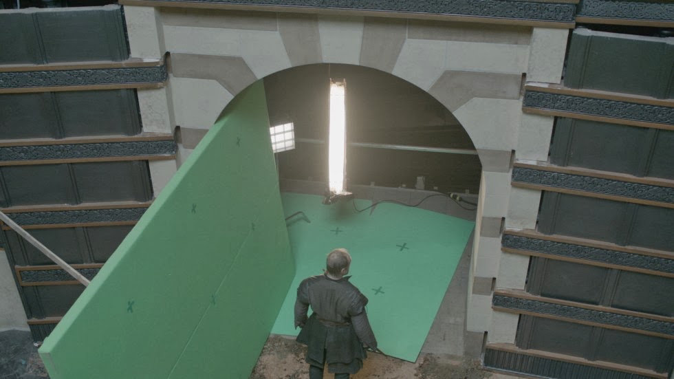
Game of Thrones, the medieval HBO series, has captures television fans attention with it intense story line, bloody narrative, and brutal fight scenes. SpinVFX brings Westeros to life by building the castles, birthing the creatures, and multiplying the soldiers to make the series grander than any other production in television.

 The Creation of a Giant


The Making of an Army


The Building of a Kingdom


Forming of an Adventure


The usage of green screen is highly valuable for the magical kingdom because the amount of visual HBO would like would not be possible without this illusion. In September 2013, the company won an Emmy for their work they did for Game of Thrones. SpinVFX has done work for many visually thrilling productions, such as Abraham Lincoln:Vampire Hunter, the ABC television series Titanic, Battle: Los Angeles, and After Earth

The Return of the Pink Panther

Growing up one of my favorite movies was The Return of the Pink Panther. I can recall countless movie nights where my sister and I sat in the middle of the couch with a big bowl of popcorn and sang along to the opening credits.


In this 1975 comedy/crime/mystery film  the bumbling idiot, Inspector Clouseau is assigned to work the case when the Pink Panther diamond is stolen. Through out the film hilarious event take place that cause your stomach to hurt from laughing so hard. However the most impressive part of the film takes place in just 4 minutes.


The animation short was created by DePatie-Freleng Enterprises, they were an American animation production company from 1963 to 1985. They produced theatrical cartoons, animated series, commercials, film title design sequences and television specials. The Pink Panther title sequences are what the company are most well known for. A brilliant team of three are responsible for creating this masterpiece, Blake Edwards a comic constructionist, Henry Mancini was the composer, and Friz Freleng was in charge of the actual cartoon work. Friz Freleng was an american animator, cartoonist, director and producer. Some of his most famous work consists of the Loony Toons and the Merrie Melodies series.


Wednesday, November 6, 2013

Transistor

This week I'm posting about "Transistor". "Transistor" is a new video game that's being released in 2014 by SuperGiant Games. This is the trailer for "Transistor".
In "Transistor" you play as Red, a singer who finds an intelligent sword and because of that is constantly being pursued by the antagonists of the game. This trailer, shown at the announcement of the game is ripe by 2D animation both from the actual game, and cinematics created for and played throughout the trailer. This is a 2D game meaning all of the animation within it is in 2D. This is also a nice piece of work to look at because it really demonstrates how much animation goes into a video game. There's all of the cutscenes, the character animation, the environments, and more, these are all things that have to be created in order to make a complete game. In this trailer you can see all of that. You can also plainly see how all of the elements in the game are in 2D. In order to make a good video game, you need to think about everything you would think about while making a movie. Framing the scenes, lighting, costuming, all of that. I feel like sometimes people forget that games are art and I think this trailer really illustrates that well.

Ryan vs. Dorkman - Your Everyday Lightsaber Battle

Ryan vs. Dorkman, created by Ryan Wieber and Michael Scott, two effects artists who had a friendly rivalry on a Star Wars forum, leads the two friends into an intense lightsaber battle complete with, of course, lightsabers, but in addition, invisible wires, "the force", and lots of good camera work.

It's a fairly old example, but is an interesting look into what exactly was possible 7 or 8 years ago. We've come so far in such a short time, and it's amazing what was considered 'amazing' back then is now commonplace today. There's also a sequel!

The sequel not only incorporates better lightsaber effects, but introduces film-quality camera work and better pacing! The addition of better music and sound effects placement only makes this sequel better, and the production values certainly do show.

Tuesday, November 5, 2013

Sundance Institute Changes Identity

            The Sundance Institute is a non-profit organization that was founded by Robert Redford in the mountains of Sundance, Utah in 1981.  Since its establishment the now global organization has offices in Park City, Utah, NYC and Los Angeles, CA. It has been a phenomenal resource for providing creation and financial support to the thousands of aspiring filmmakers, directors, producers and other forms of story tellers looking for a place to showcase their talent. The organization is best known for the Sundance Film Festival and is responsible for screening some of the most beautiful cinematic indie films in the world. Paula Scher is a graphic design artist of over four decades who has been featured at venues all over the world including the ever popular TED talks and is responsible for this identity change. She is additionally been a partner in the New York offices of Pentagram since 1991. Scher is a seasoned veteran in the motion graphics community who has not only created the new identity of the Sundance Institute below but was also hand picked to design to the "graphic" identity for the 2014 Sundance Film Festival. Paula Scher is not just any graphic design artist, her work is internationally recognized and therefore is no surprise why she was elected to construct the new identity for this legendary organization. Here is a quick look at Scher's new identity for the Sundance Institute...


The new Sundance Institute graphic identity...


The old Sundance Institute graphic identity...

Friday, November 1, 2013

Freddie Wong Tack Bell commercial

I found this video on youtube the other day, freddie wong is one of my favorite modern vfx artists. He makes plenty of funny videos using techniques and programs that anyone could learn. Often aside from his original video posting page, he maintains an alternate page where he posts inside looks on his videos. I chose this video because I found it entertaining and it contained some simple yet amusing video effects to create the taco. While the mini taco bell prop may have been real, its obvious that the taco that was made on the inside was not. He must have and to track the camera movements in order for the 3d taco to look like it was indeed placed within the mini taco bell prop. And it probably took some time to create the actual digital taco that was made from the lasers. Anyway heres the video, hope you enjoy it.