As of this point, if the session this week is any indication I am light years from even being ready to touch this level of animation and graphics. But this is an aspect that I would like to touch on given the chance. The things that appeals to me the most the idea of designing a various species for this world. While my drawing skills are currently need improvement, I could see myself working the concept design of some of these characters. (after several how to lessons of course)
Friday, January 31, 2014
Grimm Morphing Effects
As of this point, if the session this week is any indication I am light years from even being ready to touch this level of animation and graphics. But this is an aspect that I would like to touch on given the chance. The things that appeals to me the most the idea of designing a various species for this world. While my drawing skills are currently need improvement, I could see myself working the concept design of some of these characters. (after several how to lessons of course)
What's the big deal with Minecraft?
Let me just say right off the back that I find it amazing that the game Minecraft is still alive and kicking. For those of you that may not know what Minecraft is, it is game that allows players to build constructions out of textured blocks in a 3D procedurally generated world. The game is very pixelated, as you can see in the pictures below.

| This is a simple grass block in Minecraft. |
 |
| This is land within Minecraft. |
So I am not the biggest gamer in the world, playing the occasional Mario Kart and Halo, but I do know a lot of people that play video games. Generally, the gamers I know say that they want the most realistic and high definition games ever, but they for some reason they are still in madly in love with Minecraft. My question is why, why do people love this game when it is the complete opposite of what they are looking for.
I had to do a little research of my own to find out the answer to that question. I asked multiple people why they are really into the game. It was almost an unanimous answer, they liked the simplicity of the game both the look of the game and how the game is played. In the commercial version of Minecraft players are able to play in creative mode or survival mode. Creative mode allows the player to create their own world, they have infinite resources and space to create whatever their hearts desire. There are no lives or hunger. Survival mode on the other hand is really exactly what it says. You have to survive. There are attacks that happen at night. The player has to begin building shelter and also soothe their hunger with limited supplies. So the survival mode is definitely more challenging. In both of the games everything is made of blocks allowing your everyday joe to build amazing buildings and lands.
So if we are to take anything away from Minecraft it is that something extraordinary can be made out of something ordinary, it is really what you do with it that makes it amazing.
Pre-Production AFTER Production?
Something that has been stressed upon my introduction to After Effects is the importance of planning. Trying to create a project that you haven’t actually planned out proves especially frustrating when it comes to animation. I’ll elaborate. Anyone can take a camera out and shoot some footage of whatever happens to be convenient. In this case, let’s say you shot 2 minutes of a man sleeping on the bus. While editing your footage, you realize that a shot of a bus driver would really tie everything together. So, the next day, you film the bus driver, insert pieces of the clip throughout your sleeping man footage, throw on a black and white filter and Viola! You’ve successfully created an incredibly deep cinema film in less than 48 hours.
Now let’s imagine you’re an animator. First of all, recreating the shot of the sleeping man through animation would take even the best animators hours upon hours to recreate— regardless of whether they use digital tools or not. Oh, now you want to add a shot of a bus driver? Ok, that means spending hours upon hours recreating THAT scene, hours upon hours repositioning the original animation to allow room for the new animation, a couple dozen hours trying to figure out why your sleeping man keeps flipping upside-down 5 frames in and— oops. Looks like you not only missed your project deadline, but also the birth of your firstborn son and 3 Super Bowls.

In short, preproduction is an essential element of animation.
One of the most common documents associated with animation is the storyboard. Traditionally, filmmakers/animators create a storyboard before they move on to the actual shooting/animating.
Here are some examples of storyboards from some of the most famous scenes in movie history:

Psycho directed by Alfred Hitchcock:

The Sound of Music directed by Robert Wise:

In all of the above examples, the storyboard acted as the blueprint for each scene. However, I recently stumbled upon an animated film that strayed from the traditional production timeline. Israeli filmmaker Ari Folman’s Waltz with Bashir is an animated documentary film depicting Folman’s experience as a soldier in the 1982 Lebanon War. Often times when it comes to documentaries storyboarding is left out completely. This of course makes sense considering the uncertain/candid nature of the genre. Still, Waltz with Bashir is not just a documentary, it’s an animated documentary. Therefore, the 90 minute movie was filmed in a sound studio and then transferred to a storyboard. I’m sure that the unconventional production timeline of Waltz with Bashir is the real reason the film was banned in Lebanon.
Alright, I’m going to be honest— all of that “storyboard” talk was really just a way for me to gracefully (hah) transition into talking about how Waltz with Bashir was animated. Many people initially assume that the movie was made through rotoscoping, or the animation style that uses drawings over live footage to create realistic animation. These people are wrong. “Waltz with Bashir” is actually a combination of Adobe Flash cutouts and classic animation. Each drawing was sliced into hundreds of pieces which were moved in relation to one another, thus creating the illusion of movement. This technique is a unique style invented by Yoni Goodman at the Bridgit Folman Film Gang studio in Israel.
"Movies that scar"
David Fincher: A Film Title Retrospective from Art of the Title on Vimeo.
"I don’t know how much movies should entertain. I’m interested in movies that scar."
—David Fincher
David Fincher is arguably one the main reasons growth in the importance and design of title sequences has happened. In all his films he has moved the use of the title sequences into a new direction. His films are very "distinct from one another", but are an undeniable Fincher film. From reading through an interview between Ian Albinson and Fincher it was really interesting to see how much influence this director has over his title sequences. The titles can prepare the audience for whats to come in the film. Fincher finds the titles to be well made not for pleasing the eye, but moreso for an engangement to set the scene and pull your interest. Movies that will be good always have superior title sequences as well.
For example, the title sequence for Seven, designed by Kyle Cooper. This carefully designed title sequence was able to give a glimpse into the world of the story you're about to enter and "did very important non-narrative things."
Another incredible sequence most people have seen is The Girl With The Dragon Tattoo. This sequence, not directly having anything to do with the plot of the film to come get your psyche in the mindset of the film.
My personal favorite sequence and movie though is the wonderful Fight Club. The microscopic view from inside Edward Norton's brain and zoom out to a shotgun rack focus to his face is simply incredible. He think the title sequences themselves are "part of the entertainment form."
Source
Inspiring
After our attempts to animate our names in class, I felt good about what I had done. It was exciting. Then, I saw a few advertisements on TV that inspired me to look up some real motion graphics designing. I came across this website that showed 25 different motion graphics animations and was completely blown away by what I saw. It made my name look like a drawing done by a two-year-old child. So much for feeling good about getting my name to write itself across the screen. I know there is a lot to learn, probably more than we could ever possibly learn in this class, but it is inspiring to see the complexity and beauty of professional work in the industry.
I just want to share a couple that really caught my eye out of these 25:
The end of this video blew my mind. It had been completely designed with the entire speech written out in different ways, but all on one "canvas." Then to match the pacing of the talk and incorporate not only camera motion over the words, but zooms in and out and different twists for emphasis, must have taken quite a while. The animation added to some of the comedic tone and phrases and made the viewer actually read the most important parts of the speech. It really made the whole video come alive.
Speaking of which, this one was my next favorite: http://www.youtube.com/watch?v=TnKirux5EPA
Unfortunately, the video wouldn't load on the blog, but I encourage you to check it out. It is a commercial for Clear Water and Unicef. The animated water was fantastic and it was interesting how even the water bubbles seemed to have child-like shapes and spirits to their movements. In this we also see the importance of sound, even in animation. Without the sound, I would never have been as drawn into what was happening. This was created in a way that made me feel like a child again. I'm still smiling from watching it.
Finally, there is a third lesson learned from watching these examples:
Motion graphics is not just about adding cool explosions or aspects to a video or film. It is about telling a complete story. Just like any other medium, we can use motion graphics to pull an audience in, tell a story, and reveal a conclusion. Only with this medium, we can do really, really, really cool, shocking and amazing things! I encourage everyone to go and watch some of the videos on this website:
http://creativeoverflow.net/25-amazing-motion-graphics-animationsvideos/
(written by Harry Jay Clement)
Even the examples that aren't ads seem to tell a story through the motion graphics and the sound. They are inspiring. I hope that the next time I animate my name, maybe a lot later in the semester after we have learned more, I can make it seem more like a story and less bland.
by Amber Capogrossi
Revenge Replica title sequence
One of my favorite shows, "Revenge" on ABC, has a pretty unique title sequence. Everything about the title ties in with the show which I really like. Some title sequences do not add or go along with the show itself. This video breaks down a very similar version of the original title sequence. I am most definitely going to try this out one day. There is a lot of advanced things about this title though. The waves are all separately created and having them flow at the right times like an ocean is impressive to me. The actual title itself is a little different than the original show title and when I try this I would like to achieve the original title.
Below is the original title. Like I said earlier I think the whole title sequence is great and I can't wait to try it out! Also the whole show uses After Effects to create different feels to the show. They have a lot of actions scenes and flash backs so AE definitely contributes to the show!
The Upcoming Annie Awards
The Annies are the highest honor in animation, and in regard to the exciting awards, I'll be sharing an interview I had with the vice president of the IAFS (the organization that puts on the awards), Jerry Beck.
What do you do in the animation industry?
I’m not an animator. I’m a writer
about animation, with books published. I’ve worked as a distributer, producer,
and executive. I helped start the blog Cartoon Brew, and have two other cartoon
blogs, Animation Scoop and Cartoon Research.
How did you get into the animation industry?
I loved cartoons, and wanted to be
a cartoonist. I went to SVA (School of Visual Arts) in the 1970s. It was very
hard to get into animation back then, you had to either be a veteran (animator)
or amazingly good. I met Leonard Maltin and took his course. We became friends
and I slowly got into animation by distribution. I helped bring Japanese
animation (anime) to wider audiences and helped create animation magazine.
What was the first Annie awards you attended?
My first Annies was in the late
1980s. I met famous animation people in New York, and hooked up with the IAFS
(International Animated Film Society) branch in LA. The Annie awards are their
big thing. The Annies recognized the animators. Back then, it was a small
banquet. I remember going to those banquets. I was at the meetings when we
changed the awards before the Oscars.
The Annies have gotten bigger in recent years, do you
think they will continue to grow?
I hope so. I have been advocating
for 10 years now that we have a second ceremony. We don’t have enough time. We
add and subtract categories each year. I see a second ceremony now. The Oscars
do that, it isn’t televised. It’s kind of a banquet at the moment, and it’s
growing. A lot of people say we need to recognize the voice actors more. I
think it’s more for the artists. We already have a few awards for voice actors
and they tend to be part of the ceremony. I think we have room to grow.
Are all aspects of animation well-represented at the
Annies?
Fairly well yes, the key positions
for making a film or TV show, Editors want in now, they have a sophisticated
job, with lots of control over the style. We took a vote, and we have a
category for them now. We really recognize the artists not recognized
elsewhere, the “hand artists”.
With visual effects gaining more prominence in live action
films, how do you think this will change the relationship between the two
mediums (live action and animation)?
What I see happening, the reality
is, there’s more animation in feature films than live action. Animation (VFX)
is a strong part of Hollywood and live action. In the old days, there were
cartoons and effects animation. I see, well, a return to a world with the two
things, the cartoon and the live action. It will be like it used to be, we’re
evolving back to that. I like that. It’s a mish-mash. Hollywood wants to
control animation, I want the artists to control it. More cartoony, less
photorealistic. I like cartoony as opposed to photorealistic. If people are
told it’s a live action film, they think it’s a live action film. (regardless
of how much is animation/VFX) It’s going to become 2 separate worlds. VFX isn’t
my thing. We do it at the Annies, and the visual effects society has its own
awards. We shy away from it.
This Is Hard But Maybe One Day I Won't Suck
I saw this trailer for the movie Malificent premiere at the Grammys and I immediately fell in love with it. The selling point was the haunting cover of Once Upon A Dream by Lana Del Rey. I firmly believe music can be the most important factor in a video and, after watching it with and without the sound turned on, it's easy to tell how much of a difference the audio makes.
I came back to the video after our last class and watched through it once more, and I had an anxiety attack after seeing how complicated and brilliant the special effects are, and realizing how much difficulty I had even adding a sparkler to a terrible animation of my 4-letter name. It's extremely intimidating. I wanted to make my post about this subject because at the same time, it's a motivation to one day be able to create amazing special effects like these.
And maybe animate my name.
Thursday, January 30, 2014
After Effects used on Iron Man
In college we're always learning how to use new programs. I've always been interested in knowing what professionals are using these programs and how are they using them. Well I did a quick search on what movies used After Effects as part of their creative design and Iron Man 3 was one of the first movies to pop up. Was I surprised? No way, there are no limits in adobe after effects so I would be surprised if movies didn't used this program. After Effects was used to create the HUD (head up display) of Iron Man.

Watching the video gives you a glance of the work being done and if you pay close attention you will see a ton of layers listed in the after effects program. It just goes to show you how extensive a project can be and how advanced After effects is.


It's both exciting and challenging learning how to work with after effects. I know the if I acquire the necessary skills in after effects I can create awesome work and obtain money doing something that is pretty cool and can possibly be seen be hundreds or thousands or even millions of people.

Here's the link that shows the video, as well as other videos. Click here.
Welcome to Film Riot
Ever wonder how movies did all their fancy After Effects effects? Of course you did! We all do, and that's what Film Riot's here for! Created by a group of film makers who love what they do, Film Riot teaches viewers how to do a wide arrange of things that the pros do. From pre-production to post, Film Riot encourages people to learn all the techniques.
Along with step-by-step tutorials in After Effects, Film Riot also has great Do It Yourself videos, to help you make the best cheap gear you can get. Film Riot can show you the ways of making cheap light stands, shoulder mounts, sliders, and more! While I haven't used all the DIY gear, I have used the slider, and I must say it is great! For less than $20, the DIY slider flows beautifully, and was a great tool to work with in many shoots.
Don't feel like learning, but feel like making instead? Great! Film Riots encourages viewers to not only watch their videos, but to go out and shoot their own films. Offering weekly video challenges, Film Riot wants you to go and make stuff! It makes sense when you think about it, the best way to learn the techniques they teach is to go out and actually do it!
So that's Film Riot! If you're interested in becoming a film-maker, or just want to learn more cool techniques, I highly recommend checking these guys out.
Wednesday, January 29, 2014
Again With The Rendering

All this time I realized I haven't even put the website in. Well if you want to check it out just click ME.
Anyway, going through some of these films, the first one most definitely catches my eye: Toy Story. Made in 1995 by Pixar. One of the first, if not the first Pixar animated film. This film was the turn of the "Animated Revolution." Looking at the Toy Story section though, it says that the total number of frames was 114,240. Now let me put this in perspective for you. If you were going to do the math: Figure it would take about 7 hours (on average) to do one frame. That would mean it would take one machine to do 685,440 hours. Let us break that down a little more: 28,560 days, 4,080 weeks, or 78 and a half years. So clearly when they used the 800,000 machines to render it out, I think they made the right decision.
Clearly Woody up above has the right idea. Sorry Buzz, It would take an infinity to render all of Pixar's animated films with one machine.
Tuesday, January 28, 2014
The Future of Animation
"We have amazing tools, but they do not create anything; it is really what the filmmakers do with it."
So says John Lassester, the man who's had a hand in almost every single Disney or Pixar animated film since he first directed Toy Story almost 20 years ago. His credits include executive producer of two of 2013's best animated features (Monster's University and Frozen), director of Cars and a Bug's Life, and - my personal favorite - the writer of 2010's emotionally charged, I-swear-I'm-not-crying-right-now film Toy Story 3. The guy knows a thing or two about telling a great story for a visual medium.
This quote, spoken at a panel back in 2012, gives me hope, and quite frankly I'm really glad that I share the opinion of someone in the film industry that I respect so highly. As a culture, so much of our focus seems to be on what's new or what's next. What does the future of cinema look like? How will technology change in the next five years? What will animation look like?
 I tend to take a different approach. Don't get me wrong, this new Mac I'm using is perfect for writing and accessing everything I need for school and life in general; I'd be pretty helpless without it. But at a certain point, new technology has to take a backseat to the things that really matter. Toy Story 3 is a beautiful movie. I saw it in 3d and was absolutely blown away by how gorgeous it looked. However, I didn't leave the theatre thinking about the animation or the CGI - I was too focused on the incredible range of emotions that a bunch of toys had managed to stir up within me. Hell, I can't even type out this blog post without getting choked up at the thought of Andy driving away from Bonnie's house, watching as the little girl waves Woody's arm in farewell. And then that pan up, showing that the clouds in the sky are the same as the wallpaper in Andy's room from a movie made 15 YEARS EARLIER? It's perfect. Words can't even describe.
 So no matter how much pressure I may feel to buy the newest editing/special effects software (sorry Arturo, I'm not paying hundreds of dollars for a tablet that I'll only use in this class) it's really comforting to know that story still comes first. When I googled "the future of animation" in hopes of coming up with something intelligent to blog about, I had no idea what to expect. Technology is only going to keep getting better, and I'm sure the industry will continue to evolve alongside it. But no matter what changes, story will remain crucial to the process of making any kind of visual medium - animated or otherwise. Precise animation and advanced technology are what made Andy look emotional as he was giving away his childhood toys; but it was what the filmmakers did with that technology that continues to effect me to this day.
This quote, spoken at a panel back in 2012, gives me hope, and quite frankly I'm really glad that I share the opinion of someone in the film industry that I respect so highly. As a culture, so much of our focus seems to be on what's new or what's next. What does the future of cinema look like? How will technology change in the next five years? What will animation look like?
I tend to take a different approach. Don't get me wrong, this new Mac I'm using is perfect for writing and accessing everything I need for school and life in general; I'd be pretty helpless without it. But at a certain point, new technology has to take a backseat to the things that really matter. Toy Story 3 is a beautiful movie. I saw it in 3d and was absolutely blown away by how gorgeous it looked. However, I didn't leave the theatre thinking about the animation or the CGI - I was too focused on the incredible range of emotions that a bunch of toys had managed to stir up within me. Hell, I can't even type out this blog post without getting choked up at the thought of Andy driving away from Bonnie's house, watching as the little girl waves Woody's arm in farewell. And then that pan up, showing that the clouds in the sky are the same as the wallpaper in Andy's room from a movie made 15 YEARS EARLIER? It's perfect. Words can't even describe.Monday, January 27, 2014
Come one, come all. Visual effects tutorials for everyone!
Last semester, the director for my Fiction Field 1 short film wanted a production logo that resembled the one Lionsgate uses. Well, I didn't know how to make one. Nor did our graphic designer. But guess what. Yeah, you. I can make it now. Really. I can. Seriously. I can. I just don't want to show off and make you all feel terrible about your lack of animation skill.
"How'd you learn how to do that?" one might ask. It's actually fairly simple.
Step 1: Watch this video.
Step 2: Do exactly what the man in the computer says.
Did you do it? I doubt it. Well, if you had enough free time on your hands and you actually followed the tutorial, then you now have your very own, homemade Lionsgate logo animation! Congratulations! And for those of you who didn't...well, maybe you learned something anyway.
The video you (hopefully) watched comes from Video Copilot, a website that provides animators with tutorials and tips on how to make some of the most professional projects out there. This tutorial can be found just one click from their homepage under "Tutorials" along with about 150 others showing step-by-step how to create such animations that you've always wondered about.
The greatest thing about this website is the fact that, as long as you have Adobe After Effects at hand, anyone can do it. They literally go step-by-step when teaching you a new skill. They even explain what it is exactly that they're doing so you're not just following a bunch of jibber jabber. Yes, I said jibber jabber. Andrew Kramer, the gentleman speaking to us in the tutorial, even has a few jokes for us! He's no comedian, but he certainly adds a bit of personality to what could have possibly been a very dull explanation. Kramer is actually a very experienced visual effects artist, not just some guy on a computer who knows a thing or two.
Anyway, I've gotten seriously off topic. To sum up what I meant to discuss, the linked tutorial, along with all the others from the Video Copilot website, is an extremely efficient and simple way to learn much of what you need to know in order to become a great computer animator.
"John Carter "
The first time my friend told me about "John Carter" I didn't believe that it was going to be a good film but the story line of extraterritorial life and a human visiting this planet while there is a civil war going on between two very different societies. John Carter is a sci-fi fantasy film, directed and co-written by Andrew Stanton.
Patrick Giusiano a animator designer was able to work on "John Carter"working under Pixar's artistic supervision team. His work done for the movie is shown in the link below.
John Carter of Mars books by Edgar Rice Burroughs, Animation director Bob Clampett shows the original test reel for the studio.
Friday, January 24, 2014
It is amazing what you can do with animation. It is just absolutely insane, whatever thoughts or images that you have floating around in your head are able to become reality because of animation. After thinking about animation I then became interested in the different ways that animations can be made, really the different types of animation. I found many different but enticing animation styles, but my favorite has to be 3D animation. 3D animation is used quite extensively today especially within Disney. I believe my fascination with 3D animation really began with Toy Story.

The 3D aspect of the animation made the movie more realistic for my as a child and really even now. Being about three years old when I first watched the movie I actually thought that my toys actually came alive and to be honest I still believe that a little now.
There is so much work that goes into creating a 3d animation, definitely a lot more than I thought! It requires people acting out the movements to make sure the movement they are animating are truly realistic, as well as sounds, and so much more.
Here is a video that showed how Toy Story was made.
Watchmen Opening Sequence
One of my favorite opening film sequences of all time is the
one found in Zack Snyder’s 2009 film Watchmen.
While I found the movie slightly disappointing as a whole, especially in
comparison to the graphic novel, I was incredibly captivated by its opening.
The film begins by zooming in on the novel’s signature
smiley face pin being engulfed in a pool of blood. Following this, the next
several shots feature superheroes being photographed as they fight crime and
receive awards. Included in this is a group of superheroes being photographed
in front of a banner with the date 1940 written on it. The general sentiment of
these first few shots is that these crime fighters were revered during that
period of time. Also of note, the use of Bob Dylan’s “The Times They Are
a-Changin,” along with the use slow motion, create a very nostalgic feeling
that ties in nicely with the vintage style shots.
Although the opening sequence is not heavily reliant of
special effects, there is a shot in which a CGI military plane is shown with
the portrait of a superhero painted on the side. This use of a military plane
is nice segue into the rest of the opening montage, which showcases how the
passing of time, shown by tying in historically significant events, has
effected the superheroes shown in the earlier shots. In contrast to the
beginning, some vigilantes are now shown celebrating their retirement while
others have been murdered.
One thing that I particularly enjoy about this opening
sequence are the historical references. For instance, a superhero is shown
shaking hands with John F. Kennedy right before his assassination. Some of the
other famous historical events alluded to include Thich Quang Duc burning
himself as a form of protest, the Kent State shootings, and man walking on the
moon for the first time. Although they are subtle, I thought the special
affects used to show a flower being blown apart by a gun, as well as recreating
the moon, were well done.
As the opening sequence comes to an end, a new group of
superheroes is seen taking a group photo, with a much more modern camera,
similar to the group from the 1940’s. However, in contrast to the reception of
superheroes during that time, the following shot shows people protesting such
superheroes. Finally, the sequence is bookended by zooming out on the pin that
started the film. In addition to raising my anticipation for the rest of the
film, this opening sequence spoke volumes without saying a single word.
It's All In the Details
As an avid Syfy fan, it is not surprising that the new show Opposite Worlds intrigued me. Even though I don't normally watch reality shows, I loved this concept. As I watched the first episode after class on Wednesday, I was very pleased with the filming and the unique style of the show. Afterwards, I was curious about the trailer that first piped up my interest. I watched it, and was taken aback by the effects and style it emulated. Here is that trailer (produced at Hold Fast; creative director: Rich Scurry):
Something that seems so simple, yet after what we heard in class, I'm sure has many layers of complexity. What I love about this trailer is the 3D feel they give to the video. As a viewer, I feel as if I have physically been pulled into the environment and can see in a 360 degree sphere the details and almost feel the atmosphere change from a sophisticated future to a barbaric past. That move around the spaces, as well as the little details, like the fire and the large touch screen monitor displayed only added to the drama and helped to create a story that I wanted to learn more about. I think this trailer is successful in creating the ultimate question: What will happen next?
This may not all have been animation or done in After Effects, but I'm excited to learn how to use these programs to add those important details in film that give atmosphere, feeling and story to a video. Whether that is opening credits or trailers, television or film, these details help intrigue audiences, and create more realistic environments.
By Amber Capogrossi
Maybe the Beginning of Animation but Who REALLY Knows Anyway?
In celebration of the new year and new beginnings, I wanted to post about what many people consider to be the beginning of animation. Of course there is always much controversy about whom EXACTLY created the first animated film. Questions of what classifies full fledged animation ranges drastically.
For example, J. Stuart Blackton is often credited as the Father of American Animation.
Handsome fellow am I right?

Anyway, J. Stuart Blackton produced a piece in 1900 called The Enchanted Drawing in which he appears to have an interaction with a drawing. This illusion was created using a technique called Stop Motion animation: IE the process of taking a series of photographs and moving the objects in the scene around between every shot. Still, some believe that Blackton may have borrowed some techniques (stop motion) from famous french illusionist and filmmaker Georges Méliès. This is what I'm talking about-- lots of controversy.
Regardless of whether this is ACTUALLY the first animated short, here's a look at Blackton's piece The Enchanted Drawing:
Although Blackton's work may be the first of the animation era, French director and writer Emile Cohl contributed generously to the animation revolution as well.
He's there, under the mustache

In Cohl's 1908 short Fantasmajorie, a drawn character interacts with a setting that appears to be constantly shifting and transforming. At one point while watching Fantasmajorie, I'm pretty sure that I saw a sketch of Abraham Lincoln drift by.
Check it out:
Did you notice that Fantasmajorie looked like it was all drawn on a chalkboard? That "chalk on blackboard" look is just that, a look. Rather than filming an actual chalkboard, Emile Cohl first drew 700 drawings the traditional way: black lines on white paper. However, instead of processing the negatives of the film like is done traditionally, Emile projected the negatives. Negative film captures the inverse colors of the picture which creates that white on black "chalkboard effect" you see here.

There's Abe! ^
Intro Sequences: Breaking Bad
Whether it's animated or live action intro titles have always interested me. A show/movie can be a very uninteresting, but can still have an amazing intro. Or a it can be an amazing production with a great intro. For example every James Bond movie and also my current favorite TV show "Breaking Bad"
This is the intro to "Breaking Bad":
The title its self is not very complex, but it fits the series so well. It sort of gives the viewer that unease which is a feeling that accompanies most of the series. It is short and sweet and doesn't take the viewer far away from what they just witnessed on screen prior to the intro. By the end of this class I hope to be able to recreate this intro. Or the Game of Thrones intro, but I'll save that for another post or lifetime.
3D's Biggest Advancements Are Looking Very 2D
One of the neatest tricks in art is something called Forced Perspective, which can make things look 3 dimensional, even though they are only 2 dimensional drawings. Things like the picture below:
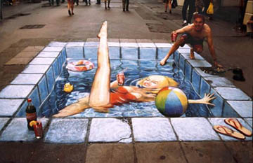 For more information on drawings and paintings like this, talk to Arturo, he's done some impressive stuff with it, some even involving toilet paper!
So, you can make 2D art look 3D, that's pretty impressive! But what about 3D art? Things like animation, can you make those look 2D? Well, in a way, you can!
Disney's short Paperman used a style of CG that was reminiscent of a painting or ink drawing. The short went on to win both an Annie and an Oscar, and is a visual treat. But as interesting as the short itself is, the way it was made is in my opinion, definitely worth a watch:
Recently, Pixar has released info on it's new artist friendly rendering system that captures the look of traditional watercolor. The new technique involves painting over some of the CG frames, and even works on the studio's previous animated works.


So, you can make 2D art look 3D, that's pretty impressive! But what about 3D art? Things like animation, can you make those look 2D? Well, in a way, you can!
Disney's short Paperman used a style of CG that was reminiscent of a painting or ink drawing. The short went on to win both an Annie and an Oscar, and is a visual treat. But as interesting as the short itself is, the way it was made is in my opinion, definitely worth a watch:
Screenshots from "Up" with the new system
The painted style looks interesting in motion, however, footage of the system in action is not on youtube, and I cannot upload it. I cannot stress how much it's really worth seeing, and can be seen easily be following this link
Keep in mind, Pixar's new system only effects rendering, not the animation itself. The animation is already done when the system is utilized, at least so for. This is much more an achievement in rendering than it is animation, but it brings new possibilities to the final look and feel of future CG animated features. I have no doubt we will be seeing this new system in the future, likely in an animated short. Keep an eye out for it!
Opening Credits Don't Have to Be Boring
When I was a kid, I used to hate the opening title sequences of movies. Just absolutely, 100%, flat-out hatred. I didn't understand why there had to be credits at the beginning of a film and at the end. It just didn't make sense.
Now, however - after taking Fiction Field 1 and actually learning about all of the positions involved in making a film - I have a whole new appreciation for opening credits. I realized that all of those names that I used to loathe probably worked incredibly hard to make the best film that they possibly could, and that they absolutely deserve to get credit twice throughout the duration of the movie. That being said, some opening credits still suck. We talked about this briefly in class, but the opening of a movie has to try and delicately balance the themes of a movie without giving too much away (if your movie is about bikes, find things that have some kind of offbeat connection to bikes, etc.) but also hold the interest of your audience at the same time.
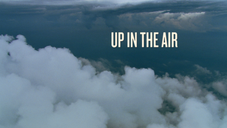 After we looked at it in class, I started poking through some posts on the website Art of The Title, and I found two slightly similar opening credit sequences that I think really find this right balance of being informative and entertaining. The first was from the 2009 Jason Reitman film Up in the Air, about a man who spends most of his time on airplanes, traveling from job to job across the country. Here's the full video, along with an interview with Garreth Smith, a designer and frequent collaborator with Reitman.
Smith talks about the whole technical process of how they made the title sequence, but it stands out to me because of it's overall simplicity and because of the unique 2d/3d effect the names and titles have. Some may just appear flat against the backdrop, but other names seem to be floating in and out of clouds. It's a pretty cool layering effect. You also get the basic idea that this movie has a lot to do with flying.

The second title sequence I watched is actually from a show that I'm currently re-watching: Archer. This one is animated, but is fairly similar to Up In the Air. It has the same sliding panels and the same kind of transitions from one name to the next in the credits. It also gives you a pretty cool retro-spy vibe, which isn't particularly a good indicator of what the show is about, but is entertaining nonetheless. I'm really excited at the chance to make an alternative opening credit sequence for some film or show, and I think I'll definitely get some inspiration from both of these.
Now, however - after taking Fiction Field 1 and actually learning about all of the positions involved in making a film - I have a whole new appreciation for opening credits. I realized that all of those names that I used to loathe probably worked incredibly hard to make the best film that they possibly could, and that they absolutely deserve to get credit twice throughout the duration of the movie. That being said, some opening credits still suck. We talked about this briefly in class, but the opening of a movie has to try and delicately balance the themes of a movie without giving too much away (if your movie is about bikes, find things that have some kind of offbeat connection to bikes, etc.) but also hold the interest of your audience at the same time.
Smith talks about the whole technical process of how they made the title sequence, but it stands out to me because of it's overall simplicity and because of the unique 2d/3d effect the names and titles have. Some may just appear flat against the backdrop, but other names seem to be floating in and out of clouds. It's a pretty cool layering effect. You also get the basic idea that this movie has a lot to do with flying.
The second title sequence I watched is actually from a show that I'm currently re-watching: Archer. This one is animated, but is fairly similar to Up In the Air. It has the same sliding panels and the same kind of transitions from one name to the next in the credits. It also gives you a pretty cool retro-spy vibe, which isn't particularly a good indicator of what the show is about, but is entertaining nonetheless. I'm really excited at the chance to make an alternative opening credit sequence for some film or show, and I think I'll definitely get some inspiration from both of these.
Subscribe to:
Posts
(
Atom
)