Wednesday, September 30, 2015

The Good Dinosaur

Pixar Studio's newest feature film is arriving in theaters this Thanksgiving, and it will be the first pixar film to be released in the same year as another (ie. Inside Out) Pixar is also not slowing down. In 2016 we'll be getting Finding Dory, the sequel to Finding Nemo, followed by Toy Story 4 and the brand new property, Coco, in 2017.
Either way, Pixar is one to always push the envelope in terms of technical achievements. In Good Dinosaur, the focus was on Environmental Effects. For example:


A Look at foilage from Bug's Life (1998)
A rainy shot of procedurally placed foliage in The Good Dinosaur (2015)

Also Water has seen a whole new breath of realism, using a new algorithm to calculate fluid mechanics. Notice how in Finding Nemo the Water looks to be made more of plastic that the more real photorealistic water from The Good Dinosaur:
Marlin looks for his son in Finding Nemo (2003)

Arlo gets whisked away in photorealistic water in The Good Dinosaur (2015)

Lastly,The film's settings are unlike anything seen in a Pixar movie until this point, with a focus on large and extremely accurate open areas. The film's environments were created using terrain mapping technology to capture the actual geometry of several areas found in the American wilderness and then using that data to recreate photorealistic landscapes for huge areal shots.
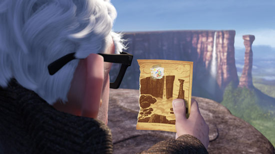
The Terrain from Up (2009)

Procedurally Generated Terrain made for The Good Dinosaur (2015) 

With all the added hype surrounding this new feature, and the suggestion to work on title sequences for upcoming films I've decided to try creating a title sequence for The Good Dinosaur. I think creating a Title Sequence from scratch without having a preexisting idea of what the original looks like, I will have much more creative freedom to create my own!

Tuesday, September 29, 2015

Animation and Light

I have become interested in programming live interactive experiences. I think that the manipulation of light in an artistic way is a really creative way to incite emotion in an audience. A lot of these light artists are using innovative ways to animate. The most interesting I found was light painting. For this technique they have a camera capturing a screen that is on a track that moves back and forth in the z-direction. The screen projects a different frame of a video and it creates the effects of outlining an 3-D image. Another interesting use of light to animate is the artist who uses drones programmed to move mirrors that reflect projected light to create shapes and images. One artist also featured a large sphere covered in RGB LED lights acting as pixels. This sphere could be programmed to be animated images. These videos from The Creators Project showed multiple ways to incorporate new technology, sensors, camera, programming, and lights to animate.


I foresee this technology being utilized by performers in concert, art exhibits, and theatrical engagements.

Friday, September 25, 2015

Hitman or Inside Out; The Two Most Different Foods

For my title sequence project I had a bunch of ideas, but ultimately narrowed it down to 2 styles I think I can pull off. The first film I might make a title sequence to is Hitman, that awful movie in 2007 (or the upcoming one next year, pick your poison) which was based off the video game of the same title. The route I would take is to make it a Saul Bass homage since he is the father of title sequences as we know them today. Hitman, or at least the game, emphasizes a lot about how your character, Agent 47, is just a number to The Organization. Every assassin has a barcode tattooed on the back of their head and I thought it would be fun/interesting to style an intro around that idea in the style of Saul Bass.


My second idea involved a Pixar movie, of course. Inside Out came to mind first since it is the newest film from the California-based animation studio. I would want to also, in a way, replicate Saul Bass' style, while also making it my own. SPOILER ALERT: There's a scene in the movie where 3 of the main characters enter Abstract Thought, a land where thoughts and ideas are broken down into four stages, I won't go into detail. Anyway, the style that the characters are created in this area of Riley's brain holds so much potential in motion graphics.


Let me know in the comments which one I should give a go. I can't decide for the life of me. Thanks!


Animation and Atmosphere

For my title sequence I thought that it would be an interesting challenge to create an intro sequence for the critically acclaimed cartoon mini series "Over the Garden Wall".

For those of you who haven't seen Over the Garden Wall, the story follows the journey of two brothers lost in the woods, who with the help of a magical bluebird, traverse the land of the unknown. I enjoy watching a lot of the cartoons that are currently running on cartoon network (Steven Universe, Adventure Time), but I've not seen anything in recent years that has captured my imagination quite like OTGW. The show itself oozes with atmosphere, each background is an original water painting and every bit of music composed for the show is an original orchestra performed composition.

I feel as though this would be a really interesting piece to create a title sequence for. I look forward to dissecting the show further to better understand all the moving pieces that work together to create it's unique atmosphere. A lot of the show's music has been published online as well , so it'll be really interesting to see if I can find some sounds that'll resonate with the world of OTGW in a cohesive way. All in all I'm really excited to start working with such an intricate and interesting piece of media, I hope I can put something together that'll at least capture a bit of the show's timeless magic.


Vertigo or Pursuit of Happyness

For my title sequence project, I am still deciding between doing Vertigo (1958) by Alfred Hitchcock and Pursuit of Happyness (2006) by Gabriele Muccino.

The title sequence for Vertigo is one of the most thrilling and well-created ones and it would be hard to come even close to it. Here's the original title sequence.


It is one of the best and I would love to work on this one. The title uses a lot of animation and I think I can get inspiration from there.

The second movie that I looked at was Pursuit of Happyness because it is one of my favorite films. The movie does not have a specific title sequence but it is a very inspiring movie and I wanted to give it a shot.

Here is the current opening scene of the movie.


I am still deciding between these two and any suggestions are welcome.

Thursday, September 24, 2015

Reign: Title Animation


One of my favorite shows is Reign, and I think that it has a lot of important elements which I can use when it comes to making my title sequence. I have a rough idea how I want to do it, I know I will take some inspiration from the Series of Unfortunate Event's Title Sequence because it has a lot of gory elements which I wish to incorporate into my Title Sequence for Reign.

I do like the opening to the show, but I might do my animation to the theme song instead, I haven't quite figured that part out yet.


007

So as I was thinking about this upcoming title sequence project, and I was trying to think of the best title sequences or ones that I really like. While a bunch had come to my mind, I remembered the movie franchise that is title sequence royalty; James Bond.
The use of color, and music and adding the theme of the film in the title sequence makes for a memorable title sequence on its own, but because it is a part of the James Bond franchise, it becomes a staple of the Bond film to have amazing title sequences.
In the newer films, with the addition of artists like Adele in Skyfall providing the opening song, it makes each title, unique but still adds excitement to the staple of the Bond films. Each of the James Bond films, has the wild, and impressive title sequence, but they are each their own, and they are each unique. James Bond really is title sequence royalty

Batman or Gotham Titles?

Ok so for the next project (the title sequence project), the theme that I am thinking of is based on the Batman franchise, but I'm torn between 2 ideas.

The first idea is basically to recreate the Title sequence from Batman vs. Robin (aka the worst of the Batman movies). Now why would I want to recreate this? I grew up watching these movies and, while it is a bad movie, the title sequence was pretty good. Although not great. When I watched it back recently I was commenting on how static the camera movement was until the bat and robin symbols fly in. But otherwise, there isnt too much in terms of the motion. And I was thinking, may using sure target and some clever ideas, I can make a a much more dynamic title sequence. Also maybe change some of the color and style to make it feel less sci fi and more gritty like Batman should be (Schumachers Batman movies I always found looked too futuristic and sci-fi-ish for Batman). I'd also make this one a parody, using references to what fans hate about this movie, like Bat credit cards and the infamous batsuit nips. So thats one option.


But I had another idea. It still pertains to Batman, but its for a TV show: Gotham. Gotham just started its second season, and is actually a pretty good show that serves as a prequel to long before Batman started roaming the streets of Gotham, following the character of Jim Gordon and most of the popular villains before the Dark Knight showed up. Anyway, it is a good show, but there was one thing that always bothered me, and that was the opening graphic title. Its because its WAY TOO Simple, its literally text moving pass the camera in Z space on a background of dark clouds. Its actually really sad in my opinion. I was expecting much more from it. So I want to try to challenge myself with this option. I would want to make my own title sequence for this show, something thats much more dynamic, something that reflects the show very well.


So either way, Im thinking Batman, but I'm not sure which way to go. Right now I'm leaning more towards the Gotham option mainly because I can be as creative as I want. But I could also do the other one and have a little bit of fun with it. I could really go either way. What do you guys think? Leave a comment and let me know which bat idea you like better.


Title Sequence Project

For our next project I am in between ideas. Earlier this week I was reeling through different movies like "Sherlock Holmes", "Fight Club", "Pan's Labyrinth"; all movies that have a certain aesthetic that would be relatively simple to convey in a title sequence, but decided against them because I didn't want to recreate already made titles or felt that I could make one that fit the movies tone.

My mind immediately went to this stained and drawing look from "Sherlock Holmes"

Now I am between two very different ideas. One would be Wes Anderson's "The Grand Budapest Hotel". His greatest strengths in his movies are the stylized vintage-pastel aesthetic, which I feel could easily translate to a simple title sequence. 


My other idea would be for "Over the Garden Wall", a twisted cartoon that follows two brothers into the dangerous "Unknown" woods. I feel that a 2D animation of the brothers walking through different significant scenes would be a good start for the title project. 


Once Upon a Time Title Sequence

For my next project I'd like to create an opening title sequence for ABC's Once Upon A Time. Currently the show's opening sequences are about 7 seconds in length, simply showcasing the title of the show and along with a mythical creature, person, or item that foreshadows what the current episode is going to be about. The following is a video including Once Upon A Time's episode openings through Season 2:


I'd obviously like to elaborate on this and create a sequence that tells a bit more of the story and includes appropriate credits. The following song is the perfect base to begin animating: 


This song, entitles "Henry's Proposal," I think does a great job of communicating the confusion, tentativeness, realization, and excitement that Henry--one of the main characters--finds in unfolding the magical tale that surrounds his life. 

Real Life FIFA Game

I'm a very big soccer fan and I follow MLS (Major League Soccer) religiously. A few days ago the new FIFA video game came out called EA FIFA 16. I don't know if any of you guys play any sports video games but the animations and movements that are involved in making the game is incredible. One of the improvements to the new FIFA game is that they had Lionel Messi come into the studio and they animated him while he did some tricks around the studio. They then took his movements and put into the game so while playing, his movements would be more real towards what he does in real life. It's explained more in this video:
I'm also a huge FC Dallas fan and to help advertise for the new game, the MLS channel decided to put head to head an FC Dallas player vs. a Vancouver Whitecaps player and have them do the games in the FIFA video game in real life. So in the video, they made it look as if they were in the video game but instead it's real life. I honestly thought for the first minute that I was watching a video game. I think it's a pretty cool video. You can watch that here:


Wednesday, September 23, 2015

Opening Credits - Game Of Thrones

While trying to come up with the title sequence I wanted to recreate, I had a lot of ideas and options to choose from. After watching multiple opening credits, I decided I wanted to recreate the Game of Thrones title sequence. It is personally my favorite show and one of my favorite opening credits, I think the animation of the maps and realms in the opening sequence is fantastically done. This is the show opener for the first season:

 So instead of trying to recreate the animation of the maps and realms, I would like to do a title sequence showing the characters and scenes from the actual show. I would also like to play around with effects such as fire and ice since they have significant meaning to the show. I think the special effects and a dark and contrasted color palette would really make a good show opener. I would base my opening credits on this fan made version I found. The opening credits would also be for Season 1.
This is the fan made version:

Deep Compositing

Have You Seen Those Amazing Composited Images In The Movies?
For a long time, the movie industry would hire visual effect houses to create these beautiful Scenes and add in elements to a movies story. Things like set extensions, overlays, masks and other sisual effects were often done by major names like Weta Digital, Animal Logic, MPC, ILM, FUEL VFX and others.


But what happens when after a shot is considered finished and now it's time to get the directors opinion? Often, when a shot is delivered to the main production studio, the directer with "I like the shot, but it would be better if..." "that character's face wasn't so dark?", or "if I could see through that dust cloud a little bit easier" or " if the camera were a little more to the left?" yadayadayada.....
Usually, these minor changes are the major headache for Visual Effect Compositors because they would make the small change. and have to render the entire scene to see if it was any better. (Just imagine how much time that would take on a major battle scene where hundreds of characters are fighting, and we need to just move one of the characters to the left!)

In 2010 a group of compositors reviled a remedy to this headache. After researching for a number of years, their solution is today known as Deep Compositing. In a Deep Composited image, every pixel in an image has not only a Red Green Blue and Transparency value, but also a depth value in the scene. This minor change makes the entire work flow unbelievably faster. The video below describes the concept:


Using Deep Compositing, making and update to a little part of the scene was now faster than ever before.
This Semester, I am taking an experimental Course in Maya Animation, and a majority of the curriculum is based on what technical achievement by some group of people made a program like Maya function the way it does today. In the same way I see that there are compositing techniques that are still being developed and seeing that research is still being done inspires me to continue my pursuits as an Emerging Media degree.

Tuesday, September 22, 2015

Fan Made Breaking Bad Opening

With our second assignment on the horizon, I'd like to share one of my favourite fan TV made openings. YouTube user Jamesmontalbano masterfully created an extended version of sorts, of the Breaking Bad opening. By taking what little there was of the opener, adding more of it, as well as fusing his own elements, he came out with an awesome result. While Breaking Bad benefits greatly from the shortness of its title and the fan made opening would be too long for the show, it's certainly a great tribute to the show.


I really love how highlight clips from each character has been added. After Effects would be ideal to create something like this, especially with the use of the z-axis in the video.

For my own project, I'm considering following a similar path, perhaps extending a pre-existing opening and adding my own twist. All-in-all I think this video provides a good amount of inspiration, showing off what a fan made opening can become.

Partly Cloudy

Today in screenwriting class we watched a short animation called Partly Cloudy and I decided to do my post on this animation because the flock of birds reminded me of what we did in class on Monday and because I really enjoyed watching this.

Here are some parts from an interview that explain the animation process that I found very informative and great to read. I especially liked how they created the cloud to seem realistic but ‘floaty’ and see-through at the same time. I also provided link to watch the short animation, the ones I found on YouTube were recreated with new soundtracks so I had a hard time finding the original.


PS: The original pitch was just as I explained: There's the world of storks that deliver babies, but where do they get these babies from? And my answer was obviously the clouds. And I had done some drawings of these cloud characters -- taking some photos and Photoshopping eyes and a nose in and then having some birds all flocking up to the skies. I pitched this story of a smaller gray cloud that [lived below and] made some of the dangerous babies. And I showed John these images and he touched on one of them and said let's start developing this one.
And that was close to a year-and-a-half ago and it's been a really interesting learning experience for me. Obviously, this is my first [short]. It really is like raising a baby. I felt very much like Gus during this thing -- making something and wanting people to like it.

Sohn pitched the idea a year-and-a-half ago, visualizing where baby-delivering storks actually get their babies from and picturing clouds creating them out of thin air.

BD: How did you find the tone?
PS: I always wanted to have something with heart. And what I mean by heart is characters that are sincere in what they are doing. That was something I had to really look for and find. There were many different tonal characters. Gus was more like a bartender or a frat guy. And Peck went up and down. But ultimately it came down to being a story about miscommunication when I originally pitched it to John. I had grown up in New York and from Korean parents and they spoke very broken English and there were always miscommunications between my mother or father and me. So, from the very beginning, it was: How do these two guys work, a bird and a cloud? That miscommunication idea is a subtle thing: most of the shorts around here don't have any dialogue, but I really wanted to play with how they communicate with each other. And the way Gus looks off at the other cloud [Gloria] was inspired by my mother's reaction when I was going out to play with my friends. She would take it a certain way. That didn't change but how I moved the characters around did.

Peck and Gus in their early stages.

BD: Let's talk about the animation, which is obviously very cloud-driven.
PS: The animation is heavily based on rhythm and timing... but to describe how a cloud moves was a huge hurdle for us because the short needed to be snappy. And we did tests of Gus moving sharp and crisp, but it just didn't feel like a cloud. And we had to slow him down and get him to be floaty and have his nose and exterior parts move in a certain way and keep the crispness with Peck. So there were many experiments we did with him without even the cloud effect on him: "naked" Gus, who looked kind of like the Michelin Man. And a couple of animators [Matt Strangio and Dylan Brown] found this really amazing style of keeping him floaty: he doesn't stop ever, he just moves around. John Lasseter had a great call of that where he overshoots his overlap but doesn't rubber band back. He just floats out to that extremity and comes back. That call gave us a great place to shoot for with Gus and we experimented a lot with that and then added the cloud effect on top of that really helped sell Gus' look.
BD: How was this achieved technically?
PS: Gus is literally wearing a 200,000-particle suit. Because he had to be kept transparent, we have an invisible character that we animate that we turn off, essentially, and leave the suit on that we never get to see until later. The suit pretty much looked like a lint guy when we were using him because a cloud is basically moisture and light and the final lighting process is what brought him to life. It wasn't just the cloud movement but how soft the shadows are, how the light works underneath him and what kind of detail we get in the shadows. But he was really an amazingly difficult character to build. In the beginning, when I first pitched this to some of the technical folks, they gave you a lot of options and different "Yellow Brick Roads" to what Gus would finally look like. There was a gaseous-looking Gus and a ghosty-looking Gus. We came up with this version that was more of a caricatured puffy cloud. Sort of like Ralph Kramden from The Honeymooners. The really tough challenge was that, because he is transparent and made up of so many particles, the rendering and lighting times are really long. It was a big fear that we wouldn't have enough time to render this short.

Animators Matt Strangio and Dylan Brown found a style of keeping Gus floaty and see-through. This is achieved by having Gus wear a 200,000-particle suit.
BD: But obviously you did. What were some of the other challenges?
PS: What I loved about it was we were using techniques in a new way that no one had ever done before in the lighting and in the particle world like blending shadows. But it was so hard to sell his eyes and his mouth. They were so soft that you could hardly read what was going on the face or the hands. We had to do some tweaks to finally get a smile on his face. And we tried cloudy eyes and it looked scary. Or it was difficult to make the eyelids work. Because the cloud effect is so thin, when he closed his eyes you could still see the eyeball beneath it. We just wanted someone appealing and really cute. And we came up with these eyes and mouth.
BD: And was any of this repurposed for Up?
PS: No, actually we took something from Up. A storm sequence was tweaked for our own purpose. It was lucky that this technology had just been achieved.
BD: What about the color palette?
PS: I always wanted the short to take place in a day: it starts in the morning and ends in the evening. But Noah Klocek, the production designer, brought it to life with the pastels that he had done so that morning and sunset can look exactly the same. So he caricatured it to look really warm and golden for that classical drop of the storks and toward the evening to come up with a look that is its own kind of world. It's so abstract that you want it to be believable, but you also want to caricature it so that every time you saw those colors it would be iconic in a way. And then Tim Best and his lighting crew translated that and brought it a whole new level. It was really surprising for us because there were so many times when we were working that we don't even see the clouds above or Gus in the cloud form. When the lighters come in, which are the last few months, that's we finally get to see Gus and the world.

The pastel color palate moves from sunrise to sunset over the course of the short, keeping the look iconic but also abstract enough to look believable.
BD: And what about the storks?
PS: I really love the Dumbo storks in the beginning and was trying to get that realistic feel. There are really two Dumbo storks: the realistic storks in the beginning and the cartoony stork that actually delivers Dumbo. It was a mixture of both extremes: the realistic and finding how to caricature the stork's eyes to get the appealing faces from far away when they're flying in.
BD: And the babies?
PS: It was funny because JL kept saying to make them as cute as possible, even the more dangerous animals, because you want them to be the cutest things you'll ever see. We really tried pushing them and caricaturing them and that's what sold them.


Gus thinks even his most dangerous babies are loveable.
BD: And what was it like working in 3-D?

PS: We've just done some of the right eye rendering the last couple of weeks, and that's what forms the 3-D. That world of 3-D has been really amazing. It's fun but it's a whole other set of challenges. You really feel like you're up in the sky in 3-D. It falls really far back in the depth, but you also want to focus where the audience's eyes go, and sometimes Gus' shoulder will be way in the foreground and you'll start looking at his shoulder instead of [what we want you to focus on]. It's a real balancing act of where the focus plane lies on the 3-D. But it was very successful and it's a really crazy thing to fly up there in the clouds in 3-D.

Monday, September 21, 2015

Raster vs Vector Graphics

Computer graphics that are interactive and mutable undergo mathematical transformations. Depending on user’s actions, the computer will take in that information and use different linear algebra principles to transform the image in the way the user intends. These transformations use matrix multiplication to change the graphic.

In order for computer programs or applications to manipulate images they read the image as a matrix, where each entry is a pixel value. Each pixel value is a combination of red, green, or blue (RGB) because computer screen use light, additive color. 
Additive color structure

Different programming languages have built-in libraries with functions that can be used to manipulate individual pixel values. At this point, manipulating graphics refers to filters (black and white, sepia tone, brightness, etc.) applied to images. The programs use nested for loops, or commands encapsulated within each other that run pieces of code for a given number of iterations, to comb through the elements of the two dimensional array. The types of images that would experience manipulations like photo filters are called raster graphics. These are collections of pixels on the screen and they do not have the same mathematical properties as vector graphics. Vector graphics can be scaled and not loose data or quality. This is because they are not just a matrix of pixels, they are defined by paths, curves, and end points. 


Raster graphics are often photos and
vector graphics are usually logos or models.

If a raster image image1 is defined as a matrix and it is being scaled to twice its size then the resulting matrix would have duplicate data  matrix . This redundancy of both rows and columns manifests itself as a pixelated image. When a high quality image is scaled down to a smaller size and saved or stored that way, the data of the image can be lost.

Example of loss of data causing pixelation.

This does not occur with vector images because they are not themselves matrices of image values. Vector shapes are matrices that are read and interpreted differently than rasterized images. 

Example of controls to make vector image.

One area of computer graphics that heavily uses vector shapes is in logos. Logos have to reshaped and resized for different platforms and merchandise. Because vector graphics are stored as paths and points they can be translated and scaled for different programs that read in vector graphics. For example, a pamphlet made in Adobe Illustrator can read in a vector graphic and scale it to a small size without it looking distorted. Additionally, a company that creates billboards can use that same vector graphic file and feature a logo that is completely not pixelated. Vector shapes are also greatly preferred because of the multiple platforms on which media is viewed. A logo can appear crisp on a TV screen and mobile phone.

Sunday, September 20, 2015

Pixar Supercut

Color theory is a big part of filmmaking. It allows the filmmaker to subtly convey a tone or feeling to the audience. Color theory is most commonly known for giving Hollywood blockbuster movies their dramatic undertones. Teal and orange is one of, if not the most, common color combinations that filmmakers utilize.


However, color theory is not reserved for live action films. Color plays a huge role in animated features. More often than not, it is an animator's job to give an inanimate object human-like expressions and emotions. It can be quite difficult to make, let's say, a robot look as though it is experiencing wonder. I recently stumbled upon this fantastic video that takes the most colorful scenes from Pixar movies and organizes them according to ROYGBIV, that is, the colors of the rainbow. 

Here's the video I'm referencing: Pixar Supercut

If you know anything about color theory you'll be able to tell how each color affects each scene in the movie. For the still frames below, the emotion or state that the color represents is listed:

Red is danger, yellow is happiness, green is growth, blue is tranquility, and pink is friendship.