Showing posts with label graphic design. Show all posts

Thursday, March 24, 2016

My Next Project

I'm wrapping up my name animation now (yeah, I know my workflow isn't the fastest) and I finally came up with a new project that I think is both challenging, yet achievable.

In my Program Development class, I'm working with a team to develop a web series called Turnt Trivia. On the show, our host will pull people off the street as they're either on their way out, or on their way home after a night of drinking to ask them trivia questions for a chance to win some prizes--like a free ride home, pizza, and a t-shirt.

I want to create a short animation to play at the beginning of the show that will end with the logo. I also want to put the logo on the t-shirts but that's a whole other thing.

So here's what I've come up with so far:

My terribly drawn storyboard
In case you can't tell by my drawings, I basically want a hand to reach for a bottle of beer, open it with a can opener, and the the bottle cap will flip in the air and land on a table revealing the words "Turnt Trivia" on it.

Also, here is a mock up logo I quickly made. I'm probably going to put the word "turnt" on the bottle cap.


I would greatly appreciate any and all feedback on this, so if you have any ideas, I am more than willing to hear them. Thank you!

Designing After Effects Assets in Adobe Illustrator


Someone posted this article on Facebook. For people who are just getting into After Effects animation, this can be helpful when designing assets. Photoshop is great for some things but it is raster based meaning things created in it are a set pixel ratio, and scaling it up will reduce the quality. Illustrator is vector based so your images basically have infinite resolution. Because the two programs are both made by Adobe they work very well together, so making adjustments to an imported illustrator asset file, will show up in your After Effects project. Illustrator is also a more advanced tool as far as asset design in many ways, because that is really what it is meant to do, while After Effects is primarily a compositing program. Consider using illustrator to design your assets and export and import them into your After Effects project. Especially for more detailed objects. And check out the article if you want. It just gives some advice on asset creation and proper importing of layers and what not.


Wednesday, January 27, 2016

Some Helpful Links

Hey everybody! I thought it would be helpful to you all if I shared this online game that I used to get better at the pen tool. I'll warn you, though, it gets pretty difficult, but you learn A LOT from it.

I'll also give you this link to a page of online games that are meant for creative graphic designers. They're fun, helpful, and wicked competitive. I'm not kidding. I've lost friends because of some of these games.

And last, but not least, Lynda.com is now free for IC students so I highly suggest going on and checking out the After Effects Essential Training course.


Sunday, November 8, 2015

An amateurs guide to working with color

So something that really helped me improve my graphic design game was dipping my toes into the wide and wonderful world of color pallets. When I first started animating, almost all of the colors I used for my projects were chosen from the default color map. Let me tell you that the color map on most programs is not there to help you, it's there to destroy your life. They're incredibly one note and even someone with a novice eye would be able to spot them out. Instead try going to sites that already have user uploaded color palletes (like this one: http://www.colourlovers.com/palettes), bring them into Photoshop, and using the color picker see how the different colors interact with each other. You may find that a color you thought looked yellow actually turned out to be closer to turquoise, or that you enjoy the look of muted color pallets more than overly saturated ones. Tastes in color vary from person to person, and often times the style you like may have not have been someone else's first choice.

Below are a few animations that do a wonderful job at using color to set the mood:


Thursday, October 22, 2015

Inkscape: Free Graphic Design Software

I've always found it very hard to draw on photoshop, and I realized that sometimes its easier to make simpler or complex designs on a different software and then import into photoshop to retouch. I found this really cool website called Inkscape and I tried it out to make a few designs for a poster, and I found it really easy and simple to use. I was really excited to find out that it was free! It sounds too good to be true, but I'll take it.

You can check it out on the link listed below:
https://inkscape.org/en/

I found some cool tutorials on youtube just to show you how easy it is to draw characters, and or create graphics. Take a look at how you can draw Dexter from Dexter's Laboratory.


Although the purpose of Inkscape isn't to animate, you can use it for animation. Its not really animation, but more of sequences of images to create a sort of giff. Take a look:


Try it out and let me know what you think!

-Serena


Sunday, October 11, 2015

Taking inspiration from video games

I've been working on my title sequence project a little bit everyday and so far I've found there are a few extracurricular sources that have really helped me in working out the finer aesthetic details. As I mentioned last week I'm going to be doing a cut out title sequence to the critically acclaimed animated miniseries "Over the Garden Wall". The greatest challenge I've faced so far, beside the laborious never ending tedium that is fiddling with the after effects interface, is combining my onscreen elements in a way that looks and feels like the real show.

In researching this I turned to one of my favorite video games of all time: Paper Mario 2:

Now if you're like me then the very mention of this game is enough to fill you to the brim with excitement and nostalgia. This game stands alone in it's excellence because it masterfully combines fun gameplay with a timeless art style and wraps the whole thing up in a unforgettable sound track. While there are so many things I love about this game, on my most recent play through I tried to focus more on it's paper aesthetics in hopes that I might me able to glean so insight for my own project.
\
Among many other elements I noticed that it was the perspective of the world that really brought it off of the page. Any time you move the background moves with you in a sort of layered paralax that really draws you in. Also the way that many of  these set pieces are shaded really adds to the illusion. Overall I'm really exited to keep working on this project and if any of you have any game or tutorial recommendations please don't hesitate to drop me a line!  

Tuesday, February 3, 2015

Motion Graphics Designs!

I ran across some videos today with very cool motion graphics designs. I thought that these videos would be useful to everyone! (There is even one with a 3D bird) 


Typomania Festival: this short was made in attempt to popularize the typography culture and was aimed towards designers, illustrators, and animators. Notice the 3D birds at 0:28 seconds. 
                   Take a Look:   https://vimeo.com/68512678


Social Media Awards Ceremony Opening Titles
      I enjoyed this video because the fairytale story about the competition between social media comes across flawlessly to the audience. However I'm posting the video because its primarily composed of animated shapes, expressions, several layers, and text (nothing that we can't achieve as After Effects beginners- or atleast i think.) 
               Take a Look:  https://vimeo.com/76510274


Cinco Radio Buenos Días 25 Aniversario:
   This animation piece was made to celebrate the 25 anniversary of Cinco Radio, a local radio station in Puebla, México. Every single aspect of this piece was amazing and is a goal for any graphic designer or animator to accomplish (not to mention the intricate and spot on detail of the hands!) 
            YOU NEED TO SEE THIS:  https://vimeo.com/77067342


Till next time, 
Krystal . 


Friday, February 21, 2014

"The Look of Saul Bass: Title Designer"


Saul Bass is a major influence on the rise of title sequences for feature films. As a graphic designer and a filmmaker heis best known for his title sequences, film posters and corporate logos. He made title sequences for Alfred Hitchcock, Otto Preminger, Billy Wilder, Stanley Kubrick and Martin Scorsese. His sequences started a trend and moved title sequences in a new direction.


"He did something very simple very graphic very modern. And he did that with very economical means."

"To set up a context. To take you from the time when you're getting your popcorn to to bring you to the place where you need to be to follow this story to put you in that context."

"People kind of woke up and said, hey the main title sequence can be a vehicle by which he artist may express himself...he did something that was graphically innovative."

File:Saul Bass.jpg


His simplicity, but very telling and purposeful titles re invented another aspect to the entire art of storytelling.

Tuesday, October 22, 2013

Films for Action


This is a good example of a simple animation done to the soundtrack. Films for Action is an independent media, community driven site that explores important social, environmental and media-related issues not commonly covered by the mainstream news.

Friday, September 27, 2013

EXIT 73 Studios: Coin

     Recently I was scrolling along our blog page and stumbled upon the link to the site Motionographer. I found a short little animation called "Coin" created by a small animation and motion graphics company in James-port, NY that specializes in animation production and graphic design. "Coin" was directed and animated by Chris Burns with music, sound design and composition by Bob Fox. "Coin" is a 2D 8-bit animation that plays homage to games from the past. The animation takes the viewer on  a nostalgic journey through many environments such as underwater and outer space that include references to many of the games in our early childhood which inevitably faded out due to better technology. While only a team of two EXIT 73 Studios stands tall among its peers with its precise animation, overwhelming creativity and lastly experience to keep the company moving in the right direction. Chris Burns has been an animator for over 10 years working for prestigious clients such as Disney, Fox, Adult Swim, Comedy Central, MTV and Nickelodeon. Additionally Bob Fox partner of Burns has worked for such clients as Disney, Nickelodeon, MTV and IFC. Enjoy as "Coin" takes you through some of the most memorable video games of all time.

Exit 73 Studios


A few other examples of EXIT 73 Studios notable works:


Friday, September 6, 2013

Remembering A Graphic Design Legend

Hi Guys,

For this weeks posts I thought I would switch things up a bit, while many of you are probably familiar with Saul Bass I thought I would do a little  blurb on him to inform you of some stuff you might not know. Recently I stumbled onto an article featuring a Google Doodle honoring iconic title sequences associated with Saul Bass and I figured this would be ideal material for a blog post. Although I was aware of Saul Bass I was naive to know that not only was he a recognized graphic artist but also worked with some of Hollywood's most prestigious filmmakers during a 40 year span making countless
title sequences. In addition to assisting filmmakers Bass also created some of the most prominent corporations logos and designed legendary film posters still recognized today.  Here is the Doodle that Google created for Saul Bass for his 93rd birthday which includes many of his most famous works such as West Side Story and Vertigo.


Some of his famous corporation logos.....


Friday, February 24, 2012

Influences

Saul Bass, who never went to college, described himself as "a subway scholar", as told by his daughter Jennifer, he read voraciously during his long subway trips from Brooklyn to Midtown Manhattan, "soaking up a wide array of imagery, from comic books and films to magazine covers."(1)

In one of his bookstore browsing trips, he discovered György Kepes's Language of Vision (1944),  a book of student exercises by Hungarian artist and designer who had worked in Germany with Bauhaus teacher László Moholy-Nagy. Reading the blurb on the book cover he discovered to his amazement that Kepes was teaching at the Brooklyn College. Needless to say he enrolled immediately.


These are a couple of examples of György Kepes work as a photographer, clearly showing the influence of László Moholy-Nagy.


László Moholy-Nagy

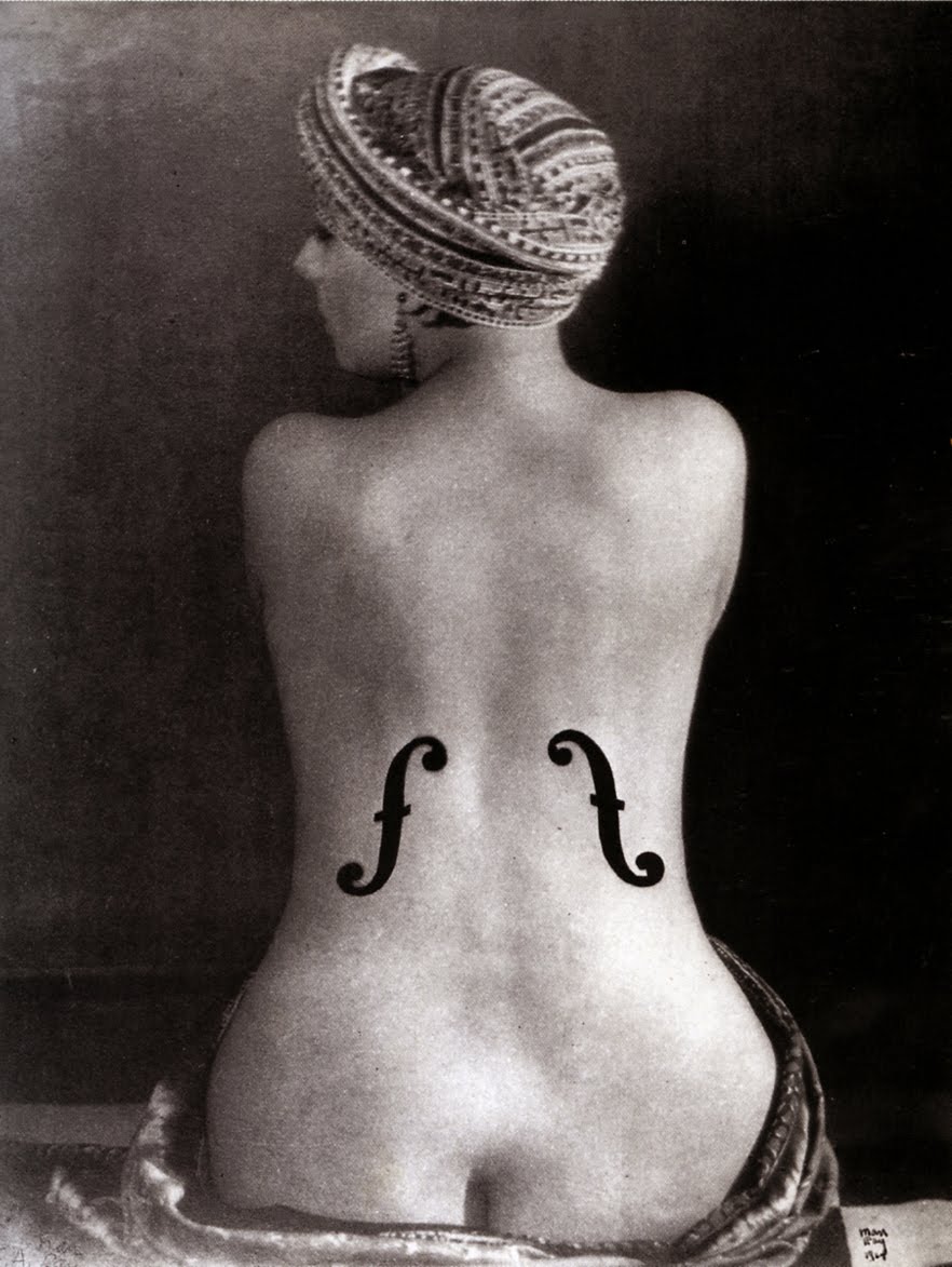
Saul greatly admired the work of the surrealists, particularly Magritte, and also the work of Man Ray, Paul Rand, whom we have discussed in class, and Cassandre, all of whom were mentioned in Kepes's book.
 Magritte's "The Son of Man"
Man Ray's "Ingre's Violin"


A short motion graphics piece using the works of Cassandre, created in After Effects as you can probably see.


(1) From Saul Bass, A Life in Film & Design, by Jennifer Bass & Pat Kirkham, Laurence King Publishing, 2011