Friday, April 29, 2016

Animation VS Animator

This is the second animation in the series.

Since I've been posting a lot of Flash videos lately, I thought I'd add one more.

This animation is a part of the Animator vs Animation series. According to creator Allan Becker's website, he started the series in 2006, his junior year of high school. The series was incredibly popular, and was nominated Newgrounds movie of the year in 2006, 2007 and 2011.

This is a really fun series and I'm impressed that a junior in high school was able to come up with the idea for it. I really enjoy how the stick man breaks out of the animation program and begins to interact with items on the desktop. I think takes a lot of creativity to imagine the different ways one could interact with everyday items.


Be a Friend PSA

I saw this commercial today and it has cute animation, but I also think that it sends a good message. It was created by Katherine Duffy, the 2012 winner of the Project Yellow Light Scholarship, which is a scholarship given to those who promote change, and send in these types of videos to help spread the word against texting while driving.

Thursday, April 28, 2016

The Animation of Man

While searching through Vimeo once again I came across a short stop motion animated film that used paper cutouts. It's a simple story, the evolution of man, but the paper cutouts are charming and give evolution a whole new feel.

Another aspect of this short that I find incredibly intriguing is that the created left markers on the paper, so the process of stop motion is visible. I think this helps the audience realize that stop motion animation is incredibly time consuming and a very involved process. I also like that the creator put themselves into the work, even if they were just a hand.

This is a beautiful example of paper cutout animation and I hope to try my hand at it someday.


The Animation of Man

Oma, a short animated film


I recently found this cool animated short called Oma by Karolien Raeymaekers.
It's about a young girl who has to conquer her fear for her own grandmother, who is terminally ill.

Change in Animation & Alice in Wonderland Behind The Scenes

What's really interesting to me is just how far we've gotten in animation. The technology and the process compared to the beginning of the whole idea of animation is just so wild to think about compared to the amount of software's and such that we use today. However when looking back on it, you can still see the core of the animation, especially for classic Disney films like Alice in Wonderland. It all comes back to a paper and pencil and from there what happens next is anybody's guess. I thought it was just fascinating watching this video, to see how much hand work went into the animation compared to the programs we use today.

A Cool Tutorial and A Cool Website


I might be catching you off guard with this one, but - I found something cool on reddit! This week it was a tutorial I found on /r/VFX on how to create the HUD (heads-up display) from Iron man, aka the cool hologram stuff you see when Tony Stark puts his helmet on. While the tutorial was pretty fast moving and involved a lot of things I had never seen before, I liked the light humor throughout it and it kept me engaged. Engaged enough to make it to the 5:45 mark that is, when the maker of the tutorial shows off his website. I went over to productioncrate.com to check it out and I found some pretty cool stuff there. They have lots of cool video FX and royalty free audio you can download, as well as some tutorials (although I haven’t yet looked at any of the tutorials besides this one). To download things you need to make an account, but a free account can still give you access to download some pretty cool stuff. I’ll definitely come back soon to check out exactly what I can get with a free account and see whether a pro account is worth it. Because in the grand scheme of things, $40 per year for a full-access account can save me a lot of time and help make some things a lot cooler.

End-of-semester Reflection

Motion Graphics and Animation was exactly how difficult I imagined it to be. I didn't think it would be easy at all and I knew going into the class that I had absolutely no knowledge of After Effects, Maya, or anything related to stop-motion animation. But I'm proud of myself for giving it my best shot and at least attempting to use all three.

I used to think I wanted to have a career in animation (because I love animated movies), but now I know that industry is just not a good fit for me. What I like about animated movies and television shows is that anything is possible. You're only limited to what you can come up with in terms of characters and the world they live in. I am taking Program Development this semester as well and I've learned that story development is much more my style than actual production. (I also kind of learned this after taking Fiction Field 2, but that's a whole other story).

Another thing I learned about myself this semester that is completely unrelated to this class is that I really love working with and helping people. Feeling like what my job is significant in someone else's life is important to me. This semester I started teaching group fitness classes at the Fitness Center and I absolutely love it. I'm going to study over the summer to become a certified personal trainer. So I guess if I were to relate this to animation, I would rather work with voice actors than actually animate the production.

As I look towards the future, I don't regret taking this class at all. I learned a lot and now I highly respect everyone in the animation field, even more than I did before. If I apply to intern at an animation studio when I study in Los Angeles, I will most likely apply to be a part of their development team.

Finally watching Zootopia!


Over the weekend I was finally able to see probably one of the greatest animations Disney has put out in recent years, Zootopia! And while it is a rockin’ children’s film it is also very culturally relevant and people of all ages have most definitely enjoyed it. I mean went to see this film in theaters about last week and the theater was nearly full. Zootopia has most definitely rekindled my love for watching not only animations but movies in general. Although Zootopia is most definitely a movie for children, there are some jokes that are thrown in there for it’s probably not so intended older audience. Zootopia is more than just a children's movie that is about how any “animal” can be what it wants to be when it grows up but goes into the deeper relations with other “animals” that aren’t like you. The Predator vs. Prey dynamic is a main story element and the way that it is deal with in a way that shows not all Predators are evil at heart but also not all Prey are always innocent. This film shows a a wide range of characters that could easily be from the everyday life and because of this it is easily one of the most relatable Disney Animations to date.

Lemonade

Its hard to overlook the impact that Beyonce's Lemonade album has made in pop culture this week. It was not only a relatively secretive album drop, but a full hour long visual film with all album tracks and spoken word. The visual album is absolutely phenomenal, bottom line. There were seven directors, one an Ithaca College alumni that produced this cinematic beauty. If you have access to the video the section around 4:52 has great examples of After Effects and wonderful visual effects. I high recommend checking it out if you haven't yet.

Tame Impala- Mind Mischief

https://vimeo.com/59407115


After going to an all guy high school, I really related to the story being told in this video. This is just one of many music videos Tame Impala has released that has gotten a lot of attention through their creativity with story lines and use of graphic effects. This video specifically is interesting because half of it is filmed and the other half is all done with animation. At 3:21 the music video does a complete 180 which is always exciting for the viewer because it comes out of no where. Please check this video if you haven't seen the video/heard the song because I assure you'll enjoy it. Im guessing the second half was edited on photoshop seeing that most of the animation is drawn out.

Carn

Carn is a short animated film created by French filmmaker Jeff Le Bars. The story revolves around a boy who becomes lost in a snow storm. Desperate and afraid, he meets a dying wolf and makes a violent pact with it.  

The use of color and lighting really help illustrate the dire tone that the film portrays. A lot of the scenes utilize silhouettes and beautiful backdrops that give the audience a memorable experience even with the short 5 minute runtime. The story, visuals, and editing were all produced solely by Le Bars and it definitely shows his expertise with animation.


Carn is a beautifully animated feature that is packed with dark imagery and a violent ending that takes the audience by surprise. You can watch the full film using the link below:
                                                         https://vimeo.com/69700933 

Adobe - Remix - Ash Thorp

I came across this animation by Ash Thorp that I thought was really awesome. It is a trip through this psychedelic space they have created and it leaves you almost hypnotized when you're watching it. Whats even cooler is there is an equally as mesmerizing animation taking us through the process of its creation. Its amazing how even the production of this piece is almost as great as the final product. Definitely would recommend watching the final animation first and then moving to its creation.

REMIX - ASH THORP

https://vimeo.com/138571008

REMIX - ASH THORP - PROCESS

https://vimeo.com/138574427


Power Trip

Power Trip is one of my favorite songs by the artists J. Cole and Miguel. It has a very relaxed and emotional feeling to it and zones me out every time I listen to it. This video displays typography to go along with the song and it's done in a very creative way. The lyrics are shown on the windshield of a car driving through a city during a rainy night. The lyrics are animated perfectly with the song, giving off a very urban feel. They appear and disappear creatively by being wiped away by the windshield wipers as though the words are raindrops. The video is extremely simple but it managed to capture my attention throughout the entire song.


Game Of Thrones Is Back!

Game of Thrones is back! That also means we get to see the opening credits again of the kingdoms of the various places in the series. This title sequence started as a concept to help people figure out where everything was since it can be confusing otherwise. It was then pushed to the opening credits and involved an intensive process. Through practical models and eventual CGI Maya models, the structures came alive. It is also interesting to see that the models resemble Leonardo DiVinci  concept designs. Art of the Title interviewed Angus Wall who is the creative director at Elastic on the project. The one thing that proved difficult at first was what was beyond the map as the  camera moves along. This was solved by making the sun that is seen at the end of the title sequence. If you haven't watched the opening already, I highly recommended it.

Wednesday, April 27, 2016

3D Animation Meets 2D in this Amazingly Colorful Music Video

I'm not sure how many people are familiar with Animal Collective, but their music is awesome and they usually have some great videos that go along with their more catchy songs. "Floridada" just came out and it's exactly what anyone would want out of a music video. Weird patterned 3D people having a baby by doing yoga? Check. Epilepsy warning? Check. Amazingly smooth and fun painted 2D animation? Double check.

Who says 2D animation can't marry 3D animation? It just did. In this music video. So enjoy! Get up and dance! And don't forget about that epilepsy warning there are some seriously bright flashing colors in this.

Animation Using Physics in Maya

I wish we spent more time in this course learning about Maya and all the things you can do with it. I understand that Maya wasn't the primary focus of the course (that's what COMP 290 is for (and it's being offered this coming Fall, if anyone's looking for a couple more credits in their schedule (shameless plug))), but I definitely wanted to incorporate it into my third project somehow. I found this really cool tutorial that describes how to use gravity fields and various other variables to create a simulation of a Newton's Cradle, which I used as part of my project. I figured I'd share it here, just to give a small look at Maya's physics engine. This is probably one of the least complicated tutorials for dynamic animation in Maya I've seen. Most of them are 30+ minutes.

Also, the website that made this tutorial, Studiofourmedia, has some other really cool Maya tutorials on their site. Some of them require purchasing to view, but the free ones are still in-depth and very informative.


Tuesday, April 26, 2016

Visual Effects in the Jungle Book

The new live action version of the jungle book has come out recently. While reviews are mixed and I am not sure if the film itself is worth seeing, but it is absolutely full of complicated visual effects. This video shows some of the work and compositing that went into this film. So much of this film from the characters to the backgrounds are computer generated. It looks pretty cool and is definitely something that I would like to be able to do in the future.

Thursday, April 21, 2016

Catch Me If You Can and Saul Bass

This weekend I re-watched Catch Me If You Can for the first time in a while. The movie, starring Leonardo DiCaprio, is a 2002 drama about a boy who lives a fake life using fake checks and creating many different personas for himself. What I didn't realize the first time I watch this movie was the amazing title sequence. It's an animated sequence that tells a tiny bit about the movie, but mostly alludes to just the title of the movie itself and the main characters. The transitions between each animated scene and the style of drawing stood out to me as being very impressive. The title sequence was created by Saul Bass, who I went on to find out is a master of title sequences. I will definitely be looking for inspiration from these as I continue to work on my title sequence project.

Some more of Saul Bass's title sequences:

A Plethora of Animation Styles!

Hey, do you guys remember Chalkzone? It was a rather obscure cart that aired on Nickelodeon in the mid 2000's. The thing that always interested me about this show was the shift in art styles when they left the natural work and when into the “Chalkzone”. Granted the main characters never changed they appearance but the world around them after they the charted go through the portal turned into this chalk drawn world.
Although this show has been on for a while and is for children yet again, The Amazing World of Gumboil is surprising with its animation style. Although I would assume the set style is that of the main character, each secondary character carries their own animation style with them, ranging from flat 2-D to 3-D and everything in between. The great thing about The Amazing World of Gumball is the way they incorporate as many different animation styles as they can and the result is somewhat disorienting as well as charming! (But again keep in mind this is a children's show so yeah be wary.)


Flatbush Zombies x Trash Talk -- "97.92" OFFICIAL MUSIC VIDEO


This music video by Flatbush definitely sparked my interest when I saw it for the first time because I really had no clue how these camera angles/ effects were being done. Ive watched it a bunch and Im guessing that they used a  several fish eyed cameras or GoPros attached to a drone but I'm stumped when it comes to the post editing or that even took place. The angle in the video is hard to explain but its almost like they're giants onto of the globe and earth looks like a tiny ball. the best is when they're on a boat at 2:00 in.

Boom! Explosions!

This is an informative after effects tutorial about how to make realistic explosions in after effects. I can't see there being a ton of use for this tutorial but it a cliched thing to make it silly videos. I think it is a cool and fun tutorial.

Onirik

While going through different animated videos posted on Vimeo, I came across a very beautiful animation. The video was made by two animation companies, Fink and Colts. The video is described as a "surrealistic journey through the minds of creative people". This video is a way to show the creative processes of different artists and how they can truly make their animations come to life. It's very entertaining and gives us a different perspective to animation. Check it out!


Onirik from Fink on Vimeo.

The Ballad of Mr.Steak


Last semester I stumbled upon Kishi Bashi, while I was looking for some new music. The clip above is a very unique music video for their song The Ballad of Mr.Steak. While I had a hard time finding any information on this video and its animator, I thought it would still be an interesting animation to share here.

I really enjoy how well the animation lines up with the music, especially in the very beginning when the axe comes down on the cow. I'm also a fan of the stars at the beginning, which seem to have a bit of meat texture. Since it was difficult to find information on the animation specifically, I don't know exactly how it was made. Judging from my own observations, it looks like the meat was animated using stop motion. The whole video was probably created using a variety of animation techniques, as as certain elements (like the light, stars, and clouds in the beginning) don't look like stop motion.

Overall, I  have a bit of a love/hate relationship with this animation. I find it original and well done, but at the same time, the "booty shaking" meat can be a little freaky!

Music & Motion

Bringing imagery to your favorite song is always interesting to see. It can completely change the song for you and make you love it or hate it. The stop motion and animation that is used in the video below is one of my favorites. It is so colorful, loud and interact. I would love to make something like that someday. The different materials that it uses and the motion of it all brings another type of psychedelic story and trance of "always going backwards." Its very well done and a great inspiration.


Typography & Motion Graphics After Effects Tutorial

This is a basic tutorial on typography that I thought is really easy to follow along. Typography is such a fascinating use of animation, you can create and do just about anything with it. The way it all flows together is almost like creating its own story, its so interesting! There is so many examples of it on YouTube that I definitely recommend checking out.

Bob's Burgers

Bob's Burgers is an animated sitcom that centers around The Belchers -- a quirky family composed of Bob, Linda, Tina, Gene, and Louise -- and their ownership of a a burger restaurant on a seaside. Their misadventures have to do with family issues, school issues, neighboorhood issues, and trying to keep their restaurant on their feet while competing with the restaurant across the street. It won the Emmy Award for Outstanding Animated Program is 2014. The series was created by Loren Bouchard,

Home Sweet Home

Home Sweet Home is an animated short film directed and created by French filmmakers Romain Mazevet, Pierre Clenet, and Alejandro Diaz. Winner of multiple awards in its 2013 debut, Home Sweet Home features the story of a house as it embarks from its desolate suburban location into a grand adventure across the world.


The most notable aspect of this short film are the visuals. It's opening scene makes it hard to tell if it's a work of animation or not. The environments vary tremendously and are always lush and full of life. The film definitely gives a Pixar feel through its animation and lively characters. The team working on this film implemented innovative ways to make a seemingly normal looking house full of life and character. Windows and doors are used for eyes and mouths and hedges and overgrown bushes are used for facial hair. Different kinds of houses, from dog houses to mobile homes, are used throughout the film and add a lot to the story and environment.


Overall, Home Sweet Home is the most original and charming animated short film I've seen in a while. Every minute of the ten minute feature is brimming with gorgeous visuals and creative ideas. You can check it out for yourself :

Home Sweet Home from Home sweet home the film on Vimeo.

Processing

Arutro told me about a really interesting program that is worth exploring, especially if you have any interest or background in programming and computer science. The site describes the program as: "Processing is a flexible software sketchbook and a language for learning how to code within the context of the visual arts. Since 2001, Processing has promoted software literacy within the visual arts and visual literacy within technology." Basically it is a program that allows you to create art, motion graphics, among hundreds of other applications. The site contains a variety of examples of some of the basic uses. This is one that changes the hue as you drag your mouse across it. Below, you are given the code that makes it work, and it is often surprising how simple the basic stuff is. The language is based on java so if you are good with that program you should feel right at home. Download the program and try entering and tweaking some of the sample code if you are interested. It is a really cool concept and the possibilities are endless. Here are some exhibition examples of work people have done.


Dragon Ball Super

Last July, the anime Dragon Ball Super premiered in Japan and quickly found its way over to the U.S. Fans of the immensely popular Dragon Ball series were understandably excited, as this was the first new story in the Dragon Ball universe since the last show aired its last episode in 1997. The series is known for its very well animated and ridiculous, over the top action sequences, and many were wondering what new show would have in store for them this time. However, during the first big fight scene of the show, which was currently telling a story arc that mirrored a recently released Dragon Ball movie in which Goku, the show's protagonist, fights the universe's strongest being, there was a noticeable drop in the quality of animation that fans expect from the series.


These are stills taken from the 5th episode of Super, and they contain some of the worst animation in the history of the Dragon Ball franchise. Quite a lot of outrage was thrown in the direction of the shows's animators, all of which I believe was justified. With such an iconic, almost revered series as this, it's very difficult to imagine that the show's producers would be okay with this kind of sloppy work. Since this point, though, the quality of the animation has continued to be on and off, with some episodes lacking many, if any real glaring issues and some not being pleasant to watch. The most recently aired episode, episode 39, has actually had some of the best animation that I have seen in all of the various Dragon Ball shows I have seen, which I hope means that the animators learned from their mistakes and that this will be the standard for the show moving forward. When such a large group of people have these kinds of expectations for what they consider to be an acceptable product (expectations that have, up until this point, been consistently met), a disappointment such as this can have serious ramifications.

Her Morning Elegance

Stop motion is one of the most time consuming animations to make but the visual result is worth the effort. Stop motion has been used in music videos before, most noteably on MTV, this one in particular worth sharing. "Her Morning Elegance" by Oren Lavie and produced by Michal Dayan took over six weeks to script and storyboard and then 48 hours to shoot all the pictures. I have, along with the orignal video, shared the "making of HME". Enjoy.

SleepyCabin Animators

http://sleepycabin.com/


Sleepycabin is an animation company started by a bunch of Newgrounds animators I used to follow back in the day.  It interesting to see them all working together now and what kinds of projects they have moved onto.  It's pretty NSFW

Wednesday, April 20, 2016

Thinking About 3D Space and Installation: Locomocion

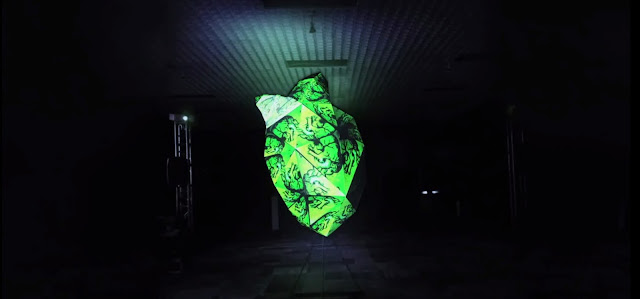
Locomocion  is essentially an animation festival in Mexico City, started by a group of young people interested in experimental animation and creating an intimate space for the sharing of this art.

Last year (2015), Locomocion invited 13 animators and visual artists to come together and collaborate on a single piece. Titled The Heart of the Visual Alchemists, this piece takes a step back from the nature of mainstream cinema by making it a 3D experience and transforming the physical space through animation, sculpture, and music.  The sculpture at the center of the room was a 118 inch tall paper heart that was covered with animation at 360 degrees.

In the piece you can see the artistically unique styles from each animator that participated.

The piece itself also represents the mission of the festival itself. As Locomocion said that the goal of the festival was to create "a space to create, experience, and enjoy experimental animation."

Watch the installation here!

Making Progress on My Stop-Motion Animation

I am so close to being done with my stop-motion animation! In the beginning I had such basic drawings and now I have a piece of production that I think looks pretty cool. Of course I had a couple setbacks like not knowing how to light any shot, accidentally making my project 4K (literally have no idea how I did that), and struggling to hide the paint marks on the bottle cap. A number of people helped me solve each of these problems as they came up (thank you Arturo!) and now I have this:


Ta-da! I'm still working on the sound design and the LMFAO song that's in there right now is more of a placeholder than anything. I'm hoping to get an original track from a friend to swap in for it. Let me know what you think.

Animation in Sitcoms and Films


It is relatively popular to have a scripted television show or film throw in bits of animation throughout their series or movie. I personally don't know how I feel about it. There are many examples, such as in season 2 of Unbreakable Kimmy Schmidt, in the Disney Channel show, Lizzie McGuire, or in the movie Enchanted. All of these scripted shows and films have actors and sets and a true script, but sometimes animation actually enhances the plot. In Unbreakable Kimmy Schmidt, it is only used once, when we are looking inside Kimmy's mind, and we are able to see an animation where she turn into a princess. In Lizzie McGuire, it is used much more frequently and offers an enhancement to the plot in every episode, and in Enchanted, the main problem in the movie is trying to get back into the animated world, so mixing the 2D and 3D world is a key point of the movie. Personally, I think that it should be one or the other, but critics offer that this popular choice actually plays pretty well with audiences. 

Tuesday, April 19, 2016

Breakdowns of the Force Awakens

Obviously, the CGI in Star Wars is pretty good. They practically made the industry what it is today. This is a pretty cool video of the edit breakdowns in the force awakens that shows a lot of the layering and compositing that took place to make some of these shots. I can only imagine how long some of this took to make.

Thursday, April 14, 2016

Color Scripts in Animation


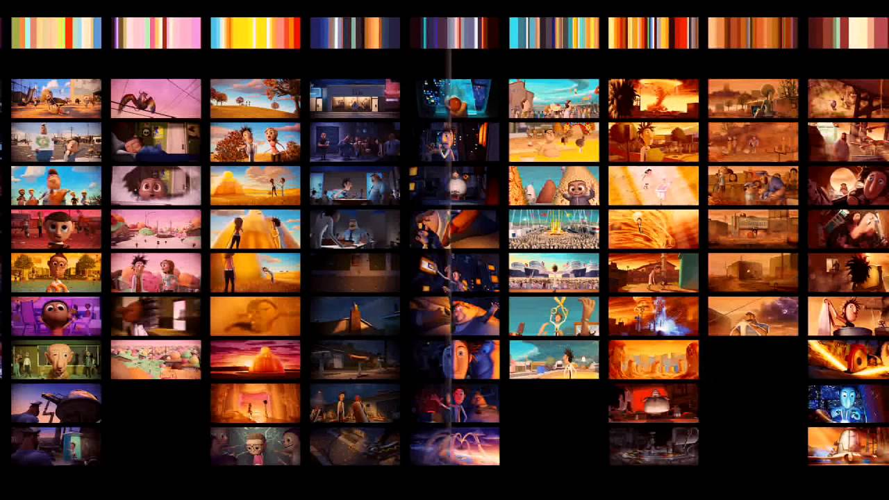
After taking the color grading minicourse a few weekends ago, I started to wonder how color correction and color grading played into traditional animation and how if might be different to the process that its used for live action films.  Color correction and grading are actually used quite frequently for animation in the same sense as live, to give the director more creative control on the final image and adjust each scene accordingly for the perfect emotional tone and to relate to the story.   In a sort of non-computerized form, animation films have their own version of Lookup Tables (LUTs) in the form of color scripts.  An LUT is essentially a way to modify the original image shot to the intended image to be displayed, and color scripts are sort of a way for animators to determine what kind color needs to be changed when the time comes for the process.  Color scripts are a way to map out the colors and saturation for each scene in order for the director to have a clearer vision of what the final product will look like, and possibly make more changes along the way.  Big-studio films like the works of Disney and Cloudy with a Chance of Meatballs use color scripts that are developed early on, and go hand-in-hand with the story development, as when some scenes change the emotion and color can change as well.Picture
Color Script for The Incredibles shown above, mapping out each scene chronologically

Script for Cloudy with a Chance of Meatballs, providing a palette of colors above 
to correspond with the specific scenes, not necessarily in chronological order

As much as I still need to practice color correction and grading with live action first, I find the techniques for color in animation quite fascinating, it's essentially another kind of storyboard to develop in the preproduction process in order to have a more solid vision of your final product.  Definitely something I'd like to try on some of my projects in the future.

Female Representation in Film

More recently than not, especially in this day and age where superhero films dominate the box office and Marvel receives extreme positivity from critics, however one of the biggest problems reviewers have is the lack of female characters in these films. Now I'm a big fan, and I do agree that it is a fault. Luckily they've heard fans crys and in the new movie coming out in May, Captain America: Civil War, there are three key female characters in the story. Natasha Romanoff/Black Widow, Wanda Maximoff/Scarlet Witch and Sharon Carter/Agent 13. It's really exciting to finally see such a strong presence of females in these movies, the comics there are so many powerful women that it's quite remarkable to finally see them on screen. Little by little they are diversifying. Check out this women in Marvel featurette that showcases Black Widow, Scarlet Witch, and Agent 13

World's Largest Stop Motion Film

Gulp

Gulp is the world's largest stop motion film. It was shot on a Nokia N8 phone to showcase the abilities of the phone's camera (The world's smallest stop motion was also shot on a Nokia N8).

While the animation on its own is already impressive, the making of video shows just how much work went into the film.

A lot of the animators were used to shooting in a stable indoor environment, but because they had to shoot on a beach they encountered a lot of new challenges. Because they are using drawings in the sand to create a good portion of the animation, they have to be really careful about not letting the sand get swept away by the changing tides. Time also becomes an issue, as lighting is completely different at night. In the making of video, they talk about how they had to bring in lighting on cranes.

Gulp- The making of

Becky and Joe - From Tame Impala to Don't Hug Me I'm Scared

Tame Impala is a band well known among college students, and probably their most well-known song is Feels Like We Only Go Backwards. Aside from having that classic indie music sound and lyrics that are easy to sing along to, Feels Like We Only Go Backwards has an amazing, colorful, engaging and trippy music video. It wasn’t until recently, however, that I found out that the makers of the music video are the same people behind the popular YouTube videos “Don’t Hug Me I’m Scared”.

Don’t Hug Me I’m Scared is a five part video series that falls into the “WTF” category of YouTube videos. It’s nothing special in terms of animation, and is mostly just known for the dialogue/music in the videos. It was very surprising to me then that these same people were the brilliant animators behind the popular Tame Impala music video. Their website has this caption accompanying their upload of the music video: “Becky and Joe directed the new video for Tame Impala’s latest single ‘Feels Like We Only Go Backwards’. The film is made up from over 100 separate plasticine collages all individually made by hand”. That’s what makes the music video so amazing - the fact that it wasn’t computer generated. They actually took the time to design all of this will plasticine clay - a process that is much more precise and time consuming than the computer-based alternative. Knowing what the animators at Becky and Joe are capable of makes me really wonder what made them decide to stick with the Don’t Hug Me I’m Scared videos…

Flash/Qucksilver After Effects tutorial

This is a tutorial to do a speedster animation. As a Superhero fan, this is a cool effect, especially since the Flash is one of my favorite super heroes. This could come in handy in the future and is a great tutorial.

Stop Motion Animation

For my final project, I was weighing on what exactly to do and then I saw this video and was instantly inspired. I think stop motion is so fascinating and doesn't nearly get enough credit on just how difficult it is to create this type of animation. This particular video was so unique and I loved the sound effects, it's definitely worth checking out!

Lighting and Animation


I stumbled across an interesting Ted Talk about how lighting plays a very crucial role within animation. In the Ted Talk, Danielle Feinberg discusses her career at Pixar and how her work at Pixar has made her dream of having art as a career possible. She speaks in depth about how lighting has the potential to drastically change the feeling of the film as well as bring a scene or character to life. Lighting is such an important characteristic to not only cinema but animation as well and I suggest you all take a peek at this Ted Talk, it is around 12 minutes but I promise it is very interesting!