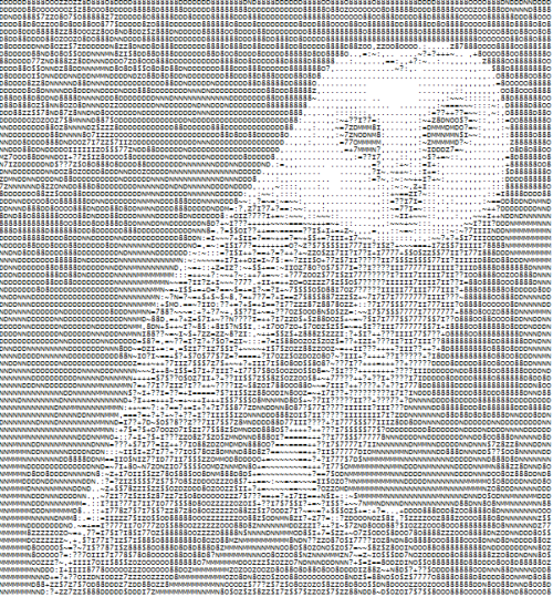
For those wondering, what ASCII art is, let me show you.
A lovely Barn Owl by me
See how it's made up of numbers and letters and such? Those are ASCII characters. With ASCII art, a general rule of thumb is that if you want to see the picture better, get further away from it. More complex pictures will be bigger, using more characters.
There are different ways to go about creating said art. You can sit for many hours and type out a masterpiece, or you can be lazy and make a program that does it for you!
Being a huge nerd can take you from this
To this!
So making the pictures is one thing, but what if we wanted to do more with them? What if we wanted them to move? Well, we can do that! It's just going to require some work.
First, we need to know what we want to animate. For this, I'm going to use another thing from Steven Universe
So we have our short clip picked out. Next, we need to turn that clip into a series of stills to turn into ASCII masterpieces. Each one is going to be a frame of our finished product. I ended up breaking this clip into 18 frames. I then took each of the new ASCII pictures and compiled them into a gif.
The timing needs a little work, but there we have it! Animated ASCII! I would love to make some kind of plugin that converts frames to ASCII to be able to do this in an even lazier fashion, but that's a dream for the future.
I’ve been trying to determine my feelings toward the trailer
for the new Spongebob Squarepants movie. This movie will follow our favorite
under the sea characters onto dry land, combining live-action with 3D
animation. I think there’s something about bringing cartoon characters into a
live-action setting that makes some part of my brain a little uncomfortable. I
think this is especially true when a 2D cartoon becomes 3D—it takes a second to
get used to, and even after that second it takes a minute. Despite this, whenever
animation interacts with live action, I am impressed, and the Spongebob trailer
is no exception.
Of course, Spongebob isn’t the first 2D character to become
3D in the real world and definitely not the first to bring cartoon characters
to live action. We can’t forget about classics like the live action Scooby Doo
franchise or Who Framed Roger Rabbit. What I find interesting is that Who
Framed Roger Rabbit doesn’t feel as unnatural and brain-itching as Spongebob or
Scooby Doo does, despite its decidedly darker themes. I feel like the
juxtaposition of 2D in a 3D world doesn’t feel as wrong because of how
obviously the 2D doesn’t fit. Because it makes no attempt to fit in, it doesn’t
feel as unnatural as it is. In 3D animation, the characters are designed to
masquerade as something that could be apart of the real world by attempting to
match the structures of a real life 3D world. Even though the quality of the
animation is, I think, really impressive in the Spongebob movie, the characters
are still the characters they’ve always been--they’re still brightly colored,
they’re still exaggerated. Their cartoon-y characteristics are still very
present, but structured and designed to move about in a world that isn’t
natural to them.
You know that feeling after the lights have come back on and you’re in that awkward blinking back to reality phase after a movie, not really sure where you are? Your head feels heavy and, no matter how long you stare at the blackness that cut in afterwards, no one is going to come and tell you “just kidding, here’s the ending you want.” It doesn’t happen often and it’s not an altogether pleasant feeling. Because sitting in that seat, you feel like you just witnessed something you weren’t supposed to. Something that was supposed to stay behind closed doors. Something that sticks in your mind, like tar. Something that latches its claws and refuses to move, an ugly creature that keeps you up at night. Something that you won’t soon forget.
For me, this feeling came after watching Errol Morris’s Standard Operating Procedure. Even now, as I write this, I’m still trying to wrap my around what I had seen. To be honest, it didn’t surprise me as much as it confirmed things I knew existed. Humanity is certainly a strange animal. For the sake of this article, I will only provide a paraphrased summary of the events that unfolded. Because in this moment, I don’t wish to talk about the movie as much as I want to talk about how it was made. I will say this though: it is something that needs to be watched with an open mind. That’s what Errol Morris does. He provides perspective. So that’s all we can go with. Perspective.
The film follows the events leading up to the “Abu Graib” scandal of 2003. In short, the United States had a series of prison out in Iraq that were used to torture its prisoners (for information). See, this concept isn’t new. And it certainly isn’t something that this country can acquit itself of. But this movie focuses itself on the details of this scandal. Because while these prisoners were interrogated, a series of photographs were taken: of those running the prison smiling and looking as if they enjoy themselves. Yet, Errol Morris provides a different take on the situation (that led to the arrest of a handful of military personnel). He provides perspective behind each image. He allows those to explain themselves. And you’re left wondering who you should believe.
It’s an incredible well-done documentary: with an overall feel of grit that meshes well with its equally dark topic. From the lighting, to the camera work, it sets up this very intense atmosphere. You almost feel like you’re the one now interrogating these people but you’re not finding any answers that make you comfortable.
Specifically, in terms of making this, Errol Morris utilizes a fascinating mix of motion graphics and animation. In scenes where the actual pictures are discussed and brought up, he gives them life. He creates these spindling maps that link together, swirl into righteous identity, and float about demanding attention. They make words that otherwise would seem boring and unremarkable, come to life in a frightening way. It’s certainly no Ken Burns.
He creates a digital atmosphere that transports us into the bodies of those who investigated these events. We feel as if these moving pictures, as they record time differences and link of clues, are doing this in real time. It's a strange sort of re-enactment that begs to be seen beyond the realistic ways we'd go about it. By using motion graphics to put up a photo or to visualize an abstract thought, Morris is able to create a scenario of discovery that follows the lead of the film.
Almost like watching a hacker makes his way through thousands of digital files during an action movie, we see exactly what these interviewees mean as they start to connect the dots. And it plays well with the entirety of the film because the point is that pictures are just two-dimensional. That every story has more than one side. And if we're not careful they can tell a story vastly different than intended. One that's dark and cruel is a sickening way.
I guess pictures do tell a story. And I guess they really don't.
This YouTube channel is one of my favorites. I feel as though maybe some day I would be able to recreate some of the things he's done (although I wouldn't be using final cut). He's pretty young, and it seems like he keeps trying to find new ways to make his imagination come to life.
In this one, Final Cut King does a great job of making this small cat look just as pikachu would in real life. The audio may be a little off, but it shows that even a young person like him can edit if they set their mind to it.
I think that everyone should check out the rest of his channel! Maybe I'll be the "after effects queen" by the end of this class?
Today I'm going to talk to you about one of my very favorite television shows, "Adventure Time". For those of you who don't know, "Adventure Time" is a cartoon that airs on Cartoon Network and it was created by Pendelton Ward. It tells the tale of a boy and his magic dog living in a post apocalyptic world of Ooh along with mysterious and magical creatures. Although this show is geared for kids, it has a strong following for people outside of its target audience, including teenagers and adults (and me). The show's appeal is that it is simple, fun, and light-hearted, but below the surface there is a whole depth of meaning to the show. It is brightly colored giving the show a seemingly positive and worry-free world, but there is also very dark themes throughout the show. It also includes witty humor that definitely goes right over the heads of kids who watch the show.
What impresses me about "Adventure Time" is the execution of the episodes and the creativity behind each and every character and scene. Each quirk is unique to this show. One of the main characters, Jake, is a magical dog that can grow and stretch and transform into just about anything. There is also a floating cloud-like character, Lumpy Space Princess, who has more sass than anyone I have ever seen. The character detail is not overly complex, but the colors used in the show are truly breathtaking. The episodes are a labor of love and the process takes about 9 months to create just one episode (including storyboarding, writing, animating, coloring, voice-overs, etc.). It feels like so much more than a kids show to me and I definitely would recommend it to just about anyone.
A friend of mine showed me this video a while ago, and I thought it was the coolest idea ever.
This video will make a lot more sense, and seem way cooler if you are a "Game of Thrones" fan as it is a parody of their amazing show intro(See Below). This video was made by the company Hootsuite which combines all of your social media apps into one single application. Hootsuite smartly uses pop culture to draw comparisons from a central item in the show known as The Throne.
I've always found that the Game of Thrones intro is one of the most impressive out there, and I always wonder how they managed to make it, but this is certainly not easier to do. This parody, while very similar to Game of Thrones was definitely no walk in the park to make. All of the keyframes and masks that had to be added to this is sheer insanity. What really draws my attention is the moving shadows and use of 3d space. These towers aren't rising but rather growing towards the camera. The use of the XYZ plain, and the moving camera angles really makes this an amazing animation!
Hello! My name is James Sussan. I'm a senior TVR major. Looking forward to working with you all this semester.
I've always been fascinated by animation. It's a ludicrous amount of work to produce, with a high level of skill involved, but the result could be something absolutely glorious every time. Not only that, but the possibilities and creative boundaries of an animated project are nearly limitless. As evidenced time and time again by film studios such as Disney, Pixar, and Dreamworks, a fully realized animated film can leave an impression that lasts a lifetime, whether a feature-length project or a quirky short.
In our first couple classes, we've started learning the basics of animating in After Effects. Essentially, I now know how to create a shape, and make it do certain pre-programmed actions using code. The idea that a person can start with something as simple as a few shapes and a few codes, and end up with something as heart-warming as "Toy Story", or "Up", is something that truly excites me for this class. Not that I am expecting to create a full, professional, animated film anytime soon. However I'm sure my experiences in this class will be a lot of fun and will help me appreciate the art of Motion Graphics and Animation to the fullest.
An animated movie I saw recently that really surprised me was "Cloudy With a Chance of Meatballs". I never saw this movie when it came out, because I honestly assumed it would be stupid and unfunny. The children's book it was based on never seemed like the type of thing to be translated into a successful film. A friend showed it to me a couple months ago though, and now its up there with some of the best animated movies I've ever seen. It's creative, hilarious, and yes, at times heartwarming. It's nothing at all like the children's book it's based on, which is a great thing because this allowed the movie to create original characters that helped push the raining food concept into a cohesive story.
Luckily for me, there's a few behind the scenes videos for "Cloudy With a Chance of Meatballs" on YouTube. One of my favorite scenes from the movie is the Jell-O Palace Flint creates for Sam. I think this is pretty much everyone's dream:
I always liked watching these types of videos, where the animation gets broken down step by step. I'm sure they'll mean a lot more to me however by the time the semester is over.
These videos already make the amount of work put into animation look really scary. Despite that, I can't say I'm not eager to try my hand at it. Hopefully I can make something one day anywhere close to as cool as these movies.
Back in 1998 Cartoon Network debuted an interesting new show. The premise involved three, evil fighting, chemically created young girls. In every episode Blossom, Buttercup and Bubbles would defend their town and deal with their own issues of growing up. The show lasted until 2005 and even transitioned in to a highly acclaimed feature movie.
The Powerpuff Girls were loved by many audiences and took risks that many other "children's" programming wouldn't dare to. Fighting gender stereotypes were at the backbone of every episode as the girls would constantly prove their worth and prevail against stronger, more traditionally masculine characters. The villains of the program fought gender stereotypes as well. One of the recurring villains, HIM was essentially a cross-dressing devil who expressed himself in female clothes. The Rowdyruff Boys acted as a parallel, masculine version of The Powerpuff Girls who constantly ridiculed and belittled the heros, but always ending up powerless in comparison.
The artwork and animation of the show used pastel colors and flashy, short animation. At times the animation seemed almost choppy, but it always seemed to fit within the action packed, comic-like world The Powerpuff Girls lived in. The girls themselves looked young, and fresh. They sported their signature large, baby eyes that could change in a seconds notice if it was time to seek justice. Cartoon Network recently announced a reboot scheduled for the show. They plan to bring The Powerpuff Girls back to television in 2016. Along with this announcement the network also shared a shot of the new animation style for the girls. It features harder lines that add a realm of darkness to the girls persona. I personally am not a fan of this new style and feel like this art style fits in more with the world of the Cartoon Network show Samurai Jack, rather than the bubbly land of The Powerpuff Girls.
Below are the original artwork and new artwork. What do you think? Should they have just kept the original art style or is it a much needed upgrade?
With Fall upon us, it is time to prepare for the best time of the year, Halloween. Lobotomizing pumpkins, crunching leaves, and all things spooky have their time in the sun. So, what should we look at to get in that Septemberween spirit? Scary video games of course!
Taking place at a Chuck-E-Cheese Freddy Fazbear's Pizza, you play as the night watchman tasked with looking over the place from 12 to 6 am. But be warned! The animatronics don't take too kindly to you, and if they get you, well, you die.
Looks pretty good right? But what if I were to tell you that everything in the game was 2D?
Five Night's at Freddy's was made in an engine called Multimedia Fusion, which is a 2D game engine. The game itself is actually a 2D point and click, styled to look 3D. The graphical style is reminiscent of the point and click computer games of the 1990's
Darkseed II, 1995
I Have No Mouth And I Must Scream, 1995
Every possible action and outcome in Five Nights at Freddy's is pre-rendered. The fully animated parts (which tend to be the parts right before you die) are gifs, and not a character moving in real time. The textures and shading of the characters and environments make them look remarkably 3D.
If you see this in-game, you're good as dead.
Most of the character movement happens off screen, adding to the terror and subtlety of the game. Nothing moves so long as you watch it, but you can only watch one camera at once, and it eats up your limited power.
Each of the animatronics has its own AI, resulting in each one having different tactics. For only 5 bucks on steam, even to just look through the game's files at the superb art, Five Night's at Freddy's is worth a look. If you don't feel up to the spooktacular challenge and would rather watch other people play it and freak out, there's plentyof that too.
If any of you grew up in the late 90's or early 2000's (which is all of you), you have definitely come across these demonic looking action figures that are known as, "Barbies." The show, The Most Popular Girl In School has Barbies for characters, and is produced in a similar fashion as other shows such as Wallaca and Gromit, in the respect, that animation is made through the similar kind of movement and the background is also done similarly. All of the characters are made of Barbies, and although they all look fairlysimilar, their personalities are extremely dynamic for an action figure. If you need a good laugh, and if you are frustrated with Netflix freezing, and if you liked Clueless and/or Mean Girls, this is something you should definitely watch.
Back in the day, my mom worked at Fisher Price. Part of her
work involved the production of Little People videos, which were moral-heavy
videos featuring your favorite Little People characters and created in
stop-motion. My mom worked mostly as an editor during preproduction, where she
would go through the storyboards and animatics checking for continuity. A lot
of times, she would bring her work home, where my brother and I would
participate in continuity-hunting. We would go through the animatics and point
out anything that confused us or didn’t make sense to us, offering a kid’s
point of view for a video geared to kids. My mom would take pages and pages of
notes on these episodes that rarely hit 10 minutes. I remember it being really
cool to see the final product a few weeks later—the transition from animatics
to full animation was pretty impressive.
These two YouTube videos are a culmination of a few episodes
found on one VHS. Upon watching them as a not-child, I recognize they’re a bit
silly, but still enjoyable:
Also upon watching these videos again, I was impressed by
some of the “up in the air” shots—flying, jumping, etc. I didn’t really know
how those types of shots were done, as we obviously cannot see a rig of sorts.
I then found a video on Motiongrapher called Plasticine Rhythm by Andy Martin that features a
making of video that briefly explains how these shots can be attained. Once
explained, it gives me hope for doing stop motion in the future:
There are many factors that go into making a good parody, and one of the most overlooked aspects is the title sequence. Now, it might not seem that important but a good title sequence can make or break any production. Take a look at the famous youtube channel, the Hillywood Show:
For quick introductions: the Hillywood show is a channel on youtube co-created by sisters Hannah and Hilly Hindi. They produce parodies of widely popular shows and movies, to the beat of re-mixed songs, dancing, singing, and acting as the original characters. Amazingly enough, they do it without a huge production crew and they've attracted the attention of many celebrities (like Lady Gaga and Psy).
And the parody aside (how fantastic it may be), we need to give some props to the people who created that opening sequence. For any non-Whovians, DoctorWho is a British sci-fi series produced by the BBC that follows the Doctor as he travels across time and space with his many companions. It's one of the longest-running shows, dating back to 1963, but it's become a cult classic in recent years.
Even if you only head of this show in passing, you've probably heard of the most iconic thing to this show: the Tardis. It's essentially the Doctor's "space ship" that he uses to propel himself where he needs to go (or where he happens to end up). Without getting too much into the logistics of the show, the important thing to take away is that the Tardis is iconic in more ways than one.
And you can't have a cult classic without an anthem, but this one is slightly more unique.:
As you can see, it has no lyrics but that doesn't take away from the feel of the show at all. If anything, it sets up an almost invigoration vibe. It's as if we too have joined the Doctor on his quest through time and space. And the animation of this sequence is legendary. Although it has changed throughout the years, the concept remains. Swirling stars and galaxies whiz by, as the Tardis comes spinning too and fro. It's a journey and it's one that should be appreciated. And getting back to the Hillywood show, they have people and users like Tom Dicker and Thomasjt017 to recreate their titles just like the original. It may not seem like much, but it really sets up the parody to be something great because it's familiar. For all those fans who passionately sing along to the BBC's version, they have something to look forward to in the Hillywood's one. As "the Hillywood Show" dances in-line where "Matt Smith's" name would be, viewers from both communities find something of equal purchase. And that's why opening sequences matter. Because animation means something. It's iconic in the most subtle of way, especially in live-action shows. It sets up the atmosphere and it pulls us along for the journey. Some may say it even grabs our hands and tells us to "run."
Hi everyone! For my first post I decided I'd start out with a classic. I've always loved Tim Burton and the weird/creepy stuff that comes from him. The Nightmare Before Christmas was one of my favorite movies as a kid, especially because I love Halloween!
The animation in this film is fantastic. It really makes you feel as though this place, Halloweentown, is a real world. The lighting is great, especially in the scene with the moon in the background. The textures of the ground and the stitches on Sally's face are so carefully detailed!
Not to brag or anything, but I did carve a sweet pumpkin 3 years ago that sums up my appreciation for this movie.
For my first blog post of the semester, I wanted to talk a little about the intro to the Showtime show, Weeds. Weeds was created by Jenji Kohan and it has been a personal favorite of mine ever since I started watching it. I wanted to talk about this intro for my first post because this intro is the reason why I started watching the show. Instead of talking about the intro, I'll let you see it for yourself:
For those of you not familiar with the show, it is about a white, middle/upper-class, family from the suburbs of California that has been thrown a curveball when the father dies unexpectedly. To deal with this hardship, Nancy (the main character and mother of two) turns to selling weed to her community in order to keep her "white picket fence" image.
Why I like this intro in particular is the fact that it depicts the nature of suburbia perfectly. And, the use of animation only amplifies the feelings of rapid growth and homogeneity of the suburban life.
The show also throws in some fun animations in the intro that are specific to the feelings of the episode or what is going down in the episode to follow. The use of animation in for these hints at the episode make watching the show intro fun because they change by episode. All in all, I think this intro and the animation used in it creatively set the scene for the television program and it really makes the show special.
I am Alex Cammy- a 20 year pop culture junkie from NJ. I am entering my junior year at Ithaca College, where I study Television and Radio. This past summer I was lucky enough to intern at MTV (Within the Research and Insights departments) for the Times Square location. I have a slight obsession with Oprah (I commissioned a 65 year old woman on Etsy, to create an Oprah pillow!) and a slightly larger obsession with the Real Housewives (I have seen, every episode, of every season, of every city!). I love pop culture and it's inherent nature to infect itself within society and influence it's people in a way that can be done by no other entity. I pride myself on not only being able to sassily trash and poke fun at pop culture, but also my ability to understand and analyze it. As you see my blogs this upcoming semester you’ll definitely notice a heavy influence of pop culture. I’m excited to explore how my personal interests fit within the realms of Motion Graphics & Animation!
To get the ball rolling, I’m sharing the opening sequences from a few of "The Real Housewives" locations. Every season these sequences change, along with the ladies and their taglines. While many may look down on "The Real Housewives" and that form of television, these sequences are incredibly well produced. Each location of the franchise features a unique sequence that is truly representative of the location. For “Orange County” you’ll see beaches, and sunny locales coupled with bright orange colors. In “Miami’s’” open you’ll notice a faster, spicier pace edited and put together with the flair of the Miami Latina culture. And in “New York City”you'll find heavily produced skylines, along with darker colors that produce an air of sophistication and class that the New York City lifestyle is associated with it. While each city's opening sequence is representative of the lifestyle and themes that specific series represents, all the title sequences feel united and part of a franchise. I applaud the editors and their ability to make each opening unique, yet cohesive.
Feel free to take a look at the open sequences below. No matter how you may feel about the programs themselves, we must at least appreciate how well done their openings are!
So my first Motion Graphics blog post goes out to this amazing music video by the band "Ok Go" The song is titled "Writing on the Wall."
This music video does an absolutely amazing job of organically using camera angles, and video illusions with literal in motion graphics to bend the mind. The ending does an amazing job of showing just how difficult of a production it was, and how many people were involved.
The ending also alludes to the fact that this entire video was created in one take which just adds to the insanity that is this music video. This is probably about as close to a Rube Goldberg music video as you'll ever see.
This video just shows that perspective can be everything and that some of the preproduction and setup would be insane. I can't even imagine what the storyboarding for this music video would look like, because my brain is still fried from just trying to keep up with the actually video.
Second time around attempting this class for me, this time I'm going to try and retain use of my arms. I really want to get good at little stupid things, like doing YTPs (which might get their own post later) or a cool opening sequence for my DnD group.
The class blog is a great way to show the class stuff you're working on or stuff you think is neat. Sometimes Arturo looks it over in class MAKING people see what you posted! Cool, huh?
So I am going to make this post short and sweet, but I want to say how much I have learned in this class. The information and skills that I have gained, I know I will be able to use in the future. Whether it be for a job or just because I am bored and want to have some fun. I know that I will be able to use after effects to help.
The projects that we made for this class were all a lot of fun and helped to expand out knowledge on each section of after effects. Making these reels from scratch though was the most fun because we can say that we created these things from nothing. And that is what I am the most proud of.
Thank you, Arturo, for making this class enjoyable and knowledgeable because I never would have been able to learn it otherwise.
Tim & Eric Awesome Show Great Job! is perfectly representative of everything that I see funny in a television program. In my opinion I'm sure at least 9/10 of the general public will pass off the show as garbage but to me, it appeals to my sense of humor. It does not, for the most part, use expensive and complicated special effects; it uses simplistic and juvenile techniques and confusing writing/dialogue to create a unique and non-sensical product. Its heavy use of green screen and basic me-level of After Effects is laughable. It does, however, probably take a lot of skill to produce because while the humor is nonsense and confusing, it is still captivating and there is still a very faint plot to each episode. The simplicity is still gone about artistically. The eleven minutes flies by because you're both captivated and confused the entire time.