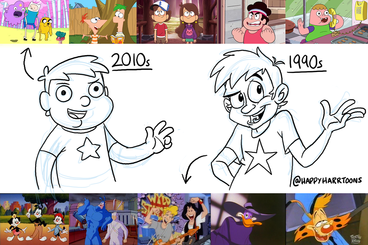
He's a huge fan of 90's "He-Man" style traditional hand drawn cell animation, and he feels as though a lot of cartoons nowadays are getting less stylistically diverse.
When the cartoon "Adventure Time" first aired on cartoon network I remeber thinking it was like nothing I'd ever seen before. The style was a lot cuter and curvier than a lot of cartoons at the time and it seemed as it's creators had put a great amount of detail into the characters and world of the show. The aesthetic matched the show's pleasantly strange world and for the most part I thought that AT would be one of those cartoons that usher in a new wave of creative aueterism.
However as the years have gone by it seems as though a lot of the new cartoons on cartoon network haven't really branched away from the curvey cute adventure time style. Content wise I think that many of these shows are really well crafted, but I can't help feeling as though a lot of character artists are stuck in a sort of creative rut.
Take a look at the difference between pilot episode for one of Cartoon networks newer series "Steven Universe" and it's release version.
I really miss the stylistic diversity of a lot of early 2000's shows.

No comments :
Post a Comment