Working on animations that are controlled by mapping the amplitude of a sound clip made me think about how else mapping could be used. After seeing the video in class and hearing Arturo mention that different projections are commonly seen in Europe on the sides of buildings, I wanted to read up about this phenomenon.
Friday, September 27, 2013
Doug Aitken's Mirror at Seattle Art Museum and the power of mapping
Working on animations that are controlled by mapping the amplitude of a sound clip made me think about how else mapping could be used. After seeing the video in class and hearing Arturo mention that different projections are commonly seen in Europe on the sides of buildings, I wanted to read up about this phenomenon.
EXIT 73 Studios: Coin
Exit 73 Studios
A few other examples of EXIT 73 Studios notable works:
The Dissolution of Communication
You can probably figure out by now most of the techniques used in this piece, but the most interesting aspect is the use of color, composition and simple shapes to convey a powerful idea.
Thursday, September 26, 2013
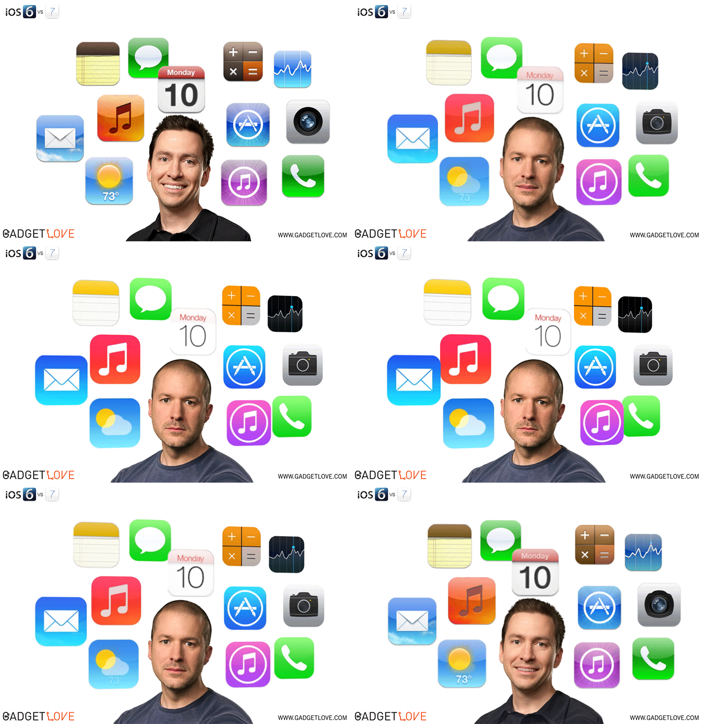
Flat Design and the End of Skeuomorphism
Skeuomorphism is the incorporation of ornamentation and elements found in previous non-digital formats. For example, a calendar application that makes use of a leather frame is using a skeuomorphist approach. Or a wooden bookshelf in iBooks...
Critics of skeuomorphism argue that the design trend clutters designs with unnecessary and outdated physical metaphors that can confuse users. Proponents contend that it gives technology users a reference point in the world.
Apple has opted in favor of a flat design chosen by the company's lead designer Jony Ive, after previous lead designer Scott Forstall left in October of 2012.
Tuesday, September 24, 2013
Ottawa International Animation Festival
At the festival they also offered various professional development workshops with people like the director of "The Blue Umbrella"- Pixar's latest short, Regular Show's creator JG Quintel, Disney animator Eric Goldberg (Alladin, Hercules, Fantasia 2000, etc...) and a few more. They talked about developing stories, coming up with ideas, animating and working in the industry.
It's difficult to find many of the films screened since most of them can't be available online after being selected for the festival, but here's one very interesting animation and the trailer for the festival, which used a lot of simple but interesting motion graphics.
Shugo Tokumaru "Katachi" from Kijek / Adamski on Vimeo.
Saturday, September 21, 2013
"The Last of Us" Title sequence
Kung Fu Panda - Ending Sequence
Done by Shine, a creative design studio in Los Angeles, in close collaboration with James Baxter Animation, who were responsible for the opening sequence, and DreamWorks Animation, Kung Fu Panda's ending credits sequence is a great example of simple, yet effective motion graphics. While the sheer graphical awe may not be present in this sequence, the aesthetics are phenomenal, evoking imagery of Chinese manuscripts and scrolls through the horizontal scrolling, kanji stamped on the screen, and old-style fonts.
There was a lot of visual research done for Kung Fu Panda, said Raymond Zibach, the production designer, and Tang Kheng Heng, the art director. According to them, most of the visuals in this ending sequence are actually concept designs of the characters from the movie, so they were able to make use of them, instead of just having references for the actual 3D models in the movie.
It flows extremely well. The screen moves slowly throughout the colored concept art, with parallax. Kanji are painted on the background. The colors are all warm, and the art style is consistent with Chinese paintings. Without a doubt, these aesthetics were thought about to great extent, and the result is a pleasant feeling credits sequence accentuated by fantastic music in a Chinese style.
Friday, September 20, 2013
Retro production intro's
Take a look:
This title sequence was designed by Jim Helton, an experimental filmmaker and editor who commonly collaborates with Derek Cianfrance. Mr. Helton has a very interesting past: born in Germany on a US army base, he then went off to attend the University of Colorado to study film under Stan Brakhage and Phil Solomon, whose work he credits as his main influence.
In an interview on theArtofTheTitle, he cites Phil Solomon as his main inspiration and recommends interested in this type of design to explore Phil's work. He talks about learning a process called "bi-packing," a process of placing two film strips on top of each other, and then rephotographing them to create a different effect than a superimposition. He goes on to describe his process for this sequence, made entirely on Final Cut Pro, taking a layer of footage of out-of-focus exploding fireworks, then taking the song by Grizzly Bear and using its rhythms to edit, and finally taking set photography by Davi Russo and reframing them to fit within the fireworks, and cutting them up into little details. Although he does not give away entirely his process, he says it was basically made with the composite feature and lots of tweaking. The fourth layer, the actual typeface for which he used "a short fade in, and a long fade out, like exploding and disheartening light." And finally, the fifth layer he discusses is the sound recordings of fireworks streaking and crackling, children playing and laughing, mixing it with the image to create an abstract echo.
You can read the article here if interested:
http://www.artofthetitle.com/title/blue-valentine/
I really like the elegance of this piece, but I really love how this clearly shows me that the tools and tricks to do these things are not necessarily difficult at all. Instead, coming up with good design in the first place is the actual labor.
Phil Solomon's influence on Jim Helton makes it clear how important an awareness and attention to other design truly is for making original design work. By paying attention to other's work, Jim was able to find ideas as references points for this piece. For me, this is a good example of how paying careful attention to design, and being knowledgeable and active supplies you with a well of creative influence from which to pull.
You can see Phil Solomon's work here:
http://www.philsolomon.com/
The Last of Us
With so much thought going into a game, the title sequence could not be given any less. On theartofthetitle.com, I found a video of the title sequence and an in depth interview of how they made it.
First off, the intro:
Dan Savage: The Poker Club
Ben Radatz making the king of cool cool again
I love how the camera transitions to different scenes so seamlessly nd the combination of live action images and cgi is fabulous.
Karin Fong is Awesome
Fong began her career with a job on the production team for The Island of Dr. Moreau (1996) under the command of Kyle Cooper. Cooper then took Fong along and created Imaginary Forces where they both remain working.
One of Fong's first independent projects was Dead Man on Campus(1998).
Fong since has done amazing work on title sequences such as television series Boardwalk Empire (2010) and films Rubicon.
Richarg Greenberg and "The Dead Zone"
Thursday, September 19, 2013
Wayne Barlowe on creating worlds
Wayne Barlowe is a benchmark science fiction artist and designer who has had his hand in Avatar, Pacific Rim, Harry Potter, Hellboy, The Hobbit and many, many other big budget films. He is known for his creature designs. In this short interview, Barlowe talks about the believability of science fiction creature design and how conceptual artists must keep forms both familiar but interesting at the same time for the audience. This has always been the balancing act that visual conceptual artists face every day. He states that he wishes to bring his work into a modern classicism. As far as I am concerned, he has achieved it and has entered the circle of master artists of today. What strikes me however is his capacity of imagination and for fun. He still has an air of child-like wonder that makes it clear to me that that honest curiosity is critical for ALL artists.
Steve Viola and Captain America: The First Avenger title sequence
Steve Viola is a creative director, title designer and head of Method Design (formerly Rok!t Studio), located in Santa Monica, California. Viola has some elite title sequences working as both creative director and or title designer including The Avengers, Captain America: The First Avenger, Madea's Big Happy Family, and X-Men Origins: Wolverine. One of his latest title sequences Captain America: The First Avenger began when Rok!t's EP David Garber collaborated with the director of The Wolfman, Joe Johnston, to generate ideas and eventually pitch the idea to Marvel. The idea behind the title sequence is a spin on the black and white Nazi propaganda films. The really cool part about this sequence is how the production team of Rok!t Studio's took existing Nazi propaganda to create the stereoscopic effect. While this might be a little advanced for our class an animation with depth like this one should be something to strive for in the future. The team created the title sequence by using Adobe Photoshop, After effects, Illustrator, 3D was done in Autodesk Maya and all 2D /3D composting was done in Nuke. Viola stated, "As a team we took a lot from Joe himself. From a concept perspective we tried to take inspiration from the WWII period and abstract/environment-based titles like the Bond title sequences and Thank You for Smoking." Here is the Captain America: The First Avenger title sequence, Enjoy!
Captain America: The First Avenger (2011) — Art of the Title
Here is The Wolfman intro title sequence created in Adobe After Effects by Joe Johnston and his team, Johnston again was the director of the title sequence for Captain America: The First Avenger.
Michael Riley
Michael Riley is a designer from Palo Alto, California. His career began over 20 years ago and he has been known for designing some great sequences. A few of his most popular ones are the "Kung Fu Panda" opening sequence and the "Gattaca" opening sequence. Riley has received numerous design honors, including a Gold Medal From D&AD, five Primetime Emmy nominations, and an Art Directors Club Silver Medal for the design of the Marvel Pictures theatrical logo.
http://www.artofthetitle.com/title/kung-fu-panda/
Above is the link to the Kung Fu Panda title sequence. This sequence by Riley has a very unique style. The animation almost looks like a 3D diagrams where the layers are made out of paper. The style is also very anime, and the panda looks more abstract than the actual movie's animation. This sequence is very "cartoon" esque and relies heavily on the animation aspect.
http://www.watchthetitles.com/articles/00114-Gattaca
This link of the "Gattaca" title sequence is very different than Kung-Fu Panda. It is very calm, playing with different shades of blue. It only tends to focus on one thing at a time, drawing the viewers attention to specific and simple motions.
Michael Riley's style is variable and flexible, very unique and artistic.
Wednesday, September 18, 2013
Juno
Gareth Smith & Jenny Lee are self described filmmakers, designers, and collaborators. They are known for major title sequences for the films Juno, Thank You For Smoking, and Up In The Air.
The two were masters at distilling the title character into her most basic, and even cutesy attributes. Not only did they enhance Ellen Paige's award winning performance, but they gave it new depth and imagery that helped build her character's core.
The couple posted a behind the scenes 'making of' blog post in which they chronicle their production experience. They painstakingly stitched 900 photographs to create a two and a half minute hybrid mixed cartoon.
"We wanted to create something that had texture and a little bit of edge, but also imparted the warmth and heart of the screenplay." - Gareth Smith
Juno - movie titles from DYRM Daily on Vimeo.
Tuesday, September 17, 2013
Jim Capobianco and Wall-E End Titles
Wall-E's end title sequence is basically an art history tour depicting the rebirth of earth and how the humans survived and developed after the events in the story.
Reading the interview available from this link you can see how much work and research it must have taken to design each of these shots and animate them.
Thinking about what we've learned in class so far, I could probably see myself being able to re-create some of the simpler parts of this sequence, such as the cave painting and greek pottery animation bits. Of course it starts getting more complicated after that, but hopefully I'll get there one day.
Monday, September 16, 2013
Measuring the Universe
The video reflects the narrator's commentary well, with simple, yet effective graphics used to accentuate the meaning behind each explanation.
Even with something as complex and mostly unknown as our universe, this editor found a way to make it all seem super simple and extremely understandable. And for that, he or she should be congratulated.
Friday, September 13, 2013
Face on Inanimate Object Effect
The full tutorial can be seen on the ae tutsplus website:
http://ae.tutsplus.com/tutorials/vfx/put-your-face-onto-an-inanimate-object/?search_index=6
It seems like a fun trick to know in general. It also helped me understand motion tracking a little better.
Enjoy the link and good luck everyone!
Music Video
This video features a bunch of green screening and modeling effects, I really enjoy how the effects are used to make an entire world for the band to be in. during the segments of him falling, clearly there was heavy green screening, but I still thought it was interesting how a simple shot can be turned into something amazing just by knocking out the background and adding some nice effects. Many music videos are actually simple shoots in front green screens, its only after that effects team takes the shots of a singer or guitar player and makes something cool out of it. While some of the effects do look dated, I still thought it was worthy to post on this blog.
I really like the fact that it relies mostly on the cinematography and production design more than the actual titles/animation. However, the simplistic approach they gave to the actual type design is essential to make it - in my opinion - a memorable title sequence.
WATCHMEN (intro) ... by majestic69
Kroll Show Title Sequence
-MCH
*The title sequence wasn't a choice on the blog youtube search but here is the link.
KROLL SHOW INTRO
Feng Zhu: Concept Artist Extraordinaire
to get better at something do that some thing.
Thursday, September 12, 2013
Cutout style animation
This is an interesting animation that I found, put out by Riot Games, creators of the video game "League of Legends". The content isn't all that important, but when I saw it, the animation style really caught my eye. It starts out with the "animation of words" style graphics that Arturo showed in class. Where it gets interesting is when it gets into the animation of gameplay sequences. The point of these animations is to represent gameplay without actually showing recorded gameplay. It is a pseudo-cutout style, and involves a lot of 2d graphics moving around in a somewhat 3d space. The cutout characters move around and do the actions they normally do within the game, but in the cutout style that the video uses. The whole time, the video follows the narrator using the "stream of consciousness" sort of style that this type of video tends to use. It seems to me that one of the harder things about making this video would be making the elements recognizable to players while still making each asset unique. Each action that these "faces with weapons"take is one that is based on the game, and since the video is made for players, needs to be recognizable to them. However, using this 2d cutout style would naturally make this difficult to pull off. Overall, its a very cool animation that accomplishes its intention well.
As I was looking around for something to post this week I came across this music video. I finally decided on posting it for a few reasons. The first is the use of both 2D and 3D elements, which is something you don't see very often. I think that's a very powerful tool that was implemented well in this piece. Also, 2D elements like the ones used in this video are totally achievable using the techniques we've been learning in After Effects, they'd be a lot of work, but a lot of the same principals are there. The second reason I picked this is because of its aesthetics. This is something we haven't really hit on in class yet, but it's a very important part of creating anything, an animation in particular. this strange whimsical world the animator has created is pretty unique, which is not only tough to do, but it also generates a very specific response from the viewer. That response is hard for me to put into words but it does convey a sort of feeling or mood. That is also an important part of creating anything. You want to make your audience feel something, whether it's the theme of the movie following your opening sequence or the message of a song as a designer it's your job to do that.
The Fore Front of Motion Graphics
MattPyke.com, UniversalEverything.com
information from thecreatorsproject.vice.com
Short is Sweet
Wednesday, September 11, 2013
Skyfall: Title Sequence
Here's the video. Watch and I'll elaborate.
In the very beginning, we see the hand dragging down the body, an effect probably stemming from some photoshop and after effects crafting. Simply edit the hand in photoshop to be larger than the body, and accurately place the layers in after effects, and I'm pretty sure that's how you get that effect.
Now, what I found cool was that there were some clear signs that some of the effects were made using the particle effect that we learned about in class last week. First, the sand moving inward as the body falls into the hole looked like the particle effect that we used. I'm no expert- but I have a feeling that the sand was made using some of the same techniques we learned in class when we made the smoke coming from the cigarette.
Then we see the picture of the man (again, just guessing, but that's probably the work of photoshop), with blood floating away from the picture. Now does the blood not look exactly like the cigarette smoke we made in class, just using red particles?
If I talked about every effect in this sequence, this post would go on forever. A few other things I liked were the "3D effects" by changing the opacity of the images that were supposed to be further away, to make them look further in the distance and therefore, more faint. Also, the rhythm of the movements went along perfectly with Adele's "Skyfall". This is one of my favorite title sequences, and it's comforting to know that recreating some of the effects in it is something I've learned how to do.
Tuesday, September 10, 2013
Avatar: The Last Airbender Opening Sequence
Monday, September 9, 2013
Awesome Matte Painting
Here's the video:
Breakdown | - HORIZON - from Mickaël Forrett (MEO) on Vimeo.
Sunday, September 8, 2013
How Language Can Effect Our Life
(just copy and paste the link – for some reason blogger could not find the video)
http://www.youtube.com/watch?v=US7wLCbZ84M
I thought the combination of information and animation made this an incredibly interesting video. My curiosity was sparked by this video and I found this TED Talk that covers the same theory.
I was very fascinated by the research behind how language can effect your lifestyle. Of course this is still a theory and is not fully proven, but in a globalizing world this can help us further understand the cultural differences we face between different groups and ethnicities.
Friday, September 6, 2013
Breaking Bad Opening Sequence
Monster's Inc. Title Sequence
The upbeat jazz music and rhythm inspire the movement of the graphics. It is also a title sequence that embodies what the film is going to be about. The monster's hiding behind the doors as the opening credits were rolling really made the sequence playful but also relevant to the plot of the film. It also went full force with taking parts of the sequence and playing around with them so they become the next part of the sequence. To better explain what I'm trying to say, the random shapes in the beginning become a door, the door opens and we find a children's closet and then a monster. Later in the sequence, a monster's hand takes a piece of chalk and writes out the word "Presents" and then the chalk turns into a door. See what I mean? The designer was playful and turned certain things into other relevant things. It was one of the first Pixar films with a true title sequence.
Susan Bradley is the designer of the title sequence. So here it is. I hope you enjoy it as much as I do.
Google Glasses
fake iPhone concept
RWBY "RED" Trailer
Miyazaki
So as most of you probably know, Hayao Miyazaki announced recently that he is officially retiring from the film business. For those of you who don't know, Miyazaki is a renowned animator and film maker. He was the creator of "My Neighbor Totoro", "Howl's Moving Castle", and "Spirited Away" to name a just a few. It is because of this that today I chose to post a scene from "Howl's Moving Castle". I chose this particular clip because there's a lot going on in it. In this scene the interior of the castle is transforming into a small almost cottage-like setting and that process is shown here. Along with that, there's the wind that billows Howl's clothes, and Calcifer, the fire demon's sudden transformation. I think looking at a piece of hand drawn animation is not only an opportunity for admiration, but also to understand where a lot of the techniques we use today came from. Things like tweening and other processes we still use today started with animating in this manor. I'm always impressed by the shear amount of work that goes into something like this, and by how much movement and life these animators can create with 2 dimensional images. Animation like this has amazed me since I was about 6, and Miyazaki was always a prevalent part of that inspiration.
Remembering A Graphic Design Legend
For this weeks posts I thought I would switch things up a bit, while many of you are probably familiar with Saul Bass I thought I would do a little blurb on him to inform you of some stuff you might not know. Recently I stumbled onto an article featuring a Google Doodle honoring iconic title sequences associated with Saul Bass and I figured this would be ideal material for a blog post. Although I was aware of Saul Bass I was naive to know that not only was he a recognized graphic artist but also worked with some of Hollywood's most prestigious filmmakers during a 40 year span making countless
title sequences. In addition to assisting filmmakers Bass also created some of the most prominent corporations logos and designed legendary film posters still recognized today. Here is the Doodle that Google created for Saul Bass for his 93rd birthday which includes many of his most famous works such as West Side Story and Vertigo.
Some of his famous corporation logos.....
Thursday, September 5, 2013
"Dont try to be original, just try to be good"
However, I do know the companies associated to these logos.
Fringe Title Sequence and Overwhelming Assets
This is the opening titles for "Fringe" on Fox, which I just learned recently was designed by Andrew Kramer of Video Copilot fame. The thing I want to draw your attention to is how much is going on in this sequence, but also its simplicity. The whole thing is incredibly slick, the "moving off into the horizon" transition is very cool, and there are several lens flare effects in there too. There are several easily identifiable assets, like the hand and the frog that are fairly straightforward. But there are a bunch that you have to go frame by frame to figure out. This style of "overwhelming assets" seems pretty common in a lot of TV title sequences, where the designers through up so many images it's impossible to keep up.
Oz: The Great and Powerful Title Sequence
Either way, the visuals reflect the classic tone that Raimi seemed to be going for, with stage props and mechanical special effects playing out in both the background and foreground. It reminds you explicitly that "The Wizard of Oz" was created in a time without the fantastical computerized special effects that we have at our disposal today. (Although, ironically, this entire title sequence appears to be created digitally. So it's a bit of a symbolic nod to the special effects of yore than anything.)
Do you think it was effective? Does this opening sequence sufficiently put you in the mindset that this movie, indeed, wants to take you back to both Kansas and Oz?
Tuesday, September 3, 2013
Stop-Motion: Then and Now
Stop-motion is a creative form of film making where several pictures are put together to simulate one fluid motion, similar to regular filmmaking, except stop motion usually uses inanimate objects that must be moved by hand for every single frame. Stop-motion is appreciated simply for the immense amount of time it takes to create. In the height of production for the feature film Chicken Run, it took 1 week to put together just a minute and a half of footage. The entire production took over three years.


.png)